This is my kitchen (well, one half of it). It was the first room in the house that we “finished” (I put that in quotes because of course it’s never really done) before we moved in. We spent very little money on it (about $1000, not including appliances) even though it needed to be redone top to bottom, and while there are some things I’d eventually like to change about it (larger sink, a dishwasher, a place to sit, and more natural/found/repurposed materials), it’s one of my favorite rooms in the house.
The most important thing to me in the design of a kitchen is that it doesn’t look like the materials were chosen to achieve a certain level of status or perceived value (e.g. the granite/cherry/stainless triumvirate of horror) [EDIT: please see my comment from 1:59pm for clarification]. I disagree strongly with the recent trend in spending huge amounts of money on kitchens, and with the emphasis that those in the real estate business put on the importance of making kitchens into showcases for extravagance. A kitchen is a necessity in a home, not a luxury, and pretending its contents need to be expensive and new in order for the kitchen to be both beautiful and functional is, well, sick and sad.
That said, these are some of the simple, non-stuffy, non-showy kitchens that are inspiring me right now.

(Mette Antero Kjær’s kitchen; from this great home tour)
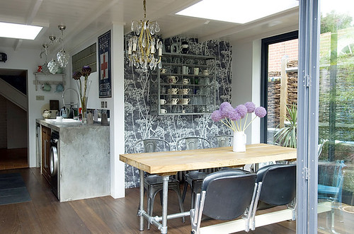
(from inspace)
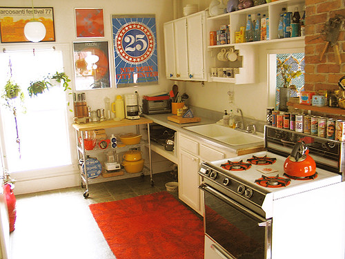
(from Wary-Meyers)

(from Marie Claire Maison)
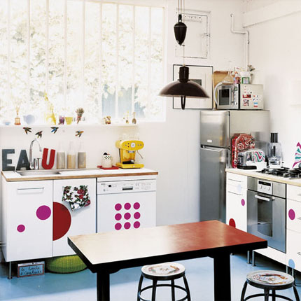
(from Marie Claire Maison)
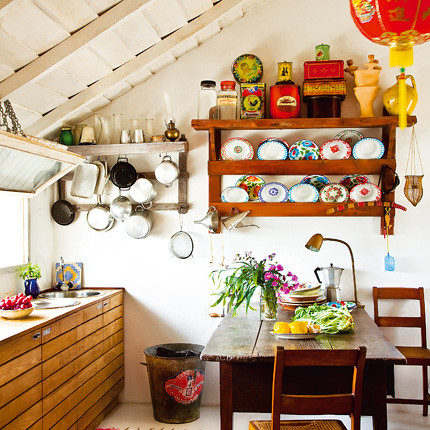
(from Marie Claire Maison)
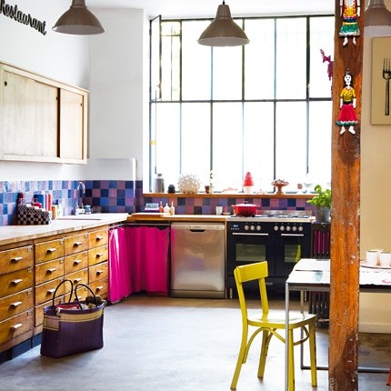
(from Marie Claire Maison)



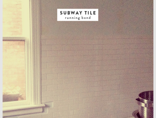
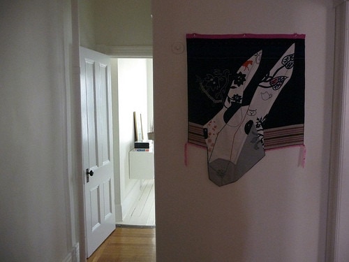

73 Comments
There’s nothing intrinsically “wrong” with granite. It can be any shade of grey, and any finish, and it’s much more durable than, say, formica or soapstone or marble, even. It’s just “wrong” when it’s finished to look like a disco mirror in a nasty nightclub.
Same goes for stainless steel or cherry. It can be done well. It’s just better when it’s not done in a pretentious way.
Materials do not in themselves equal “good design” or “bad design.”
I love the hits of red!
loved it! thanks!
As someone from New Hampshire, I’ll vouch for the benefits of granite. ; )
All of these kitchens are lovely. Thank you for brightening my day using something so unexpected as kitchen design!
That’s really well put.
I need to rephrase it a bit, and email it to my realtor. I’ve been kind of tired of her showing us kitchens she claims are “COMPLETELY FINISHED!” (I think she talks in all caps) that seem rather … “dead” to me, and then places she claims need to be “gutted” that to me just need a facelift. I’ve been a bit unable to put into words my opinions of these kitchens, and how expensive doesn’t necessarily equate with good in my book. But you said it really well. So thanks. 🙂
(and my realtor will thank you too, as I’m pretty sure she’s getting sick of our “it’s just not RIGHT” claims with no specifics to back it up)
ahj, of course I agree with you on a factual level (i.e., there is nothing wrong with any specific material), but I think if you take what I said about granite/cherry/stainless within the context of my post, you’ll see that I was not criticizing the materials themselves. If you’ll notice, my own kitchen (the first two photos in the post) is full of stainless steel!
My issue is with the insistence upon using certain materials in kitchen renovations solely for the purpose of achieving a level of faux-luxury. I’ve looked at enough newly-renovated houses in the past few years to have seen what happens when the goal of a kitchen renovation is not to create something well-designed or practical, but to use catch-phrase-ready materials in an attempt to justify a jacked-up selling price. I’ve also seen a lot of people struggle to pay tens of thousands of dollars on their own kitchen remodels (very often using the triumvirate I mentioned) simply because they think that’s what they have to do to have a beautiful kitchen — or to be able to sell their houses.
That kind of thinking has gotten a lot of people in a LOT of trouble financially, and it’s very sad.
Oh yeah, I agree with you there. I’ve seen a lot of cheaply renovated condos/houses with terrible finishes … and stainless steel/granite countertops/cherry cabinets, just as you point out. These all seem to have become checkboxes on a realtor’s luxury assessment list.
We’re in the midst of rehashing some decisions we made with our current kitchen when we did a top-to-bottom renovation of our multifamily townhouse. We cook constantly, and the formica we used for our countertops is delaminating. So we’re looking at granite (at first reluctantly, now a bit more enthusiastically) as a replacement material, just because it’s probably the only thing that won’t stain/break/dissolve under constant use. We were amazed at how much better the finishes are now. I think the “luxury” condo kitchen combo has become enough of a cliche that manufacturers are now interested in making those materials more interesting. Anyway, we were pleasantly surprised.
ahj, I’m not sure what you’re planning on doing on your countertops, but there are LOTS of materials that you can use that won’t stain/break/dissolve under constant use (take a look at professional kitchens, most of which use a combination of wood, marble, and stainless steel — I should mention, though, that I don’t see anything wrong with using a material that gains a patina over time. I tend to favor these materials for that very reason) — and many of them are cheaper and/or more environmentally friendly than granite. Caesarstone, Richlite, Paperstone, soapstone, EcoTop, Vetrazzo, etc. …the list really is endless.
I’m really not trying to make a case against any specific material here, but I think it’s a real shame that granite has mistakenly elevated to a kind of gold-standard level of greatness when it comes to countertops. There are a lot of options out there, and I don’t want to perpetuate the notion that we should all be working toward a specific material just because of what the party line has been saying for the past few years.
Also, this really isn’t just about the materials. It’s about doing what you want to do because you love it and because it’s within your means — and, hopefully, because it will last for a good, long time and not need to be tossed in a landfill after a decade (or even two or more).
Hey Anna,
So I love this post. One of the reasons I love it is because I agree with you wholeheartedly.
Another reason is because we are planning on buying a house in the next 6+ months and I’ve noticed that people tend to gut kitchens, stuck some Home Depot cabinets in there and add granite + stainless appliances and say “done! i’ve increase my home value by $30,000!” Well, not for me. I’d rather buy a house with the original kitchen, gut it or just improve on it, and give it some character.
I don’t want to buy a “model house”, I want to buy a home.
Jaime
We really like soapstone, but are afraid of stains. My husband is a take-no-prisoners messy kind of cook, and I fear the “patina” that will develop. 🙂
Ideally we’d find something as durable as granite with a soapstone look. Or slate, even.
Hey Anna-
I completely agree. It drives me crazy to see these kitchens that all look the same due to people wanting to look fancy or something. I am an interior designer and it drives me nuts that people don’t think for themselves and determine what works for them and what they like. I have seen so many houses that just look plain gaudy because people try to achieve “faux-luxury” like you said.
oh god, what you said about kitchens I COMPLETELY AGREE WITH. what a wonderful, smart, true statement. sick and sad is right!
LOVE these!!
It is exactly the same situation here in Australia. There are so many people in the town that I live in that have more money than style. As part of my job, I have had the opportunity to see inside many of the homes that are fantastic from the outside, but are so disappointing once you set foot inside. They really aren’t ‘homes’, just showcases for what these people think they should have and how things should look. Heartless kitchens that you know cost a bomb but just leave you cold. And in a similar vein – there’ll be an Eames lounge chair and ottoman in one corner and a rip off Arco floor lamp over two LCW Lounge Chairs in the other. Don’t get me wrong, these are pieces I adore, however you know it’s all been plonked there not because they have a love for design but because they are the ‘it’ pieces every magazine has told them they should have. I have much more respect for people like yourself Anna, who rescue unloved and abandoned original pieces purely for the love of their design and their history (yay for family of chairs!).
Sorry to veer off the main topic! I love your kitchen by the way Anna.
I want to live in Marie Claire Maison, real rooms for real people
I agree with you too. Your kitchen rocks and is a perfect example of non-fussy. I splurged on some items for my kitchen, but I don’t want a fussy look to it. Which is why I want to paint my floors. I find it gives a much more casual look than stained hardwood.
I totally agree about the faux luxury look, which ends up being soulless, in my opinion. We are looking to update our kitchen, and are hoping to spend about $500 on open shelving and a few replacement parts. That means living with our off-white formica countertops (which cover a whopping 75 sq ft, or they would be soapstone in a heatbeat). But honestly, what has the formica ever done to us? It’s fine.
If I ever bought granite (which, no offense, I don’t think I could justify the expense when I’d rather have marble for that kind of $$$), I would definitely get the honed finish, and none of the stones that look like they were attacked by a bacterial blight, please.
Just my two cents.
And I forgot to give props to Marie Claire Maison!
I love all these kitchens! They truly feel like the heart of the home. Funny, I have a red tea kettle as well that I purchased this summer. I totally agree about the faux-luxury. But what’s even worse than faux luxury is faux-faux luxury. I have a formica faux granite counter top in my bathroom. Yeah. Gross. Every time I brush my teeth or pee, I just shake my head.
btw, I posted a couple pictures of the exterior of the house! I’ll definitely post some updated interior shots soon. I’m hoping to have some triumphant, kitchen on a budget before and afters, but I’m still contemplating hardware…
I love all the pictures. I was trying to figure out what I love about them so much more than my kitchen – it’s the natural light. All these kitchens have big windows. Or at least windows larger than the 3×3 in my kitchen. Now I want a new window 🙂
Mad, mad props to you for this post Anna (LOVE all your inspiration photos too!) Our kitchen cabinets were made by the previous owner using scrap MDF from where he worked at the time- Dublin airport. I didn’t like the dark brown finish but the cabinets were robust(if a bit wonky here and there) and well laid out, so I painted them white, swapped out the handles and now I love our kitchen way more than I could any snooty, bland space. Between the work the previous owner did and my painting every possible surface white, I think our entire kitchen cost like, uh, $200! And it used to be part of Dublin airport for cryin out loud!
Regarding the Orla Kiely wallpaper- I was gonna get in touch with you about it actually! I think it could look adorable in your hallway somewhere. The colours would fit in with the other colourful accents, and it would be kind of cute adjacent to your Orla Kiely wallpapered vestibule! I’m thinking of maybe using it on some door panels, but could change my mind a million times. I might even my stair risers…
Hi, I loved this post! I found your blog not so long ago and just wanted to let you know I have found it inspirational – I am in the process of decorating my first flat (bought a year ago) in Glasgow, Scotland. The kitchen was the first room I tackled and I did it on a strict budget. Thick wooden work tops were by far the most expensive thing I bought (my kitchen is very small – the only reason I could afford them!). They were worth it though as they give the kitchen character and look great with inexpensive gloss units.
oh man, am i inspred!
I’m just redecorating my kitchen & am greatful for the inspiration.
I have recently renovated faux-granite formica & the most disgusting cheap beige tile/MDF cupboard combo that my landlord is more than proud of. It’s difficult to escape into modernity with it. But I rent. So what can I say.
That saarinen armchair at the kitchen just brought me to totally peace with the pair I have felt guilty about not putting the time/money into refinishing. I will embrace the *patina*.
Suddenly, I love it!
..Weird crossover that won’t make sense to anyone else..
Dear Anna, I know I’ve already bought more than I need (er, my whole house would fit into your living room!) so if it the wallpaper doesn’t become available in the US I will most gladly send you what I have left.
That sounds a bit scroungy- I will obviously also buy some rolls over here to send to you, if needs be!
Can I just say B-O-R-I-N-G! If you watch HGTV you see that a lot and no offense to anyone that likes that look, but I find it lacks personality. But, chances are the people that own those homes probably lack personality too…Ah, that last comment was a bit mean, but I’m leaving it. 🙂
I meant to say I love your kitchen but started ranting and forgot to mention it.
Hi Anna-I think this is a great post. Why do people place such emphasis on luxury kitchens? With our economy in such disarray we need to be practical and remember that kitchens are for cooking food. In Europe, kitchens are small and functional–not romper rooms and certainly without granite and tvs built into the fridge. I think the US could take a cue from our friends across the pond.
I am in the process of buying a house (I close on Monday-YAY!) In the process of looking for a house I found so many foreclosures with souped up kitchens some good a most bad. I had the hardest time convincing my realtor that i pretty much wanted a house with great original charm and that i really do not like granite. The house i found has really charming original tile that i’m considering just re-grouting if not I’ll go with a very light colored solid surface like quartz for aesthetics since I’m a photographer and will be shooting in my kitchen. I love the individual style kitchens pictured. And I really appreciate that your kitchen is your favorite room. Your bathroom is mine one of the inspirations for my own bath reno. Thank…-S
Love your kitchen and the inspirational images. I agree with the granite countertops sentiment. I worked for an architecture firm that was something of a condo factory and “granite counters/stainless steel appliances” was the defacto “luxury” finish package. It was so thoughtless. I think it looks so tired. I was looking at apts online and so many ones touting a “modern renovation” also have those ugly countertops. My old yellow formica countertops in my 60s era rental may be tacky in a different way but at least they are different! 🙂
Your kitchen is so lovely! And those other images are too, it looks like someone actually lives there and uses the kitchen. I completely agree with you on what you said!
I love your kitchen and wish I could make mine as put together… I feel like I have too much clutter. Your use of the ikea shelves is awesome and may be something I steal since I have the world’s smallest kitchen and a real lack of cupbards. Also love the art above the stove.
i too love your kitchen! and i love your marie claire maison photos… just watched an episode of ‘This Old House’ regarding this very thing. One of the guys was saying how kitchen cabinets are functional and should not be a “feature” and this crosses over to so many things in our lives – over design – over thought – self concious, vanity aaaaaaaahhh – i better stop. 🙂
Thank you for this post. I’ve never posted here before but I’m just so happy about this posting.
My husband and I bought our first home after getting married and had to re-do everything because it had been run into the ground. We were able to completely renovate a kitchen for under $1,000, re-doing everything (excluding appliances). I love my kitchen, but sometimes people will ask about the materials. I guess it’s just sad to think that the blood, sweat and tears we spent on the house will not be appreciated because we didn’t get stone countertops or stainless appliances.
But, it doesn’t matter. Because it is exactly what we wanted – unfussy, comfortable and nice. And, we can still afford it. With this economy, this is important.
I think your homes featured have the same qualities. Thanks.
Hi, Anna – Thanks for saying what I’ve been thinking for a long time. It’s not that the triumvirate (ha!) is so bad in and of itself, but watch HGTV’s (dreadful) “Spice Up My Kitchen” a few times and you’ll be convinced quickly that granite countertops, cherry cabinets and stainless steel appliances have replaced all rational thought in kitchen design in America. I’m all for creativity, thinking for yourself, and the pleasure to be taken in more modest accomodations. It also always looks to me that you can’t actually cook in those rooms.
oh I so agree with you too! I was so delighted when our planned kitchen (yet to be built) came in sooo under budget. I wanted a warm heart to my home and specified only what I needed in the brief. It will basically be a stove, pantry, central island and 2 benches but I love it already! A-M xx
I’m grateful that my (mid-century) house 1. never got a horrendous 80’s oak cabinetry and laminate counter redo (like it seems every other midwestern house of a certain age got) and 2. that when it was remodeled, the former owner forwent the cherry and granite in favor of a very unconventional (for around here) and modern kitchen which kept with the spirit of the house. For that, I can even forgive the fact that the former owner chose eggplant-colored base cabinets.
What scares me the most is that an incredibly livable and enjoyable kitchen, actually enjoyed by the family, is then trashed right before someone moves out just to make it more “marketable” when it would have been perfect “as-is”. For certain types of people, they are actually making the house less marketable with these cookie-cutter additions.
Check out my blog, I left something there for you…
love the one with the rafters showing – this is what i’m be doing for the kitchen in my wee hoos. one line of cabinets, with sunken in “bowls” that will drain outside and eventually have plumbing. ha.
Thanks for this post! I’ve always admired your kitchen. When we renovated/remodeled our 1951 home, I wanted a simple kitchen that went with the style of the house. The drawers and cabinets are plain-front and the countertop is Formica (in “Virr-Varr” pattern). I really do believe that a beautiful kitchen can be achieved without a whole lot of money involved.
Also, it makes me sad when I see mid-century homes that have “Tuscanized” kitchens.
AMEN to this post! As someone who watches tons of do it yourself shows, it is always disheartening to see people putting kitchens in their home that cost more than I paid for my house simply for the “status” of it all. I don’t need a kitchen that looks like it came out of a magazine, I need a kitchen that is primarily functional, easy to clean, has a sense of MY STYLE and is durable. Beyond that, I’m not concerned with whether it makes and high end status-quo. For several years t.v. had me convinced that I would have to spend upwards of $70,000 or more to have a “nice” kitchen, now I know that I will hopefully be able to do it for a couple grand if that. I wish more people would look for what would make them happy when they are doing work on their homes rather than trying to live up to some sort of showroom mystique!
I totally agree – a lot of kitchens are Super Fancy but to me they just remind me of a scary Model Home or even a restaurant kitchen, which is just sort of frightening. I think a kitchen IS important and should be functional, but most of all it should be cozy and warm and inspiring, instead of cold and lifelike. It should make you want to go in and bake cookies, not just make you want to stand outside and look at it. I love these pictures you posted – exactly the sort of kitchen I can imagine myself having!
Awesome post. Really spoke to me on so many levels. I am an interior designer too, and you don’t know how many condo’s I have done with the cherry/stainless/granite combo. It’s really disgusting actually how often it’s requested.
I am in the process of conceptualizing for my own design business and this is exactly what I would like to focus on. I think it takes much more creativity to work on a tight budget and make something look great than it does when someone hands you 50K for a kitchen.
i love your perspective on things, anna!
Hey I have to agree with a lot of people, my BF and I are firm believers in not having a kitchen out of a catalogue. It’s a matter of personal preference, and certainly not an indictment on those who choose the route of built ins, etc. The look fits into our house, which isn’t fancy and would look odd with a fully built in kitchen.
Our goal is to have freestanding furniture for storage and use used materials – our cabinets are actually going to be ones that we purchased off of ebay and are bright yellow and metal. We’re thinking of poured concrete counters (a job that we plan on doing ourselves – very ambitious I know) which are a good option if you’re not into the soapstone or granite.
Re: “Tuscanized.” I think this is also known as “French Country,” yes? Where everything is a beige-y frosted color, and there aren’t any sharp edges? Yeah, yuck. This seems to be the treatment of choice for extremely high-end newly-built suburban houses. It reminds me of burnt marshmallows.
Your kitchen is gorgeous. It’s a shame that some people don’t realize that “high end” as defined by realtors and builders does not equate good taste. I’ve seen so many of those soulless of kitchens house hunting over the years and going to estate sales. I like to call them kitchen ruinovations.
The worst is when you check a site like Zillow and see that they will raise their estimate on your house if you add a value for renovations done. You can do an amazing job with a small budget if you are a creative person but according to them the more you spend on the renovation the more your house is worth. It’s absurd.
Oh and thank you for posting that photo with “Cow Parsley” – I’ve been trying to convince the husband that we should still use it somewhere!
i love a functional kitchen. i do like it pretty, doesn’t need to be expensive, but just pretty. i find yours to be lovely and functional.
Anna, I adore your kitchen. You did a fantastic job, and you have great taste. My jaw dropped when I read you did that for under $1k, excluding appliances.
I completely agree about granite, cherry, and stainless. As everyone is pointing out, each of those can be done well, but the three of them together are so overplayed. I also have to admit that, while I have seen some nice granite, 90% of what I have seen is just hideous, but it’s still touted as some luxury countertop. We have silestone, which I love, and I chose it in part because I just didn’t want granite, which will be the avocado green appliances of this decade, imo. I would actually love to have marble, but we would stain it (and not in a cool French bar kind of way) in a second, it’s expensive, and it’s totally environmentally unfriendly.
What are your countertops, or do they come with those cabinets?
I also agree that everyone spends way too much on kitchen renovations, and I love the ones you picked.
I’m so glad to see someone else feels this way too! I just toured a house over the weekend with my mom and SIL and they were shocked when I turned up my nose at the big ‘new & improved’ kitchen that had recently been put into the early 60’s ranch..it truly was a deal breaker for me as I’d much rather stay in my current mostly original slightly worn and quirky 60’s kitchen. I love the character older items have and have always felt uncomfortable in shiny new spaces.
I have been reading your blog for a while because I appreciate your design aesthetic but am less of a fan when you make sweeping generalizations. I don’t have a cookie cutter kitchen in a cookie cutter home – I am just someone who appreciates happy, optimistic blogs that dish out a little less judgement.
I love simple, bright kitchens with splashes of color thrown in here and there. It’s important too to me to have some space that are open and clean, as well as cluttered spice shelves (or other cluttered areas).
Anyway, I hear you on the kitchen as fave room.
Sunny: What do you see as being the “sweeping generalizations” in what I wrote? I’m baffled! This was a post about finding happiness and satisfaction in what you have and what you can afford–and how good design, functionality, beauty, and style are not directly related to cost. How is that pessimistic and judgmental? Frankly, I think your comment strikes the only sour note on the page.
You go, Anna!
I have found that whenever you prefer one thing over another — as a matter of personal taste — some people will find that to be judgemental.
But isn’t that what personal style is all about? We can’t (and shouldn’t) all like the same thing.
Which, I will add, is exactly MY problem with “the triumvirate.”
I just found your blog today via emmas design blog. I love it! Anyway, just wanted to let you know that I completely agree with your “triumvirate of horror” comment. At some point someone told someone else that those things meant luxury. I’m not saying they aren’t pretty, but people are throwing granite and stainless steel and cherry all over their kitchens and calling it “high end.” For crying out loud, it’s a kitchen! It’s meant to work hard preparing meals, spilling drinks, getting spaghetti stains, and a little bit of love.
I second (or rather, 50th) that! I love the basic, relaxed, functional, sometimes whimsical, style of your pics. This is precisely the anti-look I want for my kitchen, which is even less “finished” than yours! I didn’t even get Ikea standalones, I got the faktum (or whatever the basic unit is called in the US), put the basic black legs on them and pushed them against the wall. Then I have a bench along another wall made of the a-line trestle legs with shelves, and a benchtop from the “as is” section. I’d like it to be prettier, and your pics give me something to work towards.
Happy birthday to your Mummy. (I call my parents mama and papa bear, and mama and papasan, so you stick to your guns!)
PS, I don’t think you dish out judgement, Ms Door Sixteen. I find your blog to be a nice, happy place to visit. It’s important to have discernment. Not everything can be nice, good, right or appropriate for everyone. Sheesh. Otherwise we’d all be the cookie cutters one commenter abhors.
Viva taste, choice, preference, and blogging what we like.
Hi! I’m new to your blog, and it looks like a goodie! Your kitchen looks great, and your budget is inspiring 😉 well done. i love seeing rooms with personality and warmth, can’t wait to keep reading.
Hey Anna,
I was just wondering who made the print/artwork that’s on your kitchen wall? I love it! And, btw, I covet your house…it’s fantastic!
–Megan
I am new to your blog Anna. The kitchen pictures are just what I needed. My husband and I purchased our first home and are trying to make it beautiful again (1940s, small farm house, near the city and with a gorgeous lot). It was so important for me to remodel and still give character to these spaces. I really don’t want to loose the charm of the home and yet everything feels just super expensive right now.
I am inspired by the pictures you have posted of less expensive, comfortable, beautiful kitchens. It is too late for us on the appliances (we already purchased the stainless steel fancy stuff, we are big cookers and the home came with no appliances), but I am thinking now of some other creative options for storage and what not.
We are installing concrete countertops and putting in a cork floor. I should post the pics on my own blog. Enough rambling, beautiful work…keep it up 🙂
I just hopped onto your blog from another blog(though I can’t remember which one because of the hundred tabs on my browser). ANyway I agree with you completely and the kitchens you posted are absolutely beautiful! My favorite material for counters is butcher’s style raw wood.
Also, for anyone considering granite, you want to make sure your granite isn’t emitting radiation! I think even the possibility of a risk is a turn-off when there are so many healthy natural materials out there.
Okay, I am totally subscribing right now… You had me at the pic of you and your mum, and this post sealed the deal.
i love love love your kitchen!
I love these images. I’m editing a new shelter magazine right now, and if I see yet ANOTHER operating room/kitchen, I’ll scream. I loathe the Ubatuba granite runways that every home owner seems to think they must install for a home to be sale-able. My partner and I recently took possession of my paternal grandmother’s walnut kitchen armoire. She removed the hideous finial, we’ll likely paint the thing white, and it’s now doing service as a spice cabinet, with each shelf dedicated to an ethnic cookery (we have an Asian shelf, an Indian shelf, a French shelf, etc). Works wonders, and everyone who sees it, loves it. Kudos to you all for breaking the kitchen design “rules.”
Love your kitchen! I’ve been looking for inspiration for my own and nothing has seemed quite right until I saw your pics! Thanks for the inspiration!
i completely agree with you! just watch a couple hours of hgtv and you’re bombarded with that triumvirate you speak of- especially on the real-estate and kitchen design shows.
i personally think its so boring- its become the go-to combination for kitchen design. not to say that cherry cabinets aren’t beautiful, and granite is nice as well, and i LOVE stainless. but when all 3 are put together it just looks like any other cookie-cutter townhome kitchen- in my opinion anyway. not too mention the outrageous cost of those materials- thats money i could spend on the rest of my home or for family activities!
I totally agree with what you. My husband is obsessed with HGTV and whenever you watch those shows where they appraise the house, people complain when there’s no granite countertops, stainless steel or the cabinets are not the type of wood that they want. Or what’s worse is when the seller’s’ home is not appraised for what they want it to be worth. It’s really sad. Great post!
i’m so glad to stumble across your blog… it’s fantastic and such inspiration!
i’m always so so pleased to find another fellow UDDEN kitchen as well… and with a touch of red too..yay!
Do you think that maybe your comment deriding people for their faux-luxury kitchen is really just a backhanded compliment to your own, superior tastes and originality?
To be honest, i think the popularily of the cherry/stainless/granite kitchen has more to do with wanting to be like everyone else than it does about showing ones status. People are like sheep: they follow trends, and the type of kitchen that is so reviled to you is just trendy right now.
I don’t see any formica in your kitchen. Or white appliances. If form over function was as important to you as your making out, then you most likely would have chosen these options. Actually, you probably would have kept your old kitchen. But you didn’t, because you are just as trend-concious as the rest of us. You just happen to follow different trends than the granite people.
I think you missed the point of my post completely, Christina.
I love this post.