Don’t get me wrong, I love my kitchen. It’s very cute, and it has served us well for the past 3 1/2 years. There are times (okay, pretty much every day), though, when I find myself wishing for a larger sink (not that I don’t enjoy washing baking sheets in the bathtub). There are also times (like after our New Years party or Thanksgiving, for example) when I think it would be nice to have a dishwasher, too. (I see it is possible to install a dishwasher in the kitchen units we have. Hmmm.)
ANYWAY! The lack of a real need for a new kitchen certainly doesn’t keep me from fantasizing about one…

Photo by Alexander Crispin (from Scandinavian Style). This is probably my all-time favorite fantasy kitchen. The combination of materials and colors is just so perfect. I love marble countertops and the patina they gain over time. I am happy with my wood and steel counters for the same reason.
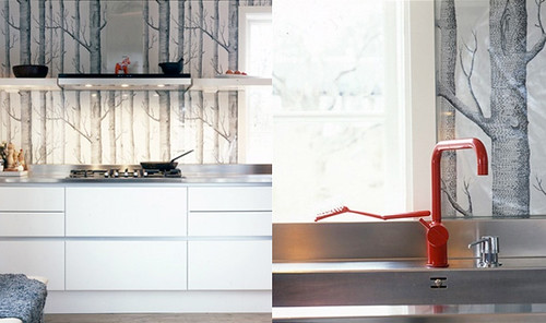
Kitchen by DAPStockholm. I’m not sure how it’s possible that I’m still not tired of seeing that wallpaper everywhere, but I’m not. Also, how cute is that Arne Jacobsen faucet?!
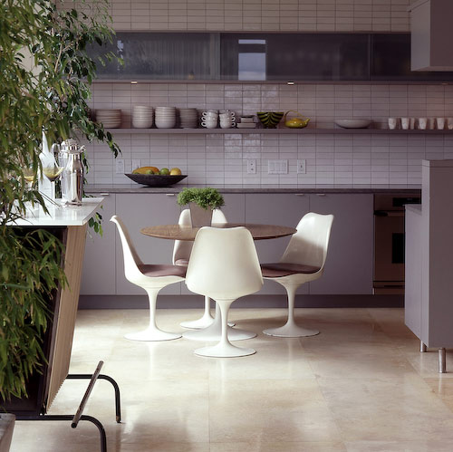
Photo by Jon Jensen. Oh Heath Tile, how you taunt me! I can definitely get behind soft grays in the kitchen.

No one can argue with a white kitchen, right? This just looks so fresh and clean. I spy another AJ faucet, too. (I can’t remember where this photo is from, sorry! I think it may be from a Swedish real estate site that Emma linked to a while back.)

Of course, black kitchens are good, too! I have black cabinets and a black floor in my kitchen, but it never reads as dark or dreary. I wish I had a brick wall that I could paint black, too. Photo by Hotze Eisma.
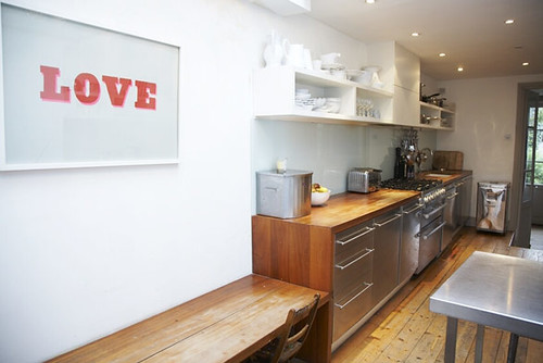
From ShootFactory. The combination of open and closed cabinets is so practical, and I love all of that wood. In 40 years, this kitchen will still look great.
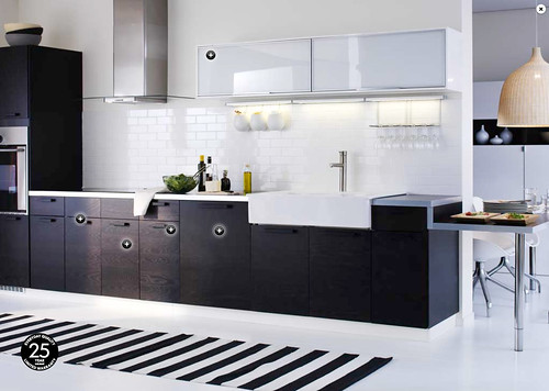
This is my favorite IKEA kitchen right now. They’ve used a NEXUS lowers and RUBRIK uppers. I particularly like the white kickplate. It makes the cabinets look like they’re floating.
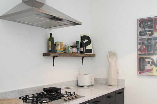
From Factory 20. More marble! Yay! And a glove mold! And a rustic shelf! With black brackets! And black cabinets! Yay! There’s a whole lot going on here that tickles my fancy.
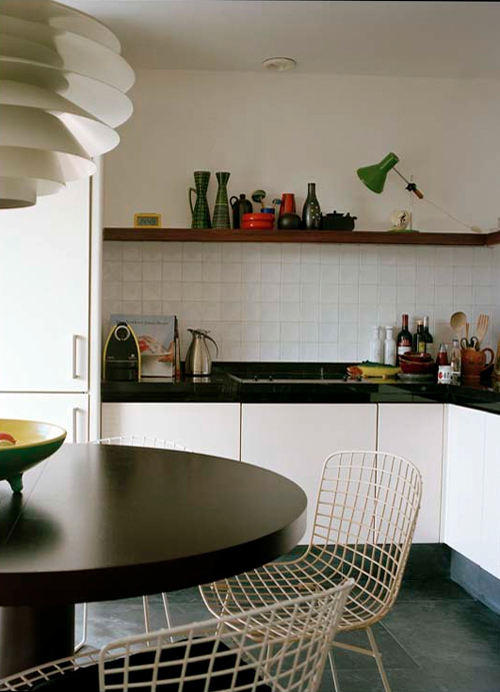
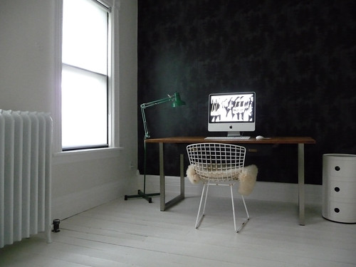
Another photo by Hotze Eisma. I may have lied about that first kitchen being my favorite, because this one is giving me palpitations right now. Everything here is perfect, right down to the imperfect tiles. Also, the combination of white, black, wood, a green lamp, and Bertoia chairs makes this kitchen the perfect companion to the room right above my kitchen: My office!


43 Comments
oh, you’re killing me here. these are each and every one gorgeous. love this!
substitute the word “kitten” for the word “kitchen” in the title and first couple sentences, and imagine my horror when I glanced at this in my feed reader.
A post that started out as warm and cuddly quickly turned nasty as I realized that kittens have an expiration date 3 1/2 years after acquisition!
Ooo, if you put that red faucet in the first kitchen it would be unbeatable. (Although I’d also like that green lamp from the last one. Er, and the white pendant. And the chairs. Ok the last one is pretty awesome too.)
Anna – my marble is finally being installed on Tuesday! I can’t wait. You may not have a dishwasher, but I haven’t had a kitchen sink in over a year! 😉
Just wiping the drool off my chin. Between you and remodelista, a girl could dribble like, forever!
Am really loving these ‘unfussy’ kitchens. Especially yours. Its really functional, but still looks really great!
Your favourite ikea kitchen is about to become my master bath – with a Caesarstone counter… black and white, I think it’s gorgeous
You know I actually have your kitchen bookmarked as an “inspiration kitchen”. However, I would probably go mad with the small sink (I am constantly complaining about my current shallow, single basin sink, though the one good thing about it is that my cookie sheets fit). These are all beautiful too.
my studio shoots food and kitchen supplies for a catalog, and one of their new items was a ‘mobile’ dishwasher. it’s probably a little larger than….oh the average microwave? lol i’d imagine all the fun (and not so fun) things that could happen with that thing. just thought i’d share 🙂
While we were planning our kitchen, we read “the kitchen for cooking”. The author is the german designer Otl Aicher. I highly recommend this book to anyone that is thinking about a new kitchen.
Nice kitchens. I saw the coolest washing machine when we were redoing our kitchen. It was an industrial machine, like the ones they have in restaurants that heats the water and then only takes a minute or two to wash up one tray. It was really tiny about the size of a microwave. You wouldn’t be able to fit the baking sheets in it though 🙂
Bonjour,
Je souhaite vou faire découvrir mon site:
http://www.myriamfaconne.fr
I love those kitchen designs. I’m in the middle of a kitchen remodel right now and I can’t wait to finish. Mine is on a very tight budget, but I think it will really come together when we are through. I’m going with the all white very uncluttered look. I don’t think I’ve actually seen a picture of your kitchen now. I’ll have to look through your archives.
-FringeGirl
Now I may be seeing this too simplistically, but I’m feeling your own kitchen is very similar already to those you are inspired by. You are not far away from that kitchen of your dreams….
Thanks for sharing the images 🙂
I really love the all-white kitchen, but I would be sooo paranoid to cook or do anything to get it dirty.
Thanks for the inspiring blog. I came here not long ago and have enjoyed reading your archives. Have you thought about dishdrawers, you can get single or double drawers here in New Zealand by fisher and paykel. You’d still have to get a bigger sink though for the trays. They do sell products in the US
I love your current kitchen, and have actually sent the links to my sister who is considering doing a free-standing IKEA kitchen in her house in the mountains as inspiration. I can understand your frustration with the small sink and lack of dishwasher (eek!). We have nearly finished our kitchen renovation and I am SO EXCITED. It’s like having a whole big new bucket of toys to play with. Would love to see what you did on any update to yours. I can see any of the above at your place, looking amazing. Particularly the one via Factory 20.
I’m loving the kitchen with the dark grey wall shot by Hotze Heisma. His/her website has been on my favourites for a lot time and I think the owners of this cool grey kitchen run a restaurant.
Got your banner from Victoria’s website so I’ve added to Door Sixteen to http://www.bodieandfou.com/fous_notebook
Bises
http://bodieandfou.blogspot.com/
Jessica: That’s hilarious!!! No one can argue with a white kitten, right? Of course, black kittens are good, too! 😀
heather: It’s about time! I hope you’re going to post photos…
tina: I know exactly what you’re talking about. I looked into them, and they get terrible reviews. Then it occurred to me that for such a tiny amount of dishes, it would be so easy to just do them by hand!
FringeGirl: There are photos of my kitchen here and here!
Jacqui: The dishwasher link in my post goes to a kitchen with F&P dish drawers. 🙂 My only concern is that the reviews for them are very mixed. Maybe they’ve improved since I initially did my research, though.
here’s what i think… i love looking at mansions and multimillionaire homes that are for sale on trulia.com. i love the way the big kitchens look. but in reality, i don’t know if i would really want to LIVE in said homes. there’s no feeling of “home”. it’s like your house has to be a showcase 24/7. the only thing i really like about those types of kitchens are the stoves, ovens, and large amount of counter space (because i am really really messy when it comes to cooking and take up ALL the space i have, haha). oh, and it MUST have windows. nothing worse than working in a kitchen with only artificial light.
i really like your kitchen. i’d have to have a dishwasher and more working space, but i love the layout of it. i love the framed picture above your stove. =)
Your kitchen pics were some inspiration for my own kitchen and the reason I started following your blog. I really enjoy your style. Please keep it up!
This is totally unrelated, but have you ever been to the High Line in Manhattan? I went for the first time this weekend and I kept thinking about their honest use of materials and industrial aspects to the design… if you haven’t made it there yet, I think you’d enjoy it!
Absolutely love the top one!! So nice too have some wooden feel after years of white kitchens! Thanks!
ooh, there’s some beauties in your selection! i’ll be redesigning our kitchen next year – can’t wait!!
I’m on a mission to create the Ultimate Happy Playlist. Please help me out by letting me know what song instantly makes you happy when you hear it!
http://leni.typepad.com/life/2009/11/on-a-mission-i-need-your-help-please.html.html
Amazing inspiration! My favorite is the one with the black brick wall! I want it!!!
Nothing wrong with dreaming!I am always dreaming about a new kitchen…& we have only had this house 3 years…But we chose the “nicest” & plainest one for our budget at the time, & o course my taste has totally changed…One part of me thinks “just be grateful for this lovely kitchen…” – & the other part of me yearns for a beautiful, white kitchen!! Especially when I look at lovely magazines or blogs!
Take care
Jas
We definitely have to agree with Jacqui Bennetts. We hope you check out our DishDrawers. http://bit.ly/2CLRsM Great blog post.
Ha, just coming to comment about Fisher & Paykel dishwasher drawers! Size-wise (and looks-wise) they would be perfect but I can’t comment as to reliability.
I LOVE your unfancy kitchen post, and have gone back to it countless times as I struggle to build my own simple, functional, budget kitchen. Thank you for the inspiration. I can’t wait to see what else you come up with!
I feel for you and that tiny sink. I’m SO close to finishing the sink side of our little galley. Since you guys are such good DIYers I thought I’d share my experience with semi-diy stainless counters (where you build the wood tops, take them to a metal shop to be wrapped in stainless then install them yourself). This brought stainless into our price range, and as a lifetime restaurant worker, stainless was my only choice.
http://www.flickr.com/photos/southof290/4074805484/
I was exclaiming over these photos, and my boyfriend made the mistake of asking what I was cooing about. I then showed him all the photos of your painted floors, and he had to remind me that we rent an apartment with carpeted floors. One day, though, I swear…
I’ve been working in a 1909 house in a bad 50’s remodel kitchen (and bathroom) for 3 years. I have hundreds of paper and digital photos of the dream kitchen. Love these!
I think the last one fits your house so perfectly. Someone must have been sneek peeking at Door 16!
Oh I love #1…and #2 and #3 love those too! And I hear you about that wallpaper! I feel the same way…i just don’t hate it yet!
I have that tree wallpaper in my entrance hall, and I’ve never got bored of it since putting it up a year ago. It gives a lovely calm vibe as you walk through the door after a long day.
I have so many things to say about this post! I found your blog last winter when my friend commented on this photo of my kitchen and its similarity to yours, only in reverse colors. I’ve been reading ever since.
Next, I just picked up the Woods wallpaper, also in the negative colorway (silver on black) for the wall at the top of my stairs…I’ve seen it everywhere for so long but the black is really fresh, it’s not even on the Cole & Son website, so I’m justifying it! (plus it was free, left over from a coworker’s living room).
I’m actually in the middle of painting my stairs right now, which will be white leading up to the black tree wall. But in my last rental before we bought this place, I did this with some leftover vinyl from a project at work.
Lastly, I totally just used that Heath Tile photo as a concept image for a design project at the office! LOVE!
Oh, I lied about “lastly”…one more thing: have you seen the Viola Park kitchens if you’re into green with your wood and contrasting cabinets? TDF. http://violapark.com/
It’s funny that you’re fantasizing about these kitchens, because I think yours is just as nice — actually, maybe even better. Of course, I wouldn’t know about the sink being too small from photos.
I recently saw an absolutely amazing kitchen that used Ikea cabinets. They used the white lacquer ones and had miles of thick white marble on top and for the backsplash. It was in the rear parlor of a Victorian row house and the fireplace opposite was wood painted gray. One of the owners is an architect. I saw it on the Bed Stuy house tour. The whole house was a wonderful mix of old and modern. You would love it.
wow. i’m in the middle of trying to plan my kitchen reno as well. It’s funny i have alot of the same photos as insparado…and now i have some new! the thing i’m most excited for is a larger sink that UNDERMOUNT! omg the amount of yucky grossness that’s probably trapped under that little lip of a drop in sink completely freaks me out! i’m thinking of a nice clean mostly white kitchen (dark cabs on bottom whit to the ceiling cabs) with some open shelves on one wall. thanks for the great ideas!
The glove mold really grabs me! Ha pun intended. Actually it did make me take a second look. I guess you could say that it is a one of a kind kitchen appliance
http://remodelista.com/posts/steal-this-look-cotswald-cottage-kitchen
Marble and old wood, tiles, a lot of white, the combination of modern and old- I thought you might like this kitchen.
Love the MJ desktop wallpaper in the last photo: http://stuartmcdonald.files.wordpress.com/2009/06/michael_jackson_-_invincible.jpg
Elias, that’s MY computer with the MJ wallpaper! 🙂
I love all these pictures, I’d take any one of them if someone else was willing to do the work– and if I had the money for it! I wish I could redo my kitchen, but my mother in law gave me almost everything in it and my husband and I can not bear to see it go..
-Sylvia
Padrons