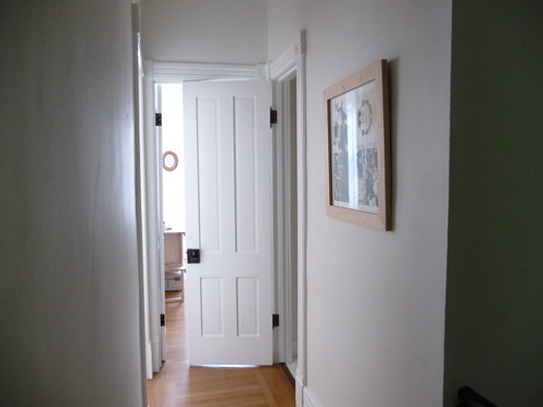
Looking one way…

…and looking the other way.
Our hallways are long and skinny. Our whole house is kind of skinny, actually—20 feet wide—typical for late-1800s row houses. We’ve managed to make this work in the downstairs entry hallway (that’s it in the first photo here) by balancing the staircase with an extra-long credenza that doesn’t interfere with passage to the dining room, but upstairs is a different story.
Here’s a floor plan to give you an idea of the space I’m working with (upstairs is on the right, and the new closet what’s behind the “attic door”—that’s the open door in the above photo). It’s really not wide enough for a shelf of any real dimension, much less furniture. There are doors all over the place. Someday we’d like to have a few light tubes installed, but for now it’s kinda dark, since there are no windows.
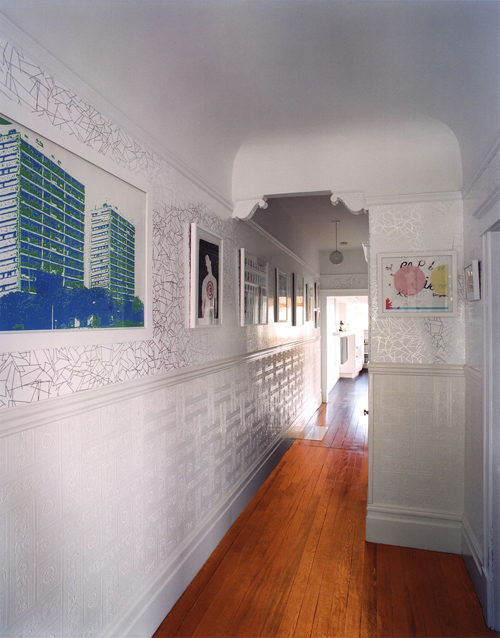
Clipper Street Residence, envelopeA+D
This is kind of the aspirational gold standard for me. Our house doesn’t have as many fancy details, but it is from the same time period and roughly the same Victorian style. I could see adding a chair rail (and maybe a picture rail, too) in our hallway, and hanging Julia Rothman’s beautiful “Pieces” wallpaper from Hygge & West (I am ashamed to say that I have been hoarding two rolls of it for about a year now—I’ve gotta use it at some point!).

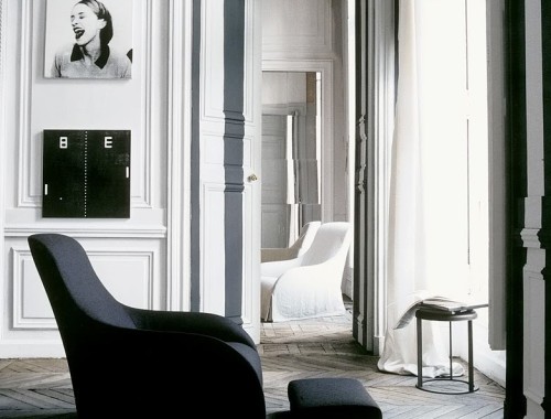
From Livingetc
I keep coming back to this hallway, too. It’s pretty much the same size as ours, but it’s looks SO much more open. Part of that is because of the white floor (sigh) and the super-strength lighting (which I don’t think is natural, so it’s probably as dark as ours in reality), but also because we have the aforementioned closet down at the end where they have that little railing. Sometimes I think walls full of frames can look a little contrived, but this is really nicely done. I feel a little bit of vertigo coming on at the thought of having to rig up the necessary scaffolding in order to hang stuff that high up over the stairs. Yeesh.



29 Comments
those hallways! They make me want to rollerskate, or run down them in socks. 🙂
Both of those have 2 things : lots of artwork, and lots of light.
I think the chair rail and the wallpaper are both great ideas. Go with that and hang lots a few things to draw the eye to the sides like in your two inspiration hallways. I feel like the abundance of beauty on the walls keeps your eye from shooting down the hallway and really noticing how narrow it is.
I love the atmosphere in your hallway photos!
Seriously. That was my thought too. I cannot even imagine trying to hang those frames and I bet those are plaster walls which would make it even harder. But the outcome is great!
oooOOOOOooo, I like it all. Including your hallway, of course. And I love your marble-topped credenza downstairs, it’s beautiful.
Is the “Pieces” wallpaper really as shiny as it looks in the picture? I always thought it was more matte. Awesome either way.
I like that bunny fabric from Ikea.
And the (sigh…….) wall-paper. eye-orgasm.
Chair rail + picture rail + wallpaper + wallpapered stair risers leading upstairs. Like a path of wallpaper.
Too matchy matchy?
boy do i wish that clipper street residence hallway were mine! love how you did yours as well. hopefully i can do something similar one day!
My favorite is the Clipper photo. While I really like the last photo, I’m dubious about the reality of it b/c I was thinking lots of white + a lack of natural light = dingy. Also, I’d want to be darn sure I like that wall color and frame situation because it would be so witchy to deal with. Scaffolding is right. My parents have an open loft-like area upstairs where the walls are filled with unmatched framed photos and portraits of our family over the generations. I love it so much. We keep adding to it year after year.
I wish your house was a hotel… I’d drain my savings just to stay there indefinitely!!! your halls are almost two skinny for as much artwork as shown in the 1st inspiration photo. I think you’re on the right track with a really cool wallpaper and sky lights. I had my finger on the trigger with that pieces wallpaper, but then my landlord vetoed papering even one wall in my place 🙁
You have no idea how much I wish you lived here, so we could hang out and talk housessss.
I absolutely adore these walls. Definite interiors inspiration!
Mmm white floors . . . I have a semi-related question . . . both spaces you note as inspirations are heavy on framed artwork/photos and you also tend to frame most of your prints, at least judging from the photos . . . do you have any advice on framing? Where and how?
@Dan: It’s somewhere between matte and gloss?
@verhext: I don’t have wallpapered stair risers! They’re white. Those are my stairs in this photo. I’ve posted pictures of wallpapered risers before but, they’re in other peoples’ houses.
@Liza S: The white and birch RIBBA frames from IKEA are great!! I either use those or the frame that comes with the art (I have a lot of stuff that was framed for hanging in a gallery, etc.). I’m cheap like that. 😀
The white floors caught my eye also! I have been debating painting my hardwood, but am afraid to.
One of the reasons why the second hall is so spacious is thanks at the depth that has been created by just adding (dark) things/frames at one side. If you would do this at bouth sides, you would get tunnelvision…
GREAT BLOG BY THE WAY!
Greatings from Belgium
I love those light tubes! Want, want, need the attic fan version for my attic. Our attic skylight bakes us during the summer.
I can’t wait to see your solution for the long hallway. I had a very similar one in my old apt. and could never really figure out where to hang art. We painted one side of it a bright green – which made it feel a little wider – and because that wall went around corners at both ends, it seemed like a giant cube at the center of the apt. Hard to describe, but cool in person.
That bunny is going to LOVE that wallpaper.
i knowwww. i’m saying maybe it would be pretty to do both!
Hey, Anna, I’ve made your Janssons frestelte (or whatever it is) tonight, and it came out pretty well! Thanks for the recipe. I’ve been planning to make if for quite a while. I used Italian anchovies, that came covered with oil in a small bottle and were unbearably salty, but this saltiness was lessened (or distributed) with baking, so everything went fine!
xo
szucs
I love the idea of putting so many frames!!!
I’m obsessed with the Clipper Street house. I have a whole folder of pics from a house tour featured on some blog some time ago and I go back to those pics all the time. The swimming pool bathroom!!!!! It’s so amazing!!!!!!
Hi Anna,
I live in a fairly small apartment… with very small windows compared to the room size, so it doesn’t get much light. My big trick is to fill my space with items that have reflective surfaces (not mirrors so much)… .and it makes the room seem brighter than it is.
Everyone says the room is so bright (and it’s not!) I toyed with painting the floors white but they were in good condition so I chickened out! My colour scheme is what I call “egg” because the furniture, tiling and most items in it are white or yellow! I think those colours imply sunny-ness.
I think the clipper street residence has the reflective surfaces thing going for it too.
PS: It’s such a delight when I see you’ve updated your blog!!!
@heather: We really need an attic fan. REALLY. This summer has been killing us!!
@verhext: Oooooh. Okay. 😀
@PhillyLass: I knoooooow. I think I may need to post the whole set.
@Tania: I definitely agree about the reflective surfaces, which is why I’m so fond of the metallic Julia Rothman wallpaper! 🙂
Anna, can you tell me how you hung your rabbit tapestry. I have the same one from IKEA. It’s been sitting in the corner of my room for months because I can’t figure out how to hang it without the slits drooping and stretching open.
What would Anna do? Or in this case, what did Anna do?
Your downstairs hallway is stunning. Upstairs, I can understand the problem. I grew up in an old house (from the 1850’s) and the upstairs hallway was even longer with no windows, 5 bedroom doors and two closet doors. My mom used bright wallpaper and a patterned runner to add brightness and interest, and so I think your best bet would be the wallpaper, too. Plus if it has metallics it will reflect any light which you could use in the dark space!
@Tara: I used plastic hardwall hooks. I think the key is to use something more substantial than a nail, and to (slightly) stretch the tapestry across the hooks when you hang it. You’ll have to plan out the positioning of the hooks, of course. I haven’t noticed any sagging/stretching, but if that happens, I’ll probably attach something to the back to make the top more rigid — maybe a thin strip of wood?
hallways can never be too skinny or rich – yours are both.
thanks again for bringing it h ♥ m e
Hiya, just wanted to mention that the Clipper Street house uses “Angles” wallpaper from Erica Waverly.
http://www.ericawakerly.co.uk/angles.html
The “Pieces” wallpaper from Julia Rothman isn’t as reflective.
Cheers
Have you thought about hanging those LED strings in the hallways, up close to the ceilings? I got a huge string of ’em (they’re the sort where the lights are completely enclosed in a flexible plastic tube) for about twelve bucks at Ace.
They come with their own screw-in-able clips, so I was able to install the tube in the corner of wall and ceiling. The only drawback is that the things need to be plugged in–so I have a cord running down one corner of the hallway.
They do, though, make a good stopgap. They provide a surprising amount of light as well, and keep me from falling over things (like the dog) in the hallway.