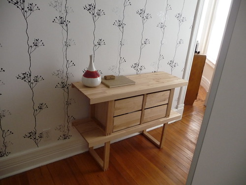
Let’s see…I started talking about wallpapering this room in October 2007, got around to buying the paper in September 2008, and then FINALLY managed to actually go ahead with the task on Friday! As planned, I used Berry Black from Ferm Living. Because my ceilings are so high, I needed almost exactly two rolls to do just the one wall.
I love this room so much now. It never felt complete to me before, and I knew wallpaper would make all the difference. My friend Heather came over to help, and the whole process went very smoothly—only about 5 hours from start to finish, including multiple breaks for lunch and dog-loving.
I’m still not sure about keeping that little bookshelf in there, but for now, it’s fine. I also need a big plant, I think. Weirdly, the wallpaper has made me hate the orange-y floor color a little less than I did before. Hmmm.




66 Comments
Wow. Looks great. Makes me want to wallpaper…something, anything. I especially like the red door handle and the red accent on the vase – it all ties together very nicely.
Cool wallpaper! You should try to find a big heavy black frame and put up some artwork or a personal black and white picture on that wall now! It would look great against the wallpaper!
Love the wallpaper, it’s really pretty. Also a cool little bookcase.
It looks really awesome, Anna, I love it!! Wallpaper adds so much to a room – it’s like a little splash of personality. The pattern is well chosen.
love the paper.
love the little book case, I want to paint it a high gloss red.
pve
I think that the bookshelf is really nice but maybe not so for that space. I would rather consider something bulkier such as a chest of drawers or even something lower and longer to use as a bench while dressing.
I think that in that space you used to have a credenza that you disliked, isn’t it? Maybe you can find another piece that you like better. Perhaps something like this: http://www.apartmenttherapy.com/boston/scavenger/scavenger-antique-dresser-50-boston-086039
And the wallpaper looks great of course!
Fila 11: The room is far too narrow for a dresser/chest. The one that was in there before was only 18″ deep, but still too large. I don’t want anything bulky in this room (or anywhere, really!) — I like to keep things off the floor and light. This shelf is convertible to a bench, but I have no need for a bench here a I never sit down while dressing. Whatever I decide, it has to be functional and add something to the room. (Maybe nothing should be here.)
Looks great! I love all the new wallpaper prints out now.
The branches of the wallpaper also mimic the branches of your coral doorknob/ hook. Lovely!
Where is the wallpaper from? The room looks amazing!
alisaan: The wallpaper is from Ferm — there’s a link in the post! 🙂
Maybe bulky was not the right word, lol
I think you are right… maybe having nothing there is the best option 🙂
Oh it looks great! I think that the shelf would be better suited for another area of the house…maybe you could build something really narrow for the space.
As soon as I get a house I’m going to claim one of the rooms as my dressing room!
Loving the wallpaper. You are my do-it-yourself hero.
I’m confused about the room. It seems like such an odd space; nice light, but small and narrow. Was it created as part of a renovation or original to the house?
Countess: It’s original to the house. Small bedrooms like this (about 6×10′) are very common in rowhouses from the late 1800s — it was most likely a nursery as it connects to the larger, main bedroom. You can see a floor plan of my house here. This is “bedroom #2”.
Neat-o. Your house is proof to me that clutter creates stress. I look at your house and it instantly relaxes me. It looks like a house you could walk into, take a deep breath and just be. Just lovely.
I very much like the wallpaper, but now that you clarified that it is the “bedroom 2” in your house, I really wonder how come and u guys didn’t knock out the wall dividing the 2 bedrooms and fit sliding doors -or even nothing – to the dressing room. Of course I say that from the leisure of my sofa… so take it as a rhetorical question 🙂
georgia
b.t.w. I REALLY, really admire your blog + taste
i would never leave if my dressing room was this pretty and sweet!
Georgina: Oh, believe me, I’ve often wished that wall weren’t there! The thing is, though, our house has managed to survive for 125 years without a single wall being moved or demolished (with the exception of a small bathroom that was created in a former butler’s pantry). All of the original doors and windows (including nearly every pane of hand-blown wavy glass) are still intact. That is incredibly rare, especially in this era of open kitchens and “great rooms”. I feel like I owe it to the house to change as little as possible when it comes to things like walls, windows, and doors.
The room definitely looks more awkwardly laid out in photos than in reality. That’s due primarily to my poor photography skills! I’m not good at capturing the whole of a room, even with a wide-angle lens.
I should let someone else come over here and shoot my house sometime. I bet it would look completely different!
What about a console/sofa table in white? I could see the IKEA lack table (inexpensive!) in there with a japanese chippendale chair and mirror to use as a small vanity. Domino (RIP) had a great article on displaying jewelery/accessories on top of a vanity using bowls, branches, etc. – and I can totally see that (in a very minimal kind of way). Love that wallpaper! Might look great in my pink and black retro tile bathroom…hmm…
Tara: The photo must be making the room look bigger than it is, because there’s definitely not enough space for a vanity and chair! (And I would never use it, anyway.) I think I need to build something…
Wow, I LOVE it! It looks just beautiful! Heather and you did such a great job!
What about some kind of floor mirror – would you use that? I’m a big floor mirror fan, just don’t have the space for one, so am living vicariously…
Hope your find a little time to rest!
I suppose you could run a shelf (or shelves) along the wall, if you really want to have a place to put things while keeping everything light. (But it would mar the wallpaper, which would be a shame.)
The wallpaper looks fantastic Anna, understated yet striking at the same time. Really gives a lift to the room.
Beautiful! The room looks so much more cheerful now. I like the black and white pattern with the warm floor boards too. The shelf looks both pretty and functional; unless all your stuff is contained neatly on shelves inside the wardrobe, which it probably is, right? How about a framed picture of your mother?
ooooh! This is really cool. I love the pattern repeat. Its very clean and really suits the space.
Given that the space is really too small for furniture, you might want to consider scouting thrift stores and tag sales for a valet for each of you.
I too live in an old house where my husband and I have a a closet that is roughly 3ft wide and 5ft deep. Even the Container Store couldn’t come up with a way for the two of us to share that closet. So it ended up my closet, and my husband puts his clothes on a beautiful, wood valet that was Dads.
I must say it again, that wallpaper is fantastic!!
‘berry black’ is my favorite pattern from the ferm living collection and to see it in a room i love it even more! oh to have a dressing room.. *sigh* well done!
mommy: I think you’re right, a photo of YOU is exactly what this room (and every room, really) needs! 😀
Countess: Oh, there are already two huge wardrobes on the wall opposite the wallpaper!! Those are the glass front doors you see on the left side in the first photo. We’re actually totally fine on storage space for clothes — we just need a place to keep records and (more) books, and I was hoping maybe that could happen in here. I’m starting to think it’s probably best not to put anything on that wall, though. I strongly dislike “display shelves” (unless there’s something very special to display), so I don’t want to force anything. Less is almost always more for me. 🙂
i love the wallpaper, and the red accents.
how about an edland dresser? only 18 inches deep, and on legs so it does not have as much visual weight as a solid dresser, and black…
http://www.ikea.com/us/en/catalog/products/50162858
could be a good shoe dresser, then you could store records in that closet?
laura: That dresser isn’t my taste, but thank you for the suggestion — I really don’t have enough space (or need) for a dresser, though. I only have about 12″ of space to spare for depth, so I really think it’s for the best to keep that wall as minimal as possible. The best solution is probably nothing! 🙂
I have heard that those small rooms above the foyer in old houses are called the “mother-in-law room”. It’s a place for mom to sleep, but too small to get too comfortable and stay too long!
I love the paper! It really adds character to the space 🙂
I LOVE it and am familiar with these rooms.
I think perhaps a long, low, narrow, clean lined bench so you have a place to sit and put on shoes etc.
I say just put one of your extra Eames chairs in there and call it a day. They have a small, sculptural profile (will look nice from the door, easy to walk around) and if you ever WANTED to sit for some reason, you could. Possibly with a tiny Saarinen-esque pedestal table next to it.
Or nothing. Nothing’s good.
It’s nice to see the progress of your work in this house!
I really like this wallpaper, makes me want to redecorate everything 🙂
Have a lovely day!
STU – NNING!
Seriously, guys, there’s NO room (or need) for a chair. Really. I can go about 12″ deep on the wall opposite the wardrobes before the space starts to feel crowded. Shoes are put on downstairs, anyway, don’t need a bench to do it — I don’t want to squeeze something into this tiny room just for the sake of it being there. I really do appreciate all of the suggestions, but I think it’s going to be just fine with either the current bookshelf or…nothing. 🙂
That is the prettiest wallpaper I’ve seen in ages. What a lovely space!
Maybe the room isn’t meant to have furniture in it… it is a dressing room. Put some 3-5 hooks on the wall and buy some nice hangers so that when you need to look at an outfit you can put it all out. Then you have plenty of room to dress in.
so let me get this straight, you don’t want a chair in there?? Maybe you need to use ALL CAPS.
Looks amazing as usual!
Yeah, I was thinking about a chair… 😉
Okay I’m gonna throw this out there, and you are free to disagree. A dressing room needs a seat of some kind, maybe not a chair, maybe not a bench, maybe a small stool. I think you will be surprised how much you use it.
….but even if one must sit on the floor it’s a great room.
I love this room. The little red branch/doorknob looks fab with that wallpaper!
Oh, great vase! I like it!
OMG!!!!…
That paper! That wall! That floor!…. B E A U T I F U L ! !
nothing! the space is too small for a shelf of any kind, and i think the light wood finish could be better elsewhere. perhaps a piece of art eventually, when you happen upon the right thing…..less is always more…
Beautiful! Love it with that vase. And the hook used as a door knob is a genius touch.
beautiful. keep the case, just a nice coat of black or a lovely red to match the knob and vase. love the paper.
beautiful. keep the case and consider a nice coat of black or a lovely red to match the knob and vase. love, love, luv the paper.
I think the room looks great (I’d probably hang some art on the wall, but that’s just me). The little bookshelf kind of makes the space look more like a room than just a walk-through space.
I love the way the vase and the “doorknob” bring a tiny bit of colour to the room and accent each other.
Please tell me where you found that beautiful sideboard/credenza/bookcase! I absolutely love it and think that it is perfect where it is.
Alexis: It’s comprised of pieces from the Norrebo line at IKEA.
Your house is becoming really beautiful!!! However, I must say the most lovely are your dogs. Super cute!!! I have a dog too (Mila, a lhasa apso). She looks like Bruno, but is white and thinks she is the owner of the house.
I don’t know which paper I love more – this one or the one in your office.
I’m not a wallpaper fan, but LOVE this. It looks amazing.
it looks great!
Well if you ask me, this floor looks awesome with this wallaper!
I feel silly saying this, but I never really was a white walls person until I came across your blog and fell in love with all of the white-walled rooms that you posted. Your house is a beautiful labor-of-love.
i’ve been a terrible lurker here for quite sometime::but now i’ve had the courage to post:) ::i just love this wallpaper it’s soooo pretty::infact your whole house is lovely::a great inspriation::i’ve always loved simple black and white interiors::you gave me the courage to go ahead and buy a can of beautiful white farrow and ball paint to re-do my lounge (soon to be whole house)::its not finished but with a beautiful black and white photo of a forest over the mantle it looks just wonderful::thank you::
Hooray for white walls! 🙂
thank you for for black and white inspiration and eclectic taste – your website is wonderful! We have a 100 yr old cottage in Moruya, NSW Australia which i would like to ‘modernise’ without losing the history and heritage of both the interior and exterior. I feel like we have bought a ‘gem’ as history is hard to come by in Canberra where we permanently live. We have had great pleasure over the last 2 years in decorating and furnishing our cottage with a predominantly ‘victorian’ theme – the house has 2 fireplaces and the flooring is made of ironbark. The dilemma is – to carpet, or not to carpet. I am keen to brighten and modernise cream colours with ‘white walls’ – any ideas appreciated????
by the way, your dogs are soooo cute! Any ghosts in your place ??
I love the norrebo line. I managed to find one of the larger bookcases a while ago on craigslist. I love this room – really elegant! If you don’t want the norrebo shelves in there, I’ve heard that you can turn them into benches and side tables.
I LOVE it! I wish I were better at committing to a wallpaper, and organized enough to actually order it and have someone come over and hang it! This is absolutely smashing!