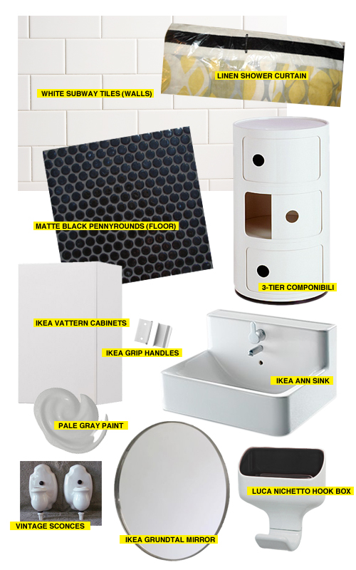
Now that the upstairs bathroom is nearing completion, we’re starting to think about what we want to do with the second bathroom downstairs. It’s really, really ugly right now, but clean and usable (I don’t even want to post a photo—it’s a bad ’80s renovation with floral wall tiles and a beige floor), so we decided to do the upstairs bathroom first. Hopefully the downstairs bathroom won’t be as much of an ordeal, since we won’t be dealing with crazy underfloor clawfoot tub nightmares. It’s a pretty straightforward renovation job (famous last words, I know).
We’re keeping the bathtub—a cast iron, apron-front corner tub—but everything else is going. I threw together a collage of what we’re planning on using. Some of it we already have (the Componibili, the Hook Box, the shower curtain, the mirror), and the rest of it is still up in mid-air. I want to get going on it! Having one nice bathroom is making the other one look really shabby and sad.
34 Comments
maybe the penny rounds in grey i feel like black could be too much
i love it already.
we have light gray walls & the same shower curtain in our master bath. unfortunately it could still use a renovation: pink floor tiles with gray grout & speckled 4×4’s with random floral tiles surround the tub.
anna, you’re killing us waiting on the upstairs bath wall paper shot already 😉
ooh, where is this shower curtain from?
You make it sound so easy to renovate a bathroom. We have to do ours, but I am not looking forward to it. Perhaps I should just start with getting a beautiful Hook Box and take it from there. Thank you for the inspiration!
you’ll be needing the new orla kiely towels then, surely??
http://tinyurl.com/6cn35g
rena: I bought the shower curtain from Anthropologie 2+ years ago (yes, in anticipation of using it in this bathroom!), but there’s one on eBay right now! (I stole their photo…)
Nina: I make it sound easy to renovate a bathroom??? Wow! Have you seen all of my posts about renovating the upstairs bathroom? It took us over a year, and was filled with plumbing/woodwork/plaster/electrical/fixture/tile nightmares the entire time! It’s not easy at all, it’s terribly nerve-wracking, expensive, and exhausting. If I’m making it sound easy, I’m obviously not complaining enough. 😉
read me: I prefer plain towels, but those are definitely cute!
I personally like the black penny round tiles. Black and white is always classic and clean.
aaaah, I’m obsessed w/ the black pennyrounds. LOVE.
How exciting! Definitely a different look than your other bathroom this time… modern but still classic. Those penny rounds are going look fantastic!
I used those IKEA grip handles in my old kitchen and really loved them – they hold up with time and have a nice feel in hand.
i am LOVING that shower curtain (and everything else in this post, too) — can’t wait to see photos of the finished product!
I want to see pictures of the Ugly Bathroom. 😀
Everything is so classic and beautiful. I love it.
Your concept board is looking lovely. I heart penny rounds 🙂
I would hope you will be showing off the stunning paint job I did in your downstairs bathroom! I love your ideas for the room!
PS: Sorry it has taken me so long to send you room measurements and whatnot, it has been killer adjusting to work this year not having a classroom!
OK, I’m going to venture a guess here…
The paint color, BM # 2137-60???
Hi, hi, it’s me again… I was wondering where to buy those fab hook boxes?
Rebee: I’ll post photos of the ugly bathroom once we actually start working on it. It’s too embarrassing to show it now while it’s still in use! I always worry that guests will think we like it.
Adam: Take your time, it’s not like I don’t have anything else to do! 😉 Oh, and without your paint job, we could not have survived 2+ years with that bathroom. Seriously…it was pale hospital green and beige. I would have had to build a temporary outhouse!
DiP: I haven’t made it that far yet! I think Gray Owl (I looked it up) is a bit too dark, I’m leaning towards Abalone (2108-60).
erin: Unfortunately, I think the Hook Box might be out of production already. They went on 1/2 sale at DWR just a few months after they came out, and soon after were taken out of inventory and would up at the DWR Annex for an even lower price (that’s when we bought ours). I don’t know if there’s any way to get one now. You could try contacting the manufacaturer, Bosa Ceramiche?
Abalone 2108-60?!?!
Wow, that brown?
Are you SURE you’re ready to dabble in the world of gray??? 8^)
Take a look at 2133-60.
Yikes, maybe I’m wrong, I don’t have the chip in front of me! I was trying to remember the name, and I thought it was Abalone. If you’re saying it’s brown, though, I must have the wrong color — this is a really pale (almost white), neutral gray. I’ll check tonight and see what the actual name is. 🙂
p.s. Please tell me you have a BM chip book in front of you, and you’re not reciting these numbers from memory! (I’d believe you either way, though.)
“Please tell me you have a BM chip book in front of you, and you’re not reciting these numbers from memory!”
If you’re going to play with the grays, you better know your subject matter!
(Perhaps the “dash 70’s” are a safer range for your first venture away from white world. Baby steps! 2134-70 maybe???)
wow, your home is really nice, i love eames.
Obviously paint looks different in different lights, etc…, but when I tried out Abalone it looked downright lavender on my wall.
I’m beyond impressed with DiP’s gray knowledge!
Dave, you’re scaring me! The color I’ve been looking at IS Abalone, I was right! I have to say, it doesn’t look brown to me at all. I also like the next color up (2108-70), Lacey Pearl. I’m a little scared by Jennifer’s assessment of Abalone as reading lavender, though, because that’s a huge fear of mine. Gulp.
What’s the worst that can happen, right? I paint a wall, hate it, and paint over it. And I’m out $50, but hey, worse things have happened. I’m actually going to experiment with a can of cheap Valspar paint (color identical to BM Abalone) next weekend, so we’ll see how that goes…
I have Abalone walls and they’re definitely not brown. It just looks that way on the chip. In some lighting it will shift purplish due to red undertones. BM sells it in a $5 sample can so you can try it out.
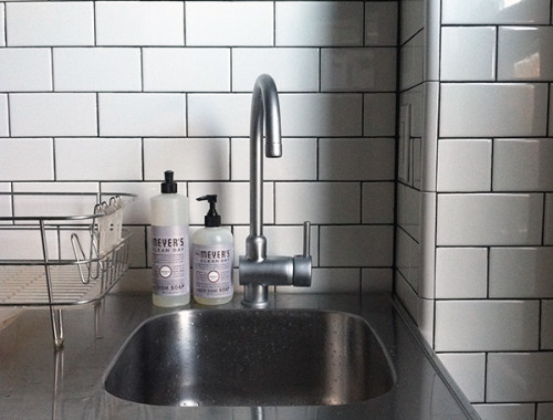
Can never go wrong with all white in a bathroom. Subway tiles are timeless and I’m loving that sink from Ikea!
“I have Abalone walls and they’re definitely not brown.”
If you have the full 2108 color card, look at 2108-30, “Brown Horse” down to 2108-10 “Ferret Brown” (Oh so appropriate!)and tell me what colors you see. BM colors are grouped by family; the “dash-10” range is the color’s root.
I do like the color, I was just surprised that was teh gray range you would lean towards.
Like erin there said, you can get Abalone in a sample size, or just paint the wall and see what happens!
I also tried Silver Fox, which is one darker than Abalone on the old 2108 card, and that came out totally freaking brown. Eventually I abandoned that whole section of grays for something in the Affinity collection.
Sorry, DiP, I don’t have the whole color card… I do agree that Silver Fox is very brown (I have a sample). If abalone is too warm for you, you could try Harbor Gray, which is what Karly used. It looked blue in my house, but neutral gray in hers.
Gray is haaaarrrd.
Oh my god, did a paint chip fight almost break out on my blog?? That is so awesome.
DiP, you are such an architect. To your bones!
It would be so unkind to start a fight on someone else’s blog!
“DiP, you are such an architect. To your bones!”
LOL!!!
I take that as a complement!!! 8^)
Now let’s debate “grAy” vs. “grEy!!!”
Hi,
Could you remind of the site that helps you create the idea boards? I think you posted about it somewhere else but I can’t find it.
Sarah
http://www.theestateofthings.com
Sarah, I don’t use anything special — I just put them together in Photoshop.
Did you use the Ann faucet with the sink? We’re thinking about the sink, but would prefer a chrome faucet. Seems other brands’ spouts are a bit longer than the Ann. Thanks!