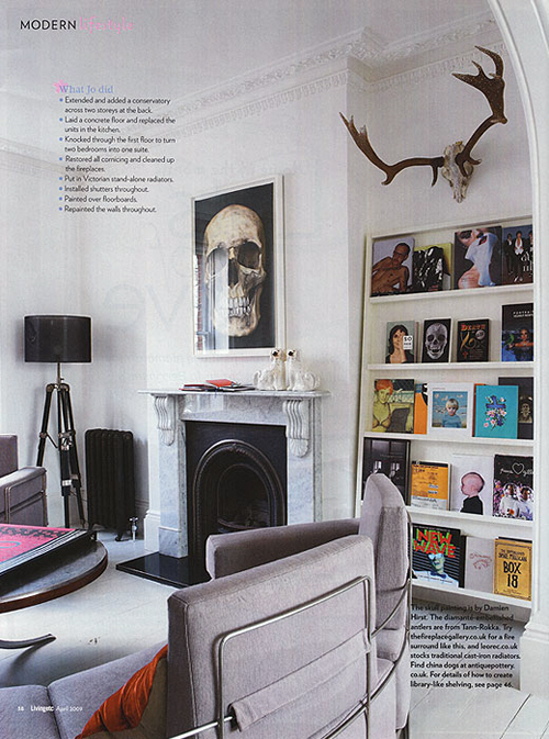
I love this room featured in the new issue of LivingEtc. The white floors, the curved sofas, the Hirst painting above the fireplace, THE BLACK RADIATOR (♥!!!), and especially the face-out display shelving for the books. For someone who owns a lot of oversized, attractive books, this is a nice alternative to having piles of favorites all over the house. I can see mixing in framed photos and drawings, too.
(By the way, the house belongs to stylist Jo Berryman, and you can take a full tour here! The kitchen is especially great.)
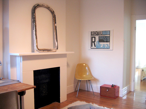
I’m thinking about implementing this kind of shelving in this room of our house, which I think is going to wind up being a guest room. I’ve always wanted to do built-in shelving next to the fireplace, but the depth of the hearth is only about 5″—not big enough to build shelves deep enough for anything larger than a small paperback. Shallow display shelves would be a really nice solution, especially in a guest room.
Why didn’t I ever think of this before?
Also, I’m pretty sure I need at least one black radiator in my life.



27 Comments
What paint colors did you use? I’m looking for a nice white and your room is so lovely!
Yes, yes, yes! Love this idea. And you most definitely need a black radiator. Or two.
PS – Do you have a source for a bookshelf like this? I can’t remember where I’ve seen them. I’m thinking you could get the same effect with very simple picture rails too, rather than buying an actual piece of furniture…
yup. black radiator love is radiating here!
Jenny: The walls throughout my house are Benjamin Moore Moonlight White (flat finish), and the trim is BM Simply White (satin finish). Soft, foolproof whites that go with everything. 🙂
Jane: I would probably just build the bookshelf myself so it’s exactly the right size for the space (and so it clears the baseboard moldings) — it looks like a very simple construction.
I dunno. The facing-out bookshelves look like a retail display to me, which is a bit weird. But it also looks like an architect’s office sort of thing, which is cool. Hmmm.
I love that idea.
I used to have a Cado unit hanging in my old apt. that had magazine display shelves – similar in idea. They are great for displaying little paintings and ceramic plates and tiles. I don’t think I ever used them for magazines!
I’d love to see how you end up doing it – I could use something like this in my office.
You read my mind! Someone around here had these on Craigslist REALLY cheap and I wanted one so badly, but I have absolutely no room left in my little house.
We want these for our alcoves (x4), but can’t find them in the UK. These are the next best thing.
Beautiful home you have, your hard work has paid off.x
I thought you *did* have a black radiator!!
eM: Who, me? Black radiator? Nope! I’ve had two refinished (both white), but the rest are gross peeling silver paint/rust!! I’m hoping to take care of most of them this summer. 🙂
A shot of Berryman’s home is on the cover of a new book called New London Style by Chloe Grimshaw. Love her style and yours too Anna. Your blog is a daily treat for me!
Oh yes! This space is so plain looking!
You’re an artist you deserve to have those display shelves to look at favorite things.
It will be a great place for unframed large format photos, art, big art books, etc.
I wish i had the space in my apartment for a flat display shelving.
I think they will bring you a lot of happiness.
I’d love to see any one of Jo’s rooms featured on Holly’s “How Much Does This Room Cost?” ~ I bet the end result would be a very large number! A stunning home indeed. She kinda strikes me as a ‘style sister’ of yours, Anna! Thanks for leading me to these lovely photos in the middle of a working day.
how cool. i’m trying to design a bookshelf combined with desk contraption at the mo’ and this is great inspiration.
I really thought the first picture was a picture of your living room! I think I might utilize this idea on the wall above that small ledge in my stairwell.
ooooh, I have a nice niche in my living room that is dying for shelves like that… thanks for the inspiration!
just discovered your blog this afternoon and immediately got serious envy over the cool chippy frame on your mantel. this of course led me to spend an hour poring through your previous posts when i should’ve been working… woops. love your style and determination!
You used to be able to buy these great very shallow shelves from Ikea that were perfect for displaying books face out like that.
Alas, when I finally went to buy some for my shop as a solution to display cards, books and stationery, they’d discontinued them. Argh.
I know you had your other radiators powder-coated, if you were to do some in black would you do the same thing or paint them yourself? if you paint them i’d be interested to know your technique. i’ve been scraping several for like 6 months and can’t seem to find a way to just paint them that looks good. thanks so much.
Jo J: Yes, I think the Hirst piece puts this room just a WEE BIT out of the reach of most humans!!!
emily: I actually just turned that frame (which is plaster over wood) to my mother on Monday. She’s going to have mirror glass cut to fit — I’m sure it will look stunning! I haven’t been giving it a good home.
Isabelle: Yes, those were the STRIPA shelves! I don’t know why they were discontinued, they seemed so practical.
brian: Sandblasting and powder-coating really is the way to go, and it’s what we will do will the rest of ours (we’ve only done 2 so far — 8 more to go!). The finish is extremely durable, and the sandblasting really does get ever last bit of paint and rust off of the surface. This isn’t something we want to have to do again, so we’re going to do a few at a time as we can afford it.
Where on earth is that Richter poster from? I want, scratch that, I NEED it now!!!!!!!
rosewm: The Richter poster was designed and screen-printed by a classmate of mine in college, Robin Hendrickson, as a promotional piece for a font he created. That was a dozen or so years ago, so I’ve been hanging on to it for a while. I have no idea what ever happened to Robin, but maybe if he’s Googling himself one day he’ll come across this comment and let me know. 🙂
As far as I know the upright front facing bookcase is by Marcel Wanders available in the UK from Moooi.
that shelving is such a simple concept it’s surprising we don’t see it more often. i can’t wait to see how you make it work in your house!
xox
f
ps: i just saw the comment (i guess you have to be pro for comment notification?) you left at my flickr over christmas…you’re such a sweetheart! lots of love…i miss you so.
Beautiful books on display in a guest room would be great. You could curate the selection according to the tastes and interests of your guests. And just show off your own work! 🙂