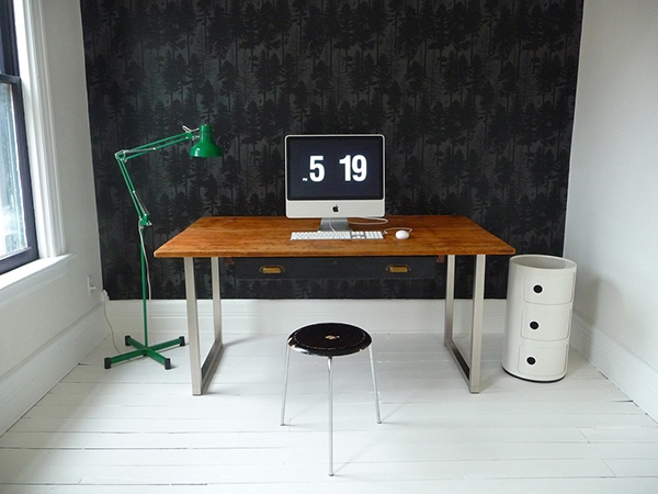
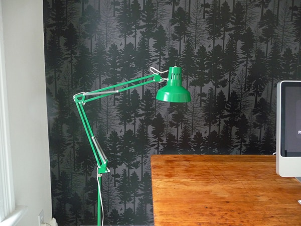
Ooooh. The Fir Tree wallpaper really makes the room, doesn’t it? I am SO happy with how it turned out, and it only took us about 4 hours from start to finish. This was my third wallpapering project, and by FAR the smoothest—thanks no doubt to this new wallpaper that allows you to put the glue directly on the wall. Miraculous!
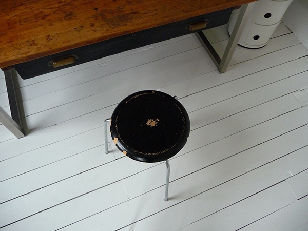
Refinishing this little Jacobsen stool is another project on the (distant) horizon. I bought it three years ago and still haven’t gotten around to it! The look of the peeling paint and chips doesn’t bother me, but since this stool gets so much use (it’s far more comfortable that you’d think, though I’ll probably have to move a proper desk chair in here at some point) I don’t want the ply layers to get more damaged around the edges than they already are. Some wood patch, some sanding, and some high-gloss paint should do the trick.
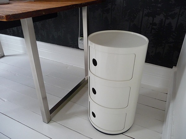
I love all of the beautiful shapes and curves that objects in black & white rooms create. The simpler my living space is, the more I appreciate each item in it.
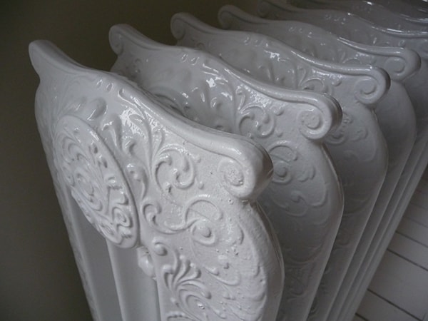
We dragged the refinished radiator back into the room today. I’m in love. We’ve never had functioning heat in this room! (Of course, it’s not connected yet—but it will be before next winter!)
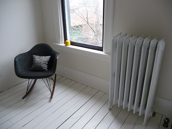
Currently my favorite room in the house, yes.


116 Comments
Wow! Stunning! It looks like it is right out of the Ferm Living catalogue!
Love!!!
I love the hit of green.
it looks amazing!
Great work, Anna!
Beautiful!! Great work! 🙂
love. love. love. i’d sleep on the floor in there …
wow anna i love it! no wonder it’s your current favourite room. i’d be mine too. the simplicity of it all is fantastic. and that wallpaper! my gosh it’s good!
Great job on the wallpaper!! Looks awesome – the black & white room is fab, and the green lamp “pops”.
FANTASTIC!!! I honestly can’t decide what I love the most, it’s all so gorgeous. The green lamp is brilliant in that room though!
I am in lust. Seriously.
I wonder if I can ever achieve this aesthetic…….
I have always been scared of the commitment that wall paper really is – but this room is giving me second thoughts.
I love it! It’s absolutely fantastic. The lamp looks great against the wallpaper.
yep. it’s great & I too love the lamp against the wallpaper.
well done you guys.
That room has such a beautiful simplicity and stream-lined aesthetic,and is full of interesting quirky accents, in other words “It rocks!”.
Once again your hard work and diligent planning has paid off. Elle deco should be knocking at your door.
if i lived closer i’d totaly barge right over just to hang out in that room!
I’d move right in and never leave – fantastic
Simple and beautiful!
It looks like a room right out of Living Etc. When are they doing to do a feature on your house? You’re a perfect match!!
Oh, it is BEAUTIFUL!
Love the wallpaper, the green lamp….every element in the room is just simple and perfect.
Super job Anna! And to think you used to call this the ugliest room in the house! Love love LOVE the wallpaper!
It really does look like it’s from Living Etc! You’re totally right Laura! Wow. I’m inspired!!!!
Congrats Anna, it looks fabulous!!
This room really turned out amazing. It’s looks like a spread straight out of a magazine.
Stunning! It looks beautiful! You are making love wallpaper for the first time in my life!
love it!
My jaw dropped–I have never ever considered decorating in black and white, but you sure make it tempting! Also, I’m incredibly jealous of your gorgeous refinished radiators. Mine are similar in style but they’re a mess, and I know we won’t ever refinish them here. Next house!
aye yie yie. bravo.
Amazing (with a big capital A)! Love it!
perfect combo of clean/bright and warm/cozy.
very nicely done.
It’s beautiful. I’m going to come over with a stack of papers from my desk, and just leave them on yours – you’ve got so much space!
You did a great job!!! Congratulations, having a dedicated space for work/creativity is truly a luxurious necessity.
I have to laugh though, it’s as if you created this office with the intention of having it be the exact opposite of mine in every way. That’s why I love your blog so much, it’s fun to see your take on a house that is from roughly the same period as mine.
My office is a cocoon of rich colors and textures, plants, and objects that inspire me to spends hours in there, plugging away. Yours is almost a blank canvas where the brain can go anywhere. Can’t wait to see what genius it inspires!!
Ooooh! I love that wallpaper and the green lamp and the floor and the table and that little white thingy next to it and and and! What a gorgeous room!
the green lamp looks awesome in the room
so, so, so amazing!!
I thought I was looking at a picture from a magazine. Every single detail is perfect. I LOVE the wallpaper and the green lamp is the perfect “pop.” Also seriously coveting the round white storage bin.
Fantastic! Looks like it came right out of a design magazine or catalog – which, of course, makes me insanely jealous! The green lamp gives the whole space that extra something to make you smile.
Good work!
Seriously – That first shot looks like it belongs in an issue of Living, Etc.
And I totally agree with you about the wallpaper application. Having also done both, putting the glue directly on the wall is 10x easier/better.
wow, so lovely! you guys did such a great job. and I love that screen saver.
Love it! Is the lamp vintage? I’ve never seen the floor version…
That desk needs some flowers.
This is stunning! I am insanely jealous – I tried to use the fir tree paper in my bathroom and it was a disaster. Oh how I wish it could have turned out like this!
Ooooooh, Anna, that looks even better than I imagined! And, what I imagined was gorgeous, so… WOW! I totally dig the green lamp with the black and white. Perfection! So glad to hear it went up easily too 🙂
PS – How did you get that super cool clock on your computer screen? It that easy to do with a Mac? Looks awesome!
Thanks, guys! It was exciting to walk into the room this morning — I had almost forgotten about the wallpaper. 🙂
arroyo: Yes, the lamp is vintage. I bought it for about $10 in October 2007.
Kyle: I prefer to keep my work surface totally clear of everything other than items related to what I’m working on. I am considering a plant by the chair, though!
coral: What went wrong with the wallpaper in your bathroom? I’m so sorry to hear that!
Christiana: The screen saver is from here! And yes, it’s very easy to do on a Mac. Just download the file and put it in user -> Library -> Screen Savers. Then select it in the Screen Saver chooser in System Preferences. 🙂
Send link to the clock wallpaper please. Thanks.
How about you read the comment you just replied to before you make demands, please. Thanks.
i love the dark wallpaper against the stark whiteness of the rest of the room. lovely.
xo
kelly
beautiful!
The green lamp really adds to the room. It’s funny to see so many people saying it looks like it’s straight from Living Etc. I’ve often wondered when we’ll see your home featured in a magazine.
Great work!
It looks wonderful, Anna! I really dig the green lamp as the pop of color.
This looks great! But I have to know if you really live like this day-to-day. Where is all your stuff? Do you have a secret room full of it that you aren’t showing us?
Hi Ana,
Congratulations! The room looks incredible and the green and yellow touches are just genious. Btw, do you plan on using a rug in that room? What about the windows?
Enjoy your creation!
anna, I LOVE THIS. and that radiator is simply the prettiest little heat-giving little treasure i ever did see. i am in love with this little room. you’ve made it so warm and inspiring!
Anna, this is amazing! Even better than I imagined!
Fabulous! I was very excited to see the finished room. A nice little surprise.
It looks fantastic! I love the green lamp!
Kara: My house is 2000 SF and there are only the two of us! With that much space, it’s easy to keep it from getting cluttered. Also, my husband and I are both pretty good about getting rid of stuff we don’t really need or love (or not acquiring it in the first place, even better). As far as office storage goes, there is a closet in the room that holds everything in terms of materials and papers, and day-to-day items (pens, staples, sewing notions, etc.) are in the gigantic drawer under the desk. It holds a TON. Believe it or not, that white plastic storage unit is still completely empty, so I still have room to grow storage-wise! 🙂
But yes, of course it does get messy in our house if we’re working on projects or are involved in work, etc. Remember that I only finished this room 2 days ago!
Fila: I’m not sure about a rug (I may put a sheepskin under the desk for my feet/the dogs), but I’m planning to buy some very sheer fabric roller shades for the windows. After three years in this house I’ve decided I don’t think I like it to wear curtains!
OK… I am being totally and completely serious here.
I have a major issue in my dining room. And at least a dozen times, I have asked myself, “what would Anna do?”
You think I am joking. I am totally serious.
Before my dining room completely makes me cry, I wanted to asked you for advice… since you have an old house and plaster walls, too. You’d understand!
Long story is here:
http://cottageofstone.blogspot.com/2009/03/what-would-anna-do.html
Short story is, the people before me used texture paint on only the parts of the wall they didn’t wallpaper. Now with the wallpaper gone, I have smooth and texture stripes.
HELP.
Seriously.
WOW. I just love everything about it. It turned out so amazing.
wallpaper is lovely. but its so stark and lifeless. needs soul.
Ana: I can recommend the Enje roller blinds from Ikea in white. I’ve had them on my bedroom for a couple of years now and love them. I believe that they could match the aesthetics of that room…
I also thought about the sheepskin. My sister has one of them (also from Ikea) and it is one of the coziest textiles to relax your feet on
hi ana! have you seen this?
http://www.etsy.com/view_listing.php?listing_id=22805191
Oh Anna, you’re such a designer in every possible way! Everything you do in the house turns out so well!
I bought the fir tree wallpaper for my downstairs bathroom, its not going to be my primary bathroom and I thought the graphic punch would be a fun surprise for guests.
It was the black and white pattern, and when my father-in-law (who has been a commercial paint/wallhanging contractor for over 20 years) hung it, the black trees just smeared right onto the white! I played with the remainder of the roll and could smear it just by rubbing it with my thumb. We had to pull it all down. My father-in-law thought it might be a problem of the ink not being all the way dry before it was rolled up. The company ultimately declared it a problem with the installation, not the product.
I will say that they were very nice about it and let us return it all and gave us our money back.
I was still upset only because I was so, so in love with the pattern, and the paper in person was so nice and I liked the company, they even sent handwritten notes with every correspondence. Nearly a year(!) later and I still haven’t decided how to decorate that bathroom. I just couldn’t live with such a delicate wallpaper that you couldn’t even touch. I had really hoped to hear them say it was bad roll so I could just get a new one and hang it up, but now I am wary of trying wallpaper again.
Gorgeous. Love it. I am going to make sure the next wallpapering project I do is with the new wall-glue stuff. Sounds so much easier.
Enjoy your lovely new room!
The room looks fantastic! I love that green lamp, it’s the perfect punch of color. Beautifully done!
Hey Anna,
I have been trying to install that fiqlo screensaver onto my mac all morning with no success. All I seem to get is a lo res screentime media logo floating across the screen. I could cry! Any tips would be appreciated.
I love your house. It is my dream house!
x
Please, please, PLEASE buy the Morrisey pillow on etsy!! Put it on the chair in your office.
girl, this is so fantastic!
I’m not sure how to convey a wolf whistle in type, but that’s seriously what happened in my mind when I saw that first picture! It looks amazing.
Fila 11: The Enje blinds are exactly what I’m planning to buy! My windows are an older, non-standard size, but from what I’ve heard, it’s easy to cut down the Enje blinds to fit. I have several IKEA sheepskins, too — I love them, and so does my dog Bruno. 🙂
kim/LIMOM: I do love Morrissey, but I’m not really not into that kind of stuff! Thank you for thinking of me, though! 🙂
coral: Wow, that’s really awful. I have to say I’m somewhat shocked — this is the second time I’ve worked with Ferm wallpaper (the first time I wallpapered was with Orla Kiely paper), and I haven’t had ANY problems at all with the inks lifting or smearing, even around the sink in my bathroom. Even sitting here now with samples of 6 different prints of Ferm papers, I’m not seeing any smearing when I rub it (even with a damp finger). Maybe it really WAS just a bad roll…?
Ronnie: See above for my comment to Christiana! The FLIQLO.saver file needs to go in the Screen Savers folder in the user library.
WOW, the black wallpapered wall is such a great contrast to the white walls and floors and really anchors the room – I love it!!
I have to ask though: did you consider pulling the desk away from the black wall and facing it the other way, so that you are looking back towards the black rocker and can see out the windows more? Don’t get me wrong – I love it how it is currently – but I do wonder how it would look to float the desk out in all that delicious white space 🙂 Can’t wait to see your next project!
*A.DOOR.A.BLE* This room is absolutely perfect!
Danielle: I did consider that, actually (placing the desk so I’ve be facing the windows), but because of the large size of the desk (3×5), the comparatively small size of the room (10×12), and the position of the two doors, two windows, and the radiator, it just didn’t work. The distance between the desk and the rocking chair is much smaller than it appears in these photos! I actually prefer not to face windows when I work, anyway, though — too distracting, and my view isn’t very nice anyway…lots of garbage and weeds…
thanks for the reply, anna!
sadly i have done as you say and to no avail. i have googled this and it seems i am not the only one with this problem. bummer cos it’s the only screensaver i’ve seen that i like the look of.
Sheesh, this blog is perfection!
I’m such a sucker for interiors so I’m now pretty much foaming at the mouth.
Fantastic study, I’d want to work all the time!
Love the black wallpaper and the contrast with the white floor. And that radiator is just gorgeous!
this looks SO damn good. i love it! if i had a space that pretty i would definitely be able to keep it clutter free. but since i don’t, i figure there is no point. 😉
just fantastic! that desk really pops against that dark wall. soooo perfect!
The wallpaper looks great…and I love the idea of the application of it being simpler. I haven’t yet delved wallpapering yet, although I have a few ideas.
I’m curious what made you decide to move the office to this space. You had previously mentioned that you were thinking of making it your bedroom. Do you have any ideas for what you’ll do with the ex office space now?
I really think it was a bad roll too. I still like Ferm Living, but as my first wallpaper experience, it’s livenitely scarred me.
Wow, I LOVE it! I’ve been working on my office/studio for months and if it looked as half as good as yours, I’d die of happiness.
I love this room and I don’t like wall paper.
I am delurking to say this room is what dreams are made of! I am proposing marriage between myself and your office… We might have to crash at your place for a bit though.
This is my favorite of Ferm Living’s wallpaper (I’ve had my eye on the white + black colorway) and it looks simply stunning on your wall! What a fantastic space — the desk, the cute green light, the vintage radiator. I’d love to move in 🙂
83 COMMENTS?!?!?!?!?!?
i’d say you have quite the successful blog!
congratulations from just another faithful follower.
A couple requests:
i would love to see the original legs to your dad’s table,
and being the voyeur – i would love to see your basement!
as is… Keep up the great work, your home is gorgeous!
My oh my!!!! I just adore your style Anna. If I didn’t have children it would give me something to aspire to. Since I have two very small ones I will just live vicariously through your beautiful home. Please keep up the good work and good haircutting. WELL DONE.
Vicki: I never really thought of it as “office space”, but we’re going to move the bedroom back to the front of the house (which is where we had it initially). The room is INCREDIBLY bright during the day on that side of the house, and it’s impossible to work in front of a computer in that room, even facing the windows. Fine as a bedroom, though, so we’re giving it another shot.
lisa: The original legs for the table are in storage, and it would be an incredible amount of work to set them up again for a photo, sorry! It’s a fairly standard adjustable drafting table, like this. Great for drawing, but no so great for computers, sewing machines, etc.
My basement is a total atrocity, you don’t want to see it. Seriously – it’s pretty much a dungeon. Thisphoto was taken before we bought the house, and it looks pretty much the same now…
Jami: Since when does having small children mean that you can’t make your home a beautiful place that makes you all happy?? Start clicking through the sites in my blogroll — there are PLENTY of stylish families out there! (Check out Cookie Magazine’s Nesting blog, too!)
Nice!
I have to admit that I liked the room without the wallpaper… I think I would choose another color if I had the chance. But it’s your room and if it’s now your favorite room it was all worth it.
Thanks for the reply anna!
and i seriously love your basement photo!
i subscribe to “world of interiors” and my favorite articles are always the in the rough, artist’s dwellings.
Looks great!!!
it would be my favorite, too! Absolutely fantastic.
That is the coolest wallpaper I have ever seen.
Looks amazing. I’m completely in awe of you and your diy skills.
where are the cords for the computer hiding?
lauren: They’re not hiding anywhere! You can see the power cord and surge protector in the 4th photo down. There just aren’t any other cords — I have wireless internet (the router/modem is in another room), and I don’t use any other devices. I plan to get a wireless keyboard and mouse in the near future, too.
The green lamp against the black trees of the wallpaper is beyond stunning… Truly inspirational!
Have to chime in to say how amazing the room looks, and so “you”. The single black wallpapered wall amidst all that white is perfect. And I agree with Anh Minh; it really does look like a shot out of Living Etc!
wow, that looks fantastic! we’ve tackled just about every home project you can think of, including the kitchen. but for some reason walpapering really scares me.
Anna, the wallpaper looks great. I am a total wallpaper convert after using it in our bedroom, our son’s room and our kitchen. Lots of people think they don’t like wallpaper, but it makes such an impact that I think when it’s done successfully it is so striking. We papered one wall of our bedroom in Ferm Living’s Family Tree in silver. It really looks magical.
Fabulous. Nothing I would ever think to try, but the results are stunning. You have vision, girl!
Anna- i have te same Orla Kiely wallpaper tha you have in your entranceway- do you know if it too can be applied with the wallpaper paste directly on the wall?
thanks! and i love, love, love your room!
nic
sorry another question- is there a particular wallpaper paste that you recommend? one that’s better for more inexperienced paperhangers?
thanks
nic
Love this, Just came across your blog, needless to say “bookmarked” Love the work space!
nic: The Orla Kiely wallpaper is traditional-style, and it cannot be applied with the glue-on-wall method. With traditional papers, the glue has to be applied to the paper and given time to absorb a bit before hanging. It IS somewhat messier, but it’s not much harder. The most difficult thing about wallpapering is the positioning and flattening (definitely buy a wallpaper squeegee and seam roller!), and that’s something you have to do regardless of the glue application method.
As far as paste goes, I’m happy with this kind (scroll down a bit to the ULTRA®, PRO-880):
http://romandecoratingproducts.com/products_3.cfm
It wipes clean easily, and the drying time is slow enough to give you a decent window to position the paper. Any clear wallpaper adhesive should be fine, though — just make sure it’s not the type made for pre-pasted papers, and get a big brush to apply it with. (And a tarp to put underneath!)
I am SO jealous of this little place in your house!! Your sense of style is amazing! If only I wasn’t renting and I could actually make changes…renting an apartment is so frustrating sometimes….
WOW!!! That was by far the most beautiful radiator I´ve ever seen.
i love, love, love your green lamp. such a great room!
Love the wallpaper 🙂 I also like that you papered just one wall – the paper makes such a statement that 1 wall done is all you need.
loving the blog. the room is spectacular too. looks like a great place to be creative!
where did you get the flip-style clock for your mac?
The screen saver is from here:
http://www.9031.com/downloads/screensavers.html
Hi — did you just paint that radiator shiny white, or did you have it professionally refinished?
If you did it yourself/ves, can you tell me what kind of paint you used and if there was a lot of scraping of the old one involved?
Thanks!
Really love this your blog! I am wondering how you got that time to your Mac? I couldn’t find the way, thank you very much for the info…
Argh…just noticed Anna’s answer to my question. Thank you anyway…
Love the screensaver! But, I too can’t get it to work for me, I have Mac OS X 10.6.2 (w/out Rosella).
I found this screensaver–same idea and it works on my system, has a 12 and 24 hour option.
http://the-bob-blog.blogspot.com/2009/10/flip-clock-screensaver-for-mac.html