Instead of just posting photos of my renovated bathroom, I decided to do the “big reveal” as part of the How Much For This Room? series at decor8. Holly is one of my favorite bloggers, and it really is an honor to have any part of my home featured on her site. Thank you, Holly!
I love this new series Holly is doing, by the way. Cost is a big, mysterious question when it comes to planning renovatings, especially when we’re told on one hand that a simple renovation of a bathroom or kitchen can easily cost upwards of $20k, and on the other hand we’re led to believe that with a little creativity and some hot glue, you can have a fabulous new room for $300. There IS a middle ground, though, and I think that by REALLY breaking down the true-life costs involved with my bathroom transformation, I can help to demystify the process a bit for anyone considering their own renovation process. (Yes, I even included the nails and screws!)
For more photos, a little interview about the bathroom, the full cost breakdown and MORE, please hop over to decor8!
p.s. Remember what the bathroom used to look like? It really is hard to believe it’s the same room.



78 Comments
Holy bonanza! Your bathroom is a dream and I’m completely envious. Seriously, if I were to ever somehow manage to go into your house and every guest room is taken, please feel free to stick me in the bathroom! 😉
Congratulations!
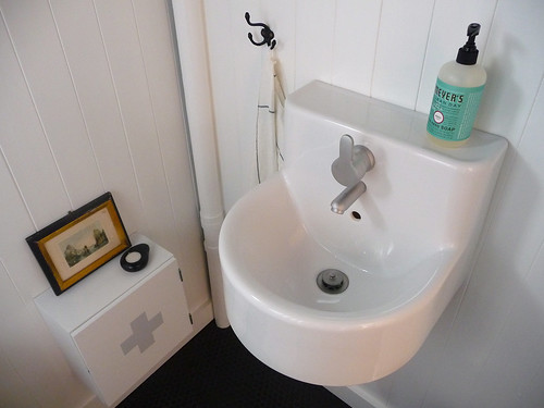
Wow-I am in love! You did an amazing job. I have to say that my absolute favorite detail is the medicine cabinet with the antique picture sitting on it-such a lovely mix of old and new.
I love the black ceiling- so unusual!
it looks amazing! congratulations on the final reveal.
question about your runtal — is it an electrical panel or did you hook it into a radiator system? I’d love to replace my bathroom radiator with one but haven’t investigated how difficult the installation would be (the runtal site, of course, says to only use a professional).
Wow, your bathroom is utterly gorgeous! It is surprising how black can be such a non-dark colour!
i am fascinated by the teepee holder. where did you find it?
You’ve done such a nice job, truly inspirational.
I want the sink faucet. No, wait, I want the whole bathroom.
Anna, it is absolutely stunning. I love the way that you revitalized that shelving area to the right of the sink (what kind of wood are the shelves? They’re beautiful), and just the overall clean-crispness of it all. And just the right balance of old and new– the industrial functionality of the medicine cabinet with the little framed print resting on top, the play of the original tub with the design of the new wall sconces, it all just looks so right. Great choice on the shower curtain, by the way. And the pennyrounds, obviously. Thanks for sharing it, well worth the wait!
Anna it really is beautiful! Fabulous job.
It looks SO GOOD!!! I looked again at the old pictures and — wow. Crazy good work!!
Just adorable, love the balance of black and white – so crisp yet soothing.
Good god this is beautiful! Can I come over and sleep on your bathroom floor?
It looks fantastic! I love the balance of old and new. It has just enough stuff and texture so that it doesn’t look too spare, but not so much that it feels cluttered. Congratulations!
How beautiful! Having seen the before first hand, seeing these pics takes my breath away! I’m heading over to decor8 to see the rest!
I’m so happy for you to be able to enjoy a shower again. The floor is so swoon-worthy and inspirational, I never would have thought of using the black grout. Everything looks amazing.
ok, I know I left you comments everywhere, but now I am laughing because see your old bathroom pic? We have that tile!! And YES! to the black ceiling.
I posted on Holly’s site, but man. This is so amazing – I just love the simplicity of it, as it all comes together. It’s both visually striking and somehow also calming…just wow. Congrats.
Everything is so beautiful!… I am in love of all the details. Fantastic work!
It’s really a beautiful space,loved everything especially the ceiling… Black is stunning …What’s in the gold framed picture or is that too nosey of me?
Yay for the bathroom reveal! It is an absolute beaut and the price tag is pretty darn good too. You really know where to save and where to splurge to get maximum bang for your buck. I love it. Thanks for sharing
beautiful! I’m so jealous of the architecture in your house, it has such beautiful bones to build upon.
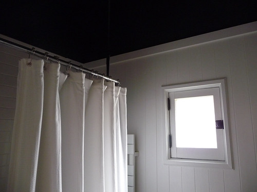
Anna it looks wonderful my favorite thing is definitely the penny round floor! What is the white thing peaking from behind the shower curtain on the window wall? -I couldn’t figure it out but maybe I missed something.
Anna, it’s beautiful. I’ve been busting to see the outcome of this room and it’s been worth the wait. You have such an incredible way of putting things together. I don’t think I would have ever thought of putting black on the upper walls and ceiling, and it looks amazing with that floor.
Well done to you and Evan. Six months of work is a huge amount of time, but the dedication you’ve put in really shows in the finsh.
Just love it.
Absolutely perfect! Thanks for sharing all the pics and costs!
Quick question…so you can use EasyMat instead of backerboard as long as your subfloor is level?? Everyone keeps telling me I must use backerboard, but I’m also planning on using penny rounds on the floor.
Totally Kick *ass! You’ve got killer style.
UNREAL. I am in awe at your newly improved bathroom. You have given me so much inspiration for my eventual bathroom renovations. Although 6 months?? I hope to GAWD when the time comes I can afford to pay someone to do the work. I don’t have 6 months worth of patience.
Thank you so much Anna for sharing the world premiere of your bathroom on my site — trust me as flattered as you are to be on decor8, I am equally flattered to have YOU there. 🙂 xo
Have a nice weekend girl!
so, so perfect. I have to say, i liked those schoolhouse electric sconces when you first posted them, but seeing them up and in the context of the room…
um, love. they are so perfect.
the whole thing is perfect!
Looks beautiful! That black ceiling is REALLY stunning. Great idea.
first class anna!
your bathroom is amazing! you guys have such great taste!
i have one question, what made you choose the eco-supreme over the aquia dual flush toilet?
Yeah! I guessed it would be for “How much for this room.” So excited. I love it when you blog people collaborate (and listen).
Okay, I’m totally overwhelmed! I’ve been wanting to show off the bathroom for a couple of weeks now, and it’s so nice to come home and read all of these nice comments. Thanks, guys. Not just for being so generous now, but for sticking around during all these months of tiny, slow progressions. As silly as it might sound, knowing that other people are interested in seeing a finished bathroom was often all the incentive I needed to keep working on it week after week after week.
Let me try to answer some of the questions that have come up…
ann: We have a steam pipe radiator system in our house (no hot water return–there’s a valve to release steam on the side), but it was never run to this room. When we bought the house, there was just a broken electric heater in the bathroom, so it’s actually never had heat until now! Anyway, we bought the electric Runtal (and the programmable timer, which we installed right next to the light switch inside the door), because running steam pipes would have been insane. Installation wasn’t any more complex than any other electrical installation, but we did need a dedicated circuit because the wattage is so high. It heats up the room really quickly, and it dries (and warms) the towels in no time. I’m very happy with it!!
yk: The toilet paper holder is the Grundtal from IKEA mounted on its side.
Dan: The shelves are white oak. I stained them to match the mirror and the threshold saddle (I used Zar oil stain in Moorish Teak).
sweet fine day: Oh gosh, I am so sorry! Both for insulting your tiles AND for you having to live with them! They could have been worse, to be sure, but I just cannot fathom why anyone chose them in the first place. Plain white tiles are SO cheap–if you’re on a tight budget, they’re a great option (our 3×6 subway tiles were only 22 cents apiece!).
jaboopee: Not too nosey at all. 🙂 The painting is a Hudson River scene. I grew up in a Hudson Valley town, and my house overlooks the Hudson now, so it’s very fitting. I bought it for $1 at a junk shop in Beacon (on the other side of the river!), and for the past couple of years I’ve been trying to find the perfect place for it.
Erin: The white thing behind the shower curtain is our Runtal towel radiator! It heats the bathroom AND it warms/dries our towels. LOVE.
lori: We used Easymat primarily because we didn’t want to add too much height to the floor. The most important thing isn’t so much that your floor is level as it is that your subfloor is (a) 100% rock-solid stable, with NO give, and (b) totally smooth and free from imperfections. If you do use Easymat, take it from me and backroll the whole thing a couple of weeks in advance. It will make laying it flat MUCH easier.
kim @ dti: You have to remember that we did this with basically no existing skills–this was the first time we had tiled, the first time we hung cement board, etc. We were learning as we went along, so everything took us twice as long as it would if we were to do it all over again now. I also tend to get really obsessive about small details, which caused some delays when it came to the woodwork!
gwen: The Aquia Dual-Flush toilets aren’t available with a round bowl! The bathroom is way too small for an elongated bowl, so it was out of the question. The Eco-Supreme is the only low-back, one-piece Eco toilet that Toto makes, so there really wasn’t any other choice for us. We have an Eco-Drake in our upstairs bathroom, and we love them both. I highly recommend Toto toilets! 🙂
I still can’t get over how professional and perfect your shower tiles look, and that wasn’t even the hardest thing you did!
Count me another awestruck admirer. :->
Lovely! I’m so happy to see this finally. I came across your blog while a while back while researching my own bathroom renovation and have it found it completely inspiring. And thanks to you, I spent two weeks relentlessly trying to find someone to sandblast and powder coat my tub, even when the first five places said it was impossible! Thanks for your sharing you adventures in home improvement.
The tile is breathtaking.
I love that you say “contrasts between old and new” versus the typical “old meets new.”
Great job! I will definitely be bookmarking your post so I can refer back to it once we get around to redoing our tiny bathroom!
WOW Anna! It looks amazing – and those walls!!! Fantastic!!!
I actually just bought the ‘medicine cabinet’ for myself, its exactly what we needed but I would never have thought of it myself. I’ll be painting it this weekend, another inspiring idea from Door 16. I have so many ideas from your blog twisted to fit my style and space and I love everyone of those details in my home.
Congratulations on the completed, gorgeous bathroom!
Oh my gosh, I WANT your tile floor so bad it hurts! Love the whole bathroom. Enjoy!
You were right, the Mauste fabric would have been way too much in this room. It’s such a gorgeous space that it doesn’t need something so bold as that fabric. I LOVE that black ceiling, it was a brilliant idea!
I am so jealous of your towel warmer. That was one of my absolute favorite things about London.
It all looks gorgeous. But I especially love the mirror. The perfect imperfection.
yay! finally… I must confess I was absolutely hanging out to see it!! And you didn’t fail to deliver, it’s awesome.
You must be so full of pride whenever you walk in there! You’re attention to detail is what makes it and of course the high standard of the work done. It’s an absolute triumph.
Congrats to you both, now you can sit back and enjoy it!
Anna, you said “tend to get really obsessive about small details” … and I say thank you for that! Every angle is gorgeous! I think my favorite shot is the one standing in the bathroom looking out. I keep fixating on the bathroom door hardware and the threshhold saddle. The hinge is beautiful. And I love where the tiles meet the wood. It says so much in very subtle ways – industry/nature, form/function, romantic/practical… timeless & now.
All the different textures really bring the space to life. One question (speaking of tiny obsessive details) but why did you hang your medicine cabinet so low?
Truly gorgeous–you did a phenomenal job. Congrats!! What’s your plan for filling all your weekends going forward? Not….gasp….relaxation….? 😉
Really beautiful–I’ve been waiting to see it and I wasn’t disappointed. I particularly like the placement of the medicine cabinet; it’s little surprises like that that make it so perfect.
Anna – WOW. I love those black penny tiles. and the subway tiles, well the whole bathroom. I have been house hunting for the last month and found a house that basically needs a complete overhaul. My partner is not really into but I told him to imagine how wonderful the house would be when its finished and how we could do some of the work ourselves to save money. Somehow I don’t think he is totally convinced but is warming to the idea. I think I should show him your blog as you are a complete inspiration.
Thanks for sharing your house with us.
Mel
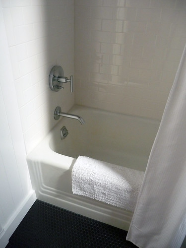
I wasn’t sure about those black pennyrounds at first, but I bet they look great in person. I love the tub.
Beautiful, and a novel way to reveal. Holly seems like such a sweet person.
Well done!
We are doing the exact same small bathroom remodel right now. Our house is from 1930 and the bathroom is 12.5 X 4.5. I have been watching you very closely : )
I love the price breakdown you did for Holly. It’s great to compare… we kept our cast iron tub and gutted the rest. This is the first time we ( ok, I) will be tiling. Thanks for the courage that I can do it myself!
Oh and I chose my floors first too and worked the design from there- they are red marmoleum.
Congratulations!
I lust after those penny rounds…
Congratulations on a job well done! This gives me hope.
I’m sure it’s been said already, but I have to say that I adore white shower curtain. Mariemekko is gorgeous, always, but the white curtain really really compliments absolutely everything in this gorgeous bathroom. Love!
it looks soooo nice!!!!!!
great great job!
It looks amazing! Great Job Anna and Evan…….Congrats to you!!!
My favorite thing is the floor. Those penny tiles are simply gorgeous. I love the way they reflect the light in such an unexpected way. I plan to steal that idea when I tackle my kids’ bathroom.
It looks awesome 🙂
Wow!!! This bathroom is gorgeous. And I just realized that I already fell in love with your house from the Apartment Therapy tour– which I have bookmarked. You guys are *amazing* and your home is stunning!
Gosh you have such a great eye! The room looks fabulous. I love that it has a little edge yet is calming at the same time.
wow oh wow.
i don’t know what to say.
Not that you need another person telling you, but you two have really done a fabulous job on the bathroom. It looks great!
amazing!! care to do our bathroom?!?
The bathroom is spectacular! I can’t believe its the same room! You have done an amazing job on your home.
WOW! You and your husband are amazing…truly an artiste. I can’t imagine a more professional, lovely and anna-like space. Your entire house and all the work and love you both put into it is inspiring. I love how you do exactly what you love. THAT is what home is all about. Bravo Anna.
p.s. you write beautifully and your aestetic is stunning. It’s like looking at a foreign design magazine…in a good way.
Hi, somehow I missed the big reveal of your bathroom even though I had been eagerly following your progress along the way. I just finished reading the post on Holly’s blog. What an amazing result, especially considering the cost! All of the details are perfect…the floor is my favorite element as well, though the mix of white, black and warm wood detailed is a close runner up. I really appreciate how you mixed modern and classic. I am saving this for my inspiration file. Thanks for sharing!
I love it. And I have had the post on decor8 starred since I saw it because I want to use the same shower tile. I went to the site and can’t figure out which it is though. Do you know which collection is was from or anything?
i am in awe!
you have such crazy talent.
i am lusting after a bathroom that looks this neat!
especially after seeing how sad it was to start with!
Love the sink – such a great design 🙂
Waaaah, I wanna see, but the link doesn’t work and I can’t find it anywhere on Holly’s site.
🙁
Looks gorgeous, I want to see the small details.
olga: Thank you for alerting me to missing post! Holly had some data loss problems recently, and the original post was apparently lost. She’s just reposted it – here’s the new link. Unfortunately, the comments are gone, but at least you can see the photos now! 🙂
Love the Ikea sink. What a great find. Do you happen to have the 9 digit IKEA product code to plug into the inventory search on ikea.com? Thanks!
nevermind! saw the code (401.444.69) on another page in your blog. sadly, it’s not available at the 3 stores in my vicinity.
i’m wondering if you could please tell me if those awesome sconce lights emit a substantial amount of light? or are they simply mood lighting? i’m looking to use a series of them to serve as a primary light source and i’m desperately hoping it’ll work out. AND your home is beautiful! i admire the passion you put into it. thanks…
the ikea stock availability is not to be trusted! the website said zilch, but i found the sink (401.444.69) while wandering in the bathroom self service aisle of my store.
This plus-sign/cross shaped window on today’s Remodelista reminded me of your bathroom re-do…
http://www.remodelista.com/img/sub/uimg/sarah/12-2009/fjall%2010.jpg