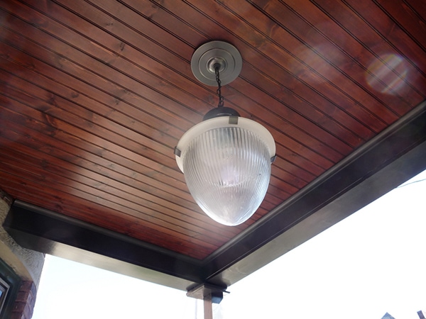
Look! We have a new porch ceiling! And a new porch light! Yes, I know the light is very traditional, and it’s really a bit too “faux-old” for my taste—but it does suit the house quite well, and the scale of it is right. Our porch is high off the ground, and small overhead lights look out of place. (By the way, we bought it at Pottery Barn on clearance and then squirreled it away in the basement for a year. They don’t have it anymore, sorry!)
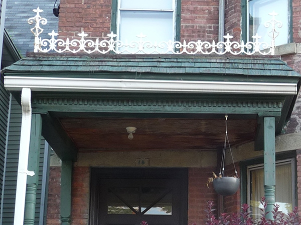
Here’s a gross before shot. As you can see, the current situation is definitely an upgrade from rotted plywood and a bare bulb.
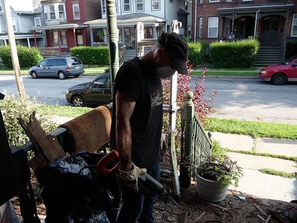

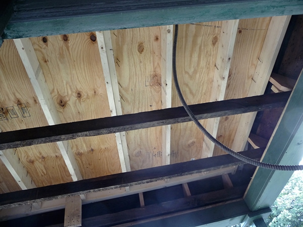
Sorry I don’t have many “during” shots! The demo took forever (not that I had anything to do with it—I left the dirty work for Evan). It was disgusting and marked by the discovery of a wasp infestation.
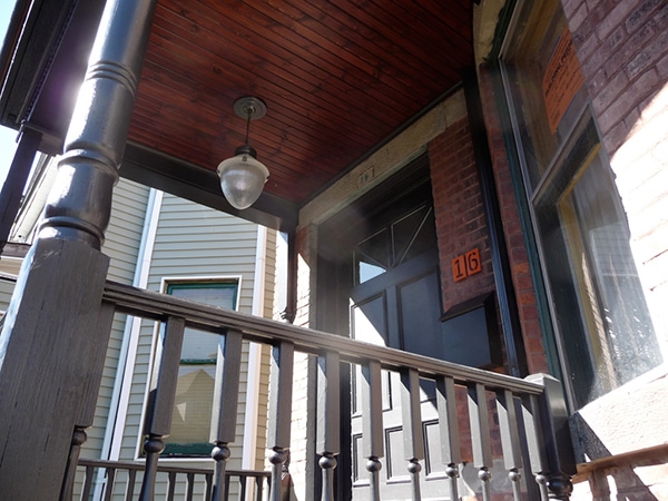
The new ceiling is tongue-and-groove pine beadboard. We put it up using a nail gun and an air compressor, which was SO FAST AND EASY. I applied two coats of oil-based ZAR Wood Stain in Dark Mahogony, then a coat of ZAR Ultra Max polyurethane in a satin finish.
(And yes, that’s BLACK trim you see! More exterior renovation photos to come…)



57 Comments
Wow, that ceiling looks fabulous. The light is perfect – attractive yet simple so it doesn’t take away from all the hard work you put into the planks. (it doesn’t look old -faux or not- to my eye.)
Just gorgeous. And I love that you did it yourself. Such an inspiration!
you guys are incredible. it’s RIDICULOUS looking! professional style. but then again you’re both motivated and ambitious. if i ever tried to renovate my house i’d just sit on my hands forever.
you’re just fly.
(and yaaay for black trim!)
xoxo
Wow. When I saw the first picture I thought for myself you really splurged and had it professionally done. It looks fantastic.
Um, if you ever have me as a guest at your place and there just so happens that there aren’t enough bedrooms to fit me in, I’ll be honest and say that I’ll be perfectly comfortable on your porch. I could stare at that ceiling all night long.
this looks amazing. i can’t wait for more black trim!
Hooray! It looks marvelous, and I’m totally stoked about getting to see some black trim.
wow! I can’t believe that’s diy. It really looks professional and great! I thought I saw some freshly painted trim in your other photos – I’m excited to see the reveal!
It looks fantastic! A gorgeous mix of modern and traditional 🙂
Looks great! Can’t wait to see more of the outside – your house is so handsome. What’s the building permit for, if I can be so nosy?
Wow, it looks absolutely fantastic!
The wasp nest…was it active? YIKES!
zee, the permit is for everything we were doing on the outside, including the painting. I live in an historic district, so we had to have everything approved and reviewed by an architectural committee before we could make any changes. The building permit states that we can make all of the changes that were presented/approved.
Wow! It looks fantastic Anna! Great job you two!
Anna, I have to admit that it makes me laugh that anything Ikea is A-OK with you … but god forbid that anything be “faux-old!”
Don’t get me wrong; I really admire your design aesthetic and your commitment to a developed look. But I don’t always understand why putting brand-new modern stuff in an old house is fine, but new fixtures that happen to reference old fixtures are somehow a travesty.
p.s. I forgot to say … your porch ceiling looks wonderful. The finish is so professional.
“And yes, that’s BLACK trim you see!”
Trim is the first step!
Welcome to the dark side!
D.
Wow, that’s fabulous! Zar is my favorite stain product too, so much easier to use than other stains.
OMG WASSPPPPPPPPPS!!
How did you get rid of them without being eaten alive? We have some particularly angry ones that are rather attached to our awning… any tips for getting rid of them without getting stung? I’m pretty allergic, sometimes it can be hard to get to the Benadryl in time!
WOW! Job well done, that ceiling is beautiful, I love the color of the stain, and I do think the light suits the porch very well. I can’t wait to see more exterior pictures!
Jaimie: First of all “anything IKEA” isn’t any more A-OK with me than anything from anywhere else. I judge based on design, quality, and material — something beautiful from IKEA is worth no more or less than something beautiful from anywhere else, just as junk from IKEA is just as bad as any other junk.
That said, my feeling about “faux-old” stuff really speaks to my personal desire for authenticity in design and manufacturing. I keep and restore absolutely anything original I can in my house, but I see no value in trying to imitate a 125-year-old design in 2009. Good design should be about moving forward. The natural progression of time is what makes a mid-century lamp look beautiful in a Victorian house (unfortunately, the reverse is not always true).
This, of course, is only my personal belief, but it does extend beyond aesthetics — the thinking is much deeper than that. I certainly don’t expect the whole world to agree with me, though!
looks really fab. of course i love the black trim and can’t wait to see it!
i was thinking of attempting something similar on our back porch and these pics may be the thing to get my Mr. on board.
I like the light! It’s not faux-old, it’s industrial. Love the optical glass.
I must say I was surprised that you guys did that yourselves! Beautifully done 🙂 And I do love the lighting fixture you guys used… fits the space perfectly.
Gorgeous – I LOVE that stain.
It’s so inspirational how the two of you tackle these things yourself and finish them to such a high standard. Fantastic job.
Yowza! That’s beautiful work. My favorite part is that you said the tongue and groove was easy to put up with a nailgun- can’t wait to tell my husband, as I’ve been going crazy for tongue and groove ceilings in the kitchen.
That looks fantastic! And the black trim against the dark stain is awesome. Did you have to restore/replace any other element of the porch besides the ceiling? The trim work looks so spiffy and fresh.
The ceiling looks beautiful. I, too, thought it was something you had hired-out. Although your projects have greater workmanship and attention to detail than most contractors-work I’ve seen!
I was surprised to see that you stained the wood as opposed to painting it. Just curious what your thought process/inspiration was regarding that.
I thought it was a pro job, too! I should have known y’all would be able to pull it off yourselves. It looks gorgeous! *tumultuous applause*
LOVE the ceiling … and the light.
Looks awesome! I can’t wait to see what else you guys have up your sleeves for the exterior.
Hey, wer’re working on our porch right now so this timinb is perfect. We were already thinking of the bead board but hAdn’t found a light fixture. Yours is really nice!
Oh how I’ve missed you’re DIY posts. I adore your style!
That. is. seriously. gorgeous. Love it, love it, love it!!
The ceiling looks great and I love the light and black trim. Can’t wait to see more!
Anna, it looks lovely! The color of the wood works so well with the metal finish on that light and the brick and of course the black trim (which I’m so excited to see!). Congrats.
NIIIIICCCCE!
omigosh that is gorgeous! it look so sleek and elegant, and it really compliments and puts a little extra “oomph” to the exterior of the house. love it! you should put another picture of it from the roadside. love to see how it’d look from a driver’s perspective (because yes, when i drive around my neighborhood to get to the main road, i love looking at how people decorate the exterior of their homes, hehe).
WOW! Really makes a difference.
Beautiful..!
-maria
Add me to the light lurve. IMHO, it’s good to create a some unity with the rest of the neighborhood design. Little details like your house numbers (and any other little thing you do to the porch area) will add your individual stamp without ticking off the historical society. It’s a good thing to tease a little as to the inside of your home!
I love your house, really wish we hade houses like that where I live. Lucky You! 🙂
May I ask where you got that nice hanging planter? I’ve been looking all over the internet for something like that, but I’ve had no luck.
The porch looks fantastic!
that’s really wonderful. The fixture doesn’t read “faux-old” to me and I think it is the perfect foil for the ceiling. and the clamps on the light really stand out to me- which I love. btw, I love how your husband is wearing a mask. so, so important. My husband tends to ‘forget’ to wear a mask which causes me to have a mild panic attacks. Did you find the process of appearing before the architectural committee to be a good one?
Looking good! 🙂
Katie, the planter is from IKEA (summer 2008). Starting around Feb/March they start to get in their garden stuff, so definitely check there when the time comes — they usually have hanging planters that are much nicer than the standard fare.
Regan, yes, the process was fine for us. My only complaint is that the policies are not enforced across the board. I really believe that if a district it going to set regulations, they need to be adhered to by EVERY resident, and that there should be repercussions if the guidelines aren’t followed.
I have mixed feelings about the concept of historical guidelines, though. On one hand, I think it’s important to preserve these pockets of America that are architecturally valuable, but on the other hand, I think it does limit the possibility of seeing really innovative things done in the way of combining very old structures with very new, modernist/forward-thinking additions or modifications (much like you see all over Europe and in parts of NYC). I’m not sure Newburgh is quite ready for that kind of thinking yet, though, so in the mean time…I’m happy to just play by the rules. 🙂
So fun to see another of your projects!
This turned out just beautifully. Can’t wait to see the rest of the trim and any other fun exterior surprises! As a renter, I can change much of the inside as I’d like to but the outside of our home is off-limits. Very frustrating since it could use a pressure wash and fresh coat of paint.
Hi Anna,
I just wanted to ask you – how your floors in the office are holding up? I painted the floors in my kitchen, living room and hallway with the same paint from Benjamin Moore (I used Grecian Green, not white), back in April. They look pretty good, but I’m noticing that the paint is susceptible to scratches. I’m afraid to slide anything across the floor, spill anything that could stain it or drop any hard objects that could dent it. I’m wondering if I should’ve put a coat of poly or verathane on it, but the guy at the paint store said it would dry so hard that a dog could walk on it and not scratch it – I highly doubt that!
Mellany, the floor is holding up great. It definitely gets scuff marks under my desk chair, which is to be expected (they come off with a magic eraser), but other than that, it pretty much looks the same as the day it was painted.
How did you prepare your floors before painting? Did they already have any kind of coating on them? Did you sand? What kind of primer did you use?
The BM floor paint is extremely durable (I agree with the paint store guy on that one), so if you’re having trouble with it not drying hard or scratching easily, I would tend to lean toward it being a problem with the preparation.
Anna – love the website and love the house!
I’m curious to know about the plywood above the porch ceiling — was that the underside of a new roof you put on the porch, or did you put that up there as part of the ceiling work?
(The nails stick out like it was put on as a roof, that’s whay I ask…)
Great work — and we’ve been looking at Newburgh ourselves…
Anna – You and Evan are too clever! I have two of the exact Pottery Barn lights in my master bath. I love the appeal of placing outdoor fixtures in. Especially in a room with a steam shower unit. We thought the oversize glass globes looked a bit more industrial. I love the light on your porch! Mazeltov.
This looks great! Good job!
That looks amazing!! Can’t wait to see more pics of the exterior.
I cannot believe the porch ceiling is a DIY. It looks professional and gorgeous. Do you mind sharing your budget for the project?
To a lesser extent, I have reservations about faux old myself. I think, though, that 2009 living, to be authentic, aggregates the past and integrates the present in terms of design. For me, the best way to live in a vintage home in a more authentic way is to use period pieces rather than contemporary reproductions.
I don’t remember how much the light cost (maybe $100 on clearance?) but the materials for the ceiling came to about $200.
Wow, the porch looks fantastic. It’s so funny you apologize about the light, because I have just been cornering the market on lighting (we just finished a whole-house electrical upgrade in a house with very few existing fixtures) and I would never have guessed in a million years you could find something so cute at Pottery Barn.
It looks less faux-old than some of the stuff available at Rejuvenation.