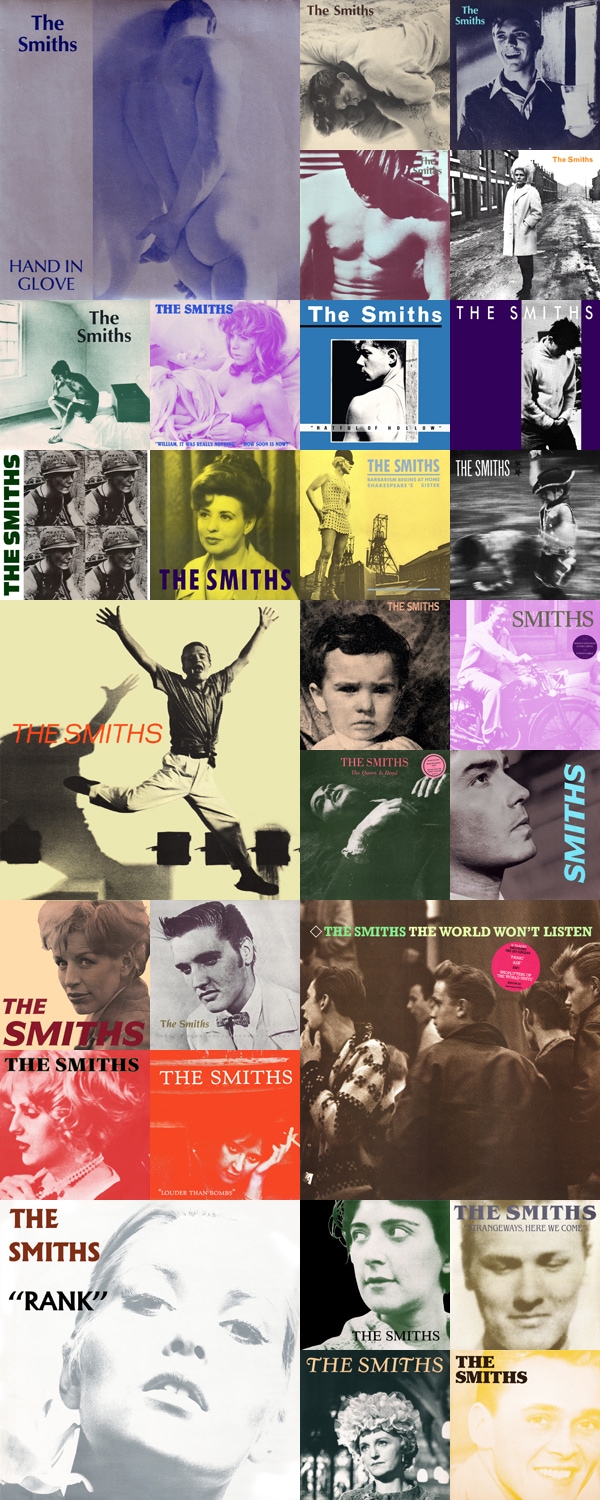
Yes, I know this isn’t exhaustive. If exhaustive is what you want, here you go.
In the midst of a fit of impatience over the seemingly endless wait for a new Morrissey album (He’s spoiled us over the years, really—to the point that I get very anxious if much time passes with no album or New York tour date. And good grief, it’s been two whole years since the last time I saw him. I don’t want to wait any longer!), I started thinking about how he’s really one of the few artists I still care about buying music from in a physical format. I’m one of those kinds of fans who buys everything—every album, every single, every format; LPs, 45s, 12″s, CDs…and Heaven knows there are even cassingles (ugh, worst Frankenword ever) stashed away in my closet.
One of these days I’ll have to drag everything out and take a photo of it all.
What was I talking about? Oh yes, the physical albums. Aren’t the sleeves for the Smiths’ records great? They just perfectly capture what it is that made the Smiths who they were—you’ve got high glamor, homoeroticism, iconography, idolatry, melancholia, film stars, nostalgia, wit, the working class, fading beauty and gender ambiguity. I love the mono/duo-tones, the very basic fonts and understated typography, and, especially considering the style popular album covers of the era veered toward, the somewhat “undesigned” look of the collection as a whole.
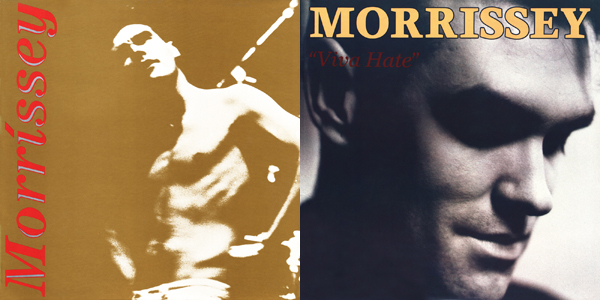
Because the Smiths put out so much recorded material in such a short period of time (the selection above represents less than six years’ worth of recordings—incredible, right?), they were really able to establish a consistent visual aesthetic that’s instantly identifiable as their own…without ever appearing on the front of one of their own recordings. Not even once! In contrast, Morrissey appears on the covers of nearly all of his solo releases, something I’m sure was very deliberate and quite well-planned.

(Who’s the icon now, suckers?)
All of the Smiths’ sleeves were, of course, conceived of and created by Morrissey, with art direction on nearly all by his personal assistant, Jo Slee, and layout design by Caryn Gough (there are a few exceptions—“Sheila Take a Bow”, for example, is credited to Andy Warhol). The partnership of Jo Slee and Morrissey lasted into the early ’90s, extending into the first phase of his solo career.
Slee, by the way, released a book in 1994 called Peepholism in which she delves deeply and exhaustively into the process of creating these covers with Morrissey. It’s hard to find and quite expensive as it’s long been out of print, but if you happen to find a copy, buy it. Even if you have to sell everything you own (Squander your cash! Be rash!). It’s that good.
Speaking of that good…


62 Comments
i love your 1am posts. 🙂 this is awesome.
Thank you for giving the world such a beautiful late-night cookie… who knew The Smiths were such amazing arbiters of marketing taste? Love every single one of these covers and wish more were made like this!
Haha I’m glad I’m not the only one who’s spent some time looking at the album covers’ typography. For me I think the typeface on Louder Than Bombs works best.
This Charming Man is my jam. My work mate and I used to turn it up really loud before close and dance around the store. Heaven Knows I’m Miserable Now is also high on my list. Oh, Moz <3
The word cassingle is hilarious. I still have a few of my cherished cassingles, although I purged recently. (Too many.) I remember poring over these Smiths covers. Whilst smoking and memorising the words.
Cassingles were really such a terrible concept. Those stupid cardboard sleeves! Ugh, cassette tapes in general were just awful…except blank ones, of course, because everyone knows mixtapes are the best thing ever.
They are beautiful cover designs. I’ve written a chapter about the iconography Morrissey selected for the Smiths covers and then using his own image for solo releases – the book comes out next month, so excited!
Thanks for this post, it’s made my night & let’s hope the rumours of Morrissey working on a new album are true 🙂
A chapter for what, Melissa?
It’s a book titled ‘Morrissey: Fandom, Representstion & Identities’ published by Intellect this May. The chapters came out of papers presented at the 20009 Morrissey symposium held in Limerick. Was brilliant – and Moz toured Ireland in the days following.
As you were compiling this post in the wee hours, I was scanning through an old videotape, revisting clips of Morrissey on SNL (http://www.thesoundofindie.com/2007/03/08/morrissey-suedehead-live-video/), Leno, and some MuchMusic (Canada) spotlights on Smiths/Moz. Hadn’t watched these in years. Guess I’m missing him, too. Sigh.
My all-time favorite TV stint of Morrissey’s was his week-long tenure on Craig Kilborn’s show in 2004. Moz! Every night! All week! And Craig is such a fan.
(By the way, I could be remembering this wrong, but I seem to recall Michael Keaton referring to Morrissey as “the band Morrissey” during his SNL monologue. Am I imagining that? I do remember that fabulous gold lamé shirt, though. Going to watch now…)
Oh…looooved the Kilborn shows! I remember even my mom commenting on his “incredible presence”. 😉
Unfortunately I didn’t tape the monologue and you probably have a better memory than I do. And yes, the gold lamé. The shiny shirt phase, as I like to call it. Still doesn’t quite top the sheer black shirt in NSAM, but close….
I actually have a scrap of one of those gold shirts—torn from his sweaty body with my bare hands!
http://www.flickr.com/photos/doorsixteen/3410291269/
(Watching it now. SO HANDSOME! Alain looks great as always, and it’s weird to see Boz so thin, hahah…)
(Now I’ve entered a YouTube vortex. Oh my god, THIS is amazing!)
makes me so nostalgic! the smiths sound as good today as they did then. thanks! i always enjoy every word of your posts (hate to say it, but on many blogs, i’m only there for the pics!).
Thanks Leah 🙂
Too wonderful. And I have the early copy of Viva Hate that went out as Education in Reverse.
Excellent, Cath, I’m envious!
I swoon over all things Moz and the covers are brilliant, but I’m of the generation where CD booklets were/are substantial. I always found/find the Smiths/Morrissey’s booklets lacking in substance, like a beautiful girl with no opinions.
Hmmm. Are you referring to his solo releases from the late ’80s/early ’90s, or to the more recent offerings? Content-wise, the earlier CDs were fairly typical of what was being put out at that time, but most of what he’s done in the past decade (including reissues of the earlier albums) have been incredibly well put-together, in particular the ones designed by Stylorouge. Beautiful uncoated papers, foil-stamped embossing, extra inserts and booklets, gatefold digipacks, etc. Perhaps you just haven’t seen the deluxe editions? He usually offers a choice at different price points.
(By the way, he’s never stopped releasing everything—including singles—on vinyl. Now more than ever, it’s a great option for those who might choose to pay for a digital download but wish to also have a tangible object to accompany their purchase.)
Mostly the earlier stuff. I can’t say I own all of the Smiths/Morrissey anything and I can’t say I have the most complete understanding of the type of things being produced at the time. I just remember sitting in front of the stereo with my Cure cassettes and staring at the books and the little photos and text being so amazing. Later, I’d stare at my Smiths CD book and be not so amazed.
I’m not of those earlier times but all that Moz has released in the last 10 (ish) years I’ve rushed out and purchased the most expensive one only to be amazed. I have to say the design and substance has gotten better on the new releases and the rereleases.
Sometimes I’ll turn on my MP3s and pull out the CDs just to feel the texture of the paper and the emotions of being a kid again… Maybe I should consider converting to vinyl, my vast (three records) record collection could fatten up a bit.
And the tour posters are quite good as well (I have this one on a postcard):
http://991.com/newGallery/The-Smiths-Smiths-Tour-256565.jpg
Indeed, as are the enormous backdrops used at the concerts (my favorite, like everyone’s, was Harvey Keitel)!
The photo of the kid with the ice pop was later used on the French single for “There is a Light…”. I have no idea of the provenience, though.
LOVE this post, Anna. It’s so fab to see the covers all laid out like that, and that Peepholism book sounds rad. Thank you. ♡
Exactly the same comments I made last night. Solidarity! (Oh how I miss Spencer.)
And thanks for that link…hadn’t seen that one before. Brilliant.
…obviously that comment didn’t go where it was supposed to. oops
That lineup really was the best.
I never realized how similar these covers are to the Belle and Sebastian ones. [or I guess I should say how similar the Belle and Sebastian ones are to them!]
xo
Oh my lord, that collection is just amazing… and there’s no better song. “Swing those flowers, boy!!” LOVE!!
Love this! My husband is a die-hard Morrissey fan. I’m a newer fan, but love him, too. I’ve seen him live once & would love to see him again. I live in Nashville & obviously we’re not high on his US cities tour list, haha.
Thanks for sharing!
–Kim
Lovely! I did my work placement at Stylorouge while at university and they were working on the design for The Ringleader of the Tormentors at the time. They graciously let me have a crack at it (not used, alas) and I was pressing my knees together with excitement every time the door to the studio would open in anticipation of Him possibly walking in for a meeting. Great music, great man, great taste, greatest hair in music. ‘Nuff said.
He never showed up for a meeting while I was there though. Sneefle.
I take it back, it was his Greatest Hits album. I am getting old. Ugh.
Do you have anything to add about the ‘Your Arse N All’ image used in the Greatest Hits? Would love to know more about that
I know you’re asking Süsk, but I’d like to add that I LOVE THAT PHOTO. I really love that Morrissey sat on it (as it were…) for well over a decade before he put it to good use. Easily the cheekiest (there I go again…) thing Moz has done in ages. Fabulous.
(For those who might be wondering what we’re talking about, here you go. You’re welcome!)
That sounds like a dream placement, Süsk, and not just because of the Moz connection—Stylorouge is such a quality firm, and I’m sure you were working with some very talented people!
As I mentioned in another comment earlier today, I think the packages Stylorouge has designed for Morrissey are really fantastic. Such attention to detail! The background patterns, the crest, the paper, etc. All of it’s great.
I love me some Morrissey—we are talking shirt scraps, stage invading, waiting outside of tour buses to catch a glimpse kind of love. ♥♥♥
I lament the fact that it’s now nearly impossible to get on the stage!
I am terribly shy and not very athletic, but something just takes over when I am in the presence of that man. You can do it!
I had my time in the early ’90s, Suzanne! Believe me, I ripped a shirt from that man’s body with my bare hands, haha!! I lost a shoe and a watch at a particularly raucous show in ’92, even. 🙂
Honestly though, the security at concerts is so intense these days that if you even appear to be climbing a barrier (remember when you could stand right against the stage?!), they will immediately remove you from the venue. And I want to see the whole show!
<3<3<3<3<3<3<3<3
i read your supercool blog all the time, and i love it — but that post was particularly glorious!!! kudos to you for making my day.
my husband and i are coming up on our first anniversary, which happens to be moz's b-day. coincidence…?
“able to establish a consistent visual aesthetic that’s instantly identifiable as their own…without ever appearing on the front of one of their own recordings. Not even once!”
Well, technically they appeared on the cover of the US 12″ of How Soon Is Now 🙂
http://passionsjustlikemine.com/images/hsin-us12.jpg
Oh yeah! I was mentally flipping through the UK covers, and forgot completely about US/HSIN. I stand corrected. 😉 I wonder though—was Morrissey involved in any way with that cover, or was it put together entirely by Sire?
(I suppose you could count the replacement cover for WDDIM, too, though that’s just Morrissey…)
Edit…well, here’s my answer:
I’m standing by my claim that they never appeared on a sleeve, then, since I’m really speaking to the control that Morrissey DID have over the covers and why that mattered. Point taken, though. 😉 ALMOST not even once! Haha.
I’ve always liked morrisy and the smiths – but I don’t have any of thier albums, and I think this needs to change!
If i wanted to start buying morrisy and/or smiths album, where should i start?
First learn how to spell Morrissey (I’m just teasing, I swear!), then buy The Queen is Dead (Smiths) and Vauxhall & I (Moz). Then fall totally in love with them both, and then go and buy everything else. 😉
There are several “best of”-type Morrissey compilations (as well as several compilations of previously unreleased tracks/b-sides/etc.), but I’d skip them for the time being. Start with the studio albums, then the live albums, then the compilations…and take it from there. When you have a choice, always buy the deluxe edition (or the reissued edition, in the case of older Morrissey albums—most of them have been remastered and repackaged in recent years) as they generally have bonus discs included with lots of goodies on them.
By the way, the website Passions Just Like Mine has a simplified discography tailored specifically for new fans—check it out! (Click on “official releases”, then “new fan’s discography”—it’s broken down from there by Smiths/Moz.)
I will tell you, though, that ALL of the Smiths’ albums are absolutely wonderful (I only suggest TQID as a starting point because it’s so accessible), and the same is true for Morrissey’s solo albums. Southpaw Grammar and Maladjusted are generally considered Moz’s “low” points, but even those albums have aged well and sound fantastic in retrospect. Contrary to the path that many musicians follow, Morrissey’s three most recent albums (released 2004–2009) are COMPLETELY INCREDIBLE. On a good day, I actually think they’re better than anything he ever did with the Smiths. He’s just getting better with age!
So yeah, just go buy everything. 😉
Anna, you know how much I love the word cassingle! It totes brings me back to middle school and a bedroom filled with unruly stacks of cassette tapes.
I honestly think that this montage of The Smiths LP’s that you created here should be an entire poster…..at the same dimensions of that huge poster of Morrissey that you have hanging up in your living room in NYC! perhaps hanging them side-by-side for maximum impact!!
xo
The Biscuits
Thanks for putting all the Smiths covers together! I have a lot of them (on vinyl) and always wonder about hauling them out and looking at them like this. I loved them at the time, and still. I love them all, but “boy with the thorn…” always gives me such a strong KLANG of time and place. I was with 2 friends (one of whom introduced me to the Smiths) on vacation in Los Angeles and we were driving around and saw the poster in a record store window. Before I realized it was for a new Smiths record, I was just sort of stunned by young Truman by Cecil Beaton. I had had a long Cecil Beaton phase. So my friend (the Smiths fan) and I came at this image from different directions and were both very excited. He was surprised, impressed(?) that I knew the photo. The photo, typography, color, composition, song, spirit, Truman’s leap are all perfect. Hot Tangier/LA and Morrissey’s yodel, it all comes together.
http://www.apartmenttherapy.com/ny/news/worker-complaints-at-ikeas-us-factory-design-news-4112011-143862
Did you see this? Ughh so frustrating. I’m a big ikea fan too.
Unsurprising, as this is par for the course when it comes to companies involved in global mass production. (That’s not an excuse, just a fact.) Let’s remember, though, that the articles that have been written so far are based primarily on a press release from workers at a single factory location who are in the midst of possibly unionizing—not the result of an investigation or of any litigation.
Not wishing to delve too deeply into the subject in the context of a post about record covers, but I’m happy to discuss further via email. My views on this type of thing are very much in the gray area.
I love when an artist shows an interest in the aesthetics of their work. Whether it’s an album, movie, or book, I love when it is (like you said) consistent, and each piece is one part of the complete work. The Smiths’ albums are perfect examples, so simple, beautiful and clean. It’s nice to see them all laid out here.
Dear Anna;
I love your blog (you strike me as kind of blue and worried lately but that is none of my business really). And I don’t want to be dramatic, but honestly, ripping off someone’s shirt during a concert? And you wonder why security has been increased? I’m sorry I would be in shock if that happened to me as a performer. And you’re proud of it.
Turn it around and make it about a pretty girl and a guy ripping off her shirt and it would be very wrong. Personally I believe that if I think it ain’t right for girls, it ain’t right for boys because they deserve the same respect. But obviously I wasn’t there I guess.
Simone, that’s a bit of a tradition at Morrissey concerts—unless you’ve been to one (or watched a video of one) in the late ’80s/early ’90s, you may not understand the context, but it’s something that is both started and encouraged by Morrissey. Until security was increased (something he has been VERY much against and vocal about, to the point of verbally berating security guards at his concerts), he would actively pull fans onto the stage so they could hug and him and touch him and tear at his clothing. He very open about the fact that he enjoys this reaction from fans, and has featured the “fan rush & push” in multiple videos. He would even wear shirts that were made of easily tear-able material just to make the process easier. Now that it’s so hard for fans to get onstage or to touch him while he’s performing (again, due to increased venue security, NOT because he requested greater protection), he’s taken to tearing his own shirt off and throwing it into the crowd…where, of course, it will be torn to shreds.
There’s nothing wrong with tearing off someone’s shirt if they ask you to do it. 🙂 I think you’re misunderstanding what I’m referring to in the comment above—and again, unless you experienced Smiths concerts or Morrissey concerts in the late ’80s/early ’90s, I’m not sure you’ll get what it’s all about. Definitely NOT disrespect for anyone, regardless of gender.
For example:
At around the 2:35 mark, you can see how Morrissey would lie down at the edge of the stage so fans could easily tear at his shirt. It was actually during this same song (different concert, one year later) that I got my piece.
Here’s a great video (released by Morrissey) of fans getting on stage:
These days, it’s more like this…still fantastic and animalistic, but sad that we can no longer have contact:
To quote Morrissey himself:
“Lots of people make the stage and it can seem very violent and over the top, but it’s not really. It’s always a kind of gentle ballet.”
I’ve been staring at this collection of covers that you put together for your post for the last 20 minutes. Just staring. Hmm…God, not that I ever want to be 16 again, but I’m sort of missing that feeling of being 16 and listening to the Smiths.
Love it!!! Smiths just had the best album art ever. I love how together they create a dialogue (well, if you sit there and create one, as mad loons like myself might). I’ve always loved the Yootha Joyce cover for Ask the most, but now after clicking that link I’m in the frenzied grips of wanting the Panic tour poster!!!!!
I’ve held his hand for a , but did not get a piece of his shirt… extremely jealous! Love this post.
I love the Smiths. The photograph album art is great.
I just love, love, love when I find someone else who loves the Smiths and Morrissey and all of the music from my early teens (well M. is still making music today of course). I grew up in D.C where all we would do is go and see “shows” on the weekends/weeknights. We saw Peter Murphy and some weird loud band called 9 Inch Nails opened for them:) We saw Love and Rockets open for The Pixies, Morissey at Merriweather…also there, The Sugarcubes opening for PIL and New Order….whoa nelly……
I used to use The Smiths as a great indicator whether a boyfriend was long term material-my sister and I would start crooning “Girlfriend in a coma, I know, I know, it’s really serious..” and see his reaction. bad-gone…..singing along, dating for years (even if that was his only good quality) but we won’t get started on that…….thanks for the compiling of the album covers-it made my heart pitter patter.
anna i love your site, i have always been curious about your smiths collection. i checked back in previous posts to look for signs of it (besides the gorgeous shoplifters poster). was just curious.
I love morrissey and The Smiths! My husband and I have all of their albums, and even records. Actually, the first time we met, he had “hatfull of hollow” T shirt, and I allready knew this handsome man is my guy (:
We really hope to hear a new album and keep up these Morrissey posts and pictures around the house!!!
Wow – I never even knew how beautiful their album covers are, especially when put together.
Thanks for the post! You’ve reminded me of that wonderful era and of many great teen memories. Happy Easter!
Here is an article you’d be interested in:
http://www.guardian.co.uk/music/2011/apr/22/morrissey-autobiography-finished
Ha, fun. This reminds me of a blog post I did a few months back:
http://inbedwithleading.blogspot.com/2010/11/smiths-album-covers.html
(this is not a shameless plug). This is way more in-depth and thorough though. Really cool! The Smiths are my all-time favorites, and Morrissey is my deity. It’s great to find other people around the ‘net who are equally obsessed. Consider this blog followed!
-C