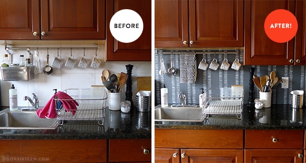
Remember the ugly kitchen in the my new apartment? The one with the kale chip counters, the cherry-colored doors and the backsplash made out of what are very clearly floor tiles? Yeah, that’s the one. Check out what I just did with the backsplash, though! This was a weekend project that I put very little planning into, and I am really, really happy with the result.
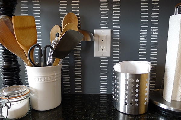
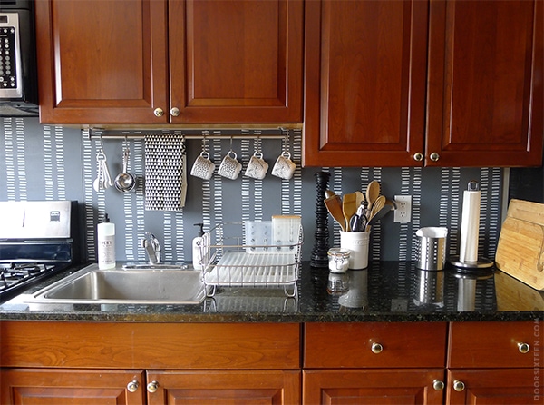
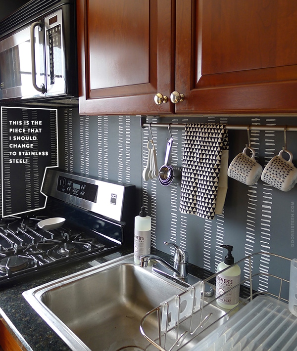
This is light years better, right? I kind of don’t even hate the kitchen anymore. Don’t get me wrong, if the landlord suddenly asked me to do a gut renovation I’d start this weekend, but in the very likely event that he doesn’t, I’m totally OK with how the kitchen looks now. It’s pretty amazing how well that color (yes, it’s Benjamin Moore Deep Space again) neutralizes the red tones in all of the wood in this apartment. The cabinet color is actually tolerable now! When we picked out the paint we made sure it picked up on some of the gray undertones in the countertop, too. They look more black than green now, which is a very good thing.
So basically all I did here was cover up the tile with plywood that I painted a pattern on. It’s held in place with Velcro, so I can remove it anytime with no permanent effect.
Here’s a step-by-step…
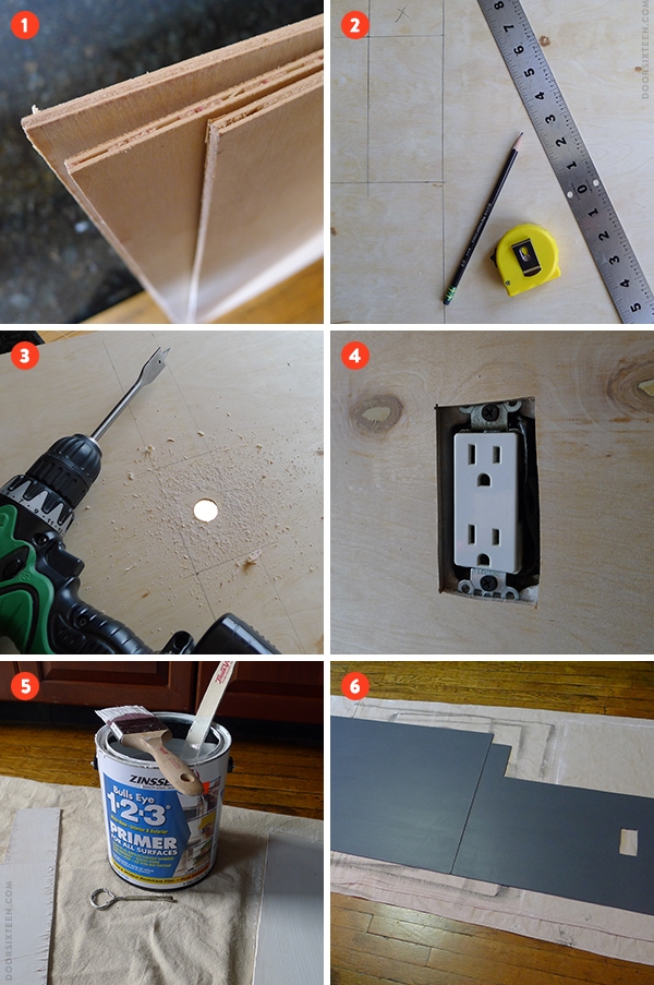
1. I used 1/4″ pre-sanded baltic birch plywood (not luan). I needed 3 2×4′ panels to do this backsplash. They were about $8 each. I chose ply over masonite/MDF primarily because it’s much lighter weight.
2. I measured out the panel dimensions, then did all of my cuts with a jigsaw. I’m sure I could’ve gotten more perfect lines with a circular saw, but ours is up at the house and I just wanted to get this done. I have a pretty steady hand, so the jigsaw really was fine.
3. To cut out the opening for the outlet, I drilled a hole first so I could get the saw blade in.
4. I test-fit the panels to make sure everything lined up right.
5. I gave the plywood a coat of primer. It’s really important to prime BOTH sides when you’re dealing with flexible stuff like beadboard, molding trim pieces and thin ply, otherwise you’re going to have a lot of warping. Trust me, it’s worth the extra time.
6. One coat of my base color was enough. I let it dry for about 3 hours before getting started on the pattern — I used that time to figure out what I was going to paint! There aren’t any progress photos of the pattern-painting, but I just used primer and little foam brush to paint it on freehand. (And yes, it took forever.) You could certainly use a stencil or stamp or whatever, but I didn’t want any repeats in my pattern. Every little line is unique.
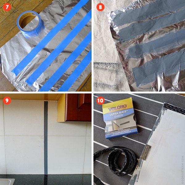
7. This might sound crazy, but I was a little worried about the original white backsplash showing through the seams of the dark panels, so I put some strips of painter’s tape on a sheet of aluminum foil and…
8. …I painted them to match the panels. Yup.
9. See what I mean? I knew it would drive me crazy to see a sliver of white, so it’s just an extra little bit of insurance.
10. And finally, Velcro! I used almost one full roll of Velcro Ultra-Mate. It cost about $17, which seemed insane to me, but I guess that’s how much Velcro costs unless you’re smart and buy it online first. I just put a few inches in each corner, plus a few extras along the edges for the bigger panels. It’s SUPER secure.
Total cost = $42. Soooooo worth it.
A few things I didn’t do, but that I still might do…
✚ Put a coat of matte polyurethane over the whole thing for extra protection.
✚ Add a bead of clear silicone caulk where the panels meet the counter.
✚ Switch out the cabinet knobs. OK, I’m definitely doing that. The current knobs are cheap-o brassy things that most of the finish has rubbed off of. I think I’ll just go with simple, small black knobs.
EDIT! ALSO! HEY! READ THIS!
Reader Jenny questioned the use of combustible material around a gas range, which is definitely a valid concern. You should check your range’s clearance requirements and local code before doing something like this around a burner/stovetop. In my case, because this is not a high-powered or backless range, the wall in back of the stove is not a concern. The sidewall to the left of the range is another story, though, and I will probably replace that piece with stainless steel upon further thought. I did kind of dismiss it because the range is already actually TOUCHING the wood casing around the window right next to it (that seems bad, right? But my brother lived here for 5 years without setting the place on fire…), but hey, a little extra safety can’t hurt.
An unexpected side effect of working on this project is that I really feel like painting. Not painting houses, but painting stuff. I feel like designing wallpaper, too. And pillows. And blankets. And everything, really. I wish I had time! I have so many ideas. I do write them down, at least.


122 Comments
WOW! That looks amazing.
I highly recommend doing both a clear coat w/ poly and the caulking. We covered our backsplash too and even though we are careful about water and splashes they still happen and it’s nice to not have to worry about them getting behind the panels.
Yeah, I’m sure I will, I just want to be absolutely sure I don’t want to change or add anything to the design first. 🙂
OMG.
Wow…what a difference!! I just love the new look! I thought you were going to say that you used that removeable wall paper but this is even better! Did you put like any seal over the plywood after you painted it? I would love to do something like this in my kitchen but I wonder what would happen if you make tomato sauce or something and it splatters?? =)
Not yet, but I probably will. That’s all in the post! 🙂
Holy cow. This looks awesome, Anna! Lemon, meet lemonade 🙂
oooh! it looks so great! what a good idea, too, to use the velcro. i use command velcro strips to hang up photos around the apartment, but i’d love to do something like this in our kitchen, too. thanks for the idea!
How do you think of this stuff?! Looks great.
AWESOME!!! I am so glad I now know what the secret project was. It was killing me!
Fabulous! Great job and congrats on getting a brush back in your hand, go for it!
This is so incredibly cleaver! I’m in the process of apartment shopping right now and while I’m actually lucking out with finding places with character and good bones, most of the kitchens are atrocious. This post has got my head spinning in all kinds of directions as to how I could adapt it for my future space.
Thank you so much for this!
love this! love love love love love this. fabulous job!!!
Wow, this looks awesome. My sister is looking for a way to do this idea. Now I can send her this tutorial.
Brill.iant.
i’m apartment hunting and thinking of ways this will come in useful and can be adapted to other spaces. ugh. i’m so glad i know you. and your blog. seriously.
what a huge difference that makes! great solution
Very clever and effective. You could also possibly use strips of small scale quarter round moulding instead of the caulk.
The caulk is to create a seal to protect from water seeping underneath the edge.
That looks amazing! I have a hideous backsplash too, this is a great idea for renters!
I’m very, very, very impressed Anna! What a difference and what a MAJOR improvement. It really does change the tone of the kitchen in a very good way. I love it!
Spoonflower.com can be a great way to satisfy some of those design urges….fabric, wallpaper, decals and now gift wrap. I highly recommend checking it out if you haven’t before.
I have, yes! It’s the time it takes to design and paint/draw stuff that’s so hard to set aside, unfortunately.
beautiful!
Whoo look at you go! It looks great, huge transformation!
SERIOUSLY?! Every day you just keep blowing my mind!
This is genius!!!!!
Wow, you made a HUGE difference, especially for only $42 bucks? Very cool DIY home improvement, and what a very clever idea! That is thinking outside the box man!
Anna,
this is exactly what I need to do in my rented kitchen, THANK YOU!! Also, black door knobs, the way to go! I never though of this clever idea and after seeing what Arielle and Daniel did (retiling) I was feeling so lazy not to do this in my appartment!! Now I can make a big change for peanuts!
Genius! That last photo really blew me away.
Holy Smokes! I’m a homeowner (Omaha = affordable) and want to do this to my own kitchen. I really think with the poly coat and silicone beading, this could last a long time. Such a wonderful idea that doesn’t seem too terribly daunting. Thank you for the inspiration. Your unique, precious-snowflake lines look wonderful, btw.
Anna, this looks great! You’ve got me wondering how plywood might survive as a cover-up for the vinyl flooring in our rental’s kitchen.
I can’t imagine why it wouldn’t be fine durability-wise. I like plywood floors, personally. I think the only issue would be that the surface would be “squishy” to walk on if you used Velcro because it does add some dimension (about 1/8″). Assuming you can’t screw into the floor joists (best option), I’m not sure what you could use to secure it place. Carpet tape wouldn’t be strong enough…
I commented on your last kitchen post, the lady with the “adobe” tiled backsplash. I’ve been trying to figure out how to do something similar in my own home for a year now! I would duplicate this project this weekend, but damn if I don’t have family coming over already. Wait, maybe that’s even more reason to be doing this project at 2am…. of course I’m also infamous for taking WEEKS to pick paint colors.
Nice! I think the cabinets look almost good in those pictures now, (partly because you can only see part of them, I’m sure). Looking forward to the new knobs!
I agree! Matte black knobs would seal the deal! Awesome job, Anna!
I’m surprised what a difference that makes. You’ve just inspired me to update my own awful backsplash – I think it’s about 30 years old so probably overdue!
Love this!!!! Where did you get your triangle towel??
It’s from Bookhou! 🙂
http://www.bookhou.com/products/tea-towel-triangle
That color (Deep Space) looks much lighter here than in your other photos. I LOVE that pattern you went with. Both organic and geometric. Reminds me of an African textile.
I think the color reads lighter here because the sun was shining on it directly when I took the photos.
And yeah, the pattern definitely has a Malian bògòlanfini influence!
This is amazing! Wow. Where you see potential, I see tears and giving up 🙂
Question – What did you use for the pattern? Did I miss that? Just some white paint?
I just used primer. That’s step #6 in my long-winded post. 😉
Lovely! You clever woman you.
Soooo very nice!
And since you’re so good at cutting plywood, why not cutting out some new plywood doors to replace the cabinets old doors? (which i guess can be stored if the landlord wants them back at the end of the rental) I don’t know if plywood would be suitable for that but i sure love plywood natural color much more than red-ish wood.
Yes! Temporary plywood cabinet doors! I’m sure a lot of people would be curious to see if that could work…
I got into that in my last post about the apartment kitchen, actually. I’ve considered changing the doors, but there are so many design flaws with this kitchen (the badly staggered cabinet heights, the floating microwave, the cabinet above the fridge, the weird island on the other side of the room, etc.) that it really becomes a “lipstick on a pig” kind of thing. I don’t mind the cabinets now that the backsplash has been changed, so I’d rather save my time and money (good quality birch ply at that thickness is quite pricey, and I’d need a lot of it) and put it toward working on my own house. 😉
Down the road, I might propose painting the cabinets to the landlord. We’ll see. In the mean time, I’m happy.
It looks fantastic! I can see a duvet cover in this pattern in my bedroom. Hint. In your spare time.
I’ll think about it, but only because you gave birth to me. That was pretty nice of you. 🙂
it’s kind of amazing (super amazing!) how much of a difference this makes! and I love the design. go anna go!
Wow, that was really, really smart. And you’re right, it makes that wood tolerable now! Love the design.
Oh my goodness, this is amazing! Totally makes me want to do the same to my horrible blue-gray square tiled backsplash. The rest of my kitchen is fine – white floors and white cabinets with a boring gray laminate counter (it’s also pretty big, especially for Astoria – about 18′ x 18′), but there is SO much tile to cover that i’m not sure i’d be able to get it to look at crisp as yours does!
Question – next to your stove, did you stop the paneling just below the top of the stove or does it continue down? I ask because my stove is in a nook and the tile surrounds it on all sides all the way down to the floor and it has a gap of about 2-3 inches on each side. Sorry for such a long post, but I have been struggling with ideas of how to cover the backsplash for awhile and never wanted to spend too much.
It really looks amazing!
Hi Nicole, the panel behind the stove extends to the same point as the countertop, just like the rest of the backsplash.
That looks AMAZING! I’m feeling very inspired to do this to my ugly late 80’s MDF nightmare of a kitchen.
I’m a landlord and if you were my tenant and sent me a link to your blog and showed me what you have done to your homes, I would totally grant you permission to paint the hell out of the cabinets, gut it, whatever you wanted to do.
WELL DONE!! Love this solution…
Looks great! I knew it looked familiar, then found this in one of my open browser tabs (Agnes Martin’s Untitled 1962): http://www.zwirnerandwirth.com/exhibitions/2003/022003Martin/untitled62.html
Nice! I’ve never heard of that artist, but I like that painting.
1) This looks really good! I love the little design you made. Kinda Lotta Jansdotter-y. 2) Totally unrelated, but on the Mrs. Meyer’s Clean Day site, they have glass hand soap bottles that are still printed all over with the same stuff as the plastic ones. I love mine because the plastic ones always crumple and become a pain about halfway through. Or maybe I am just bad at plastic soap bottles.
Huh, weird! I’ve been using/refilling my Mrs Meyers bottles for YEARS (seriously…like 5–7 years) and they’re still fine! Nice that they have glass bottles, though, I didn’t know that.
I might dare to say that I cherrish this color story of deep space with hints of white and wood (ha, ha).
Plus, it always amazes me how powerful good design is… your chosen pattern attracts the eye so strongly that blurs the vision of these nasty doors. They are still there but aren’t on focus anymore.
You clever little dog, you. Love it.
this is amazing! Thank you so much for sharing – I’m off to Bunnings!
Wow! What a difference…
Wow, that looks amazing. The old backsplash was definitely the worst part of that kitchen, this looks so good.
It looks lovely. But don’t fire regulations in the US require fire-proof backsplash around stove tops and other sources of heat? I’d be concerned the plywood could catch fire?
I’m pretty sure that’s only the case with high-powered gas ranges (Wolf, Viking, etc.) in terms of what’s behind the stove’s built-in “backsplash” (the part where the controls for the oven/clock are). The sidewall is another story (the requirement for this specific range is 4″ clearance for combustible materials above counter level) but considering the front left corner of the range has 0″ clearance from the (wood) window casing, I think that’s probably more of a concern — though it’s nothing I can do anything about. I may replace that sidewall piece with stainless steel anyway, though. You make a good point! I’ll put a note about this in the post.
(Edited to add that I’m referring to clearance for vertical materials, NOT horizontal.)
(Further edited to add that you see so much crazy stuff in NYC kitchens that the window positioning didn’t even phase me. Now I’m eying that molding suspiciously, though! Maybe I’ll just avoid that burner. Heh.)
OK, I’ve edited the post and the photo that shows the sidewall. I also added a picture of the window casing for extra drama. Thanks for bringing this up, Jenny!
I have the same situation in our apt. The stove is right next to the wall, but there is NO way to give a 4 inch clearance AND the paint on the sidewall has already bubbled in the past from the heat. I’d be very interested to learn if you ever put up some sort of fire- or heat-resistant “side splash” there. I was thinking of some kind of stainless steel or tempered glass.
Hi Cathy, I no longer live in this apartment, but no, I never did put up a side-splash. I never had any trouble, either. Of course, there’s a huge wood window casing inches away from the burner, so…I’m not sure the biggest hazard here would’ve been my plywood panels, anyway. 😉
I would think stainless steel would be the simplest route, though.
you are a goddess. awesome.
I’m new to your blog and love it alreayd! Great post!
So cool. Perfect shade of gray.
I read this before bed last night and subsequently had an epic dream about painting a room. There were circles and lines and Benjamin Moore labels.
FWIW, I’ve never actually painted a room.
Nice Job!!! 🙂
You could paint the brassy knobs
Wow!! Amazing! Love it.
Long time reader, first time commenter (I think?). I’m stunned by how beautiful & clever this project is. You have truly outdone yourself Ms. Dorfman. Brava!
I just read about this company in NYT – they do the same sort of thing, but with handscreened magnetic tiles. http://www.moonishco.com/
You both have just given me a ton of ideas!!
Wow, that’s a whole ‘nother level!
Not only is this brilliant, but now I understand why the beadboard in our bathroom is warping! Anna, really you should write a book with all of your collected DIY knowledge.
The only book you need is the Reader’s Digest Fix-It-Yourself manual! That and just Googling everything first. 🙂
I was wondering how you knew to paint both sides of the board.
I’m not sure I know the answer to that question, Nancy! Just some knowledge I acquired somewhere along the way…maybe in art school?
Great Job! Amazing what is difference it makes…
This is so cool! Anna, your ingenuity and vision just blow me away every time. I can’t wait to see what you do next!!!
Shit cool design 😀
This is really so much better than most of the “temporary” backsplash cover-ups I’ve seen! Good job!
When you caulk you may want to consider temporary also. DAP makes a product called Seal ‘N Peel that is made for drafty doors and windows but probably would be just fine for this application. Doesn’t leave a mess when you’re ready for it to come off.
LOVE
Way better than the before shot! This is a great and simple DIY project for renters who can’t make major renovations and who want to live in some kind beauty. I love the design you created with the paint too. It’s delicate and easy and way cooler than white tile. Thanks for posting!
Wow! What a great project. I absolutely love it. And you’re so right about the color neutralizing the wood tones. We have really orange-y wood floors and we painted our lower level a very dark grey and it had a similar impact. Love when that happens.
that looks really nice!;)
I just discover your blog and it is the kind of creative space that I like!
Such a genius idea to paint over plywood! I ended up painting an ugly laminate backsplash until we re-do our kitchen, but this is a great idea if you’re renting. (Definitely change the knobs too! 🙂 xx
I changed the knobs already! Pictures soon. 😉
So – did you stick the other side of the velcro to the original tile? WIll it be hard to remove? That would be my concern.
It looks so so nice. I would never have thought to put a blue grey color up with those dark greeny countertops AND the cherry-ish cabinets. Never in a million years. So nice.
Yes, the Velcro is stuck to the tile. Easy to remove any leftover adhesive with a razor blade, it’ll just take a few minutes! 🙂
Wow! This turned out great. Awesome job!!!!! I’ll definitely have to keep this in mind for future ugly backsplashes.
This is brilliant. Amazing. We live in a rental with an old, disgusting kitchen I have no idea how to improve. Forget nice stainless steel appliances – think old beige appliances and some kind of light-color veneer-that’s-peeling cabinets. Same neighborhood as you (next to the Two for the Pot guy – amazing teas and spices!). If you ever run out of things to renovate in your apartment (ha!), you are welcome to come do some inspiring over here.
Love it so much. Any DIY that allows you to change your backsplash every six months is a winner with me.
This is brilliant! I’m going to have to recruit my brother to do this, but my kitchen could definitely use it. Thanks for sharing this!
I would buy this pattern in a minute if it were a fabric. I have a chair I’m reupholstering that would look great with this pattern (especially with a navy blue background). So I for one say — please design!
What a brilliant idea. I love this. I wished you live closer to me so you and Danile could counsel me on how I can freshen up my kitchen without a major overall (because I cannot afford it). My kitchen is so ugly and so oudated that I have a feeling you and Daniel might quite possibly hyperventilate if you entered my kitchen — it’s that scary!
Let me give you a taste: I have BLUE PANELING in my kitchen and some sort of faux stone paneling behind my stove.
When I first moved in (a year ago) I ripped down some of the paneling and behind it was sheets of melamene “tile looking” stuff… I also took some of the horse hair plaster when I tore down the paneling. Oops.
YOU are a genius! It looks amazing!
Your backsplash is seriously too cool – love it!! I’ve got this linked to my DIY backsplashes post too today, for inspiration!
Looks great! This is perfect for my sister who also lives in an apartment.
This is a brilliant solution to a problem A LOT of people have! Awesome job!
SMALL changes really make a BIG difference! Another idea would be to just paint an artistic backslapsh and protect it with a layer of glass, turns out beautiful and saves time having to look for wallpaper
I love this!! For the side that you want to put stainless, you could also use flashing. It is very inexpensive and comes in a long roll that can be cut to any shape. I used it as a full backsplash in my basement apartment. It works beautifully.
Flashing is a great compromise! I will use that above my gas stove! Great ideas, ladies!
That’s so awesome!
When I moved in I bought pretty Japanese paper, cut 1×1′ “tile” and laminated them. They’ve been held up by double sided tape the last 5 years and still look awesome. Such a small change but it’s made all the difference.
I know I’m replying to an old post, but I would love to see the “tiles” you made. Do you have a picture?
You could have a piece of tempered glass cut to cover the panel at the end. It would render it fireproof and be easier to clean and not mess up your total coolness….
This has got to be the most insane, simplest, solution I have ever seen! You had an amazing turnout and I am completely in love with it. I’ll be graduating college soon (Sunday to be exact) and I know the place I move into, after my parent’s house, is going to need some love. I can tell this is going to be something that I will use! Simple, easy, and inexpensive is how I like it! Thanks!
The backsplash looks really pretty now. On another note, could you please tell me where you got your dish drainer from? thanks!
The dish drainer is from Simple Human:
http://www.simplehuman.com/slim-dishrack-stainless-steel
I luv how you’ve made this rental your own. Beautiful work! I am about to move into a partially carpeted unit, which I’ve never had to deal with before. Do you have any recommendations for covering it up, aside from ripping it all out? Thanks Anna for a great blog!
put a little bondo (yes the stuff they use on cars) on those seams and sand smooth and they wont even be noticeable
I love this post and refer to it all the time with clients who have ugly cabinets that they won’t change. I also included it in a recent blog post I did and wanted to give you a heads up. ( http://theavarice.com/?p=1161 ) Thanks for the great content!
Great post, Whitney, thanks for including my backsplash!
Did you have any issues with the depth of the wall outlet? The former owners of my house put panelling up everywhere — and the sockets are too deep as a result.
Mary, you can buy something called an outlet extender to help with this problem. You can see how they work in this kitchen-tiling post:
http://www.doorsixteen.com/2013/08/20/kitchen-tiling-madness-has-resumed/
I thought it looked fine before, this lady doesn’t even know what an ugly kitchen is. Lol
Hello! I just bumped into this article by chance and I really like your towel rack with the movable hooks! Where did you get it? Thanks! Love how the kitchen turned our btw 🙂
Hi Tina, that’s a GRUNDTAL rail from IKEA:
http://www.ikea.com/us/en/catalog/categories/series/08006/
A have you thought about adhesive vinyl for the cupboards removal after tenancy with sugar soap or WD40 as its wood it will actually treat it?
It’s so cheap too, I am sure you have JIC
http://www.amazon.co.uk/gp/product/B00IXJBI4C/ref=ox_sc_sfl_title_3?ie=UTF8&psc=1&smid=A1BQHK6R59DFWO
I no longer live in this apartment, but thanks for the input.