When we first found out that my brother was going to be moving out of his longtime rental apartment, I scanned through my mental pictures of the place and quickly came to the conclusion that we should take it. I remembered four things about the bathroom: That it had a sliding glass shower door, a framed picture of Moomintrolls, a very nice cactus garden…and pink tiles. I was right in my memory of the first three things (though obviously the Moomins and the cacti moved out along with my brother), but pink tiles? No. That was wishful thinking.
I love a good pink bathroom. This is not one of them. This is something very different — a tan bathroom. The tiles, tub and toilet are all roughly the color of a Band-Aid. The sink and vanity are off-white, and the laminate on the latter is peeling. The floor is…the floor is WAVY, leading me to wonder what exactly is happening under those tiles, but I’m not intrepid enough to find out anytime soon.
It is what it is, and I’m totally OK with it! Much like the kitchen cabinets, none of this is what I would choose, but it’s functional and not the worst thing in the world, and who knows — maybe someday we’ll retile the entire bathroom and put in a new sink and toilet and get the tub sprayed white and angels will sing. That’s way off in the future, though, if it’s ever going to happen. This is a rental, and there are limitations (especially when you also own a house and that house has carpenter ants in the kitchen and needs a new boiler — but I digress).
Alright, now I’m just avoiding posting photos. Please be gentle! It actually looks better in person, I’m just not good at taking photos in small spaces.
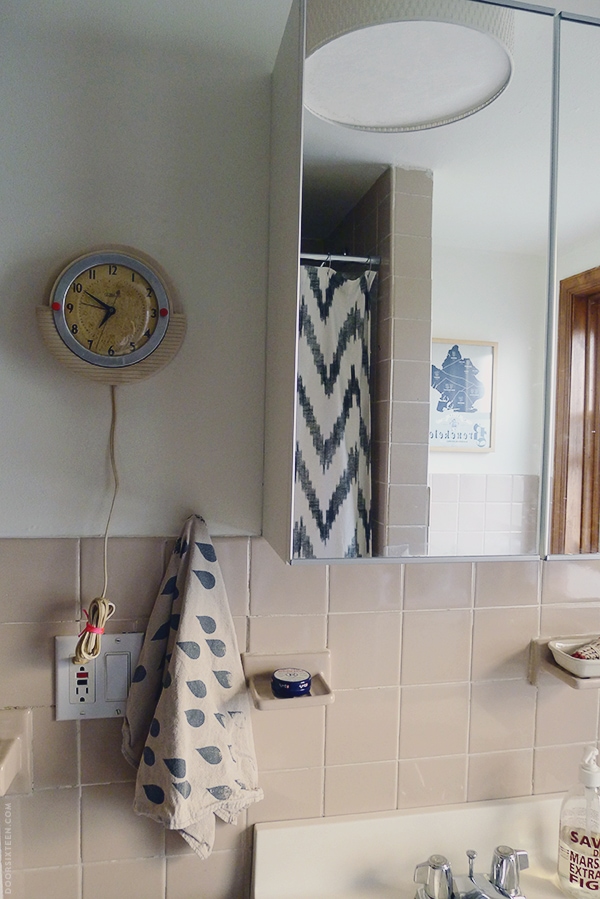
Yeah, this is as good as it gets. I decided to continue the dark gray color we’ve used on the walls in the rest of the apartment into the bathroom through furnishings (the hand towel, the shower curtain, the print, etc.) rather than painting the whole room. The ceiling in this part of the apartment is pretty low, and I don’t think dark paint would do the bathroom any favors. Dark gray and black have an interesting effect on tan, by the way — they manage to make it look more pink! My goal is to get this bathroom looking more ’50s than ’80s, but without getting too literal or kitschy about it. I just want it to feel vintage-y and not sad. I painted the walls Benjamin Moore Moonlight White (matte finish), which is the same white I used throughout my house. It’s very soft and warm, perfect for imperfect spaces.
Here’s what the bathroom looked like before we did anything at all to it…
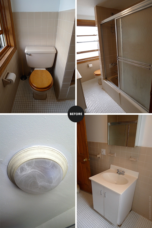
Two things are happening here that I absolutely cannot live with: A wood toilet seat and a sliding glass shower door. I really, really don’t understand why this type of shower door was so prevalent in American bathrooms for so long. What is the advantage over a shower curtain? The glass is a pain to keep clean, the tracks are traps for all kinds of nastiness and that bottom edge is just waiting to take a chunk out of your shin. Fortunately, they’re pretty easy to remove — take out a few screws, use a razor blade to slice through the caulk, pry off whatever needs prying, and you’re done. This was the very first thing we did on the first day in the apartment! Something tells me the landlord isn’t going to want us to put it back when we leave, but just in case, we have the entire door assembly stored in a closet.
This apartment had the entire array of builder-grade light fixtures in effect, including this marbled number in the bathroom. We replaced it with the ALÄNG from IKEA (scroll up to the first photo to see it!). It’s fine. I didn’t want to spend a lot of money and head clearance is at a minimum, so it gets the job done. I’m keeping an eye out for an inexpensive vintage fixture to replace it with, but I’m not obsessing.
So here’s where we are now…
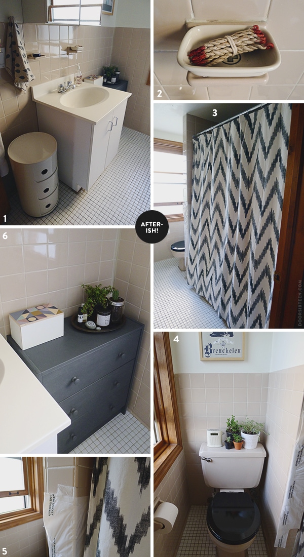
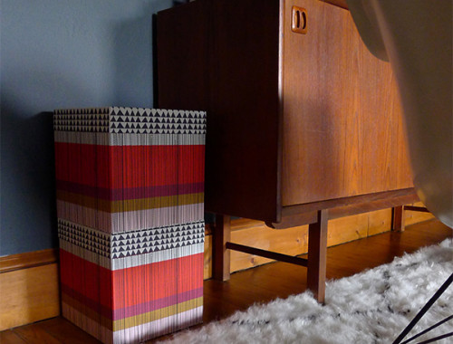
1. The hardest-working $29 scavenged Componibili around continues to be super-useful. I keep my hair dryer, straightening iron and other unwieldy implement in there. The raindrop hand towel was made by Satsuki Shibuya (sadly no longer available).
You can’t really tell from the pictures, but we replaced the mirrored medicine cabinet. The old one was pretty janky, and it was the kind that’s supposed to be recessed into the wall — except it was just floating on the surface with mirrors glued to the sides (?!). We put the LILLÅNGEN from IKEA in its place, and it’s GREAT. So much more storage! $70 well spent.
2. Does anyone use those tiled-in toothbrush holders for actual toothbrushes? Mine is holding the most amazing incense from Reliquary in San Francisco (thank you, Victoria!). The soap dish is from Izola (thank you, Ilenia!).
3. I picked up the shower curtain from West Elm a couple of years ago for our old apartment, and it’s finally growing on me now. I’m still kind of thinking about replacing it with this one from Ferm, but we’ll see. It is a MASSIVE improvement over the sliding glass doors, that’s for sure.
4. Why is the toilet positioned so weirdly? Dunno, but it looks better with a black toilet seat! I work in a 1930s-era Rockefeller Center building, and the white toilets (many of which appear to be original, incredibly) have these amazing black seats that I’ve always admired (hello to any coworkers reading this who are now giving me the side-eye). Just a little vintage flavor, if you will, but you probably won’t because who wants to use the word “flavor” in reference to a bathroom? Anyway, black toilet seat! I like it.
Oh, and the very cool No Sleep Til Breuckelen print is from Pop Chart Lab.
5. Here’s the plastic bag I taped to the wall to make the bathroom look even more authentically vintage! No. It’s there because some the tiles inside the shower are coming loose and need to be removed, cleaned and replaced, and I have to do it in stages. The entire tub needs to be re-caulked, too. It’s got that perma-mildew thing going on, which I won’t show you because I’m nice.
6. Those cheap little RAST dressers sure do come in handy when you don’t have a lot of space! We used to have this one inside of a closet in our last apartment. I painted it with Benjamin Moore Deep Space (the same color I’ve been using throughout the apartment). It fits so perfectly here, and it holds a TON of stuff.
My mother gave me that sweet Plint box from Ferm for Christmas, and I must say that thing is PERFECT in this bathroom. It ties together the wall tile color and the dark grays so well that it almost looks like it was painted to match the space. Doesn’t it make the tiles look pinker?
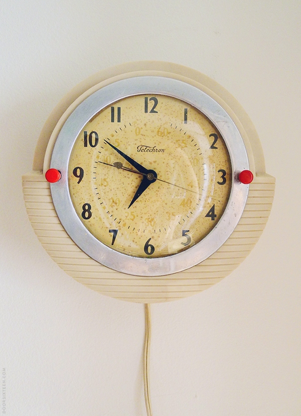
I just want to dwell on this clock for a minute, because I love it so much. I bought it for $1 at a stoop sale in Brooklyn about 15 years ago. It keeps perfect time, and it even has a 60-second timer built in. It was made for a kitchen, but I’ve always used it in bathrooms. It’s been in retirement/storage for a few years now, and it makes me really happy to have a place for it again.
There’s a whole website devoted to Telechron clocks! This is a 2H17 (the “Minitmaster”), manufactured in Ashland, MA, between 1945–1949. I love the internet.
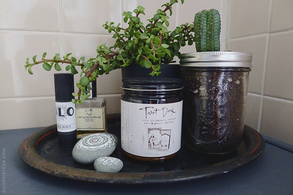
And finally, my favorite part of the bathroom! The vintage black tray was a gift from my mother years ago. My smelling-good things are Dark Wave from OLO Fragrance and Rocky Glen from Cold Spring Apothecary, which appears to be discontinued. The Tarot Deck candle is from Catbird, and it smells like “incense, Turkish rose and pencil shavings.” Yup. I like anything that smells like witches and/or my high school bedroom. The rocks — those beautiful rocks! — are our place cards (place rocks?) from Lisa and Clay’s wedding. Diana Fayt hand-painted 103 of them — you can read more about that on Lisa’s blog. (Diana has a shop for her painted rocks if you want one, too.)
What’s next in here? I’m not sure. A rug, maybe, but it would have to be just the right one. I’ve thought about adding a row of black pencil tiles to top off the tan, or maybe putting up some cool wallpaper — I think the gold Wilderness pattern from Ferm would look pretty amazing! Re-tiling the floor in a dark slate or black would go a long, long way, as would a new sink. I’ll see! It definitely needs some Moomintrolls, too…and more cacti.

48 Comments
I love the kitchen clock in the bathroom! I just sold a thrifted Telechron clock two days ago hat I had picked up at Goodwill but had no logical space for. It was groovy, but not as cool as yours. Of course, now I’m wondering if I could have used it in my bathroom.
Regret!!!
There’s a photo of it in this blog post:
http://thenonconsumeradvocate.com/2013/05/non-consumer-photo-essay-drool-worthy-storage-a-groovy-kitchen-clock/
Katy sad
Oh, that IS cute! I love the cut-out numbers. Maybe you’ll happen across another one someday…
Oh man, I am feeling for you on the Band-aid tiles. When I bought my first house, I thought it was painted beige, but actually it was Band-aid beige/pink (with almond trim to boot, gotta love the 90’s). The lighting was such that it was only bearable for an hour each day. The bathroom was sponge-painted the Band-aid with a pus-colored yellow/beige over it. It took about two and a half years before I finally eradicated all of it.
We are closing on a new house next week and I am immensely excited as it has the original 1960 tile in both bathrooms – one pink and one yellow. Not uber fond of yellow, but I can work with it (thinking a dark grey on the walls probably).
Sponge painting makes me sort of believe in the devil. It’s such a nightmare to cover up, too — there’s always that slight texture remaining even after you sand and prime.
Gray is definitely yellow’s friend! Hooray for vintage tile, and congratulations on the house!
I think this bathroom with yellowish tile makeover could interest you: http://www.apartmenttherapy.com/sharons-bathroom-before-after-120622.
Anna – I was scraping sponged-on paint off the crown molding and tile because besides picking hideous colors, they also didn’t know how to paint properly. But they didn’t sponge it on super thick and we have textured walls, so you can’t tell it was there before, thankfully.
Lena – Thanks for the link! It’s very similar to what I was thinking.
Your small changes really improved the whole thing a lot! The shower curtain, the black toilet seat, the painted rast, the pretty box….
Maybe you could add the rubber (?) thingy Dan has in his kitchen for the floor? Still kind of curious if a medium grey on the walls would work.
I thought about using that rubber stuff, but without any baseboard moldings to hold down/hide the edges, I think it would probably look pretty unfinished.
it is amazing what a few tweaks and accessories will do to a sad room, it looks so much better now.
My present rental apartment had those marble lights when I moved in – in orange and blue… I will be putting them back up when I move at the end of the summer into the art nouveau apartment I just bought and am making liveable, and then plan on fixing up over the next year(s). I am thinking I am inspired by your black toilet seat – a small detail that should be low on the list of things I need to do, but may bump up higher!
WOW. Orange and blue marbled lights?! That’s…really pretty bad. I can’t even believe that’s a thing!
You’re amazing Anna, i’m learning so much from you. I’m planning on buying a Victorian house some day in the future and i’ll be looking up your blog every day for answers to a variety of problems and fixes.
I’ve rented a lot of apartments but i’d like never dare to remove the sliding door shower! And you did that, wow! Kudos!
Thanks, Agnieszka! Removing those doors is a lot easier than it looks — it’s really just a handful of screws in the wall and some caulk holding the whole thing in place.
Agree completely on the sliding glass shower doors. The ones with textured glass are especially bad, in my view. Why turn down the opportunity to introduce a cool patterned textile?
I never would have thought of putting a dresser in a bathroom, but it looks right at home.
Yeah, that textured glass just looks perpetually filthy. 😛
I hope when you eventually recaulk the tub, you post about it. I need to do mine.
There are soooooo many great tutorials online for recaulking tubs already, though! I’ll probably take before and after pictures, but I’m not great about taking photos explaining processes — it’s too hard to stop and take photos when your hands are covered in goop. 😉
My toilet is in the same weird position. Why would any plumber do this?
I’m guessing the positioning of the drain pre-dates the tub (and the short tub wall adjacent to the toilet), and that they didn’t want to deal with moving that drain when the bathroom was renovated. Who the hell knows, though! People do weird things sometimes.
What amazing changes you’ve made to this space. I hate decorating bathrooms, and usually just leave mine functional. Yours manages to be functional and pretty! Love the gray dresser, the ferm box and the vintage clock. That toilet seat really does look better. I had a wooden seat in a previous apartment that drove me crazy, but I was too lazy to paint it. I just bought a new one. Wish I’d thought of that.
Next easy step is changing out the hardware on the vanity! Quick and easy fix for a much improved look. I purchased that same light fixture for our kitchen and cant wait to put it up.
your bathroom is looking amazing! i always love peeking into your home design projects. thank you so much for the tea towel shout out! it’s great seeing it in action.
WOW!! Anna, the bathroom looks soooooo good! I am forever in awe of your vision to turn something that is meh into something fab. You have the best eye! 🙂
p.s. Your mom gifts you the most awesome treasures.
You guys in the US are so lucky you can do so much with a rental, I’m arguing with my landlord over just painting a wall! Love the transformation, I normally hate shower curtains but you’ve changed my mind, it looks fab!
I don’t think it’s a US-specific thing, Anni, it really just depends on the landlord (and on your relationship with that landlord). I get comments from people in the US all the time who can’t even put a nail in the wall! Personally, I think it’s absolutely ridiculous that a paying tenant who has been vetted and paid a security deposit might be forbidden to make temporary changes (or permanent improvements, with permission) to a rental apartment.
How funny! I was so thrilled to move to Germany (from the US) because I could finally paint, after the years and years of California apartment living with boring white walls! Perhaps it’s more prevalent here because people often rent the same apartment/home for 20+ years. I don’t know why, but I’m so thankful for the difference in rental practices over here!
Totally agree, we´ve been making small gradual changes to gain our landlords trust and the house has improved a ton! …
Love your work! … at the moment we are also working on our bathroom and for the floor just ordered a few samples of this
http://bit.ly/15WeiRX
Hopefully it will look good!
Bathrooms and kitchens in rentals are always such a tough issue, but you’ve managed to make this one look not only livable, but fantastic! And I have been wanting that specific shower curtain for some time – which of course is no longer sold – so if you decide to get rid of it, you’ve got a buyer! I think it would look right at home in a Berlin apartment… 😉
Hi, Anna. Did you paint the toilet seat or just by a new one? If you painted, what paint, and if you bought, where did you get such a shiny black seat?
Thank you!
Tracy, I don’t think I’d recommend painting a toilet seat! It’s just a regular old toilet seat like you’d buy at a hardware store for $15-20. It’s not particularly shiny or anything — maybe the photo just makes it look that way?
Reading your blog actually gives me a new appreciation for the 1950’s that are so prevalent throughout my house! I went from loving my grey boomerang countertops, to hating them, to loving them again. But the powder blue tiles with snowflakes on them in my bathroom definitely need to go, yikes.
funny, we have the same tan-pink tiles in our current bathroom…and i have a chevron ikat kind of curtain! but in a brownish and not charcoal. it is what it is 🙂
We just moved and oh man, our bathroom’s are twins. And your’s is the much better looking one! ha. (Our’s also has some really hideous wallpaper:/ Looking into temporary paper for it, but not sure if that works over wallpaper.) This is inspiring!
wow – what an improvement. people should pay you to improve their places, rather than you paying rent!
Haha. If only the world worked that way, Jenny! 😉
Sweetheart! In Australia (and I doubt you don’t have it in the US because we’re always behind) there’s such a thing as both tile and bath/basin enamel paint – I used the tile paint at our last place & for the 7 years we lived there, not a single person ever realized I had painted the tiles (and trust me, they were worse than the tan)! Let me know if you need names of products.
Hi Karen, the tiles need an enormous amount of work (hence the plastic bag taped to the wall), and paint (or epoxy coating, which is a better option than tile paint for wet areas like showers and tubs) would really just be covering up a bad problem. I’d rather fix what’s here now and then think about doing a true renovation job down the road if we keep the apartment for a long time and the landlord is agreeable. I’m not a huge fan of cover-ups in these types of situations.
Such an improvement! I took the sliding glass doors out of my old apartment but didn’t think I could remove the tracks that easily, I just hid them with the shower curtain (these doors had textured glass in one and a mirror in the other- nothing like watching yourself sit on the toilet, ugh!) Are you allowed to paint the golden oak window? I know it matches the door, but it would go better with the rest of the room if it were black sashes and white trim.
Hi Elissa, I’m not painting any of the woodwork in this apartment for the time being — I wrote about that here, if you’re interested. 🙂
It looks great! I really need to redo my bathroom, now I have some great inspiration. Thanks!
I somehow missed this post the first time around. I just came upon it, searching through your archives for perspectives on how to deal with a bathroom rental. Which I’m sorely in need of at the moment. If you don’t mind sharing, what do you put your toothbrushes in? (I assume they’re hidden in the medicine cabinet…a feature that my bathroom does not possess. Jealousy.) Anyway, our toothbrushes have to be exposed on our sink, and I’m pretty sick of looking at our toothbrush holders. All the options I’ve found online are kind of heinous, so I’m interested to know what you use.
Hi Amanda, they’re just in the medicine cabinet in a cup!
Mine are also in cups. But the difference here is that the cups I use are ugly (albeit free). Blast. I was so hoping that you’d be all, “They’re in this gorgeous container that is also $2 and incidentally available at CVS.”
It’s just plain white plastic cup from IKEA. We’ve had it for years, and I doubt it cost more than $2. If you want to replace an ugly cup with something not ugly without spending money, just wash out a jelly jar when you’re done with it. Or spend 50¢ at a yard sale or Goodwill!
Sorry I don’t have any genius advice here, haha. It would never occur to me to care about what my toothbrush storage looks like. I’m not the kind of person to “style” the inside of my cabinets. 😉
What? You mean you didn’t know that revealing toothbrush storage is the most important part of showcasing a bathroom’s transformation?
Thanks for posting the before and after. I’ll be looking back at this post often, to remind myself that a rental bathroom can be enjoyed, rather than merely used.
I now have shower curtian and i hate it. It is white so washing is a must every 2-3 weeks othervise it gets dark seam, sometimes it sticks wet and cold to my body during showering. I hate it.
Before this I always had glas and adored it. But not the one you posted, more something like this
http://media-cache-ak0.pinimg.com/736x/55/6e/5d/556e5d7a503ef6e4494930e5799c161a.jpg
It took me less then a minute to dry clean it after showering with this:
http://www.pgm-gmbh.info/bilder2/Orca_Fensterwischer.jpg
Well yeah, ultra-modern glass showers are a whole ‘nother story! I still prefer a curtained shower, though, but that’s just my personal taste.
Are you using a shower curtain liner? I use mildew-resistant hotel-grade liners in my showers at the house and at the apartment, and I don’t have any of the problems you’re describing. I machine wash the liner 2-3 times a year, and the fabric curtain rarely needs washing.
Is shower curtain liner something like this?
http://www.organizeit.com/images/hires/hr_626-shower-curtain.jpg
If yes, yes I am using it. To be honest I don’t have any idea what else one could use to fix the shower curtian, but then again, this is my first experience with it. Mildew is not a problem, I never had some, there is huge window almost covering the whole wall and it is open – canted – all the time when I am home. The problem is that i love everything white and that really white peace of fabric gets dirty, I guess my cats help a little bit too. Curtian is also next to sink and removing or putting makeup, cleaning some strange things, it gets dirty. I don’t know, I am not THAT dirty, but I guess some body dirt sticks to the seam too…
But most important I don’t like the look, if I would like it – I would probably find all other aspects less bothering. Unfortunately in this apartment fixing the glass door is not possible. What makes me really sad.
Another question, is there an option to follow new comments after we commented some post? Thank you.
The darker colours that you added definitely help the bathroom look way cleaner and more appealing. I also like the plants that are positioned on the counters. It gives the room a nice accent.