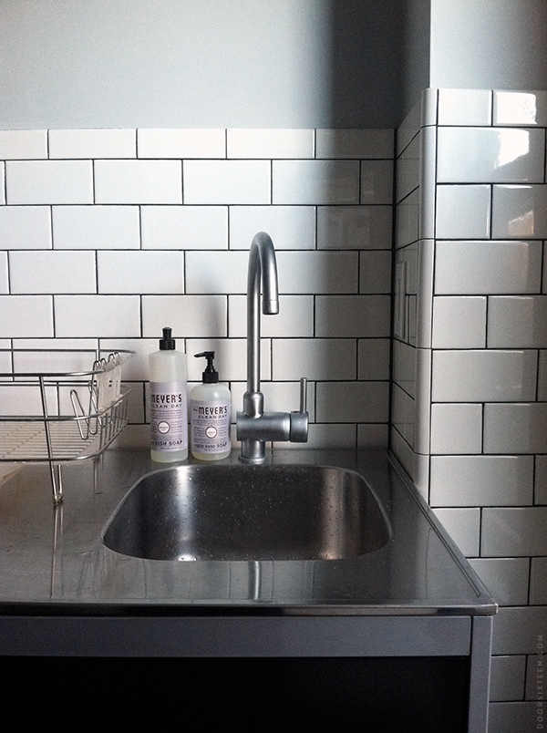
I painted the kitchen this weekend, and yes, I got just as bold and crazy with my color choice as you’d expect: GRAY. Valspar’s Filtered Shade, to be specific, in a matte finish. I had almost a whole gallon of it in the basement left over from when I painted the inside of a closet four years ago, so I figured why not give it a shot? The weather was cruddy and I have a sinus infection, so doing something indoors that required very little brain activity was about as much as I could handle.
At first I painted a square on the wall and thought it was too dark, but you really can’t tell from a swatch or a chip, you know? So I just went ahead and painted everything.
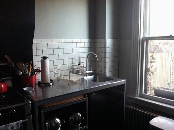
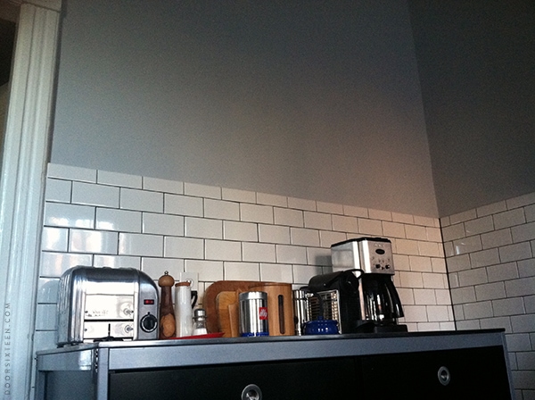
It doesn’t look as dreary in person as it does in these photos, I promise (not that there’s anything wrong with dreary). There was so little daylight left and I’d left my real camera in the city by accident, so these are just bad iPhone photos.
I’m really happy with the levels of contrast between the white, gray and black. It just all feels right. Filtered Shade has a bit of blue in it that really complements the inky-blue-black hearth (Benjamin Moore’s Soot) nicely. It also picks up on the color of the stainless steel counters.
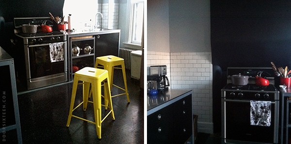
My bright yellow Marais stools from Industry West arrived, too! They look super cute in the kitchen…so bright and happy. I refuse to say “pop of color,” but they really are zingy. It’s pretty cool to see my whole kitchen plan coming together a little bit at a time. I’m already at the two month mark (or the seven year mark, depending on how you count) with this kitchen renovation, so every little bit of progress feels good.



63 Comments
Gorgeous! I’m in love with everything about this kitchen. You’ve done a magnificent job.
Looks amazing! Love the gray and yellow combo. I’ve never used that paint brand before….how was the coverage? How many coats did you have to do?
The coverage is great! I did two coats, but the first coat was about 95% of the way there—on smoother walls, one coat probably would have been enough. I didn’t prime, either. I usually use Benjamin Moore paint, and I’d say the coverage is similar to the BM Aura line.
This is the only time I’ve ever used Valspar paint. It’s the “ultra premium” line, if that makes a difference.
I’ve used Valspar also, both their normal version and the premium, and I can’t say I noticed too much of a difference between the two. Generally take about one to two coats without priming, depending on the wall texture and what color you’re painting over.
That’s good to know, thanks! I was pretty surprised by the quality, honestly, especially considering it had been festering in my basement for 4 years. If I had either been using a thicker-nap roller or if my plaster walls weren’t as unevenly textured, I think I could have gotten away with a single coat.
oh i love your kitchen. white subway tiles = heaven!
The kitchen looks fantastic! I love the grey paint with the white tile. I am definitely inspired to tile my kitchen now. It has been nearly a year since I moved into my Victorian, and it is time to finish the kitchen. Thanks for all the inspiration I get from your blog. I just hope my house doesn’t begin to look like a clone of yours! I truly admire your design sense; my own style is now morphing away from the eclectic bohemian place it has been, which I think was largely due to the fact that I had so many mismatched hand-me-downs of furniture, knick-knacks, etc. At age 41, it is time to refine my style to suit ME. Cheers!
It looks awesome!!! I love it, the grey is perfect. Where are you going to put Lisa Congdon’s wallpaper? Just wondering. Did you see the new stuff at Ferm Living for spring? There’s a beautiful black and white graphic wallpaper and 3 black and white/faded geometric pattern cushions that look very “Anna” to me!
The wallpaper is going on the wall opposite the sink/range—not seen in these photos 🙂
Ok, I see what you mean, it’s going to look so amazing!
your kitchen looks wonderful. i have a grey wall in my bedroom and love it so good choice 🙂 the yellow chairs are fab!
looking good! i love the paint color and the stools are so cute!
I thought your kitchen was nice before but now I can see how you are making it cohesive. not dreary: lovely. looking forward to seeing the wallpaper.
Love it! I just picked out Valspar’s linen for my kitchen….I will check out the filtered shade before i do anything!
you’re so right. i can’t believe how this outrage has gone on and on. DEATH TO “POPS OF COLOR”.
Hahaha. I hear it so much at work that I can’t bring myself to say it at home, too!
that and “moodboards” 😉
your kitchen keeps on looking better and better, I always love seeing your most recent project. Two months is not a lot of time to do all that work and in comparison, we have accomplished nothing from our list of home projects in that time. Hope you get better soon!
Death to “pops of color” – I second that!
The kitchen really is beautiful, though. The white, gray, and black are so comfy and homey to me.
It looks great! And isn’t it nice to use what you already have?
This is irrelevant, but I love the pull handle on your sink fixture — I just stared at it for a few minutes wishing I could turn it on. (But anyway, let me get to the point here.) Beautiful choice! It all looks so great together. Well worth the cliffhanger. 🙂
Perfect, I love it!
You poor thing! Didn’t you just get over the flu too? I feel like I get an annual sinus infection and they suck. Feel better soon! The progress you’ve made on the kitchen is stunning.
Yeah, I’ve kind of gone from flu to bronchitis to generic head cold to sinus infection. I think between riding the subway every day and working in an office building I’m managing to pick up every germ out there this winter…
Really lovely. I’m super impressed with the tile work. These old Victorian ladies would never approve of a “pop of color.” Good for you to ban the phrase.
Anna this is fabulous! Coming along really nicely. Please come and share your expertise when I move in the Spring? You’re overdue for a visit to Toronto, no???
I haven’t been to Toronto in over 20 years, so yeah, probably!! 😉
I think the gray looks absolutely GORGEOUS. So clean and welcoming…
Congratulations, beautiful work. Love the colours and the stools and it’s not dreary looking at all!
this kitchen looks truly fabulous.
Love it.
Your kitchen is gorgeous!!!! I love the subway tile and the gray walls. You never cease to amaze me. Also really looking forward to seeing your new apartment!
I do really love this grey. It pulls everything in the kitchen together. Besides that though, you need to get take care of yourself! Please give yourself a break and get well.
It’s kind of the perfect shade of Gray. LOVE the way your kitchen is coming together!
Looks great! Look forward to seeing the wallpaper. Incidentally, have you seen spoonflower.com? i keep seeing designs on there that you would love. You can order any of the designs as wallpaper, wall decals or any weight of fabric. Amazing!
Yes, I’m familiar with Spoonflower! I wish I had more walls, believe me…there’s so much wallpaper out there I’d love to use.
Your kitchen looks awesome! It makes me want to tile my kitchen with subway tiles too. The yellow chairs look great against the dark colors of the kitchen. See no “pop of color” used in this comment. Oh, well now I just did 😉
Unless one considers restrained elegance to be “dreary”, your kitchen is not!
And yes, thank you for NOT “popping” the color of your yellow stools.
BTW, that blind corner where you plan to provide a dog bed? Isn’t there some sort of lazy susan/rotating storage that could go there? Or maybe (probably) I have too much stuff in my kitchen and Anna is a lot more streamlined & therefore doesn’t need every square inch of storage that can be squeezed.
Your “new” kitchen IS gorgeous!
Haha! No, I don’t need the extra storage. Between the pantry (for food), the drawer unit (for utensils, placemats, storage containers, tinfoil, etc.), the roll-out shelving under the sink (for pots and pans) and the upper shelving we’re about to install (for dishes), we’re all set in that regard. If anything, I’ve found that having an excess of kitchen storage space leads to me holding on a lot of stuff that I never use…like an electric knife sharpener and a George Foreman grill, for example. 😉 It also makes it harder for me to tell what spices and other pantry items I have on-hand, so I wind up with 15 cans of chickpeas and no turmeric.
That space will do better as a doggy retreat! I’m going to install a slab of butcherblock in that corner at counter level, though, since the one thing I always need more of in my kitchen is WORK SPACE. 🙂
I love all the changes! I noticed your facet. I have been considering getting a higher neck facet for my kitchen. I like he functionality of fitting larger items to clean under it. (Drawers/shelves from my fridge, large pots, roasting pans…) Plus it looks super elegant.
I liked it until I saw the yellow stools and then I loved it. Just what the doctor ordered.
It looks absolutely gorgeous! I love the moody gray with the stainless, white, and black! And those yellow stools really liven up the space! 🙂
It’s perfect. I love that you just had that paint and didn’t have to agonize over chips and swatches. Wonderful! I’m smitten with your wee sink too. It’s pretty much the cutest sink ever.
jbhat
It’s looking beautiful, Anna! I have the same stools, but in a metallic grey. I really love them! I have 4 of them, but now that we moved to a smaller apartment, we are only able to fit 2 of them in the kitchen. Still deciding if I’m selling the other 2 or if I’m keeping them…
anna – love the tile (and the gray paint color)! quick question for you, where did you get the corner tile piece that can wrap the outside corner? i thought i had read that your subway tile came from lowes, but i wasn’t able to find that trim piece when i looked. i need something just like that in my bathroom…
thanks!!
I wound up getting the corner trim pieces at Home Depot, actually, and they’re a slightly different color. I used American Olean (Lowe’s) for the field tiles, and the corner piece is Daltile.
I’m sort of snickering to myself right now, though, because that’s not actually what that piece is intended for. It’s meant to go on the inside of a 90° angle (like quarter round), not the outside. I had to get pretty creative with shimming and using thinset in crazy ways, but I made it work for me. It took FOREVER and there were tears involved, but it’s definitely possible.
You’ll see what I mean when you buy one and test it out. 😉
thanks for the response, i’ll have to check out home depot. although the installation sounds not fun, maybe i need to come up with a plan b!
why is it that the smallest details always take the most amount of time (and usually tears!)
The smallest details are often the most important, though—that corner is now my favorite part of the kitchen!
that looks so great, and those chairs are awesome! I can’t wait to see, what you come up with next 🙂
but I wonder what kind of machine you have on the left in the third picture. looks a bit like a toaster but with a lot of buttons?!
Hi Becca, that’s a commerical 2-slice Dualit toaster. No buttons, just a switch, a dial and a lever to raise/drop the toast. It was a wedding present 9 years ago, and it’s the best toaster ever. 🙂
For some reason they have a second dial now instead of a switch, but you can see the whole line here:
http://www.dualit.com/products/classic-toasters
Ill admit I was a little unsure when I saw the test square on instagram but that looks FANTASTIC!!!
Looks fantastic great job!
I was following your progress on IG, it looks so good!
Looks lovely, lady!! I’ll bet that hint-o-blue in the grey really looks divine – and those stools are totally kickin’. LOVE! (I’m looking to do our kitchen fireplace wall in “soot” also, but my swatches are a thousand years old, and I’m worried it might be too “blue” for the black metal on the surround. Anyway, you’ve spurned me on – it’s doesn’t take forever, right? Ack.
Really, very nice, Anna. 🙂
*clapping hands* So stinkin’ awesome!
Love how the kitchen is coming together so far! I kinda like the dreary/brooding thing in a kitchen…it’s different from the white, bright kitchens I’m used to seeing. And those stools…they’re awesome…just…awesome!
hehe love the “not that there’s anything wrong with dreary” bit. beautiful paint though, light grey is such a soothing color to me.
WOW!! Prettyyyyyyy.
I still think I’d have gone for cream. But that’s just me! And i’d never be brave enough for these stools. ( I tend to get really sick of color choices very-very fast. I bought a red Paong at Ikea and went back to get the black cushion like 2 weeks afterwards)
But this photo ( http://pinterest.com/pin/47991552251319399/ ) makes me want to get maybe yellow lamps for on top of the sink, instead of a buzzing neon…when we do the kitchen.
Speaking of doing the kitchen, what are your floors? We are so clueless… we’re not feeling tiles, and we’re scared that cork will stain…
Looks very beautiful!
Hopefully you feel better soon.
I love it! The yellow stools and orange pots and pans really pull the room together. The gray looks great — yay!
The colour scheme here looks great. I also really like the metro ‘brick bond’ tiles, we have them at home too. How comes the top course of tiles is a half width?
It’s all about the light. Here in NC, I’ve had phenom success w/a Ben Moore color called Spanish Olive on kitchen walls. The color has green undertones – a French gray – that works well with the white cabinets & crown molding + stone countertops & sage/cream check shades on large pendant lights. I used the same color in a room on the opposite side of the house, where the exposure is southern, but shaded. In that case, it presents as a softly greyed sage green. As someone who has lived with warm colors – and lots of them – her entire life, this new palette (French grey, straw, cream, sage) is refreshing, modern, and yes – still warm & welcoming.
nice work I like the dark grout
Thanks again for the inspiration, I finally got round to painting my kitchen a similar light grey last weekend and it looks amazing – night and day compared to before!