Today I’m small on words, but big on pictures! After putting together my previous post about that amazing Swedish apartment, I got to thinking about how nice square tiles are—whether aligned in a grid or in a running bond pattern, and especially when paired with a dark grout. It’s a much more contemporary look than subway tile, isn’t it? So fresh.
Here’s a little collection of favorites…
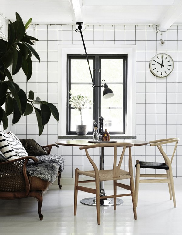
✚ Skåne home styled by Lotta Agaton and photographed by Pia Ulin for Residence Magazine (see more)
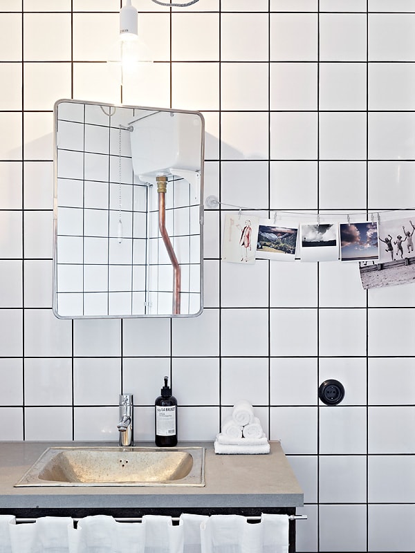
✚ Photo from a real estate listing at Stadshem (now sold)
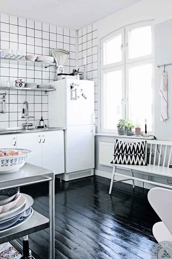
✚ Photo by Lönngren/Widell for Lovelylife
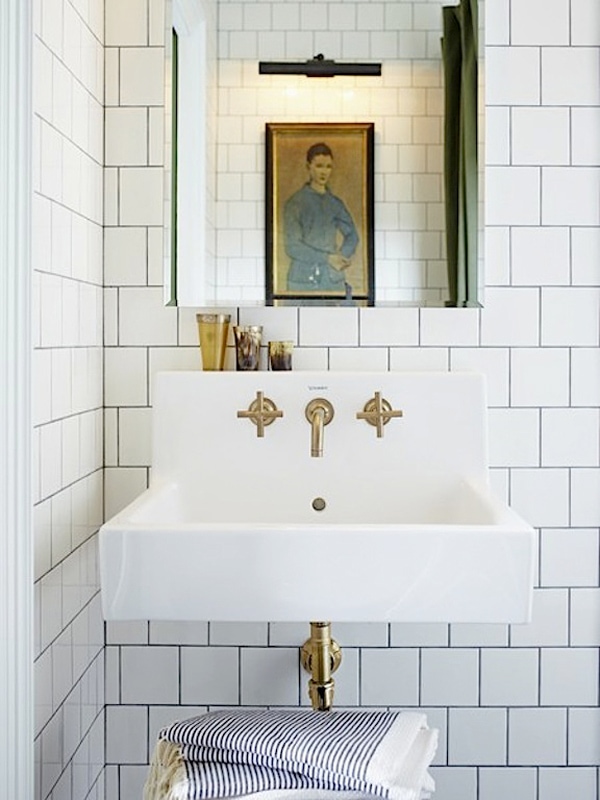
✚ Photo by Michael Graydon for House & Home
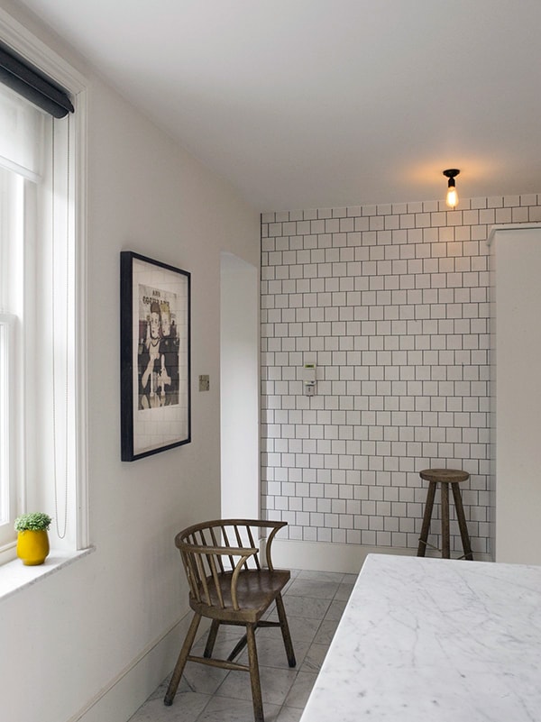
✚ London townhouse interior by Charles Mellersh Design Studio
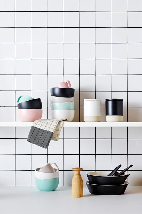
✚ From the Country Road 40th anniversary lookbook
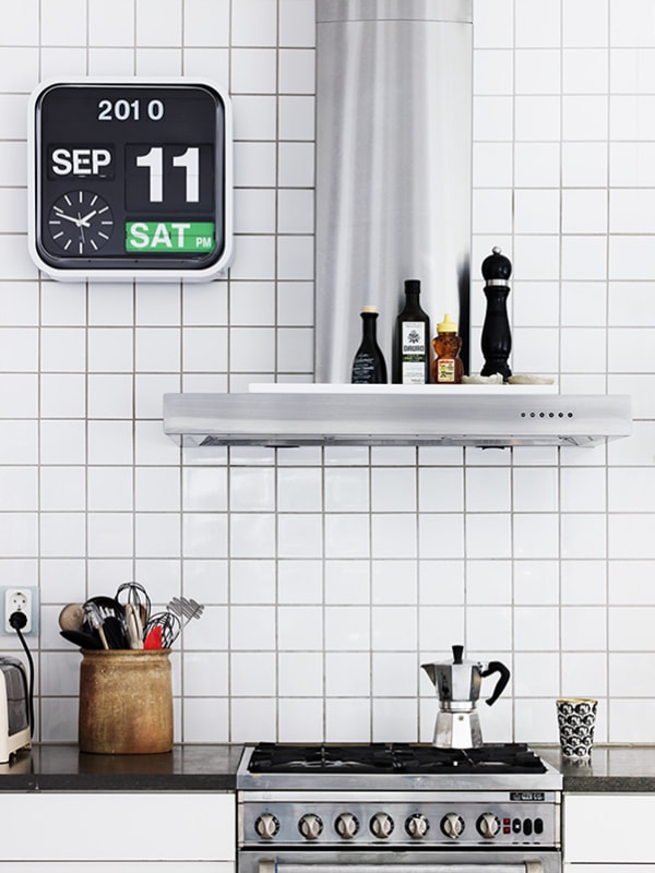
✚ Interior designer Nanna Lagerman’s home, photographed by Marcus Lawett for TrendHome
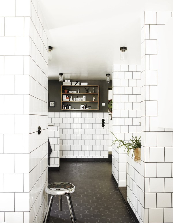
✚ Skåne home styled by Lotta Agaton and photographed by Pia Ulin for Residence Magazine (see more)


27 Comments
The dark grout really makes all of these pop for me. Love this modern take on wall tiling.
This is so chic, I just got inspired for my kitchen’s finishing touch. Xx
Totally inspired by this post to darken the boring white grout in my boring white-tiled bathroom. Love these!
Oh man, that last picture! I want to know the secret to making outer corner that flawless. Unf.
You know, I have white 4×4 tiles with black grout in my apartment kitchen… 😉
I know you do! I think you’ll recall I helped you put some of them there. 😉
I think the secret to make the corner so super-sharp is using a really good tile saw, and also flipping the cut tiles around so the factory edge is on the outside. (I bet if you were looking at that corner in person it wouldn’t look SO perfectly-perfect, though…)
Love white tiles, love white grout, however, unless square tiles are done with a running bond they look VERY 80s to me. And not really in a good way.
In Detroit we have a bunch of these 1950’s white box burger stands, all with white square tiles and black grout. I have a growing collection of Polaroids of these places. I love them.
http://www.agilitynut.com/eateries/miburger.html
WHOA!! Holy cow, they’re AMAZING!!
I love it too. A friend of mine actually tiled one of her bedroom walls. And it really works too: so cool!
Funny timing. My husband and I are working on the drawings for our kitchen renovation / dining room
addition and I’m showing square white tiles in a running bond pattern on the wall.
http://www.thirdstoryies.com/2014/05/13/im-doing-it-again/
I love the look. It reminds me of the glazed clay bricks in our neighborhood – in former dairies and corner stores.
One of my favorite images that I thought I might see in your roundup is here: http://www.thirdstoryies.com/2014/04/14/kitchen-material-inspiration/
It’s a really beautiful look.
Can anyone name the flippy Helvetica clock in the Nanna Lagerman photo? It’s so unapologetically practical and dorky, green weekend day and all. I love it.
Michelle, yes, I have the same one in my kitchen! I wrote a post about where to get it a while back:
http://www.doorsixteen.com/2013/04/01/field-report-karlsson-big-flip-clock/
My kitchen is tiled with square white tiles and dark grout. The backsplash AND the countertops. It looks like a bad gas station bathroom. And just to make it worse, half a dozen of the backsplash tiles have little flowers on them. It’s a late-80’s nightmare.
After reading this post I took another look at my kitchen, trying to envision it as chic and modern. Maybe if I stained the cabinetry black? Maybe if I replaced the faucet with a brass one? Maybe when I install better lighting? Maybe if I mop the floor?
But no. Apparently there is a time and a place for everything, and my kitchen is not the place for square white tiles. Thank you for showing me how great they can look when used well!
It’s all about the context, I know! (“Maybe if I mop the floor?” made me laugh…)
You are making me feel so much better about my square white tiled, dark grouted kitchen counters. I’ve always read them as 80s.
Ah I ADORE square white tiles. This is an excellent collection, thanks!
Nice interior designing and interior furnishing!
Tiling with square tiles and dark grout next weekend! All the materials are allready in so I’m excited to see this post pop up just now! 😀
I’m another one where all I can see when I look at stacked square tiles is my childhood bathroom (even though those were chocolate brown tiles with white grout). Scarred for life, I guess!
I love back and white but last year I did a bathroom with square white tiles and yellow grout for a client and it looks amazing too!
What is that soap? In the black bottle – photo 2 and 3? Want it.
This bathroom looks awesome! Practically speaking, I would use it as one giant dry erase board since thats where all the best ideas happen!
The faucet…. I read in another blog (I cannot remember which and I’ve searched several of my regulars) where the blogger bought a nice chrome plated faucet and had the chrome removed to reveal the unfinished brass. Genius! Probably SOOO much cheaper than buying brass to start with and just as nice in the end.
Anna, check out the post that inspired this one—there are several examples of what you’re talking about in the comments. 🙂
Wow – nice! I am a brand new reader of your blog – love it! 🙂
Thank you, Anna! Welcome. 🙂
Hello, love the tiles in the last photo! Do you happen to know what the sizes are of
Those tiles? Currently doing bathroom and kitchen renos and would love to do tiles just like that! Thanks!!