Our house has 4 fireplaces, 18 doors, and 15 windows. This makes for a bit of a challenge when it comes to decorating, as there are very few expanses of uninterrupted wall space large enough to put a piece of furniture in front of. Coupled with the fact that D16 is a row house (attached on one side; with long, narrow room), it becomes very hard to integrate modern furnishings (TVs, large sofas, queen-sized beds, etc.) in an arrangement that makes practical sense and which complements the layout of the house. Did I mention that the house also has a curved bow front with three side-by-side windows? Another challenge!
I get excited when I see photos of houses with similar layouts to D16, and I always make note of how they’ve dealt with their fireplaces and windows and doors. Today I came across this house in the New York Times real estate section, and my heart did a little flip. While our house may not have cost $1,725,000 (!!! it’s still amazing to me that just going 60 miles upriver makes such a MASSIVE difference in cost, but that’s another post), it does have virtually the same layout in the living room (excuse me, the parlor).
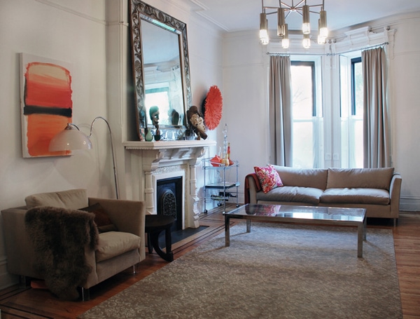
Photo via the New York Times real estate section
I love the sofa in front of the window! And the chair next to the fireplace! The best thing about finding these photos, though, is that I now know the right solution for the windows: half-height sheers for daytime privacy (and sunlight), with heavier full curtains on rings to easily pull closed at night. Perfect! And the rods should be mounted in the moldings, not inside the frame. I’ve been grappling with this problem for over a year now. Yay!


3 Comments
i can really sympathize. our count is actually 22 windows and 10 doors for our main living space (46 windows and 17 doors for the building). it’s lovely as far as letting in the light and opening up the space, but it has been quite the nightmare for furniture and art placement. when you have multiple rooms with 3 doors and 3 huge windows for each, there’s just not a lot of options. sounds like you’ve found some good inspiration to help you with some ideas.
This sofa looks just like the IKEA Stockholm you show in your next post. Of course, it isn’t it, but they are very close. Maybe it’s a sign?
Very nice looking room.