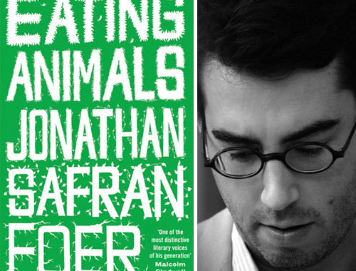
I love this! Carnivores & Destructors is a new, limited-edition Morrissey fanzine put together by Adam Krause at Pau Wau Publications in Brooklyn. It makes me happy to know that the fanzine is not obsolete! They had a Michael Jackson fanzine, too, but it’s out of print, unfortunately.
(Did anyone else used to subscribe to the long-defunct, brilliantly-named Morri’zine in the late ’80s/early ’90s? I still have every issue.)
Now, about the changes around here…
Yes! There may be a few more tweaks over the next couple of days, but I have finally given Door Sixteen a design overhaul. Aside from the design, these are some of the new features you might have noticed:
Featured blogs. Following a discussion about the effectiveness of blogrolls on Twitter a few nights ago, I decided to do away with mine completely. By featuring just four or five blogs every month, I’m hoping to bring a little more attention to each one rather than letting them get lost in a sea of links. (Check out my October selections!)
Social media sharing buttons. I resisted adding buttons to facilitate sharing posts on Twitter and Facebook (and some other places I don’t know anything about, like Digg and StumbleUpon), but the time has come for me to give in. I use Twitter constantly, and I know I like when the blogs that I read have these buttons (URL shortening is built in!), so…there you go.
Gravatar support. If you’d like your image to show up next to your comments on blogs instead of a yellow dot, visit the Gravatar website and get yourself a globally recognized avatar. This is entirely optional, of course, but it’s fun. Your avatar will show on any Gravatar-enabled blog.
Threaded comments. I don’t know why I didn’t do this sooner! Now I can reply directly to specific questions in the comments, and you can reply directly to other commenters, too.
Wow, I feel like I’m finally caught up with all of the latest features…from 2008! Please let me know if something is looking weird or not working right (and I’m not talking about Fritz).


38 Comments
I love it. Your solution to the blogroll conundrum is a happy compromise, too.
Loving it! The look totally says Anna!
looks great! love the new banner and concur with all your ‘assessments’ – you smart cookie, you. 🙂
now…i need to go re-design mine. again. 🙂 xo
Great job! Liking the new features… and I’m working on my own blog release soon, so this is some good motivation as well.
Looking awsome over here. Love the heading.
Have a good week. 🙂
Anna – It’s looking terrific.
I really like the grown-up header.
You should set Helvetica as your default header/body text typeface and set Arial as secondary. Save our mac eyes!
Done. 😉
Ahh…brilliant.
it looks great! love that you carried your theme of raindrops/teardrops.
love the new look! it’s subtle but just enough tweaks that it looks/feels fresh – and it still feels like “you/door sixteen.” i love the addition of threaded comments (that’s something i’m trying to figure out how to get onto mine…darn blogger platform…) and will have to go get an avatar now…
& thank you so much for including my little blog as a part of your featured selections for october! wow – that is such a huge (but pleasant) surprise! off to check out your other featured bloggers (a quick look tells me 3/4 of your selected are Canadians!…I think that means you should take a little visit up here 😉
I haven’t been to Canada since I was in high school!!
I lived in Canada for a year, and was granted “honourary citizen status” by my close born-n-bred Canadian friends. So TOTAL CANADIAN DOMINATION, sort of. 🙂
ps- AM I the first not-Anna to break in the threaded comments? I feel like a pioneer. The site looks so damn hot, I can’t get over it.
Looks splendid Anna! I’m glad you decided to keep a mini rotating blogroll…I love seeing what others read. Also, did you plan the little yellow dots for people without gravatars? Love the attention to detail. It’s the little things, right? 😉
Yes, the yellow dots are intentional. 🙂 I didn’t want to have a big G or a “mystery man”, so…
I love your blogroll idea as well as the threaded comments. Seems obvious, yet hummmm.
looks great, anna! i love the new header.
I love the yellow dots. Random, yes, but it’s very clean to have a uniform image for those of us who forgo Gravatar. Love the layout!
On my screen the yellow dots have a slight black shadowy-ness in the upper left. I was wondering if this was intentional?
Yes, the shading is intentional!
I love it…but I miss the OWL!
Do you mean the ad-free owl? I never actually had that—I just used the talk bubble portion of the logo. No owls here!
Absolutely LOVE the type treatment in your header image. Great update, Anna!
I love the header, Anna! And the blogroll is a great idea! xoxo
Love the new look and feel – the header is perfection!
It’s cool, yay. I hate it when a design I love has to change so was all set for a little sulk. You’re a fabulous typographer. It’s great to put faces to the regular names on the comments box too. Hello everyone. A teeny tiny thing Anna beloved – just IMO – is it possible to keep the smart yellow dots but lose the circular shape of the avatars? Paranoid about (lack of) cheekbones, hence the pre-kids pic 😉
Ha ha!! The circles are staying. We’ll all just have to put our vanity aside! 😉
Le sigh, we must we must.
Looks great! 🙂
Thanks so much for posting a link to my project. The remodel looks great!
Love the new redesign and all the features! I especially like your monthly featured blogs – I don’t really use Twitter much so this is easier for me to see some awesome new blogs.
I just had some fun popping through the featured blogs and wanted to share that mjölkshop on kitka design toronto reminds me a lot of Canoe (also a shop) in Portland, Oregon (canoeonline.net) which I just got to visit for the first time in person a couple of weeks ago. Sadly, they don’t let you take pictures! They also give every customer a little bag of Haribo bears with each order. Brilliant.
Second, I love the idea of a drop-down month archive. It’s something that I’ve always felt takes up too much space on my own site. I don’t know if it’s a new feature of if it has always been there, but it’s a nice touch just the same.
I’ve been using the drop-down archive menu for about a year now—I implemented it once the list started taking up too much real estate! If you’re using WordPress (which it appears you are) that option is built-in—just go to the archive widget and change the setting. 🙂
while you’re at it, do you think you could add an ‘older post’ ‘newer post’ link to the individual posts? that would be super awesome and would eliminate the only thing that i slightly didn’t like about your blog.
btw loved the old style and love the new one. yellow dots always remind me of yayoi kusama and make me go “awwwww!”
Good suggestion! I’ll try to do that tonight. 🙂
Being a HUGE Morrissey fan since I was 16 I am very excited to see there is a new fanzine to add to my collection! Did you collect yours bit by bit or like me did you get all the older ones in a big packet? I’ll never forget the day my bundle of Morri’zines came in the mail-there was a huge snowstorm and my sister and I bundled up under blankets in the living room and devoured them all afternoon.
I think I subscribed in 1991 or 1992, and then ordered the back issues from Nicole all at once. 🙂
i’m a vegetarian and a morrissey fan, and i just thought this spoof was too cute and
funny…maybe you will like it too?
HAhhah, that was terrible…and hilarious! 😀