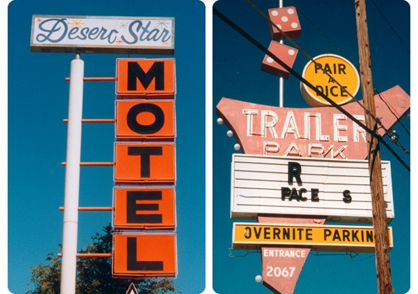
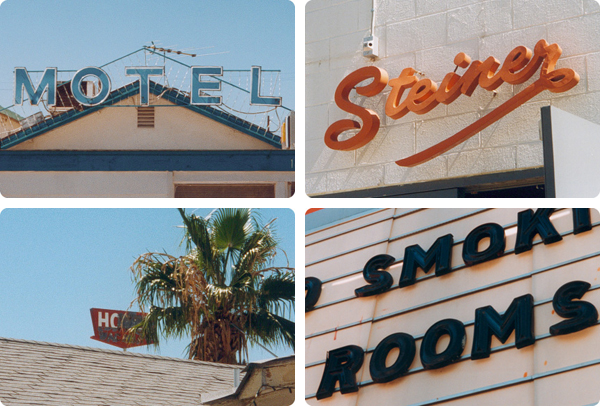
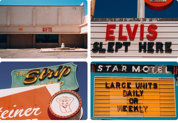
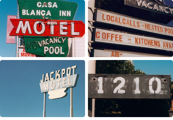
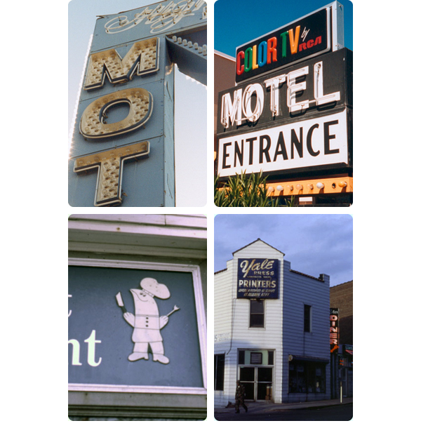
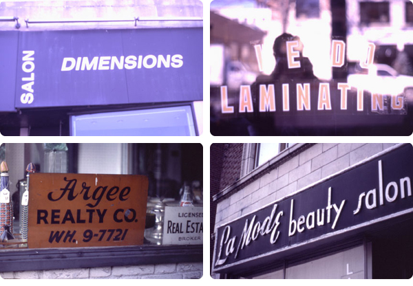
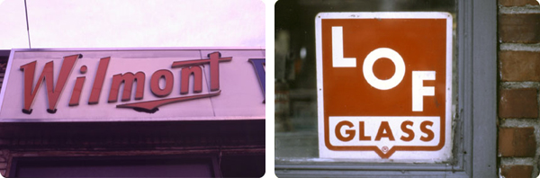
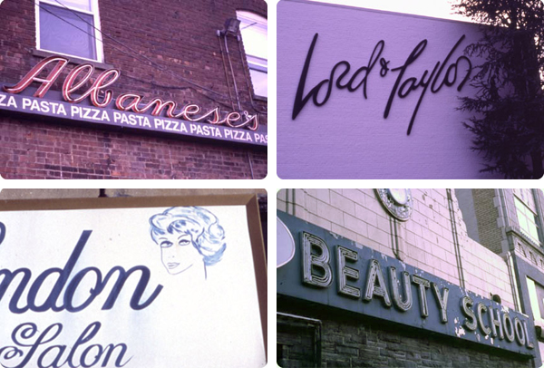
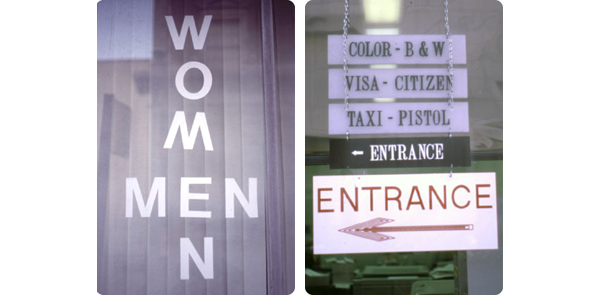
When I was in art school, I had a great professor, Bill Deere, who encouraged me to take notice of “environmental typography”—everyday type on the street, whether good or bad. Salon windows, department store logos, menus, information systems, and so on. He wanted me to think about how design relates to environment, and how typography can dictate first impressions.
I started taking photos of signs in 1996, and quickly got hooked. I continued until 2002, which, not coincidentally, is when I got my first digital camera. It’s not that I think I was ever a particularly good photographer, but when I was using a cheap film camera, I seemed to think more about composition and angles and such a whole lot more. Somehow the instantaneous nature of digital photography (not to mention how inexpensive—free, even!—it is to take shot after shot, do-over after do-over) has made me much more careless. That’s my own shortcoming, though—I don’t blame the tool or the format.
While looking for something on an old backup drive earlier today, I came across a folder of scans of my old sign photos that I had posted on my old blog, Absolutely Vile, back in 2001. They’ve all been resized to be quite small, unfortunately (hey, I was working on an 800×600 monitor back then!), and the corners are rounded (how very early ’00s of me), but seeing the photos made me feel happy. Happy and inspired.
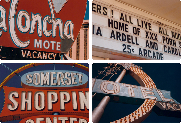
Most of these pictures were taken in and around White Plains, New York and Las Vegas, Nevada between 1996 and 1998.
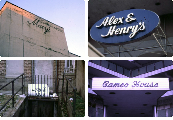
25 Comments
Anna,
Seeing these photos is like stepping back in time, they’re incredibly nostalgic. The motel signs are the best – they remind of family vacations taken during the 1970’s. Wow.
~Pam
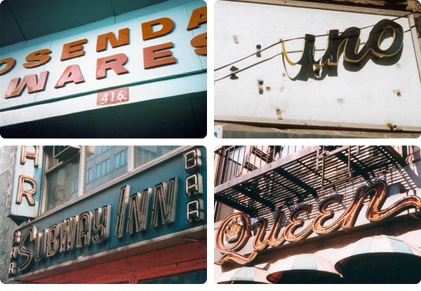
These are great! One tiny thing I would point out- the one on the top of the second set is from Rosendale Wares in Rosendale, New York, about seventy miles away from White Plains. It’s still there but I the store has changed owners a few times since 1998 and I think the new owners have changed the color somehow. The Queen sign, below and to the right, is if not the same at least identical to the sign from the Queen restaurant on Court Street in Brooklyn Heights. (I guess it’s possible there’s a Queen Restaurant in White Plains too). I’m amazed to see both of these signs together, I love both of those places.
Wow, Chloe, you have an excellent eye!! I’m impressed. That is indeed Rosendale Wares (I haven’t been there in years, unfortunately)…and that is most certainly Queen of Court Street! It was because of those two photos that I said they were taken “in and around” White Plains (a few were taken in Scarsdale, too). I didn’t foresee anyone actually recognizing the locations. 🙂
How cool that you identified them so quickly!!
I’m glad someone else thinks the Queen sign is as awesome as I think it is! The new version of Rosendale Wares is worth checking out if you’re ever up that way. I feel like the sign is now white letters on a red background, but I’m usually going through there at night on my way from the bus stop in Rosendale so I might be seeing it wrong.
as long as Chloe started the game, isn’t the Subway Inn the bar on like 63rd in the city?
photos are awesome and remind me that i have the same problem. my film photography is so much better. the post might have inspired me to drag out the film in the fridge and start taking photos. i should start lugging my camera w me more.
Oh shoot, I think you’re right!! In my defense, I took a LOT of sign photos in the mid-late ’90s, and I haven’t archived them in any kind of meaningful way.
I’ll amend my post slightly. 😉
(By the way, Subway Inn is one of the most disgusting/amazing/perfect dive bars in the whole world. I’m not really a bar person, but that place is the real deal…)
totally agree. whenever i was up there i would try to swing in for a drink if i could. have to say i also miss the bar at Macy’s in the basement. that place was always amazing for people watching.
I like these a lot, the colors are wonderful. : )
I remember reading that you’re a fan of Rauschenberg; I saw a fantastic show of his work today at Gagosian in Chelsea, 522 W. 21st.
The gallery said it’s up until 12/18 but the website says 1/15, hmmmmm.
http://www.gagosian.com/exhibitions/2010-10-29_robert-rauschenberg/
Have a good weekend!
-jcs
These are very very cool.
i absolutely LOVE these, anna! d. and i always threaten to take our drives to the coast slow and stop to take pictures of signage and such in all of the little small run down towns we pass through, but haven’t yet. have you seen the journal of urban typography? i always find it super inspiring… http://tjout.tumblr.com/
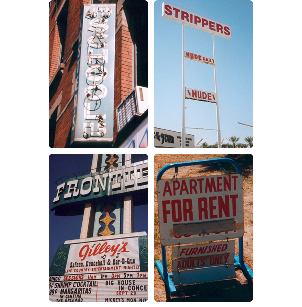
Wow! What a fantastic collection, Anna! I laughed a little at “Nude Daily” – I’m going to start saying this to myself every time I take a shower.
I love old signs! They are so much fun!
Love the sign pics and study of typography.
On my other blog (not my home improvement blog), I have a signs feature of mostly old signs in Oakland, CA.
i’ve noticed i have a natural interest in sign styles, now i have a name for it, “environmental typology”. thanks! maybe i have some artist in me after all.
These are great, Anna. (I think the rounded edges are charming.) Have you seen this site? http://chicagotype.com/ — Lots of fun Chicago typography.
I used to maintain a blog that focused mostly on Googie architecture in Orange County, CA but also had a lot of great old sign photos. Check it out, if you’d like. 🙂
http://googier.blogspot.com
OH!! Pictures from Eastchester! My hometown. Oh, Albanese’s – how I miss you!
Mr. Albanese was my 8th grade history teacher.
beautiful.
Makes me wonder where our national taste in fonts has gone.
I love these!! What a fun thing to keep track of over the years…and the old type is so cool when you take time to notice it.
Thanks for sharing!!!
Huh, I spent my first semester of college (Fall 93) at Purchase. Were you there then? Great photos btw. I love typography and signage especially.
Yes, I was! That was also my first semester. 🙂
You may just love fonts and signage even more than I do!!!
Wow! Very nice pictures! Im very amazed how different signs look in America and Europe! Its intersting that designs are so “regional”! I also recognise that in book cover designing!
Greetings from Austria, Ruth
I love these, in this format, art for everyone.
nice collection…
and I would say that it’s an unusual hobby 🙂