Yeah, I know, I design books (oh, woefully outdated portfolio…sigh), but sometimes I design other stuff, too. Aside from the wedding invitations I mentioned the other day, I’ve also been working on a few blog design projects, too. I’m having so much fun! Here are couple I completed recently…
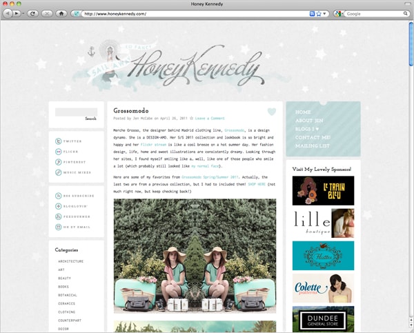
Jen McCabe from Honey Kennedy is fancy. Like, really fancy. She’s girly and frilly and loves vintage nautical imagery, and she needed a blog design to reflect those sensibilities while still providing a clean, orderly environment in which to share the work all of the wonderful designers, photographers, and other prettymakers she regularly features on her site. Jen seems to know about stuff before everyone else—her blog is so well-curated (if you’re not reading it already, you should be!), and I couldn’t be happier that she now has a site design that suits her.
Working with Jen was a joy. She really knows her personal style and has the same eye for detail that I do, and there’s nothing more rewarding than helping someone to turn their vision into a reality. I know that sounds cheesy, but it’s true.
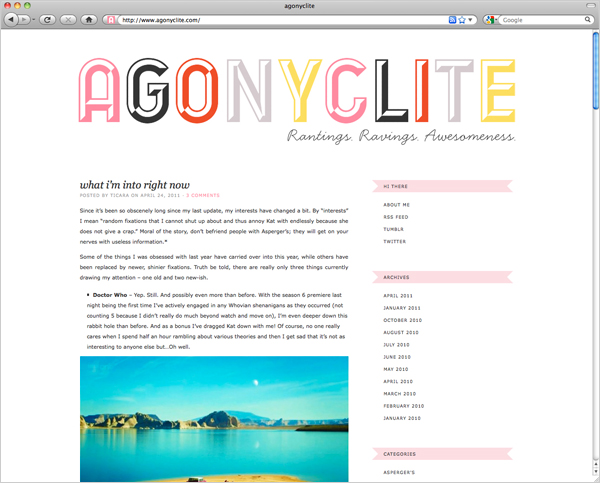
My friend Ticara recently returned to blogging at Agonyclite after taking a few months off, and she wanted a new look to go with her fresh start. Ticara’s blog tends to be on the personal side, and she didn’t want a bunch of bells and whistles—she really just needed a basic blog design that complements her style. I decided to go really bold with her logo because the word “Agonyclite” is pretty compelling (I kept reading it as “agony lite”—which is kind of hilarious, but no, here’s the real definition), but I tried to keep it looking fun and feminine, too…just like Ticara.
Thanks, Jen and Ticara, for trusting me with your blog redesigns!
53 Comments
Lovely. You are always an inspiration.
I dig the nautical theme to Honey Kennedy. The washed out look is really cool, and doesn’t distract from the content. When I first saw it the other night…I was looking at it on my laptop, and thought it was almost too light – but on my desk top machine it looks fantastic.
i am humbled by your creativity and ability to execute it.
Thank you, William, that’s really nice to hear.
The “washed out”-ness of HK is most definitely intentional. I wanted to make sure that her content always comes to the foreground and that the design recedes (while still being fancy!), almost list it’s underwater or in a foggy sky.
Completely agree with William. Anna, your designs are so inspiring, I’ve never seen a blog header or design on any of your sites that wasn’t so original and provoked me to say, “how did she come up with that?!” As an aspiring freelance web designer, seeing what you do has made me look to pursue more education in the field and try to harness some more creativity!
I have ZERO education in the web design field (it wasn’t really an option back when I was in design school—everything was pretty rudimentary at that time), so it’s all just been learning-by-doing for me. My background is entirely in print, and the thought process for the web is very different. It’s weird not to have a tactile object at the end of the day!
That is so cool! I know you’re a super busy lady but it would be fascinating to hear how you went about learning the new medium.
:)Alana
I’ve been blogging since around 1998 and I’ve had a LOT of various types of websites along the way, so I kind of had no choice…I wanted to know how to make a website, so I made a website and learned along the way. There’s really not much more to it than that! No magic secret other than learning how to apply my abilities as a print designer to the web…and I don’t think that’s something I can verbalize. 😉
There’s a LOT that I don’t know how to do (which is where my husband can step in and help—he’s a technologist), and I definitely don’t consider myself a programmer by any stretch of the imagination, but I am very comfortable working with Wordpress and, of course, confident in my ability to be a good designer.
Oh I was more referring to graphically — the typography choices you make and the graphic design and all. I know designing a website is different that designing for print, but in many ways it seems to be an intuitive thing (for example, designing business cards seems very similar to designing a header, to me). That’s more of what I was referring to. I love the way you manipulate type!
You rock! How much do you charge for blog redesigns?
It really depends on the scope of the project, since every site is different. Email me if you’d like to talk! 🙂
Wow, they are both gorgeous! I especially like the 2nd one – it is so me. Do you do redesigns for Blogger templates or just Wordpress?
Becca, unfortunately I don’t have any experience designing/developing for Blogger (or Typepad) at this time—I’m a Wordpress gal. They each have their own language and limitations that I’m totally unfamiliar with. Sorry! Maybe someday 🙂
Thanks so much for answering me! I’ll have to check back with you in a few months 🙂
I really like the header font you used for Ticara’s site. And the colors you chose work beautifully! Congratulations on two awesome projects complete.
these look so great! you are so talented.
wow anna! the second one is so superbe! is the font in the header for Ticara’s site designed by you?
Oh goodness, no, it was designed by Dutch typographer Coen Hoffman.
those look great! as always, inspiring.
Wow! These are super pretty. The second one makes me think of gummy candy!
Mama Biscuit’s site is still my fav look! where do you get these cool fonts? from dafonts.com? and how do you put the colors in the fonts? You do amazing stuff!
I didn’t design Mamma Biscuit’s site, cajeta—she’s not my dog, she belongs to a friend of mine who is also a designer.
I don’t usually use free fonts. I usually shop from MyFonts, You Work For Them, and House…but I have a MASSIVE font library that I’ve been amassing for more than a decade now. I do all of my design work in the Adobe CS suite (InDesign/Photoshop/Illustrator).
Anna, both blog redesigns are fantastic but the feel, mood and palette on Honey Kennedy is really beautiful! I especially love the font for the text within that blog! It’s great work!
xoxo
Mamma Biscuit
Thanks, Mamma Biscuit! You know I value your taste…with such a long tongue, who wouldn’t?!
These are BEAUTIFUL. Your design for Agonyclite is so perfect and simple. I love the little pink banners and, well, absolutely everything else.
I’m saving up both the money and guts to email you and ask you for a blog redesign. I’ve messed with my little free wordpress theme as much as possible and I just, I can’t go on like this.
P.S. Are you going to the National Stationery Show and/or ICFF next month?
Don’t feel like you need GUTS, Emily! I’m actually pretty nice. 😉 (Also, FYI, when Daniel and I moved Manhattan Nest from wordpress.com to wordpress.org, the whole process was really smooth and painless—don’t be scared of making that transition!)
And no, I never go to anything. Sad but true!
It might be rude to jump in, but I really encourage you (or anyone) to email Anna. She is ridiculously kind. She is also thoughtful with her pricing, too. Seriously. Do it.
Thank you, Jules—that’s really nice of you to say. 🙂
anna, these are lovely! i learned “coding” a few years ago, but with all the javascript and interactivity and constantly changing platforms it just doesn’t make sense to build from scratch anymore, especially with engines like wordpress that make it easy for your client to use your design and update the content themselves.
i have one question though, how do you find/decide on what javascripts to use? there are just so many, and i find digging through the jquery options overwhelming, sometimes to find once installed, it doesn’t do what i’d like!
do you have any go-to scripts you would recommend? for search, galleries, interactivity, or just plain better functionality?
ps nice to meet you! 😉
I learn everything from Google, and I ask my husband for help when I run into trouble. 😉 He’s a technologist (and started out as a coder/developer many years ago), and he’s much smarter than I am! If I can’t find the script I need to do what I want, he can usually take care of it.
so nice to have a handy husband!! 😉
it’s a bit of a comfort just to know there isn’t a secret. thanks!
I’ve been following your web work. It’s lovely. And it’s really neat to see a print designer transition so effortlessly into designing for the web. (For some reason it seems like a difficult transition for a lot of designers–not in your case! Helps to be involved in the medium, I guess.)
Thanks, Anne! I really don’t think of it as being a transition though, really—I’ve been making websites for almost as long as I’ve been designing books (I made my first website in 1998), but the difference is that I’ve never really don’t websites for clients until recently. I really do think of myself as being a PRINT (yes, all caps!) designer and specifically a BOOK COVER designer first and foremost, but I’m finding it very rewarding to take on some projects that are so removed from what I do all day long at my job-job.
It is a very different mindset though, yes. When I design for print I’m really thinking in terms of the finished project and how it will look when it’s a tangible object, and it can be hard to let go of that and actually think of a website as being a THING.
Oh hey, that second design looks AMAZING! Not biased or anything, just sayin’.
😀
I appreciate the “paper touch” you got for Honey Kennedy’s site, it’s hard to get textures like paper and water colour to look right in web design, if you know what I mean.
I have to agree with everyone that these are really inspiring and beautiful. My first thought was, oh, I should contact her to design a blog but reading all the comments you may have inspired me to try the Wordpress and try it on my own! Eek!
I designed my own website years ago and found the whole process so frustrating that I’ve more recently had professionals do it. But it seems like something I should revisit as the technology has probably gotten more user friendly. Thanks!
Congrats on expanding your portfolio! I’m trying to do the same. I was going to ask if you work with a developer, now I know you live with one. Is it weird I find print and web not as different as I expected? InDesign stylesheets = CSS
The funny thing is that I’ve always found InDesign style sheets (and Quark previously) pretty confounding! In print I’m almost exclusively a book cover designer, though, and since I very very very rarely do anything multi-page, it’s incredibly rare that I have to use style sheets. Funnily enough, I actually find CSS much easier to understand. Go figure!
I think the biggest challenge for print designers when working with web design isn’t so much one of technological hurdles, but the variables across platforms and monitor sizes, etc. We’re used to seeing a finished product that’s in an absolute state, but with the web you don’t have that. You have to be willing to give up some control and also learn how to accommodate Windows users, too, which I know a lot of designers aren’t too keen on. 😉
Amazing work! I already loved Jen’s blog and now love it even more! And I’m hopping over to visit Agonyclite now!
What’s the name of the script font on Agonyclite? That could work for a book I’m designing.
Lori, it’s part of the Handsome pro family.
Oh yes…I should have known. I’ve seen that one before. Thanks!
beautiful work, as always.
i saw honey kennedy’s new design early in the morning before you announced it and thought it was gorgeous, and when i found out it was your design i probably squealed like a fool! it is soooo beautiful. i love what you did for both blogs! i redesigned a friend’s blog just the other week, and it’s definitely no easy task, but you make it look completely effortless. yay, anna!
I was just noticing the new design over at Honey Kennedy a few days ago – it looks so beautiful! I love it!
May I also comment on the terrific collection of favicons for all the sites you’ve designed. Your “16”, HK’s anchor, Adam’s black ribbons, Ticara’s “A”, Daniel’s triangles… Do you have a favicon-design site of choice? I’ve only tried http://www.favicon.cc/ Anyway, keep up the good work.
Thanks! I make my favicons in Photoshop.
I LOVE YOU, ANNA DORFMAN! That was so fun to work on with you. I’m incredibly happy. You made my life so much better! Truly. Also, Ticara’s site is so bright and warm. Beautiful! XO
Anna, where on earth do you get your catalog of amazing typefaces. I am always looking for new typefaces, but there are just so many I’m wondering where you go to get yours?
I have most of Emigre, I have House Industries typefaces… I’m stuck. I guess I’m not searching hard enough.
Annie, I’ve been amassing fonts for the past 15 years, so I have a lot of resources! MyFonts is a great place to look, though—you can spend days and days just browsing. 🙂
I know!! … I get lost in those websites. Hoefler + Frere-Jones I’ve been looking at lately… ugh I wish had the money. I’d be broke if I wanted all the typefaces I’ve added to my wishlist.
Gorgeous Anna! I especially love the new Honey Kennedy site…anything vintage and nautical is A-OK in my books! Both sites are so clean and easy to use, really beautiful work 🙂
I have little to no experince with web design, yet love bloging. I Love you taste and designs here. They inspire me to try to do something a little bit more out of the ordinary. How did you get the images to be so crisp? Either way I love you blog and your designs!
Hi! I love your works and your blog. ♥ I really want to have you work on my blog design, maybe someday. 🙂 Hihi. Anyways, can you suggest good (free) fonts online?