
I love my job a whole lot. Designing stuff is what I do for a living, but it’s also what I do because I love to do it. Lately I’ve had the opportunity to do my job alongside a few friends who also love what they do, which makes work extra-fun.
Earlier today, I flicked the switch on the redesign of sfgirlbybay that I’ve been working on for the past couple of months. Victoria is not only one of my favorite bloggers, but she’s also one of my favorite people. Having the opportunity to work on her blog was a dream come true! Making the project even sweeter was getting to design a site around the new logo artist Shanna Murray created for Victoria. I hope you’ll stop over and take a look if you haven’t already. I think what we came up with just suits Victoria’s style and personality so well.
This was a very, very special project for me. I’m just so happy Victoria trusted her amazing blog in my hands!
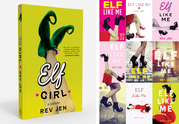
I’ve known Nubby Twiglet for years, and during that time I’ve watched her grow into an incredible designer with a style that’s unmistakably her own. Nubby has a clear vision when it comes to fashion and photography as well, and as soon as I found out I’d be designing the cover for Rev Jen’s new book, Elf Girl (previously titled Elf Like Me), I knew she was the person to go to for the right cover shot. I’m pretty sure the first question I asked her was, “Hey, do you have any elf shoes?”
Nubby was a perfect collaborator—she took my art direction perfectly, and understood exactly what I needed. Her shots and styling were so perfect that I was able to come up with 10 cover concepts in a single afternoon! Very satisfying. The final cover is on the left (the book is out in October), and you can see some of the unused designs in the right.
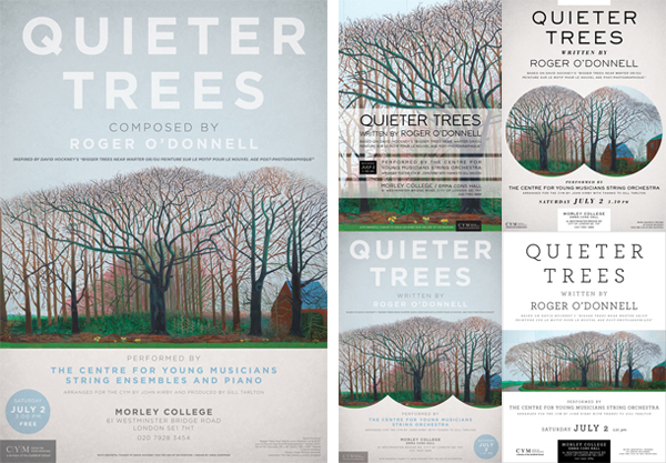
This poster marked the second time I’ve worked with musician Roger O’Donnell. The first was about six years ago on a CD jacket, and it was really quite nice to do it again. I’ve known Roger since I was just starting out as a designer in my early 20s, so to know that he respects my work well enough to ask me to create something for him—this time a poster announcing a performance of his work—is a truly great feeling.
Last year, Roger musically recreated the David Hockney painting Bigger Trees Near Warter Or/Ou Peinture Sur Le Motif Pour Le Nouvel Age Post-Photographique, and in July of this year, the piece was performed by an orchestra of young musicians at the Guildhall School of Music. You can read about the entire process as well as watch video diaries and download demos here.
Thank you, friends. It’s been a pleasure.
45 Comments
I saw your work on sfgirlbybay earlier, but i love seeing all your collabs here. You do such wonderful work- i always love your clean and fresh sensibility.
That elf cover, is great- i can’t even chose a favorite out of them!
You are so super talented its ridiculous.
anna, you’re making me a happy, weepy mess. i love my new site so much…i honestly can’t stop looking at what you made for me, and the logo shanna designed.
i wish every collaboration could be like ours. you were so patient with my many questions, and it was like you just read my mind, and my personality. the does just feel very ‘me’, with all my quirky eccentricities and eclectic taste. thank you from the bottom of my heart.
you are my superstar. xo
and, because iv’e had 2 hours sleep, i have typos. 🙁
I’m sure there are all kinds of errors in this post, too, but honestly…I’m kind of amazed I can even still move my fingers. 😉 xoxox
Wow…everything looks really wonderful. You should be very proud…
you are so talented! congratulations on ALL of your new projects. i can’t stop staring at Victoria’s new site – its amazing!!! and the concert poster would look awesome on my wall!
I spy a teeeeeny-tiny wee smiley at the very bottom of Victoria’s beauteous new blog. Love. (PS, I originally arrived at Door Sixteen via SFGirlByBay.)
Wee smiley? Do you mean the rose “tattoo”?
Oh wait, I see it too! I’ll email you a screen-cap.
Never mind, Daniel sent me a screen shot! I think that’s something Wordpress automatically puts sites that are using their built-in stats tracking.
🙂
Beautiful, beautiful work, Anna. You really are AMAZING at what you do (books, blogs, posters, oh my!), not just from an aesthetic/design perspective but also your ability to be so personable and friendly and put so much time and effort into understanding who your clients/friends are and what they want… even if, like me, they have no idea what they want. Somehow you do. It’s so incredible to be a part of and to witness here with these collaborations, I can’t tell you.
Viktoria, that feeling doesn’t really change. Anna and I are almost a year out from when she started sending the design ideas that turned into my blog design, and I STILL look at it and wonder a) how I got to be so lucky, b) whether or not it really could be mine, and c) how in the WORLD Anna “got me” so well even before we’d ever met in person, or after for that matter.
You’re tremendous, Anna Dorfman. Gorgeous work, as always. xoxo
Okay, now that I’m CRYING…
I think design can be a really intimate process, and when you work directly with the client (something I don’t always get to do), you do have to think a lot about who that person is and try to understand how they react to the way their work is presented—and it’s different for everyone. This is why I extra-love working on stuff with and for people I know and like and respect. It’s an opportunity to know them better, and to get that fuzzy feeling that comes from having given them something you created together. You know, like a blog-baby.
I need some sleep. You are awesome, and y’know…I can’t wait to do it all over again.
Anna, the redesign for SF Girl by Bay is fantastic! I just love how clean and modern it all looks! It’s perfect! Congratulations on the launch!
Of course the rest of your work looks GREAT!!! 10 comps on the Elf book in one afternoon is unheard of LOL
Yeah, I think you and Janet were out that day so I actually got some WORK done. 😉
All three are just perfect! You are obviously very good at what you do.
Great work!
Simply beautiful Anna – you did an amazing job! Congratulations to you all!
Absolutely gorgeous. I’ve admired your design skills for years! You and your collaborators do really beautiful work. 🙂
Love all of it! Your design sensibilities are very much in line with how I wish I could design. As a freshly minted Illustration grad, I am regretting not getting that GD concentration.
I often wish I were better with illustration, Brittany, so we’re even. 😉
I had loads of fun looking through the the new sfgirlbybay design. in fact, it was the first site i visited yesterday morning — even before my morning cup of coffee. yes, i was that excited. 🙂
i loved all the features and fine details from the custom page headlines to the beautifully designed category rollovers and page footer. you really do amaze me, anna.
That means a lot to me coming from you, Katrina—thank you. 🙂
I love the new sfgirlbybay design, it fits the blog perfectly! Your work is always so inspiring 🙂
Holy cows and bananas! I’m so glad you shared some of your recent work with us. I feel so inspired now!
Beautiful work (as always!)
It’s especially nice to see your work for Roger O’Donnell – I was lucky enough to see Hockney’s Bigger Trees Near Warter “in the flesh” recently (Warter is only about 15 miles from where I live, so it was displayed in our local gallery for the summer) and it’s a stunning piece. I’m curious to hear the music inspired by it – in my mind, having lived in the Yorkshire Wolds, the only sounds are rooks and the wind…
Last night I heard someone say “Joy is the thrill from creating” and all I could think about was my job. And to take it a step further, I think the thrill of creating with people I like is ecstasy.
Lovely work, Anna. You inspire me.
Beautiful! Great work! Love the retro-fresh vibe 🙂
Fantastic job all around!
You did such a beautiful job…it looks amazing!!
How exciting to collaborate with like-minded people and create such wonderful results! I also applaud you on Victoria’s site. Not only is it fabulous looking, but the navigation is extremely clear and well-thought out. I find too many sites are lacking in that respect and to marry the design and functionality is real talent.
Wow, thanks Lori! It’s so nice to hear that the navigation is clear, because that was one of the things we kept going back and forth on. Ultimately we decided that having fewer options for navigation actually made it easier to find what you’re looking for. Glad you like it! 🙂
You’re welcome. In my opinion, it really does help. I can see the thought process in some more complicated sites but I often think less is better…then focus on making it look good and you’ve done your job.
I love what you did with SF Girl, Victoria. It suits her blog, and what it’s all about, perfectly. Love your blog, btw. Fantastic.
Love your work on Victoria’s blog, Anna. SF Girl By Bay and Door Sixteen are two of this Australian bloggers absolute favourite sites. Thank you!
Sorry if I sound creepy but I want to be you when I grow up. I wasn’t sure if you were doing development for sites or just the mockups for design but damn you’re doing both.. it’s great design that is aware of the end user.. it’s compassionate for the user, aware of the content for each site…
What really gets me about your design is you put yourself out there with your blog.. There’s no sign of the girlie girl about you and then you create a site like Honey Kennedy, that I keep going back to over and over still.. or for san francisco bay girl… It overflows with feminine touches and flowers and fluffiness while remaining beautifully clean and functional..
Even Manhattan Nest doesn’t look like “Anna” it looks like everything that he puts forth.. You’re so far from a one trick pony all I can do is stare and be envious. I love seeing the different options you put up.. they’re not variations of one option with random font changes for variety… I have gotten so burned with a few forced collaborations with designers who put no love into it that your post has made me feel squishy and happy inside that this is what something can look like with love.
Aww, geez! That’s kind of the nicest thing a designer can hear, you know. I think the reason I’m able to work in so many styles is because of my “day job”. I don’t get to pick and choose which covers I work on (though it’s unlikely I’ll ever be asked to do a spy thriller or anything like that!!), and I’m constantly having to meet the expectations of not only an art director but also an editor, a publisher, an agent, a sales team, buyers for stores, and yes…authors. I had to learn a long time ago how to let go of what I would do for myself in favor of what’s going to sell the book (or the website, or whatever) and make everyone else happy. But that’s what makes me a commercial designer and not a fine artist. 😉
I actually have a really hard time designing anything for myself. I’m definitely my own worst critic, and it’s impossible for me to get to point where I feel like I’m realizing my own vision as it relates to me as a person. I suspect this is the case for a lot of designers, actually!
heh. There is a reason there is no link to a blog for my name. When we started actually doing design and development for work I realised the blog looked bad as it was. I stripped out all design elements and left it blank how wordpress presented it and left it even worse, and then mostly abandoned it. I figure it’s the kind of bad that says, “I didn’t even try” though. rather than the “I tried and failed” 😉 that’s better, right?
Obviously, from past comments we’re struggling having just started 😉 But it’s a relief to see how great it CAN be. When we work with people and figure out what they want and how to make that functional and serve their purposes it’s a wonderful feeling. To see what can come about when you get to collaborate with great people and make a great site.. it’s relieving to see what a positive experience it can be. cheers to loving what you do and being inspiring. thank you.
Amazing! As a graphic designer in training, I am inspired by what you do outside of your interior decorating (which is what I mainly come here for). I love what you create, as I too love to focus on simple but bold shapes and design. I look forward to seeing more of your work in the future.
i honestly think you’re pretty much the coolest designer. seriously. everything i see of yours i think to myself “damn i really like that” and then i see something else that’s totally different, but still with your great taste, and think the same thing. i’m just amazed. what’s the simple way to put it? nice work anna. 🙂
working with anna was like a total dream…efficient, creative, wise and well thought out, not to mention totally fun! i have admired her aesthetic for so long now, and to have her design my site was just so inspiring and exciting. i knew she understood me from day one, and off she went to work on it, and then she came back with all this beauty that i was just blown away that someone could understand what i wanted so well, even when i wasn’t very good at articulating it.
i’m so happy to hear you all like it as much as i love it. it makes me want to blog better!
thank you, anna. xxoo
Amazing work! You’re so talented! Congrats on your success!
I’ve been reading your blog for ages and then just discovered SFgirl the other day and only today did I realize you designed it. Yay!
I’m a graphic designer too, your work is very inspiring! love it!
WOW!! SF Girl looks AMAZING!
love love the sfgirlbybay redesign! great job, very simple and clean. great design