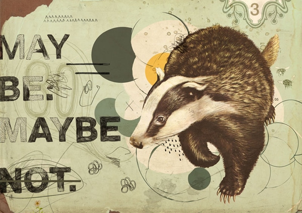
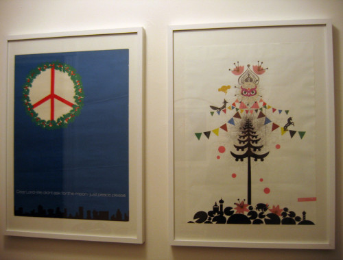
“Maybe” giclée print by Eduardo Recife
Earlier this morning, while I was searching the 13-year-old depths of my backup drive, I came across my blog header from 2002. It was collage-y and grunge-y and vintage-y and all of the other -ies that that I was into at that time, and I was immediately reminded of someone who had a huge influence on my work—artist, designer and typographer Eduardo Recife.
I love Eduardo’s use of found elements, pieced textures and patterns, hand-drawn letterforms and traditionally-set typography. There’s a roughness to his work that’s countered so perfectly by often romantic or Victorian imagery, and that contrast is so appealing to me. It’s a look that retailers like Anthropologie and Alternative Apparel have channeled with great success over the years, but never with quite the same level of artistry as Eduardo.
You could spend a year trying to emulate his work (and believe me, I’ve tried!) and never do what he does as well as he does. I’ve taken influence from Eduardo and put it into my graphic design work, the interior of my home, my personal style—everything. He just understands the balances between old/new and hard/soft so well.
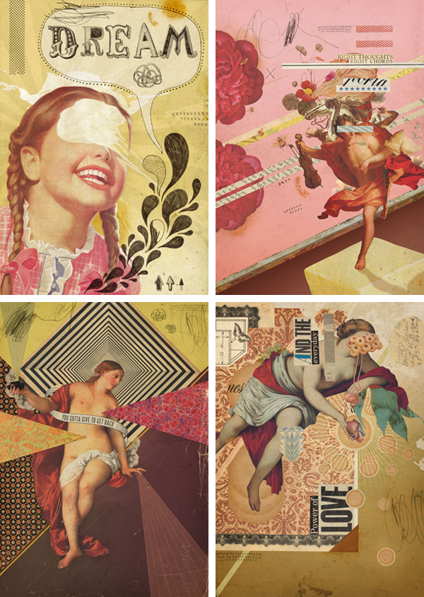
Clockwise: “Dream”, “Chords”, “Love”, and “Give to Get” Giclée prints by Eduardo Recife
I was happy to discover after not having visiting Eduardo’s personal work website, Misprinted Type, for quite some time that he now has giclée prints of his work available for purchase through inPRNT. I haven’t decided which ones I want to buy yet, but I will definitely be bringing a couple into my home very soon!
One of my favorite things about Eduardo’s approach to creating is his willingness to share resources and materials with others. If you check out the “goodies” and “fonts” section of Misprinted Type, you’ll see he makes a huge number of hand-drawn typefaces, brushes, and vector elements available—many of them for free.
Make sure you also take time to look at his recent commercial work, too—the colors are so incredibly fresh and delicious-looking, and his style still looks as current and unmatchable in its coolness as ever.
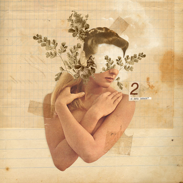
“E o amor?” giclée print by Eduardo Recife
14 Comments
My last blog header (which I JUST changed a few months ago) was using his font!
Hey, it was, wasn’t it!! I forgot about that.
Gorgeous! I adore his work.
I’m also a huge Eduardo Recife fan!! All my blog headers from 2000-2003 were very grungey and collagey. I loved checking out Misprinted Type. Blast from my past!
The early 2000s were definitely the era of grunge-y collage-y blog headers! It’s a style I really haven’t left behind completely, either—I think I’ve just gotten a little more refined in my work (as has Recife).
Thank you so much for writing this post. I’ve never come across his work and am smitten with it. I dabble (who am I kidding? I’ve only done two pieces!) in working with acrylic paints and 2D mixed media and Recife’s work is incredibly inspiring. I just…I love it. It’s exactly my taste and very inspiring.
Thank you again, Anna!
in.love.thank.you.
How interesting (and inspiring) that he makes art from direct conflict. My personality can be like that (the conflict part, certainly not the art part!), but it is something that has always bothered me about myself. I’m funny unless I’m being serious. I’m romantic, but horribly pragmatic. Even my blog name, and the story behind it, speaks to that. Sweet, but savory. Ugh.
Thanks for this post; it’s given me much to think about. I always chalked up how I am to indecision or fickleness. Maybe it’s not that simple.
I think most creative output (writing, art, design, music) is dependent on that kind of contrast. I don’t really see it as “conflict” so much as I do element of either side of the spectrum complementing each other.
Man, I TOTALLY forgot about Eduardo Recife (no reflection on his talent)! He was such a huge inspiration to me when I was a youngin’, before I knew design and typography were a “thing.” Thanks for the trip down memory lane…and the next line of that first collage is “honey badger don’t give a shit.” :]
HAH!! I thought the exact same thing when I saw the badger collage (I even bought one for myself), I just didn’t want to admit it. 😉
WOW! I totally love his work…super inspirational indeed. Thanks for posting!
Loooooooooove it. I stumbled upon his website a few years back, but I don’t think I ever bookmarked it. Thanks so much for posting about this!
I think collage is my favorite art form. Ever.
He’s like a pioneer. I remember him being a huge inspiration to me too back in my college days early 2000-ish! I had all his free fonts and felt so rebel and edgy using them while my classmates used Futura and Helv Neue.