I’ve had a lot of design projects in the works lately, and I thought I’d share a couple of favorites that I just finished up in the past week.
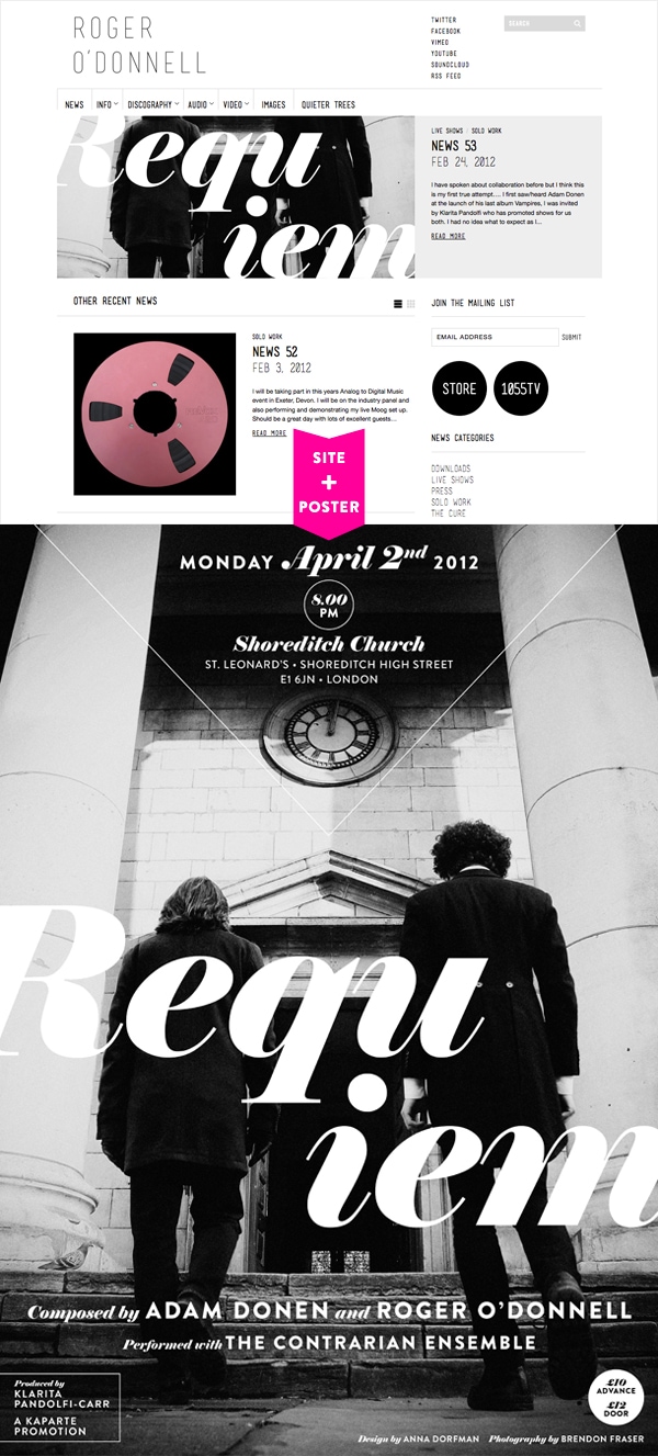
About a year ago, I convinced my friend, musician and composer Roger O’Donnell, to let me work on a complete overhaul of his website. Roger had been designing and maintaining his personal site (as well as the sites for numerous side projects he’s worked on) for many years, so it was with a bit of trepidation that I made the suggestion in the first place, but Roger was completely on board. It took a long time to migrate all of those years of content from a static site (there were literally hundreds of pages all nestled inside of directories within directories—I told him it was like discovering a giant box filled with filing cabinets inside of an enormous closet you never knew was in your house) to a WordPress-based format, and it’s still a bit of a work in progress, but I’m happy that Roger now has a website he can add news items to easily and keep up to date with information about all of his various projects.
Right on the heels of the website launch last month, Roger asked me if I’d design a poster for his collaboration with musician Adam Donen, which was to be a secular Requiem. I said of course (of course!), and the result is something I’m very happy with. Poster design is really still kind of an area of unknowns for me, but I’m finding that I really like thinking about how the eye moves and how the brain processes information when something is presented on a wall rather than on a table or shelf like a book would be.
I’d previously worked with Roger on two other design projects, the first being the packaging for Nothing Concrete, a CD sampler his label released in 2005, and then last year a poster for a performance of his Hockney-inspired work, Quieter Trees. I’ve known Roger for nearly 15 years now—the duration of my entire career as a designer—and it means so much to me to be able to work with someone whose own work I believe in and care about so much.
Roger has written more about the Requiem project on his site, and if you’re going to be in London on April 2nd, you can see it performed live with an orchestra at Shoreditch Church. I wish I could be there, as I’m sure it’s going to be fantastically dark and beautiful.
The poster itself is now available for pre-order. This is a rare chance to hang something on the wall that I designed, so if you’re interested in buying one (£20, including shipping to anywhere), head over to Roger’s store right away…it’s a very limited edition that will ship in about three weeks.
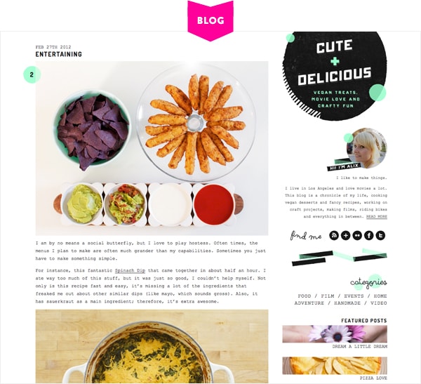
The redesign of Cute + Delicious is something I’d been thinking about for months before I actually started working on it. I love Alix’s blog (vegan treats, movie love and crafty fun…what’s not to love?!), and between the great photos and its fun name, it was hard to not come up with ideas for a new look. I did a lot of tweaking and adjusting and futzing before I even showed her a preliminary comp (always a nerve-wracking moment!), and I’m SO excited that she liked what I’d come up with right away. With just a few minor alterations based on Alix’s feedback, I think we wound up with a blog design that is, well, both cute and delicious. Alix was a dream client for sure, and I hope I have the chance to work with her again in the future. In the mean time, I’ll keep looking at this spinach dip and wishing I could coax it out of the monitor and into my mouth.
Thank you so much, Roger and Alix, for trusting me with your design projects!
23 Comments
I love the redesign on Alix’s blog! But, as I said on her blog, I like pretty much all the design you do. 🙂
Thank you, Diana!
whoa! roger’s site looks some kind of awesome! he must be so happy! looks soooo good!
cute & delicious looks just that, too!! excellent work as always, miss anna!
Beautiful work, Anna! I especially love the poster.
FANTASTIC, lady!! Wowza. (Of course, none of this surprises me…)
too gorgeous! you’re such an inspiration.
Hi Anna – great work!
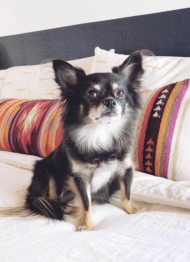
Oh, and I am missing my little Instagram fixes of B+F that you were so generous in sharing! Hope all is well with the little fluffballs!
I’ve been so busy and distracted lately, Martina, but B+F are fine as can be! I’ll let them know that they are missed. 😉
Your designs are flawless. Really, amazing work (as usual).
wow! roger’s poster rocks. i love the chunky type. thanks for sharing!
Wow! You get to work on some fun gigs! (Or, at least, it seems so to someone who doesn’t have to put in all the hours 😉
They’re both fab. Thanks for sharing your work, I really look forward to these posts!
Love the poster too and will be ordering one for my hubby who’s crazy for it. Wouldn’t mind popping over the Channel on the 2nd April.
Love your work, your site, your house, just everything! Thank you for sharing
I really, really love your redesign of cute + delicious, it’s gorgeous! And the poster is really striking – might try and pop along on April 2nd!
They both look amazing! (So does that food!) Really awesome work and thanks for sharing!
Anna, I love both Roger and Alix’s sites – beautiful clean design! Well done!
xo
cortnie
Wowzers, you have an excellent eye for detail. Beautiful stuff. And Cute + Delicious looks well up my alley, am glad to have discovered it.
Hi Anna. Congratulations for your move. If I ever visit NY can I set a tent in that deck? I think we could be good friends.
Bravo on both websites! I love your work. Keep up the good design!
I just want to say that i feel so lucky to have had you design Cute + Delicious. It is even more lovely than I could have dreamed of and I just love love love it so much. You do amazing work. I love that poster. Keep being your awesome self.
xo
Alix
ugh you kill me with your amazing design skills! love.
Beautiful job on both, especially all the black + white detail on the Roger O’ Donnell website; I like how simplistic, yet striking it is.
And how cool that you’re friends with him? I mean seriously.
wonderfulness
Anna, your designs are really inspiring. I can’t tell you how inspiring you are (well, I guess I am telling you now – but you get the point ;))