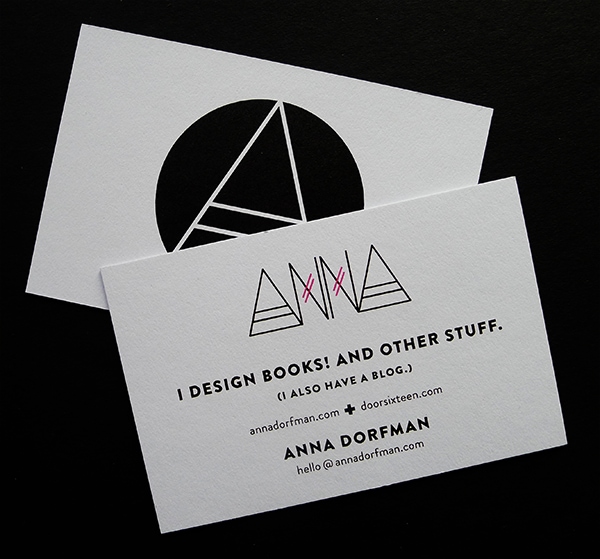
It is completely ridiculous how long it takes me to get around to doing pretty much anything. After putting off getting business cards made for, um, my entire adult life, I finally made a firm vow to do it when I redesigned my portfolio. You know how long ago I made that “firm vow”? OVER A YEAR AGO. What’s wrong with me? Designers truly are their own worst clients, I swear.
Two weeks ago I had a brief moment of follow-through, though, and I actually managed to send my files off to have them printed on cards. Pretty much everyone I asked told me to use MOO* for printing, and since I’m too lazy to do any real research when it comes to my own projects, I went ahead with them before the motivation wore off.
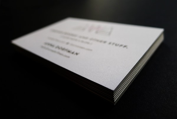
I spent a little extra to get the Luxe cards, which are nice and thick and have a colored center layer. I only ordered 100, which I imagine will last me the better part of the next decade since I’m probably going to forget to ever bring any cards with me when I leave the house, and I’ll most likely just be giving them to friends and family members who happen to come over for dinner. (Hey, I’m just trying to be realistic here.)
Anyway, all kidding aside, the cards look great. They were delivered in fancy white boxes with magnetic closures wrapped in purple ribbon and a fake wax seal and everything. The paper stock is really nice, and the print quality is perfect—no registration problems at all, which I was a tiny bit concerned about since I spec’d a rich black for the type. I have zero complaints.
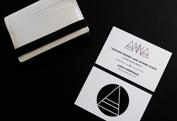
I’ve had this Pantone business card wallet (I don’t think they make them anymore, or at least I can’t find them online) for the better part of a decade now—obviously purchased amid a fleeting sense of ambition—and it’s nice to finally put it to use. I feel so legit.
* When you order something from MOO, they give you a 10% discount link to share with friends. If you use that link to buy cards, you save 10% and I get $7.50 in credit added to my MOO account—and then they’ll send you a 10% referral link to share with people, too. Feel free to use this link and become part of that magical pyramid scheme.
44 Comments
wow, awesome design…love your card front and back! i’m pretty upset that business card wallet is so old and not made anymore, but that won’t stop me from looking for it 🙂
Your cards look great! Worth the wait, I’d say 😉
great card. i also like the holder. i’ve been searching one to probably not use ever for some time now.
Love ’em! I just ordered some Luxe Moo cards too and they turned out GORGEOUS. See here:
Hi Anna-Is ‘rich black’ the same as “long black”? Do you know? I just had a client talk to me about printing a catalog using long black-it was a new term to me and I’ve been doing print design for a long time. Have you heard this term? Thanks
I have NEVER heard the term “long black.” Google tells me it’s a type of coffee, though! Hmmm. Perhaps your client was confused?
Ellen, a bit more Googling led me to this:
Black can also be used in colour mixes to replace equal components of the three chromatic colours cyan, magenta and yellow (Under Colour Reduction), thereby reducing the total volume of ink actually required in the print. This is known as ‘long black’.
So if I’m understanding correctly, it’s not quite the same thing as a rich black but rather one where additional quantity of black ink is mixed into the CMY inks so that the total K value is greater than 100%. Seems to be a fairly uncommon term, though, and possibly only used in the UK as far as I can tell.
Love! The A’s and the N’s and the crux! So perfect. Though I have to say, if you were just handing a card on it with the “A” in the black circle I would think you were recruiting me for a cult (maybe I’m thinking of the whole Scientology pyramid thing.) If it were Anna’s Cult of Good Design I would join in a minute.
Oh, this whole blog is just one long, drawn out cult recruitment!!
They look great. You will probably rip through those 100 faster than you can imagine. I always tuck at least five away just for posterity. When I am practicing architecture, everyone and his mother wants a card, so they go quick. I have been using MOO for years and need to get a new batch ordered, so thanks for the discount.
nice job.
They look gorgeous, especially the bold black lettering.
I love your witty disclaimer at the end! And duh, great business cards!
Love, love, LOVE them. So perfect and modern! I know my challenge will certainly be deciding on a look or brand – I will be the worst client, just thinking about it makes me want to drop me now (I am currently putting this challenge off until I am done with school). But these are so you and I am so happy to see you finally had them printed, congratulations!
lookin good girl. I’m also w/ Sherry…I’m ready for my cult initiation!
gorgeous! of course.
Caution: bizarre comment ahead.
Have you ever asked your parents if their careers had anything to do with how they selected your name? Because I’m trying to think of a name that looks better than yours in type, and I can’t. Two letters, almost the inverse of each other…I mean, even the placement is perfect with the strong A book-ending the Ns. It’s just such a clean, visually appealing name.
Haha! Believe me, I’m very aware of how graphically pleasing my name is—particularly given my love of (near-) symmetry. Also, if you put my first and last names in all caps, you get like a million triangles. Or 13, actually, which is why there are 13 triangles at the top of my blog. (Did you ever notice that Door Sixteen and Anna Dorfman have the same number of letters? No?)
I’m named after my grandmother. 😉
No, I didn’t notice that! I think I would have choked with satisfaction upon discovering that if I was you.
Thanks for the “long black” research. I only came up with the coffee reference. Obvi I was looking in the wrong country. No problem though, I just smiled and nodded to my client pretending I knew WTF she was talking about. Job turned out well-even with short black.
Hah! That’s probably the approach I would’ve taken, too.
Ugh, your cards are so good I don’t know what to say. I’ve been looking at MOO for a long time and have always heard nothing but good things. One day…..
And Jules’ comment about your name…and your response…seriously, some people were just born to do certain things….it’s like it was in your DNA. It’s just all too perfect!
Anna, those cards are all kinds of kick ass. Love them.
I love your card design but it’s what you wrote on it that made me smile.
haha, the best thing about this post (aside from looking at those lovely cards) was the little boost of ok I gave myself for being a procrastinator.
Thanks for the link and the motivation! I’ve been putting this off for ages, and I finally bit the bullet and ordered some cards. I feel so… proper now.
I want nice cards too. (That’s it. Just a petulant outburst of envy…)
Wow great timing. I was just looking at making up some personal business cards for when I go to networking events (bit naff but totally necessary these days – especially seeing as I’m not currently working) – gotta leave people with something. Thanks for the link, just bought some. Yours look great btw – I love the little bits of colour!
I just found your blog and am totally in love with it.
Do you know that tape:
http://seventytree.bigcartel.com/product/new-triangles-tape-choose-1-of-3-colours
I think the black one looks like something you would like.
Also, do you know the raindrop hooks from Normann Copenhagen? I really love them and whenever I look at them I think they look so much like Anna from Doorsixteen!
Anna,
Your cards look great! What fonts did you use?
I’ve been meaning to do the same for years too! I had business cards when I graduated back in ’98 and none since. But I’d like to feel grown up too – it’s on my list to do!
Oh, thanks for sharing Anna! I’m in the middle of designing my own biz cards and was just going to get them printed at Staples. Moo is a MUCH better option.
They look great! 🙂
Thanks for passing along the Moo discount. I’m going to be ordering from them soon, so that will come in handy!
Hi Anna, I’m pretty sure we passed you tonight on Rivington, on the lower east side. Almost said hello, but didn’t want to interrupt. I’ve been checking out your blog for a while. The Newburgh house reminds me a lot of our apartment back in Edinburgh — the bay-windows, ceiling height, fireplaces and flooring are very reminescent of Scottish Townhouses. The facades are different over there, usually sandstone rather than brick, but there are many architectural similarities. If your traveling bug takes hold, You should add Edinburgh to your to-do list. Don’t be disheartened with life in DUMBO. I think it is also a very beautiful area.
Hi Francis! Yes, I was actually at Teany on Rivington with Daniel from Manhattan Nest to celebrate his birthday. 🙂
I’ve actually been to Edinburgh about 10 years ago for a wedding (some photos here). I didn’t have much time to explore since it was just a quick trip, but what I did see was gorgeous.
Wow! I love your business cards! Thanks for sharing the moo discount with us 🙂
Yessssssssss. I am getting ready to migrate one of my blogs to a new URL and was already planning on getting MOO cards. Excited to join the pyramid scheme. 🙂
What a beautiful and original design. So very you.
The cards look nice! I love that the copywriting is so friendly.
Love, definitely worth the wait.
Absolutely love them, Anna! I recently used Moo cards too, also chose the Luxe, and was so happy. Glad you had the same experience! That purple “wax” seal was so clever, wasn’t it? Anyway, well done on these! 🙂
Love the cards, love your blog, love YOU.
(I hope that’s not too weird).