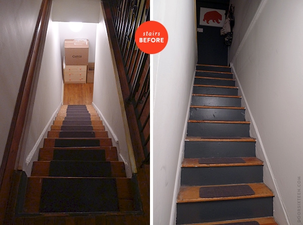
As I’ve mentioned (but haven’t really shown), the last set of stairs in our 4th-story walkup is entirely inside of our apartment. I’ve already done a lot of work on the entry area at the top of the stairs, but I’ve really been ignoring the stairs themselves completely. I had a burst of energy late Saturday night, though, so I decided to take a look and see what could be done.
The first thing I should note is that these stairs are not cute. There is no decorative molding, the wood is builder-grade, everything is totally crooked, and despite being structurally sound, the entire staircase is in generally terrible condition cosmetically.
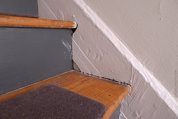
Oof. The first thing I did was pull those gross little carpet treads off. They were REALLY grimy and worn down to the point of actually making the stairs more slippery than bare wood. I held my breath and yanked. They came off more easily than I expected them to — each one was held in place with 4-6 nails and some carpet tape here and there. The wood underneath was filthy, but an hour spent with a bucket of hot water and Murphy’s Oil Soap cleaned them up reasonably well. They’re still spattered with paint and full of nail holes and deep gouges, of course, but at least I’m not afraid to walk on them with bare feet now.
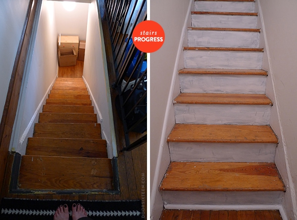
Next step, priming! On first glance you might think that the stair risers were painted in the same Deep Space color I’ve been using on the walls elsewhere in the apartment, but it was actually a kind of “dead” dark gray, a single coat of which appeared to have been applied with a scrap of burlap. Priming was a must. I went back and forth on whether to leave the stairs unpainted, and I’m still not totally sure where I stand on that. My hesitation isn’t because I think the wood is in any way worth preserving (it’s not, really), but because there’s so much unpainted wood elsewhere in the apartment that I think the stairs might look out of place if they’re painted!
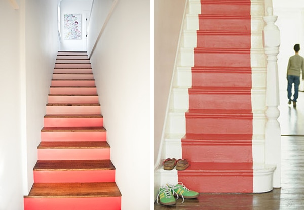
Photos by Thoroughly Modern Medusa (L); Jake Curtis for House and Home (R)
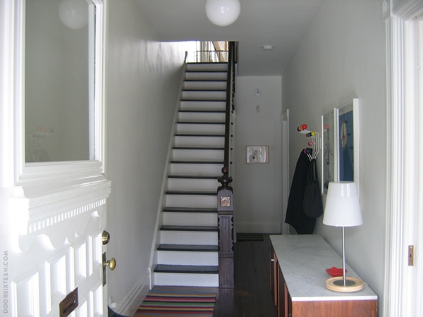
The staircase at my house
By the time the primer was done, it was about 2:00 in the morning and I was fading fast. I got into bed and tried to plan out what I wanted to do with the stairs the next day. I looked at a post I wrote about staircases four years ago. My thought process went like this:
1. What about bright orange? What about a bright orange painted runner? I’ve been obsessing over Orla Kiely’s painted orange runner for years. Or maybe shades of gradated orange?
2. No, that’s silly. Maybe I should just go with white risers and dark treads like I have at the house. Just do what I know I like. But the more I think about it, the reason that combination looks good in the house is because the stairs and banister are so beautiful.
3. Maybe I should just leave the treads bare and paint everything else with Deep Space. The walls, too. Yeah, I’ll do that. When dealing with an ugly space, the best move is to go totally dark or totally light or totally crazy. No in-betweens.
4. ZZZZZzzzzzzzzz…
But then when I woke up couldn’t stop thinking about bright orange…
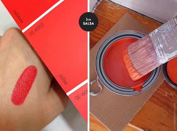
I found a good match for my favorite lipstick, MAC Lady Danger (I’m still using the same tube three years later) — Benjamin Moore Salsa. It’s a really bright hot orange-red. I picked up a quart of that along with a quart of Deep Space in satin finish (I really love orange and gray together), and headed back to the apartment to get to work.
This is where things went horribly wrong.
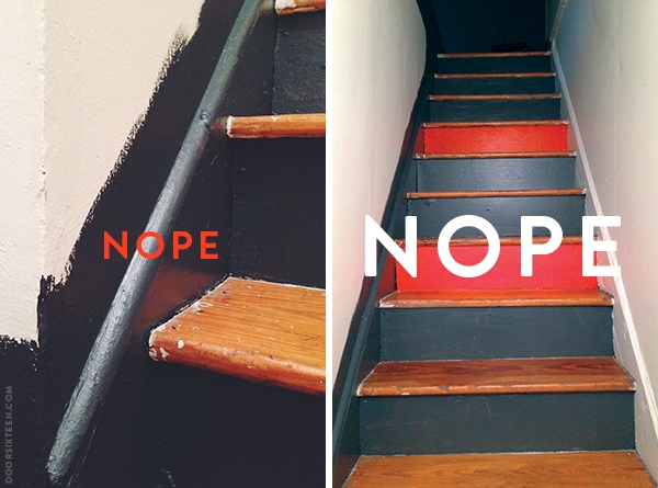

NOPE NOPE NOPE NOPE. Yeah. This is some hideousness right here, I know. It’s even worse than when I thought it might be a good idea to paint my entire hallway PURPLE — this was pre-blog, thankfully. It’s the kind of thing you know is just going to look terrible the second you stick the brush in the paint, but you do it anyway because you really think the outcome might somehow manage to match that vision you had in your head at 2:00 in the morning when you were passing out from exhaustion and primer fumes. NEVER DO THAT.
This is where I’m at now: I don’t want to have a super-dark stairwell that gets zero natural light, because the artificial light reflects off of it in a really depressing way. It’s just sad-looking. I also don’t want to mess around with trying to combine orange-hued polyurethane-coated wood with bright orange paint (I do have to give Evan credit for pointing out that there might be some clashing issues, but I was too blinded by MY VISION at that point to do anything but dismiss him — sorry, Evan!).
I do kinda want to revisit the gradient stairs idea, though, and this is also what my interior decorating idols Linda and John Meyers suggested when I asked them, “WWWMD — What would Wary Meyers do?” (They also suggested that I could do something typographic on the stairs with the Frankfurter font, but I am just not on that level of cool. Alas.) Wary Meyers have been my gradient-painting heroes since I spotted this awesome radiator way back in 2007, so I trust their suggestions.
So…how about THIS?
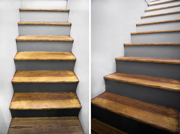
Photos by Stacey Bode
That’s really nice, right? The fact that Stacey’s stairs are a lot like mine (totally un-fancy, kinda beat-up wood treads, solid walls on both sides, no banister, etc.) gives me extra confidence that this could look good in my stairwell, too. I think with some careful planning and experimental paint-mixing (Deep Space + Simply White in varying ratios, satin finish), I can make this happen. First I have to re-prime everything I already painted (ARGH!), but I’m not in a huge rush. I should probably also suck it up and sand the treads down a little, because they really do look awful.
I’ll have to find some other place to use that Salsa paint, though. I do LOVE the color. Maybe the entry door to the apartment? I’ll figure something out!


84 Comments
I really like the black to white gradient and vote that you try it (not that it’s a vote, but still).
That is a tricky spot. Try it! What about a gradient on each step? I really like this staircase (not the shades for your area but something similar might work) http://www.merrypad.com/2012/04/19/diy-network-bifold-door-installation/
I think that’s too busy for my stairs — I prefer something more subtle.
Yeah it might be especially if there’s no natural light. The gradient idea might work better 🙂
Salsa looks a great colour it`s a shame it didn`t quite work out on the stairs. The gradient stairs look lovely, could it possibly work with gradients of salsa? (A bit like Thoroughly Modern Medusa picture in the post). I would love to have exposed or painted stairs but the quality of British 1970s homes just doesn’t cut it and neither does the positioning of out stairs! Looking forward to seeing what you decide to do.
I do like the orange gradient a lot, but I don’t want to fight with the orange wood.
That makes sense as orange on orange would be a bit much, is it possible to paint the wood or is that a rental no no? Maybe a white riser would be an easier option or maybe use a wallpaper?
I think that painting the treads will make the stairs (which are exposed/visible from the living room) look really out of place in the rest of the apartment.
I’m not looking for “easy,” really, I’m planning to do what I think will look best in this spot. 😉
Fair comment and I know you’re not one to shy away from hard work! I’m sure whatever you go with it will look great and if you don’t like it hey it’s only paint 😉 I’m still in the process of wallpaper selection (@thethreelivesof) so I do understand the dilemma
Do those stairs get any natural light? Doesn’t look like it from your photos. It might be hard to see a gradient without natural light. I think a simpler look to start would look better (like you have in Newburg). Maybe a white riser and a salsa tread?
Nope, no natural light — I get into that in the post. I’m OK with it not being super-obvious. I prefer that, actually! I don’t think these stairs are nice enough for a classic tread/riser treatment like at my house, either. That kind of of high-contrast look really accentuates the architecture of the stairs, which is the opposite of what I want to do here.
Love the gradient, and the octopus NOPE-ing outta there.
I really like the idea of the grey gradient for the stairs, and an entry door with that Salsa! Sometimes you just have to screw something up to figure out how to get it the way you want it.
I painted my yellow tiled bathroom in that Deep Space this weekend, and I’m totally in love with it. Here’s a photo if you’re interested in seeing it http://instagram.com/p/c9cahdJz5s/
Next up is the peachy-pink tiled bathroom.
Funny, that photo makes the tile look white and the wall paint look navy. I’m sure it reads very differently in person!
The tile is really pale pastel yellow, so the picture isn’t too different in person. It kinda changes from a deep navy to charcoal depending on the light throughout the day. I did notice it looks much more neutral/lighter in your photos than it does to me IRL.
Hum… I’m glad i’m not the only one with paint commitment issues!!
I think what I would go for is : white walls, especially if it’s a dark spot.
I really like the Salsa color, I just don’t like how little there is of it. (or right next to deep space..)
I’d do all orange stairs, thread and risers. With white walls it would pop and be so beautiful… Or just orange risers and white threads?
The orange wood in the apartment is just so overwhelming — I don’t want to use the orange on the stairs for that reason. They’re visible from the living room, and it’s too much of a clash.
Wow, gradient stairs. I’ve never seen anything like that – they’re neat! It is a shame you can’t use the salsa color, since it looks like it might match the bear print at the top.
Are you going to replace the black gate railing? That’s been a cliffhanger for me ever since you mentioned it, because I sadly have the exact same situation in my apartment.
I doubt we’ll replace the railing, but we’ll do something with it — not sure what, though. I’ll get to it eventually!
I love the gradient. You’d start feeling lighter as you got to the top & into your apartment!
You are scaring me a bit with this… I see a flight of stairs like that and I either think of Richard Widmark with the old woman in the wheelchair or the Priest Damien who buys it on the steps
I suggest mix a large Pimms and ginger ale with a shot of gin and a spear of cucumber and then retire to the roof at midnight and gaze at the beauty of the skyline…weather permitting
The salsa color looks so cool! But I just don’t think it’s going to mesh with the orange tones in the wood of the steps.
What about something like dark risers, wood treads, and then a white runner painted down.
OMG. I vote that you cut out and decoupage band images from your 1980s and 90s music magazines that you undoubtedly have 2+ boxes of in your basement. HAHAHAAAAHAHAHAAAA!!!! And paint orange ankhs on the walls.
Or maybe the nice greys gradient idea.
I could have Happy Mondays-themed stairs!!
Oof, you’re so right. That gray would just create a cave! But the gradient seems fantastic. I also am intrigued by the suggestion of the salsa gradient, but I think you’d need to do the treads in white, along with the walls. Can’t wait to see how this turns out!
The gradual shades of gray would be fun! I think you would like it better if you sanded the treads and used a non-yellowing finish instead. Oak has a tendency to get very yellow with oil or varnish. Sanding is a big job, but obviously nothing you can’t handle, right?
But then the wood on the stairs will look better than in the rest of the apartment! The obvious solution is for Bernie to refinish our floors. 😉
I love that you are willing to post a project gone wrong 🙂 we painted our old stairs white and I love it but they’re also inside so we can have a carpet tread to keep them clean.
That is tough!
What I might do: paint it all white but the treads, sand down the treads and stain them charcoal. OR paint it all white and pick up a few of those Target Nate Berkus runners and nail them in (if the lengths worked with the stair measurements). Of course, then you’d have, what, like 10 of those rugs?
Hahaha. This made me laugh, because I did consider the Nate Berkus runner thing. They’re $70 EACH, though, and I think I’d need at least four, so…nope nope nope nope.
Anna —
I just painted my stairs gradient gray (using 3 different color of grays, 4 risers for each color) and I have similar treads (orange-y wood) and not a ton of light (though a bit more than yours). Anyway, I really love it! Good luck!
Hmmmm. Sand the treads, wallpaper the risers in something subtle but graphic?
I sometimes like wallpapered risers, but not here — I like the gradient!
I do love the final (?) choice of d. grey to white gradient… It’s taken me YEARS of reading your blog, but I am finally obsessed with all things black and white for the home, and I blame you for it! But honestly, thank you! Haha.
I also love the first orange stairs picture you posted from TMM, and it too looks a LOT like your stairwell with the walls. I think if you wanted to make that happen, you should, it would just mean refinishing the cruddy wood treads to make it not-orange. I do realize that most of the wood in your apt is this matching orange color. It is for certain the ugliest shade for wood to ever be. Would a simple sand-and-clear-poly get rid of the color? It might be worth doing even for the grey-gradient, since Stacey’s wood also looks great against the grey in a non-orange shade.
Were you still hoping a little to change the rest of the wood in your apt? I know when you first moved in, you mentioned that maybe down the road when the landlord sees the genius of your decoration skillz (I’m paraphrasing here) you could convince said landlord that the wood trim needs to go white. Or at least, different from orange. Maybe painting the treads would be the first step there, NPI!
I am excited to see the final result. And also loving your post with the experiments and the NOPES! Normally even your progress shots look so clean and beautiful, but your readers don’t mind seeing the mess, it is fun!
Anna, it’s not so much that I think the landlord needs to be convinced as it is I want to wait until we’ve been here for a while out of respect for his property. My brother lived here for a long time before we moved in, and he was a good tenant. I really like our landlord, and I want to absolutely sure that we’re in it for the long haul before proposing doing something irreversible.
To be honest, though, now that I’ve painted so much of the apartment the Deep Space color, I don’t mind the orange wood so much. It’s made a HUGE difference, and it feels quite warm and nice. If I painted the trim white, I’d want to paint the walls white as well — I don’t like contrasting walls/trim.
Also I just realized that it was a post about stair risers that led me to your blog many moons ago… Someone on Craftster forums did wallpaper risers and linked to your stairs-inspiration post as their own inspiration! And I got sucked in reading about your house and never left!
I love the orange, but agree it isn’t a good match with the orange wood… the grey gradients seems much more like you (even if they make me think there should be 50 steps and 50 shades… and I haven’t even read the book ;))
And I really like the new logo/layout for your blog!
Those gradient stairs from light to dark grey are DIVINE! Storing that brilliant idea away for when we finally move out of our current home. I get a lot of homeware from H&M here in London, it’s decent for the price!
I like the gradient, but I seriously thought you were going to go more toward white walls with an orange runner.
I love that you posted about a project that didn’t turn out (yet!) as planned. Keeping it real! (I also think that gradient grey looks amaze.)
Fantastic! I love the simplicity but I was looking for staircase ideas earlier and I love this – http://2.lushome.com/wp-content/uploads/2013/02/staircase-design-decorating-ideas-painting-8.jpg
I accept I’m English, eccentric and possibly start raving mad but I just love this. I was already thinking of mice and mouse-holes elsewhere so maybe this appeals to just a few oddballs.
Love the Deep Space colour and I’m wondering if I can find it here because I need something that will hide wobbly wall issues and not scratch off easily because one of my two cats is somewhat destructive.
Deborah, I don’t think you can get Benjamin Moore paints in the UK, but take a look at Farrow & Ball’s Down Pipe. It’s a very similar color!
Thanks for the info. I love the quality of Farrow and Ball and I’ve just found out that we have a reasonably local supplier while searching for their floor paint for my bedroom.
Other paints I’ve looked at for my staircase have seemed very flat and lifeless. I’ve reached the point in my life now where I have to love every thing I do or bring into in my home, which can make finding the right things very time consuming but ultimately worthwhile.
I dont think the salsa is the problem
its the grey surround.
i think youre overthinking it lol
I vote orange!!! …. it will be a better impact entrance than grey
maybe add some white to the salsa for orange sherbert??
Anyways so cool to see a post about things that dont always work out
we’ve allbeen there.
keepb up the good work!
cheerio from Canada
Actually, the Deep Space paint works wonderfully to counter the orange wood. I’ve used it throughout the apartment, and I love it!
The gradient risers will look amazing! Will you ascend from dark to light or from light to dark?
Dark at the bottom/light at the top, following the path to the natural light in my apartment.
Love the gradient grey as well! What about an off-centered single vertical stripe of orange going up the staircase? 🙂 That’d be kinda cool and different.
Good luck, Lady Danger!
Love you for posting the not-so-much alongside the super-great. So encouraging for those of us who are leery of deco failure to be reminded that nobody is perfectly perfect 100 percent of the time!
This really made me chuckle! That octopus is brilliant. Thanks for sharing your fuckups as well as your successes Anna! My opinion, if you want it, is that you’re right – the grey gradient would look great and the white walls would brighten it all up. And maybe leave the treads until you have lived with the finished thing for a while then see if its worth the bother. Can’t wait to see it. x
I seriously cannot get enough of the octopus nope gif.
I really like the last grey gradient with natural treads option. I’m a fan of contrasting treads and risers. Maybe it’s just me but I find dark treads in a dark stairwell intimidating.
If you want to keep the wood treads, maybe some Howard’s Restore a Finish applied with fine steel wool would spruce them up enough (I removed some light paint splatters from a wood dresser with that method, although it looks like there’s a lot more paint on your stairs) without going through the trouble of sanding, etc. As for the paint, I vote for the grey gradient with white walls.
So many new posts. Yay!
Love your blog! I’m really not spiteful, but I also really like to see a fuck up. It just makes my own fuck ups seem so much more normal and okay. How do actually deal with the situation as it is now? The two orange risers and the unfinished paintjob would drive me insane. Plus my husband would nag me to death about it.
Anyway my two cents for what they are worth (in German this translates as “to give you my mustard”): I think, you should paint the treads as well. Some wood spackle for the holes, a lot of paint and all the wonkyness would just look quaint. You could do the gradient on the treads, too, though in the reference pictures it looks as if it’s a lot lighter at the top of the stairs. So maybe it should be from light to dark in your case. Or you could get a really bright light for the upper landing.
What does the space at the foot of the stairs look like?
I don’t want to paint the treads because they are visible from the living room — painting them would make them totally incongruous with the rest of the apartment.
You can see the area at the foot of the stairs in the first picture. That’s all there is to it!
Thank you for sharing the things that didn’t go as expected, I find those just as enlightening as the awesome things!
I think the gradient stairs you linked are beautiful, but I also think some of that clear impression comes from the fact that there’s just straight wall next to them. I’m not sure how much the parts to the left and right of the stairs (no idea what those are called) would distract from that? It’s a little thing, but who knows.
Since the gradient-project seems to be somewhere in the future, have you considered keeping the walls and the risers white, but painting those side-parts in a very deep gray, maybe even deep space again? I’d love that contrast and just emphasizing the existing architectural elements, scruffy as they may be. I made a mockup: https://dl.dropboxusercontent.com/u/13934443/stairs.png
Cleaning up or sanding the stairs would make it »clearer, but as you said, it may stand out from the rest of the apartment’s wood. When you eventually get around to trying the gradients, you can repaint that side part easy enough, but until then, it may be a nice change.
No, I don’t want to draw any attention to the stringers (that’s what the side parts are called) AT ALL. That’s actually mish-mash of broken builder-grade wood with lumpy joint compound slathered on top. It’s a complete mess. That’s the last place I want contrast! I don’t want to emphasize anything structural there. It’s just not a nice staircase in any way. I like contrasting elements on staircases like the one at my house, but it’s not something I want to do here.
Ah, good point. That’s one of the things you just can’t really tell from a picture. Even the closer one looks paintable enough in the photo, but photos often simply can’t translate the awfulness. Maybe if the stringers were painted dark those flaws would recede more though? But if contrast isn’t the right thing here it doesn’t matter anyway. I’ll be excited to see what you come up with, I’m sure it’ll be gorgeous 🙂
I admire the work and determination to make them your own, but in a way that suits the space, that you and Evan put in the places you inhabit. Thanks again for sharing all that with us!
Honestly, I’m not really a fan of high-contrast details like that even in the best circumstances — that’s why (for example) I painted all of the trim on the black wall in my bedroom black, and left the white walls with white trim, etc. It’s just my personal design taste. I like details to be more about textural/shape differences than color contrast.
This is a really cool post because it shows your process. Just getting the fuzzy brown step thingies off of there was a huge win. I agree with everything you decided – keep the wood treads, don’t use a lot of contrast on details that you don’t want to call attention to… you are such a good designer. I think the gradient gray stairs is the perfect solution. It will give the space the illusion of light and blend in with the rest of the apartment.
The Salsa paint color would be perfect for the inside of a book case.
Hi Anna,
I just read this post this morning, and this afternoon this was posted on Apartment Therapy:
http://www.apartmenttherapy.com/before-amp-after-project-193406
I really like the gradient idea and think it would suit the space really well – going from dark to light on your way up is almost like a preparation for the space to open up (where the staircase ends) and allows for subtle suspension in a way 🙂 Go for it!
Anna x
Suspense – not suspension! I’ve got to learn to read through before pressing ‘SUBMIT’ dammit!
in case you want to reconsider the color choice (I like water-colors):
http://www.apartmenttherapy.com/before-amp-after-project-193406
Haha, someone else just linked to that right before you. 😉
I was working on a shoot recently and at one point we had to knock on an architect’s door and ask nicely if we could shoot from their top window. Inside was VERY cool, mostly because it was an old building painted walls, moulding, cornices and ceilings in that deep charcoal, and their whole stairs, horizontal and vertical parts of the steps in that Lady Danger red with the walls in the charcoal. Have no idea now unfortunately what their names were or if they’d have a website with pics of their studio.
You’re getting enough advice, and from people with far better taste than me. I just want to commend you on the octopus .gif. Those orange treads wanted to be so awesome.
Anna,
Have you thought about different textures? I saw this post earlier and thought of you. http://www.remodelista.com/posts/5-favorites-spanish-style-tiled-stair-risers
These textures could obviously be accomplished in many different ways!
-Rachel
Those are beautiful, Rachel, but more more elaborate than what I want to do here. 🙂
True; this would potentially be much better for your home if you didn’t already love your deep space stair color!
However you could use some sweet contact paper, or even hygge and west’s removable wallpaper with different styles, or even use the same method you employed for your backsplash- just with a thinner piece of wood.
Can’t wait to see the fade though!
I think you might be mixing up the stairs at the house with the stairs at the apartment! The dark gray Deep Space paint is in my apartment (where the horrible stairs are), and the black/white stairs (with the colorful striped runner in the picture above) are at my house. It’s the apartment stairs I’m working on now…
“I found a good match for my favorite lipstick”… Even though it didn’t work out, that’s still my favorite phrase ever written in reference to paint color selection. =D
salsa with white walls & trim, wood tops, no grey (like “thoroughly modern medusa” red stairs photo)
THAT WAS HILARIOUS!! I was like… ooh yeah! oh… wait… no. ooooh! this will look cool… actuaally no. then i was like yes! the orange! surely the orange and then, NO NO NO NO
What I am basically trying to say is that I think the grey gradient is ideal, it’ll tie in with the apartments general colour scheme without being too dark. I also love the idea of doing something fun and experimenting seeing as the stairs are so hideous to begin with, YOU HAVE NOTHING TO LOSE!! Good luck, I trust you will end up with something amazing!!
Another fan of the gradient risers here; I think it could add a bit of interest to the stairwell and tie in nicely with the entryway without pulling focus to the less-than-perfectness of the stairs themselves.
Mostly, though, I love that you used your favourite lipstick for paint colour matching purposes 🙂
PS – Off-topic, but I am finding your orange floor woes very helpful. We moved from a flat with beautiful dark solid wood floors into a yellow laminate nightmare at the start of the year and I’m still struggling to decorate around them.
That was so funny! The octopus!!!! :))))))))
I have stairs JUST like this in my apartment and am trying to figure out what to do with them. Believe it or not, the wood is even orange-ier (new word!) than yours. I was thinking about doing something along these lines: http://littlegreennotebook.blogspot.com/2012/12/diy-stair-runner.html with a DIY runner. With runners from Ikea or somewhere equally inexpensive it might be doable. In the post above, she used the Soften (http://www.ikea.com/us/en/catalog/products/40225502/). The lines would drive me insane, so that one’s out of the running for me, but I’m keeping an eye out.
I have that rug in my apartment kitchen! It’s a perfect match for the Deep Space paint. 😉 Yeah, the vertical lines would make me sick, too. I have issues with anxiety on stairs already, and that would definitely freak me out. I’d love horizontal stripes, though! I wish IKEA still sold the multi-colored runners I have in the hallway at my house (you can see them in the photo of my house staircase above)…they would make AMAZING stair runners!! Actually, if you look at the old post about staircases I linked to above, you can see a photo if them in use. So good.
I’m not going to use rugs on the apartment stairs because it’s a really difficult area to vacuum, and I know I’d be grossed out by not getting them clean enough. 😛
Totally dead at the first two “nope” photos.
And then I died all over again once I scrolled and saw the .gif.
Many thanks to you from the lolgrave.
http://www.desiretoinspire.net/blog/2013/8/23/happy-friday.html – black, white, and bright! (since you don’t have a railing, maybe along the baseboard somehow, for the bright?
Although I like the gradient gray, it’s kind of dizzying. I would leave the stair unpainted as they are now, white risers and the gray or orange on the baseboard.
Dark colour on adjecent ends of a narrower area are proven to make the area look wider, I would haven’t for a ver light yellow or pink for the Colour with the grey. I think you made the right choice with the grey on the edge slope. The wood work is awful only a sand blast will remove it, although a lighter shade. Or all white carpet runner painted up the centre?
Hi there, I appreciate all of the comments, but this post is from two years ago. I haven’t lived in this apartment for quite a while now.
Actually paint it all a light to light/med grey all of it and a coral or yellow runner. Most definitely.
http://www.pioneerlinens.com/dash-and-albert-sunflower-ticking-rug
Hello will light the hall up grey will hide the hideous wood damage good luck A xx
The gradient seems fantastic. I also am intrigued by the suggestion of the salsa gradient, but I think you’d need to do the treads in white, along with the walls.