Well, I didn’t get everything on my Sunday to-do list crossed off, but I made a decent dent. Daniel came down from Kingston for lunch (we went to Tito Santana Taqueria in Beacon — really good food and tons of vegan options!), and I decided it was probably more fun to hang out with my friend than to organize my pantry for the millionth time. It was.
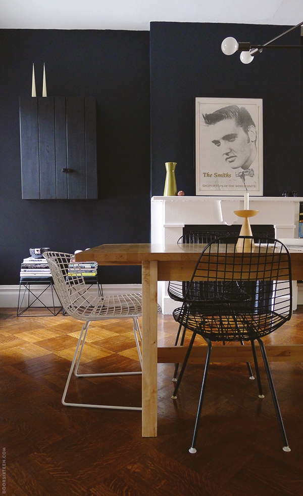
I did manage to make some progress in the dining room, though! It had kind of become a dumping ground for a long time while we worked (and worked, and worked…) on the kitchen, and once we finished carting all of the tools, construction debris and other crap down to the basement, I could see the room really needed a freshening-up. Nothing major, just a little nip/tuck here and there.
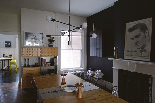
The first order of business was addressing the lighting. As cute as it was, I never felt like the pendent I had hanging over the table previously was substantial enough. I picked it out before we’d moved any of our furniture into the house, and before I had a good understanding of the scale of the rooms.
A while back, I ordered the Mobile chandelier from West Elm. (Yes, it’s on back order until April, but is April really that far away? It’s not like you’re going to get around to hanging it before then, anyway.) I wasn’t sure if I wanted to put it in the kitchen or the dining room, but they were having a sale and the pictures on the site looked nice, so I just went for it. And then it sat on the dining room table for a couple of months.
BUT! Behold! Look what Evan and I did…
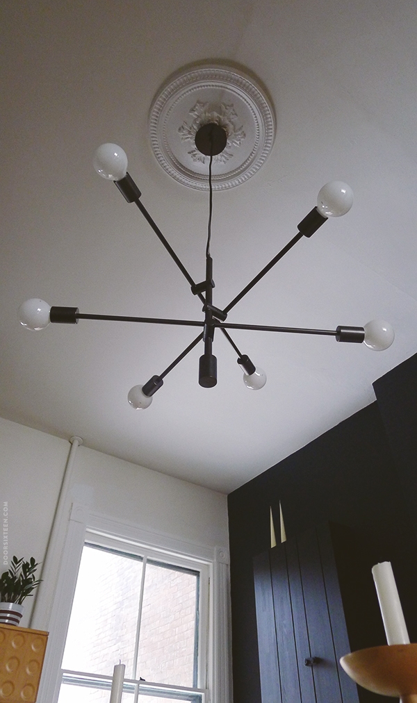
Ahhhhhhhh!!! I’m in love with this lamp. Love, love, love. It took me a day to get to full infatuation point, though. I initially positioned the arms at varying angles (like in the primary photo on West Elm’s site), which looked really clunky and jaunty and whimsical and Sputnik-ish and just not at all what I like or what looks good in my house. I was ready to take it down and either sell it or hang it in the bedroom.
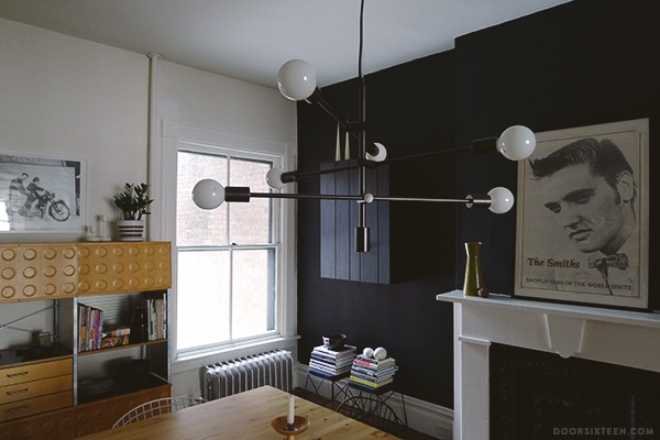
But then I straightened the arms out so they were all level and parallel with each other, and it was like a whole new lamp. Really! I’m so glad I didn’t take it down right away. It’s PERFECT. I decided to go with plain, white G40 bulbs (25W each), and I’m just going to cross my fingers and hope that energy-efficient lightbulbs are nicer by the time low-wattage incandescents are phased out. (For what it’s worth, there are current no plans to ban 25W bulbs in the US. The phase-out stops at 40W.)
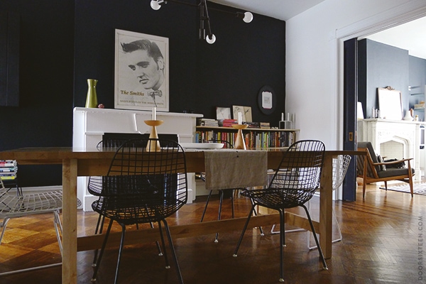
To give you an idea of the scale, the Mobile chandelier is about 30″ in diameter at its widest point (excluding bulbs), and my dining table is 95″x40″. The ceiling in the dining room is about 10.5′ high.
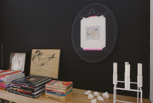
I straightened up the still-incomplete bookshelves next to the fireplace. The three drawings are by Lisa Congdon, my dad, and Jen Ray. The faceted knobs are from Pigeon Toe (I’ve been holding onto them for a project for ages…) and the Kubus candle holder is by Lassen. Some of the best books ever written are by Kurt Vonnegut.
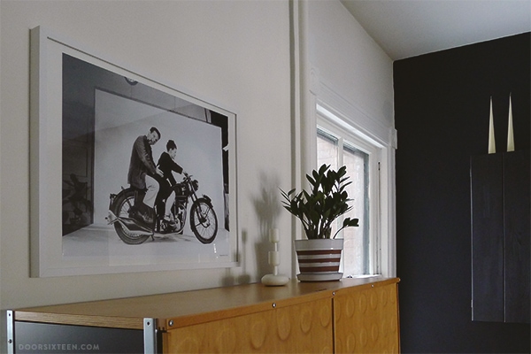
I picked up a fresh ZZ plant to replace the withered, dying ZZ plant that formerly graced the dining room, and I put my Charles and Ray Eames poster in a frame that I actually hung on a nail that I hammered into the wall! Getting things done, folks.
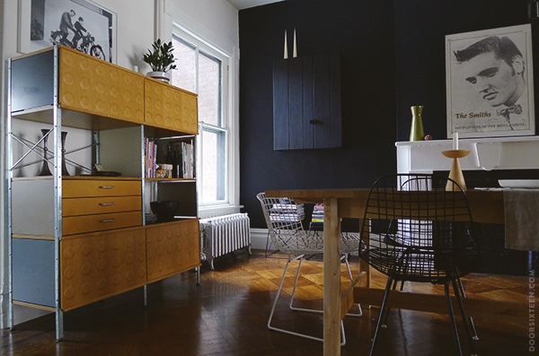
Did you notice that big black thing next to the fireplace? That’s the new OLOFSTORP wall cabinet from IKEA, and it is glorious. I had a hard time taking good photos since the light in my dining room is kind of difficult, but you can see it a little better in IKEA’s press photo.
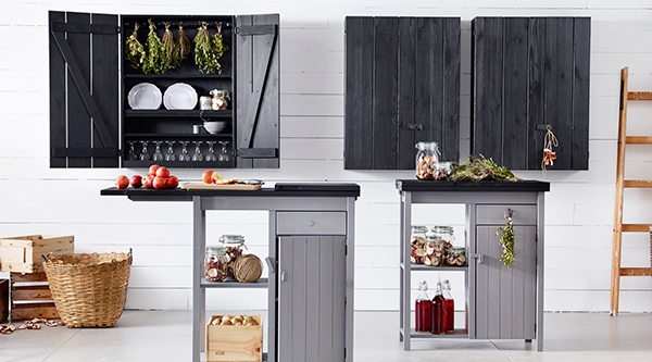
Click to enlarge! (Photo courtesy of IKEA.)
It’s very nice — definitely one of IKEA’s all-time top-ten products, which is a major accolade coming from me. The OLOFSTORP storage unit/cart is great, too. Both pieces are solid, stained pine with steel hinges. They look, feel and function like simple farmhouse furniture. Very Shaker-ish. Of course, since they’re great pieces that are built to last, IKEA will probably discontinue them within the year. That’s always the case, right? Consider yourself tipped-off and warned.
Anyway, the cabinet!! It’s just right. That space was kind of dead before because the window extends all the way to the corner of the room. The OLOFSTORP is less than 8″ deep, so it doesn’t obstruct the light flow or interfere with the view in any way. I’m a sucker for black-on-black, too.
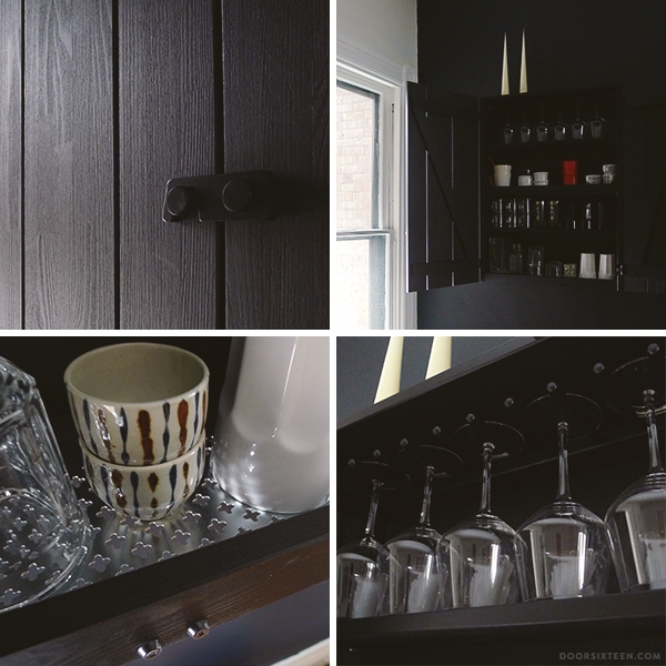
The best part is that it holds a TON of stuff. I’ve got all of our wine glasses, highballs and extra mugs in there, plus vases and various dishes I don’t use often but like to have on-hand. Moving all of these things into the cabinet freed up an entire shelf and a half in the pantry, which means I can finally sort out all of my baking dishes and get my spices in order since I’ll be able to spread out a little more.
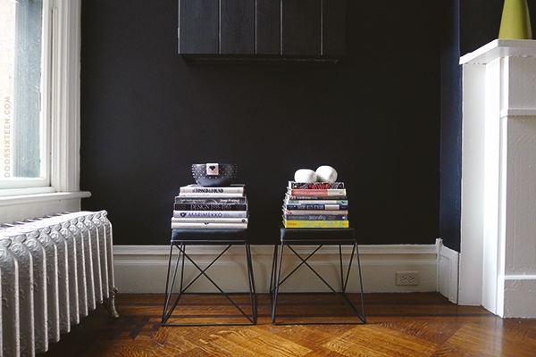
The last little dining room update I made was to add these two stools under the cabinet. I bought them at Target’s dorm room furniture line in July. I don’t remember how much they were, but definitely well under $20. At the time I thought I’d make them into a bench or coffee table, but I only got as far as spray-painting the bases matte black. They started out glossy charcoal gray, which didn’t look too terrible — but matte black is nicer.
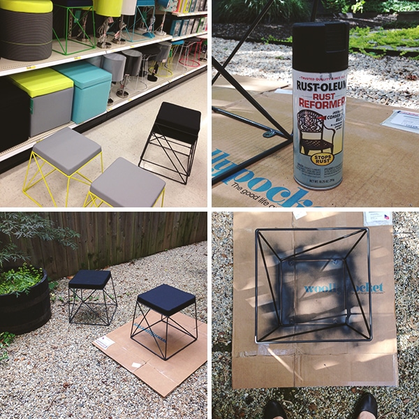
See how sunny and nice out it is in these photos? That’s how long ago I bought and spray-painted the bases. Sigh. Then they just sat and sat and sat, disassembled, in the dining room, for six months. I was sick of looking at them and feeling guilty about yet another project unrealized, so over the weekend I screwed the tops back on and called it a day.
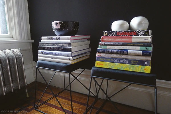
So cute! They fill out the space nicely, and I was able to get a couple of stacks of books off the floor. This makes me feel a little less guilty about not having finished the bookshelves yet. (Note that there’s still one corner of the dining room not shown in these photos. That’s the corner currently filled with stacks of books waiting to be shelved! Someday…)
Unfortunately, because Target’s product turnover is so rapid, these guys are long gone from their website. There’s a chance you could find them on clearance in a store, of course, but I haven’t seen one in my local Target for months. Hey, if you want mine, buy me a couple of Eames LTR tables and we can swap!! HAH. Heh.

Fritz was pretty distressed about all of the changes in the dining room for some reason. Lots of dramatic crying and staring at the table. I can’t figure this dog out — he’s a Martian mystery. I love him.



84 Comments
I love the progress you guys have made with this space! It’s too bad I’m not allowed to paint my current apartment, or I have a feeling there would be a black wall or two!
Fritz is adorable! I hope he’s getting used to the changes!
I have a feeling he was just trying to guilt us into giving him more snacks and cuddles. 🙂
This is such a gorgeous space Anna, I completely love everything you’ve done with it – and that amazing floor! Wow. The chandelier looks totally great above your gorgeous table and chairs!
Thank you, Sally!
Augh! I have stared at those stools in Target so many times. My local store still has a small stack of them and now I’m inspired!
Buy them all!! 🙂
Christina, do they still have these wire tables: http://www.polyvore.com/room_essentials_wire_accent_table/thing?id=84439460. I’ve been kicking myself for not picking one up for my nursery when I had the chance. I could pay for it and shipping…
I love all of this. I actually have those target stools and never would have imagined them in this way. Question: Can you give any info about the unit below the Eames motorcycle poster? I am obsessed. Thank you!
Hi Erin! That’s an Eames Storage Unit (ESU):
http://www.dwr.com/product/eames-storage-unit-4×2.do
We got a great deal on it at the DWR Annex years ago. It has a little damage (I think it fell off of a delivery truck), but nothing that makes me love it any less. 🙂
The dining room looks really great. Do you by chance remember where you bought your cone shaped candles? I have been unable to track any down that I can buy on the web. I am still kicking myself for not buying two that I saw at a Norwegian Christmas market at our local church.
Thanks.
Hi Heather, my mother bought them for me in Sweden. I’ve never looked for a source online before, but I just did a quick Google and found this store in New York:
http://propertyfurniture.com/accessories/gifts/cone-candles/
If you’re outside the US, it looks like there are a lot more options — try searching for “Danish cone candles.”
Looks great! I ordered this light in December (at that point they said it was backordered until late January, so hopefully it will show up pretty soon) and am so excited to see more photos of it.
I love it! SHOCKER. Especially the new lighting. All super inspiring!
Where are the candles above the new cabinet from?
Ah…I see your note above. 🙂
I never knew the arms on that chandelier could sit parallel! I always flipped past that chandelier for the very same reasons you mentioned. It looks SO much better. I love the room! xo
Just wowaweewah! Probably one of the most beautiful rooms I’ve ever seen!
Really love it!
Do you do anything special to keep the wood floors so shiny and lovely looking? I just swiffer ours due to Pacific Northwest muddy dog paws all the time but yours look so nice!
Tess, the shiny floors are just an illusion of reflected light! In actuality they’re quite dull and not in great shape at all. I’m guessing they were last refinished at least 30-40 years ago. All I do is vacuum (and Swiffer 2-3 times a year, tops).
good illusion! 😀
I’m waiting for the day when I live in a house that gets more natural light than the one I’m in currently (read: any!) so I can paint a wall black. I never would have considered it before but your dining room convinced me long ago. And actually, so did your living room wall. And your bedroom wall, ha!
(Also, since you mentioned that print, I’m curious about something, since you seem to be friends/friendly with Lisa Congdon. What is your take on this?: http://thomasallenonline.com/2013/11/13/copycat/ I’m surprised I haven’t heard any response from her about the allegations, especially after the issue she had with Cody Foster last year.)
Lisa is a very, very dear friend of mine, and I have an enormous amount of respect for her both as a person of integrity and as an artist whose work I admire greatly — not to mention as someone with whom I have collaborated with professionally. The subject you linked to (which has since been obfuscated by its author) is incredibly complex, and, frankly, not my place to be discussing or making assumptions about on my blog. I work in a field where I handle this type of legal issue on a daily basis and where I work with numerous commercial illustrators and photographers, and there are no simple answers. Please bear in mind that not everything we think we deserve public commentary on can be discussed for legal reasons, not to mention that sometimes people need to work through things on their own rather than in a public forum.
I’ve been reading a lot about Lisa’s silence on this issue. Like you, Anna, I’m giving the debated issue wide berth. If I could make one comment–Anna, delete if I’m out of line–it would be to address Lisa’s perceived refusal to address the issues.
During these days of rampant social media, silence can no longer be taken as an admission of guilt, an act of cowardice, or an attempt to avoid critics. I can only assume as an attorney that Lisa’s own attorney has instructed her to remain silent in regards to any matter related to pending litigation. The case law coming down, especially in family and civil court, makes this a wise decision. The only decision, really. What you post on social media is not protected communication; it is considered public information, even when your settings are marked private (keep in mind case law varies by state, jurisdiction, etc.). So, if you tweet your husband about ABC, you can’t later claim that conversation is privileged in a court of law. Many a drunk driver has gone to jail because of a status update or picture they posted on Facebook before they got into their car. Social media = opposing counsel’s best friend. It’s why bloggers getting divorced often say nothing about their divorce after the announcement. It’s the new standard instruction attorneys give, and when your visitation rights can get slashed because of something innocuous you posted on instagram, you learn real quick to shut the hell up.
Don’t ever be surprised when someone doesn’t respond or give an opinion regarding a legal issue in which they are involved. Attorneys are a cautious bunch. Were it legal, we’d probably wire shut our clients’ mouths and duct tape their fingers together to keep them from typing.
So basically your “very, very dear friend” has plagiarized and directly copied other people’s work, says absolutely nothing in response to it, and you continue to bury your head in the sand when it comes to the irrefutable proof of your “very, very dear friend” being a complete fraud.
Not only does her silence say a lot about her, your insanely biased and embarrassing defence says a lot about you.
Well done.
Yes, her silence does say something about her: It says that she cannot speak about the situation for legal reasons. Not even to offer a defense or to correct the many falsehoods that have been spread her. If you read anything more into it than that, you are a fool. The end.
And what does my reply to Erin say about me? It says that I love my friend, and that I know she is a good person. It also says that I believe in her as an artist and as a collaborator. It says that because of my profession, I know how vague the legal definition of derivative works actually is. It says that I know how reference fees work, and how commercial art is commissioned. It says that I know that people are capable of becoming stronger and of learning from experience. It says that I know people—ALL people—are fallible, and that we define ourselves through how we progress.
And what does this comment say about you? Well, given that the last time you commented it was to be a rude jackass about something as innocuous as my Etsy Page, it says that you’re a hateful, petty person who takes pleasure in feeling like they’re taking people down a notch. You’re on a mission to be better than the people you’re obsessed with disliking. That’s pretty sad, Jane (or whatever your name is this time, you anonymous coward). If you truly believe in the things you’re saying and feel it’s important to make yourself heard, at the very least own your words. I don’t care if you like me, but your anonymous grandstanding is completely hollow.
Anna, I appreciate you taking the time to respond! I know the issue is more complex now than I did when I first asked my question, and I promise I wasn’t trying to start up anything. Yikes, you got kind of a nasty handful from that Anon. Sorry! If you remember, I was the person who alerted you when that Australian blogger was using your design for SFGirlbyBay without credit, so I figured (incorrectly, I now realize) there was some segue to this topic. Thanks for answering xo
Erin, no worries, no need to apologize. I appreciate your frankness in asking, and the fact that you used your real name when you brought it up. I don’t think everyone has to be quiet about the subject, but I really don’t have anything else to add. Maybe someday the parties involved will be able to speak publicly about the whole thing. Maybe not. In the mean time, though, all anyone can do is hold on to the things they KNOW are true about the people they love. And that’s always the case in life, really.
Anna, I hope it’s not out of line for me to post a comment on this issue (and please delete if you think that’s right). I am really grateful that you left this whole discussion up (including Person in Austraiia’s comment). By doing so, you’ve provided an elegant lesson in (a) why we should not take everything we read on the interwebs to be the gospel truth; (b) why we should stay out of legal controversies that have inexplicably, and wrongly, gone public; and (c) why we should be respectful when commenting on a blog. I grew up in a household with a composer and a broadcast journalist, both of whom drew inspiration every day from the work of others. I myself do the same in my work and in my personal life (if I sent you a picture of my upstairs sitting room it would probably look like ‘Anna and Evan’s Vermont vacation home,’ and I don’t think you’d mind). I am, like you, a grateful supporter of everyone who is creative and who takes the time to make work and put it out there. And, like you, I understand some of the complexities of copyright law. And there my own expertise ends, and that’s why it’s no business of mine or anyone else’s to comment on any ongoing copyright controversies, as you’ve so rightly pointed out. Person in Australia, I hope you read this: You should be ashamed of the assumptions you’ve made, and your snide insinuations embarrass everyone who has ever taken the time to leave a thoughtful comment here. For heaven’s sake, stay out of things you don’t know anything about. The rest of us do.
I love this room. It has design classics within it but doesn’t look like a show room. Instead, I think it is a personal space that contains so much of you (and I guess Evan too).
I have the LTR tables on my wish list. I visit them every now and then to remind myself how well they’ll fit a certain space.
I have a (slightly) annoying question. Please feel free to ignore. I know the paint you used for that lovely dark wall – I looked it up. I’m about to paint one (possibly two) walls dark in my otherwise white wall house. I have a stack of tester pots from Farrow and Ball and I’m a little daunted. I’ll pick one and paint. I can always repaint it. But I wondered if you had any idea which F&B shade was closest to your BM shade? I think the light conditions in my room might be similar to yours and I’d like to see how the colour most like yours looks before I order the big tin of paint. (As I said, feel free to ignore. There’s no reason why you’d know… I guess I assume you know everything about very dark paint!)
Haha, not annoying at all, but I honestly have no idea. F&B paint isn’t readily available where my house is, so we never really considered using it. I have a chip book somewhere, but that’s the end of my knowledge. Sorry!
ack..a new house post! I literally had to go pee then grab a cup of tea because I was going to enjoy this 🙂
and enjoy I did. took me a full ten minutes to get past that gorgeous black cabinet on black wall….then later you asked if we saw it. um heck yeah I saw it….drooled even!
I am a little bummed though because I have seen those cute stools at Target many times and passed them up because they were bright yellow or teal blue and never thought about spray painting them. why? WHY? I am the painting queen *sigh* and it never crossed my mind.
my only hope is that there still might be some there on clearance. I am currently snowed in so I will have to wait with bated breath until the roads clear.
Grabbing another cup of tea and going to spend a full 30 minutes staring at your gorgeous dining room (love the new lighting!) before I pry myself up to do household chores.
thanks for the post!
This looks great, but I’m wondering, didn’t there used to be elfa shelves beside the fireplace? Did they not work out? I’ve been considering them recently and wondering about your experience. Thanks!
Yes! I took them down about three years ago, though. Elfa shelves are great for lightweight stuff, but not so great for heavy books. They were bowed within a few months. Lame!
Hi, it’s “spoonling” from Instagram 🙂
Thanks for posting the pics of the chandelier! Looks great! I really like the way it looks against your black walls. And it looks like it’s just the right scale. I actually went ahead and ordered it yesterday. It’s back ordered until April, but I found it at another location and they’re shipping it to me. I may get it today! I really hope it works in my space – I have low (8′) ceilings in a big room – kitchen/dining combo, with light walls.
I have to tell you – I LOVE the kitchen redo! It looks so, so good! I have the wall hooks from Pedersen + Lennard in my shopping cart, just waiting to pull the trigger…
I’m so curious how your floors would hold up in my kitchen/dining. It’s a very high traffic area with kids and pets. Right now, we have the worst tile (laid in a diagonal :/).
Anyway, thanks for all of the inspiration!!
Ooh, Anna, lovely. Congrats! That Olofstorp cabinet might solve a very big problem for me in our kitchen/dining room. Must check it out next time I make the three-hour IKEA drive (which I do about every two weeks).
Question 1: Didn’t I see at IKEA just yesterday a LEDARE globe bulb? I think I did. You might want to check it out. It seems the LEDARE line just gets bigger all the time, and I have used several of the bulbs with great success. Question 2: Do you think Fritz thinks the globe bulbs are balls? (Rocky had a similar issue once.)
LOVE the cabinet! I didn’t see it at IKEA Stoughton yesterday (we are now splitting our loyalties between the Boucherville, Quebec store and the Boston store, which is, by the way, the BEST IKEA I have ever been to. So roomy and so well merchandised. Gorgeous.). Now I’ve gotta look for it. It could solve a very big problem in our kitchen/dining room (similarly involving glassware).
And thanks for the comment reply on ELFA. We were about to do a full wall (18′ long, 7′ high) of ELFA book shelving in the living room. Dodged that bullet, thanks to you. Back to the original plan (IKEA brackets, ash shelves).
“The ceiling in the dining room is about 10.5′ high.” Sigh. I miss our Brooklyn apartment (which admittedly had only 9′ ceilings, but still.)
re: using elfa shelves for heavy things.
The problems with heavy things on the elfa system is in the shelf board. I installed the rails and brackets in my previous kitchen to hold my microwave and cookbooks and mixing bowls. However, I made custom shelves to sit on the brackets that were re-enforced with a 1×2 lip on the front edge and exposed side edge. It made the shelves look more finished and strengthened the shelf to keep it from bowing.
Thanks so much, Ryan! I had had that thought too, so perhaps I’ll go that route. I appreciate your help!
I can’t wait to see what you do with your shelving. I need to come up with a better shelving solution next to my fireplace as well, so I can’t wait to see how you develop yours! And once again, I’m craving a black wall…Thanks:)
The dining room looks amazing. When you opened up the Olofstorp cupboard and saw the cross-stamped bottom shelf, did you shout “SOLD”? It’s so Anna!
Question about your walls in the house.. you may have answered this elsewhere. Are they plaster or drywall? I ask because we live in an old house with all plaster walls and I’m a little anxious to nail into them but I really don’t like the way framed art hangs from a picture rail. Are you nailing into plaster? Any tips or should I just go for it.
Thanks!
Yes, my walls are plaster & lath over brick. I’ve never had any issues with nailing or drilling into them, though I do usually put a little piece of painter’s tape in the spot where I’m going to make a hole to prevent surface crumbling.
Gotta love the opportunity to play with spray paint! What makes this room work so well is the layering of the black on black which allows the textures as they capture the light, to be their own artwork. I wish more people would cast fear aside and do this. Everything does not have to shout at you and going tone on tone, works magic. Well done. 🙂
HAHA I cannot even remember how those Target stools have been stacked in the corner of my apartment waiting to be made into a bench. You inspired me to spray paint them today and forget the bench, for now!
Oh and your dining room looks beautiful, per usual! Love.
stunning… I l o v e it all so much!!
WOW! It all looks fantastic. The black is sc crisp and that fixture is to die for. Definitely inspiring!
Hooray! What a bummer to invest in a piece, wait around for months while its on backorder, then realize it doesn’t work in your space. But you turned that thing around and it looks great!
It’s looking good. I love following along on your progress.
Your house is seriously fabulous Anna!
What an inspiring space 🙂
Your endless energy inspires! Happy new year. x
Hi, Anna.
Wow. The place looks amazing.
I’ve got a question for you… my husband and I have been eyeing the same light fixture at West Elm for a while now, but it takes up to 60 watt bulbs which aren’t being made any longer (although I’m sure they’ll be available for sale for a while). Any idea on a source for attractive 60 watt bulbs for when the ones in the fixture burn out? That’s my one hesitation…
Thanks for the gorgeous photos!
Susan
Okay… I admit I just drooled over the photos before posting my comment. I didn’t get into the text until just now. And you mention the bulb thing there. Sorry. I just got so excited by the pretty pictures!
That’s OK! Nice to see you here. 🙂
Six blazing 25W light bulbs is quite a lot of light (we have this box on a dimmer switch) — I can’t imagine putting 60W bulbs in this fixture!
Love your Dad’s drawing.
That frame for Jen Ray’s piece is amazing.
Fritz. So pensive 🙂
I take it back — the light looks good in the space! We have the same 25 watt bulbs and straightened our arms out too. I don’t like it all cattywampus.
Cattywampus!! I had to look that up. 😀
The light is perfect for the space! Whenever I see gorgeous fixtures like this, I always wonder about the phasing out of incandescent bulbs, so it’s good to know that there are (as of now) no plans to phase out anything below 40w.
And random, but I was browsing Society6 and saw this print and thought of you. It must be the whole pink and black thing, but I thought I’d share it in case it’s something you’d like.
http://society6.com/product/Pink-Sun-yea_Print#1=45
Thanks, Melissa, I love Georgiana’s work!
Love the chandelier! On the West elm page it says that it is plated antique bronze, but it looks black, is it..?
Thanks!
It’s a very, very dark antiqued bronze — it reads as black in my photos (and from a distance), but the photos on the West Elm website are pretty true.
The OLOFSTORP on your black wall is very Louise Nevelson. All looks splendid!
Hi Anna! Love your blog and your aesthetic. I’m fixing to paint one of the walls in my studio black, and I am running into some serious indecision as far as whether or not I should paint the crown molding at the top of the wall black as well, or just leave it white as is.
Or would you suggest to just update the boring-rented-apartment-blah-white to a better, actual white and call it a day?
Thanks!!
Hi Jasmin, I think it really depends on the room—how big it is, how much other trim (door casings, baseboard moldings, etc.) is on that wall, and so on. I don’t think there’s any rule I’d adhere to across the board. I don’t have crown moldings in my house, but if you want to see what a black wall looks like with the moldings painting to match, that’s what I did in my bedroom:
http://www.doorsixteen.com/2010/10/24/the-bedroom-wall-is-finished/
hello, anna. the house looks wonderful and i love this post about lighting. the room is PERFECT! we bought an old historic home about 8 months ago and have finally mustered the courage to start taking on projects ourselves (after years of renting in manhattan and brooklyn- where we weren’t even allowed to nail in mirrors or frames- we realized that we didn’t even own a stud finder…but now we do!). anyway, our home has gorgeous details (it’s from 1895), beautiful tile work around the fireplaces, and wood floors that were re-done. the biggest down fall of the home is the lighting fixtures. all of them. they are truly awful. think: suburban “contemporary” meets the medieval gauntlet. we ordered the DIY lindsey adelman chandelier parts from green brass (i think that’s the company) and now we are beginning to undertake the project of assembly and hanging. this post has given me a lot of inspiration- and I think we will try and construct the chandelier to be straight, as opposed to sputniky. we also want to put in a ceiling medallion- it frames your light beautifully. so here’s my question: did your medallion come with the house? if not, do you know where to buy a good quality one that doesn’t cost a fortune? thanks. these posts are really terrific!
Hi Batya! Congratulations on the house. 🙂 Most of our ceiling medallions (including this one) are plaster and original to the house. A few rooms were missing their medallions, though, and we replaced them with off-the-shelf, cheap-o plastic medallions from Home Depot and Lowes. If you like the style of one you see, just go for it — once they’re painted (I like to use the trim color in a matte finish), they pretty much just look like plaster medallions.
If you’re looking for something a little more specialized, check out Historic Houseparts (a great resource for many things!):
http://www.historichouseparts.com/pdshop/shop/category.aspx?catid=106
We didn’t have the budget for anything that nice, but they look amazing!!
Hello Anna, lighting is so perfect, it looks like very well in your interior :-). Currently I am finding light in our living room, so thank you for inspiration. The stools are nice maybe in grey variation I like more. And of course Fritz is amazing :-).
Greats from Martina
Anna, except for stopping by to see your mother, it looks like you used your vacation very well. Poor Fritz. he is probably wondering what you did with the old lamp. Can’t the shade be used on another lamp base somewhere? I always liked it, but the new lamp definitely looks more dramatic and so nice against both the black wall and the white ceiling. I’m looking around for a floor lamp and may contact you for your opinion soon …
I just love any post about your home. The room is fantastic. I love the details and how you arrange things. I need you to stay over in my place for a few days. Any chance you call in on us here in SW Ireland ?
i’d seen those target stools and *almost* purchased one — if only i’d thought to do what you did with them! great revamp + beautiful space you have —
I love the yellow shelves. It reminds me of my sons legos! Where did you get it?
That’s actually plain molded birch plywood, not yellow paint or anything. It’s an Eames Storage Unit…if you scroll up in the comments, there’s a link. 🙂
Got it! It was hidden when I was doing a visual scan. Thank you!
very beautiful, and cut dog 🙂
Hi, it’s your neighbor 😉 Anna, the whole thing amazes me every time I look at your blog. You must be so thrilled to come home to that space! Enjoy it! There is nothing like doing it yourself, considering every addition, subtraction and hack. Love it!! One of these days you’ll have to see what we did with B & W. Ring the bell anytime!
Incredible. As always. Your house is so ridiculously inspirational. Can’t wait to get my hands on a rental that allows me to paint – black paint everywhere.
I just went out and bought the OLOFSTORP – I had to after seeing it on that black wall. What else makes your top ten IKEA list??
That’s a good question, Tyler!! I should probably try to make an actual list sometime, huh?
hi! i love your dog! and your last post on pink + black & white which made my day since I really love pink too! (and i especially especially love the elegant and restrained way that you handled the jerk commenter above with their ignorant snarky remarks which were nonsensical and designed only to be aggressive.)
my question is not related to any of the above.
How comfortable are those Bertoia (sp?) chairs? I’m thinking of getting four of those for our house – but the fake versions from Amazon- and have read a lot of mixed reviews, mostly about durability and comfort. We’d be using them on a daily basis – with two young kids. And lots of pasta sauce.
thank you! (if you’ve answered this question before feel free to just send me the link!)
Hi Rachelle! My Bertoia chairs are originals made by Knoll, so I’m afraid I can’t comment on the quality or comfort of any of the many knockoffs that are available. The knockoffs have very different proportions, so I would tend to think they also feel different when in use. (All of the knockoffs are different from each other, even…)
As far as the real thing goes, they are quite comfortable for dining room chair purposes! They’re not meant to be desk or lounge chairs, so I’d say maybe an hour is the max before I start to need some lower back support, but that’s the case for most dining chairs. (I don’t wear shorts or have bare upper legs ever, but I would imagine wire isn’t the more comfortable thing for people who do? There are pads available as an option, of course, but it’s something to consider.) Durability-wise, a real Berotia chair will outlive me, you and your grandchildren’s children. A number of NYC parks and businesses use them for outdoor seating just for that reason — they are incredibly well-made.
But again, I can’t speak to the knock-offs. I personally don’t think the ones I’ve seen look right because the proportions are all off, and the beauty of this chair is in the proportions! I’d also be worried about the quality of the welds and the angle of the seat. The knockoffs I’ve seen don’t have properly-finished wire ends, and often the seat is attached to the base in a very inelegant way.
Have you looked for a vintage/used Knoll set? They do turn up quite a bit because of their popularity in public spaces. If you live near a DWR warehouse that sells damaged products, that’s also a great place to check. We paid less than $100 for each of our three, it just took a little time and patience. They have a tiny bit of rust here and there, but it’s nothing egregious. Even an old Bertoia with a lot of rust can be sandblasted and powdercoated and look like new. (I’ll take a rusty original over a shiny knockoff any day, myself!)
This video is worth watching if you want to know more about the history of the Bertoia chair and about the quality of Knoll’s construction. 🙂
Hey there Anna! Just started following your blog day. Very inspirational stuff! And I like what you did with those Target stools. You mentioned they were glossy, did the matte black spray paint adhere to the glossy surface without having to sand them down?
Nope, no sanding is necessary as long as you use a spray paint with built-in primer.
I really like this lighting. The dining room looks very nice.
You know that you are truly amazing! Look how many magnificent design and decoration changes you have done there! I’m fascinated!!!
Hi Anna,
I was just looking at the Mobile Pendant. Where did you buy the G40 25W frosted bulbs? I was just looking for them online and couldn’t find any. Thank you!
–Julie
Hi Julie, I don’t remember (Lowe’s, probably?), but I just looked on Amazon and there are a bunch!
Hi Anna –
I know this post was from over a year ago, but hopefully you’ll see this. I wondered if there is there any chance that the bulbs you have used in your West Elm chandelier are actually G25 size? I just got this same lovely chandelier and have been trying out different sets of light bulbs to achieve a look similar to yours. So far I’ve tried Edison bulbs, G40, G25, and G16.5. The ones that look the most like your photos to me are G25 size. G40 bulbs are five inches in diameter and when installed, they really seem to become the focal point on my chandelier. When the G25 bulbs are in, the chandelier is the focus and they seem more proportional. It may just be that I have a much smaller dining room and table than you do, but I’d love to know if you’re actually using G25’s?
Thanks in advance!
Cindy
PS – I’m sorry you’re saying goodbye to your beautiful house. It has been the source of much inspiration in my life over the years. But I also look forward to watching as your next chapter unfolds. 🙂 Best wishes.
Hi Cindy, they’re not marked, but definitely go with whatever you think looks best! It’s certainly possible that I got it wrong in my post. 😉