I’m not sure I ever really noticed it until I started designing stuff for my own shop (which is turning out to be surprisingly pink-heavy), but I really do have a thing for pink. Not only screaming-hot neon pink, but a much softer, paler, gentler pink — shell pink, pale corals…blush, if you will. I think my obsession probably started when I was working on the design for sfgirlbybay, when I realized how great pale pinks look alongside black, white, marble and wood — my favorite tones and textures.
To be honest, this wishlist I’ve put together here probably could have been 15x longer. Once I started going through my Etsy Page and my Dropmarks and all of the miscellaneous junk all over my desktop, I found a whole lot of pink. I managed to narrow it down, though, and these are my favorites! I might still need to do a part two…
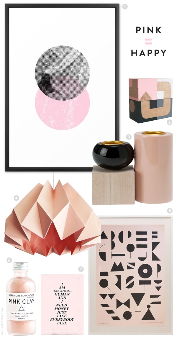
1. Two Circles print, K IS FOR BLACK
2. Ornament Pastel Wooden Blocks, Sketch.inc
3. Short Stacked Candlestick, Kate Spade Saturday
4. Origami Paper Lamp Shade, Re-Born
5. Alfabet Poster, Leise Dich Abrahamsen
6. Pink Clay Facial Mask, Herbivore Botanicals
7. I AM HUMAN AND I NEED MONEY JUST LIKE EVERYBODY ELSE DOES print, Wasted Rita
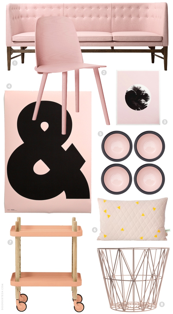
1. Mayor Sofa, &tradition
2. Nerd Chair, Muuto
3. Ink’d Pink, Sketch.inc
4. TS Berfa ampersand poster, Robert Wilson/Typespec
5. Wide-Rim Bowls, Kate Spade Saturday
6. Teepee Quilted Pillow, Ferm Living
7. Block Table, Normann Copenhagen
8. Wire Basket, Ferm Living
34 Comments
The combination is so sophisticated, right? A shame dogs don’t come in that shade of pink.
Well, not naturally at least!!
Love this collection of objects! I have recently been into light pink too! Just did some watercolor paintings with a pale pink wash & white gouache. There is something so lovely about the blush tones: nuanced, delicate, & strong.
I didn’t know how much I love pale pink until I did a big wardrobe edit and was left with a wardrobe of white, grey, black and pink. I’m loving everything you’re making for K is For Black, Anna! I can’t wait to get my OK phone case – I’ll shoot you a photo once it comes in. XO
I want a picture of the baby holding the case!! 😉 xoxo
My bathroom! 🙂 and it may need some new art – thanks for this idea filled post!
I just had the same realization while reading a post over on My Scandinavian Home of a monochrome home with touches of blush pink. I hesitate to call it salmon, but it’s a really gorgeous shade and seems to go with everything. Those bowls! Need.
Also what is dropmark? I feel so behind the times!
Oh! Dropmark is just a place for organizing bookmarks and images visually. It only stores a thumbnail locally and requires you to visit the source in order to see the full content. You can choose to keep your sets public or private (mine are all private), or to share individual sets with other users. It’s really great for designers or other people who do a lot of collaborative and client work!
You’re not behind the times! It’s only been around for a couple of years, and it’s not really a social/follower-based thing like Pinterest (which I don’t use). It’s a little more professionally-minded, so I don’t think it’s ever going to turn into some huge phenomenon. 😉
YES YES A THOUSAND TIMES YES
I am not a “pink” girl but I also love pale pink and blush tones. Some of these seem really peachy, like pale nudes. I daresay, on my monitor, some items look about the same color as your apartment bathroom tiles, only brighter. Are you warming up to the bandaids as you design the rest of your bathroom? Haha.
Haha, I know what you mean. The apartment bathroom photographs much more pink than it actually is, though. It’s much more beige/tan in real life, sadly. I love pink tiles!
I keep seeing Herbivore Botanicals everywhere. The packaging is GORGEOUS…does the product live up? Anyone?
I just ordered a few things the other day, so…we shall see!
Dusty rose, forever and ever. And I’m not a pink girl, despite being told regularly it’s a good color on me. It’s feminine without being cloying. Dusty rose is the cousin pink’s mother warned her about.
It can also be that lady with all the cats who loves a good buffet, but life isn’t perfect.
Sigh. Broken link; such is my life.
This is the color scheme I’m pushing for my 8-year-old’s room. So far, I’ve gotten her to switch from strawberry pink to blush. Now I need to work on the black. We have a Jenny Lind bed that would be so good black. So many of these items would be good in there…
I love this shade of pink. It’s the best. In my first apartment, my whole room was this blush pink and I was so obsessed with it. I think it was a little much but I still have such fond memories of having a room just the color I wanted. I love black with pink like this! Very sophisticated!
such a gorgeous round up, my friend. pink is where it’s at! at least this shade. 🙂 xo
Please excuse the off-topic question, but do you have a vacuum that you like and would recommend? You do a lot of cleaning and I thought you might be as particular about your vacuums as you are about your wastebaskets. We’re looking for something that works on rugs, including flat weave dhurries. The Miele cannisters are beautifully designed, but the ones that work on rugs are absurdly expensive.
I have a Miele, Cate, one of the less expensive ones. It works very well on rugs! Bought it to replace an Electrolux that died.
Oh, very good news, Anna! So funny! Thank you! All roads are pointing toward the Miele, lol….
Oh, just love this!
I can see your point for pinks with your chosen neutrals (my fave hues, too), and blush is flattering to most faces, but I just can’t shed my lifelong shudder at most pinks. Fuchsia and coral in small does, OK. Maybe it’s generational. To me, pinks are Barbie dolls and cliched girly-girl, and I’m much more a tailored sort. That said, the strong graphic lines of most of your picks definitely have appeal…. And it will be interesting to see what lands in your house.
Oh, I totally understand, believe me. I wasn’t even particularly into pink as a kid. It just kind of happened! I don’t think it’s generational, though—I don’t know how old you are, but Barbies were definitely still popular when I was a kid in the ’70s and ’80s, and for as much as I know a lot of parents would like this to not be the case, pink is most definitely still associated with little girls’ things. Hopefully someday we’ll move away from that! Pink for everyone. 😉
Wonderfully curated! This shade of pink is lovely. I am an “orange” gal but I am loving the pink.
I love, love, love light pink with black and white. I need to incorporate more pink into my wardrobe, I think. This post looks so pretty on your blog, too. 🙂
I normally think your asthetic is utterly impeccable, Anna! I keep looking at those images above and thinking this one’s a misfire. Really surprised.
That’s OK! Whether or not everyone likes something has no bearing on whether or not I do! Not trying to please anyone’s taste here other than my own (and maybe my mother’s). Glad you’re surprised. 😉
I LOVE what you did on sfgirlbybay’s site.
Im sure you’ve seen this by now: http://www.remodelista.com/posts/coming-to-ikea-limited-edition-brakig-stool-in-pastel-colors-like-frosta-stool-alvar-aalto
I LOVE those shelves, and in “pale rose”? I thought of you!
Hah! Laura, I actually have a post about the Bråkig collection coming up tomorrow. 😉
Lulz. Too funny!
Just came across this and figured you’d wanna know about it if you don’t already..
http://www.urbanoutfitters.com/urban/catalog/productdetail.jsp?id=30510358#
Cute!