Yeah, I could live there is an occasional D16 feature wherein I post pictures of homes I want to break into, kick out the inhabitants and move in. Today, let’s play uninvited guests at the Copenhagen apartment of set designer Nadia Nabil Korsbæk, shall we?
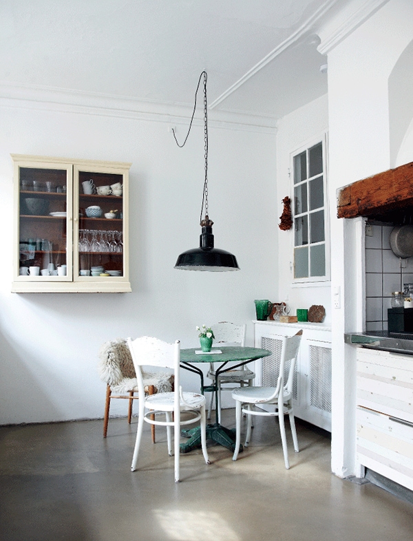
What a sweet little eating area! I wish we could see more of the kitchen that’s off to the right, but the lumber-sided cabinets that are visible look very cool…and you know how I feel about square white tiles with dark grout. The cream-colored cabinet is so lovely with its bare wood interior, and I love a good set of mismatched chairs! So cozy.
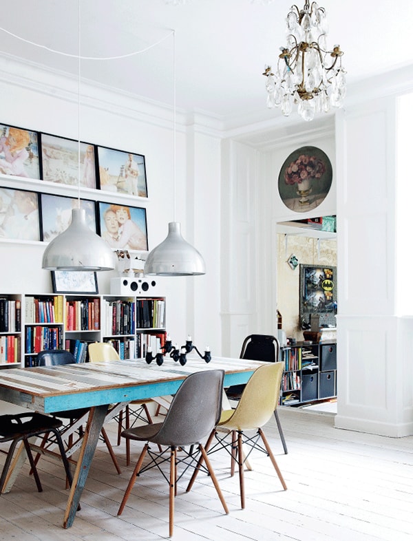
OH. Oh, oh, oh. I don’t know the story behind that table, but the shape is reminiscent of Prouvé’s EM table. The scrapwood technique reminds me of Piet Hein Eek. Wherever it’s from, it’s gorgeous. And more mismatched chairs! Four Eames DSWs and two Charlotte Perriand Les Arcs chairs (someday…). Perfect combination!
What about the pendant lamps? They must be vintage, yes? The scale is just right, and I’m amazed by how nice they look swagged across the ceiling like that with a hardwired chandelier only a few feet away. Somehow Scandinavians seem to be able to pull off stuff like that more easily than the rest of us. I’m trying to learn.
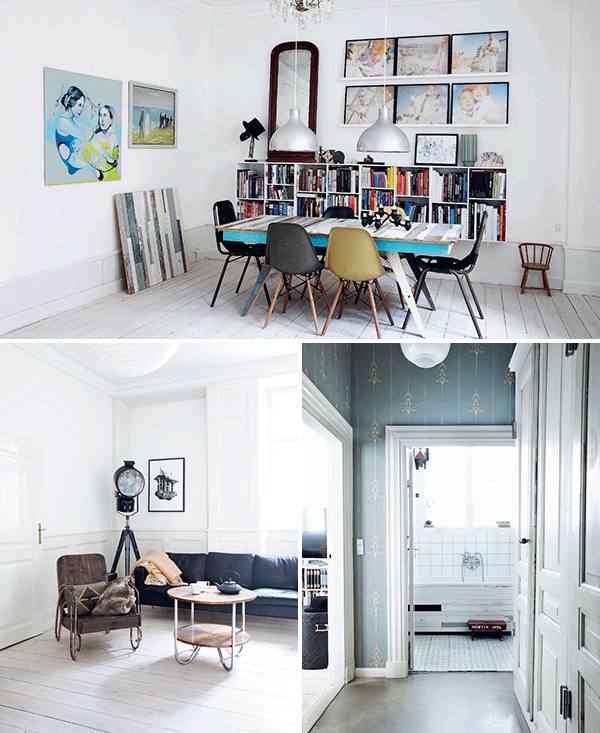
Looking at more of the dining room, I kinda feel like that oversize antique mirror really makes the space. Right? And more scrapwood. And speaking of more scrapwood, see the bathtub? MORE SCRAPWOOD. More square white tiles with dark grout, too. I love when bathrooms and kitchens match.
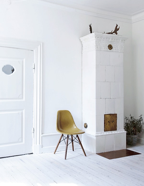
I noticed this in the dining room photo too, but see that rounded trim about a foot above the floor? I wonder if that’s actually just a strip of molding that’s been mounted higher than the baseboard to make it look more substantial. Do you know what I mean? So what’s between the two pieces of wood is actually wall, but since it’s all painted the same color (you can tell from the dining room photo that it’s slightly darker than the wall), it reads as one piece of molding. Am I making sense? Anyway, I really like that idea, even if it’s not what they did.
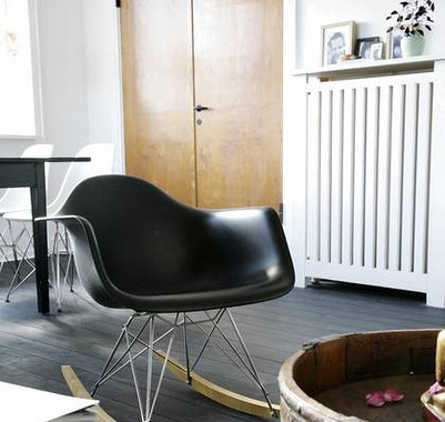
You know what? I don’t care how “overdone” it is at this point (as if!), sometimes all you need is a colorful Eames chair in a white room. And a plant. And some antlers. You know the formula. Hey…it works! I want to be in this room right now. Hopefully the homeowners won’t mind.
✚ All photos by Mette Wotkjær
✚ See the full article (and more photos!) at Femina


8 Comments
I love the cement floors in this apartment too! Once again, probably one of those things that Scandinavians can pull off so more easily…
I love the bold white and black, and then the hints of green and blue. So soothing.
This may be my favorite series – I will kick them out and live in that gorgeous space with ya!
The article says the dining table is made out of reclaimed wood by Jacob Langebæk from Snitteriet. And the industrial lamps are from Genbyg.
Ana, if you look at the dining room picture where there is tiny chair in the right corner – I think it looks like the baseboard molding is real, not just darker paint (the corner seems to stick out a bit under that molding). And on the left side, under the painting of two ladies it looks like a seem of too pieces of wood.
So sorrry, for typo in your name, Anna!
Assuming that the wood panel in the dining room is an extra leaf for the table- but it looks perfectly at home propped against the wall. My table leaves are banished to the basement when not in service- there is certainly no mistaking them for art.
Those chairs are great and remind me a bit of chairs used in schools. I also like the low-hanging lights over the table.