Okay, first of all, I have to apologize to the French—and all other living humans—for unleashing the horrible, hybrid pseudo-word “fauxdenza” on the world. I actually Googled it before starting this post and got no results, so I know it’s my fault if it actually catches on. Sorry!
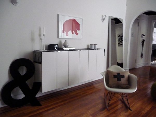
I’ve been putting off taking photos of the main room of the pied-à-terre (wow, that’s two French terms in one post! Fancy!) for almost a year now, mainly because I feel self-conscious showing stuff before it’s “done”. The thing is, though, showing these unfinished projects winds up being a good motivator.
So! Fauxdenza! We needed something credenza-like in the apartment for closed storage, but I wanted it to be off the floor and shallow. It’s a one-room apartment, and being able to see where the floor meets the wall creates an illusion of space.
Enter IKEA kitchen wall cabinets! This configuration is three 24×30″ AKURUM cabinets with APPLÅD white doors. Each cost $52, so the entire thing was only $156. Not bad for 72″ of storage space! IKEA cabinets are really, really easy to hang—you just mount a single steel rail on the wall with the appropriate hardware (I managed to hit a couple of studs by chance, and used concrete anchors for the rest of the screws), then hang the assembled cabinets on the rail.
Including the doors, the wall cabinets are only 12 ½″ deep, so they really don’t take up much space in the room. The bottom edge lines up perfectly with the top of the moldings, about 8″ off the floor.
Anyway, back to the “unfinished” aspect of this post…
The top. See, IKEA kitchen wall cabinets are intended to be hung higher up on the wall (obviously), so the top isn’t really finished. There are visible screws, and of course there’s nothing covering the line where the cabinets meet. That’s why there’s a table runner on it. For 10 months I’ve been meaning to do something more finished to the top of the fauxdenza (fauxdenza!), but I haven’t had the motivation to really deal with it.
I’m 99% sure I want to buy a piece of the LAGAN beech wood countertop and cut it to fit. I can use the scrap to make a long shelf under the window, another project I’ve been putting off for almost a year now.
Just as soon as that lease is renewed…
(That huge ampersand? It’s from Hindsvik. The great red bear print is by Sarah Edmonds at Banquet, and the cross pillow is from Brin & Nohl.)
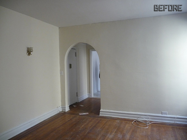
Just for fun, here’s a before photo of the apartment. Amazing what the right white paint (and a sconce makeover) can do, isn’t it?



86 Comments
what the heck. this is brilliant. who would think of doing this!?!?!?
I’m pretty sure I got the idea from this guy, but only I can take credit for calling it a “fauxdenza”!
Fauxdenza! I am barely repressing the urge to just yell that out loud.
About that countertop, what would you cut it with? Because I have been eyeing their countertops but wasn’t sure about the whole cutting part.
For lengthwise cuts, it’s probably best to use a table saw. If you’re just cutting across to make it shorter, though, you could get away with a circular saw or even a jigsaw.
Hmmm. Sounds like I need to befriend someone with a table saw.
We have an eating bar that is made from one of those amazing pieces of countertop. It was deeper than the space needed, so our contractor cut about 6″ off the width of it. He used a circular saw (he didn’t have his table saw at our house that day) and he hid the slightly imperfect cut edge with a bit of trim. We love that countertop – it’s basically indestructible! Aaaand, the 6″ wide leftover piece gets pulled out for Super Bowl parties as a cutting board for the annual Giant Sandwich.
Hahaha! I love your idea for the leftover piece, Liz!!
Looks fab. I love your candlesticks. I hope you manage to renew your lease!!
That looks excellent Anna! I really like your idea for a top as well. The mirror you have really works for the room as well, which one is it?
It’s the HOVET!
Looks great and I think the beech would be a nice touch. (Love the IKEA jars too…I bought a pair recently, no idea what I’ll use them for but the design is so simple and elegant…I wish the larger ones didn’t have the plastic “peekaboo” in the lid). I had to laugh about the table runner…we used a series of IKEA wall units for our “stair cabinet” and are having the same dilemma with a countertop. I think we’re going to end up getting a 1×12 board and painting it. We looked at countertop options but our unit is 10′ long so it gets a bit tricky.
So smart! Love it.
What a great idea! And not a bad price at all. I even like it with just the table runner. I saw the same idea somewhere else but with shorter cabinets – I think the ones you get for over the refrigerator. I wonder if the 24″ deep ones would look weird. I need something to hide my larger-than-life printer.
Tatyana, have you seen the ASPVIK wall cabinet? It doesn’t look like much on the IKEA site, but in person it’s really nice. We have one in the office at our house, and we keep our printer (and other electronic stuff) in there. We put a power strip inside and drilled a big hole in the bottom so the cord can run out, and it’s been a really good solution:
Oh, this might be the perfect solution. Right now we have a hacked IVAR cabinet with painted white doors and dark stained sides but it’s way too bulky. I’ll check this out next time I go to IKEA. Thanks!
Great idea! I love the floating effect. The place looks great!
Gorgeous, all of it! Just last night I was looking through my bible (Ikea catalogue – in English this time!!) and wondering if I could use this exact same solution for the TV room, since the sliding door “version” (I think you have it in one of your rooms) is too long for the space. I wonder if I could get the remotes to work the TV with the doors closed if we used the frosted glass option? I dunno yet… anyway, this looks perfect! And yes, affordable – that’s the best part!! Nice job, lady.
This is just fantastic!!!! I have detailed so many floating custom credenzas but this is just too easy….reminds me to ‘keep it simple, stupid’. Thanks!!!!
I’m jealous that your ‘unfinished’ house projects look better than my ‘finished’ ones…my hat is off to you and your creative cabinet thinking. Long live the fauxdenza!
Seriously, this is great. And those white walls – the bear print is perfect in this room.
oh wow, it looks really good…and super innovative too!
my husband and I picked out an ikea book shelf and turned it on its side for our entry way catch all. it’s been working out great! we are also on the cusp of painting our horrible dinged, stained and damaged wood work white. I am going to hunt around your blog for tips on that…as we are clueless! ah adventures in a first home…
J’adore! Sorry if that is butchered… 9th grade French class was a loooong time ago. Love the pillow (I dearly want) and you are so right about paint. I believe a gallon of paint in the right color could actually bring about world peace. Or give someone a nice place to contemplate it… 🙂 Your place looks so, so good!
Oh I love a room that’s been Annafied! (see, I make up words too).
You are such an inspiration to think outside the box a little. Your room may not be ‘finished’, but it’s looking great. Thanks for sharing.
Did you have the floors refinished after you moved in to the apt? They look wonderful in the after photo!
They refinished the floor before we moved in. That’s pretty standard for NYC apartments if there’s any damage to the wood. Unfortunate, they did a terrible job…so the floor is really gritty with pieces of paint and sawdust and air bubble everywhere, and a too-thick coat of polyurethane that’s still slightly “squishy”!
Looks amazing! What a great idea.
This is so cool!
Your home is the only place that makes my like white interiors-I’m amazed.
Or makes *me* like…
this looks fantastic! what a happy home for the bear, and thanks so much for the mention. your home is beautiful.
nice job ….great idea
First time I am on your blog. Great writing and book covers. Is design your primary job?
It’s my ONLY job! (And thank you!)
Hi Anna,
we are thinking of going white in our living room/hallway – what colour white do you recommend?
My two favorite whites are Benjamin Moore Moonlight White (used on the walls in my house) and Simply White (used on the walls in my apartment, as well as on all of the trim in my house and my apartment). The former is more creamy and warm, and the latter is very crisp and more pure.
Thanks! I think I see a project in my near future!
Hello Anna…
I’ve been reading your blog long time ago… and i love it!
Today while i was reading updates in Apartment Therapy I’ve notice that they post one of your ideas of your city apartment…
Take a look…
http://www.apartmenttherapy.com/ny/diningroom/5-ways-to-fit-a-dining-room-into-a-small-space-131682
LOVE IT. Great idea, the scale is awesome for the space. And the rest of the picture looks GREAT. swoon.
Tres clever and I love your new addition to Websters. Cute apartment!
FAUXDENZA!
Like bonanza. But better!
That thing is a dream. I’m going to get one! Thank you for posting this:)
As they say in French, Tres jolie! It really looks fabulous. Is amazing the things you do! and is amazing the difference between the before and the after.
I’ve just moved to my ownhouse in Madrid. You are inviting to spend some days here and I’d be pleased to learn 1% of all your taste 🙂
Love. All of it – even the new word.
A question for you about renting in the States – are tenants REALLY allowed to paint walls, affix things (you know, such as fauxdezae), replace fixtures and fixings (I remember your awesome wall light makeover too) as freely as I always see on US-based sites?
Here in the UK, doing ANYTHING to a rental property, even so much as a light neutral paint makeover, can incur massive penalties, mostly involving the non-return of the deposit. Thankfully, I now rent from my boss, so I have a lot more freedom with that kind of thing, but for most renters and certainly with most of the rented flats I’ve lived in, doing anything at all, even if it is clearly an improvement, is a no-no. I’ve lived in flats where I couldn’t even hang a picture on the wall (that wasn’t misery-making at all).
So what are the rules? Does it vary landlord to landlord? Does it make a difference if you go through an agency?
And will you be applying to the French lexicographers for entry of your new noun into 2011’s dictionaries?
Thanks!
Kellee
Kellee, I’ve ONLY ever rented apartments in New York City (a little “country” unto itself!), so I can only speak to the norm here, and that’s a very laissez-faire (keeping with the French theme, haha) kind of attitude about apartment modifications. Rental properties dominate the NYC real estate market, and people often tend to live in apartments for many, many years. It’s not uncommon for people to fund renovations in apartments they don’t own — well beyond painting and into kitchen and bathroom overhauls. (As free-wheeling as I tend to be, even I think it’s probably best to discuss anything THAT extensive with the owner beforehand!)
Anyway, to really answer your question, YES, it definitely depends on the landlord and the specific terms of the lease. I don’t know if there’s any nationwide norm. I only know that I would never want to pay money every month to someone who would have a problem with a tenant hanging a picture on the wall. (How would they know, anyway? Did your landlords regularly inspect your apartments?! I’m not sure that’s even legal here, unless there’s some kind of specific issue, like a plumbing problem.)
Again, though, I really can’t speak to the rest of the country or even other cities. My experience is only within NYC. Rent guidelines and tenant rights are taken very seriously here, and that’s not the case everywhere else.
Thanks for your thorough reply, Anna. I like the sound of that kind of freedom. It totally makes sense that if you are paying rent (and I can only imagine what kind of rents are charged in NYC) that you are entitled to make minor modifications to the property. I also hear (mostly on TV shows) that there is something called ‘rent control’ in certain buildings, which I guess means rent is fixed at a certain rate and the tenant is then protected from any attempted charges?
It really does seem as if the law swings in favour of the tenant (at least in New York) when it comes to renters. Here in the UK, the rules for a tenancy in general are strict in the extreme (incidentally,I work part time for a private landlord who is exceptionally lenient with this sort of thing as he’s a very nice guy). The standard tenancy agreement we use (which is based on the most recent Housing Act) basically disallows the tenant from making ANY changes – no nails in walls, no shelves hung, no painting, not even the use of certain types of heater! Then it’s up to the individual landlord to allow discretion and agree exceptions with the tenant, otherwise the tenant gets charged the cost of righting any of those changes, even if it is literally a picture hook in the wall, deducted from their deposit. And we’re not talking £2 for the cost of the picture hook, we’re talking labour, filler, sanding, paint, all getting charged to the tenant. There is now a body that landlords legally have to register the tenant’s deposit with, so if there is a dispute at the end of the tenancy (about, for example, charging £120 to remove a picture hook), both the tenant and the landlord have to put their cases forward to state why this charge is fair/unfair, and the third party decide who should get what. So I guess some attempt is being made to redress the balance.
ANYWAY, who knew your innocent fauxdenza post would turn into a conversation about transatlantic housing law? The bottom line is: I love what you’re doing to your pied-a-terre. It’s so important to make any place one lays one’s head the absolute best one possibly can, no matter if it’s rented or owned, and your site always provides me with plenty of inspiration for projects I can carry out in my own (rented) flat to make it extra special. So merci beaucoup!
I love it! What a great idea!
looks great!!
have you googled “fauxdenza” since you posted this? there is a full page of results now. =)
Ten pages, actually! It appears to just be this post showing up on blogrolls, and those horrible RSS feed aggregators.
The “fauxdenza” craze is not yet sweeping the globe. 😉
I’m stealing this idea. I’ve been struggling to find a suitable solution for linens storage. I was thinking about renovating a thrifted dresser/credenza, but the thought of lugging more furniture upstairs to our 3rd floor is daunting. This is so much easier, less bulky, and space-friendly.
And if I tell you I’m stealing it, is it really theft?
I’m definitely not the first person to use kitchen cabinets outside of the kitchen!! Go for it — I think it’s called “inspiration”, not “theft”!! 🙂
*sigh* You have such great style.
I am definitely going to try this. It will help console me from my recent thrift store loss: a beautiful long danish mod credenza for $40 (!) that someone else snapped up while I was calling my husband to measure the spot where I wanted it to go and figuring out how to get it home. (My heart still breaks every time I drive past that Salvation Army…)
I LOVE it! I didn’t realize the 1st photo was the after. Then I saw the before picture at the end of your post and I thought “where’s the after picture?”. I seriously thought the first picture was an inspiration picture… that’s how great the room is.
I think the idea of using the wood countertop and cutting it to fit is brilliant. I might steal your idea to make shelves.
Btw, French-inspired neologisms are okay in my book, and I actually like how English-speaking people pronounce words like pied-à-terre. The only thing that makes me cringe is the abusive use of the word “chic”. (French people love using English words because they think it makes them sound trendy haha.)
Oh, believe me, I BUTCHER the French language when I attempt to use it. I took one year of French in high school and had a French boyfriend for a while, so I know juuuuuuust enough to sound like a COMPLETE idiot. 😀
I can’t believe the “before” color. You made the room look 5 times larger with just paint.
I don’t think I ever noticed that you painted your entryway ceiling black? C’est magnifique!
Huh…I’ve never taken photos of the entryway ceiling, have I? Yes, I painted the wall above the picture rail and the ceiling black. Very cozy!
Anna, you can use all the French words you want, French will only love you more for it!!!
I am in looooove with cabinets that are hanging over the floor, they make the space instantly more airy. And way easier to clean the as well.
I was wondering if you knew what is the maximum weight the cabinet in your office can support? I would like to do something similar to put my tv on, with the dvd player hidden behind doors.
Tks!
You’d need to check with IKEA for the exact weight load. They usually put that info on their website, but it’s not listed for the ASPVIK cabinet.
The kitchen wall cabinets are rated for ~300 pounds each, though, I believe.
loooooooks goooooooood
awesome job! looks great. i will one day have a job that pays well (or even decent) and can’t wait till i can start buying things to help our house feel like a home. i love your 2 homes- so inspiring.
this may sound really silly; i don’t know much about cabinets, decoration etc. but i’ll write it anyway:)
could you have hung the cabinets upside down? i mean, the bottom of the cabinets should have some kind of finish, or am i totally wrong? of course, you will still have the gap between the cabinets. and i have no idea how the cabinets are secured to the wall, so this may not work. i looked at the photo again, and the handles are at the top, so you might have done that already.
lovely blog btw.
No, that wouldn’t have worked. There’s visible hardware on the bottom, too, but aside from that, the physics of the cabinets’ construction really dictate that they be hung right-side up. 🙂
Anna, i’ve consumed this entire blog in the slow bits at work over the last week. I’ve been entertained, inspired, educated, and heart-warmed, thank you! Your great eye and writing style have been a sincere pleasure to share.
I adore your DIY bravery, the pics of your dogs (i have a chihuahua/corgi mix), and that “Manhattan” is your favorite movie (i still laugh out loud at “winner of the Zelda Fitzgerald emotional maturity award” every single time). Your fearlessness with paint has moved me to spruce up my nasty dresser top this weekend; right now it’s tie between BM Witching Hour and Stonecutter. For me, this is huge. Huge!
Thank you again, I look forward to continuing.
-jcs
Do it! Do it! Don’t fear the paint!!! 🙂
effing genius, anna. i always marvel at your (and everyone else’s!) ability to think outside the box.
since my husband is a sys admin, and he works from home, we have all this computer equipment that is connected to our modem, TV and cable outlet. the flat screen is hung on the wall, and for a while, we had a LACK shelf beneath the TV but it couldn’t handle the weight of all the stuff we had on it, plus the wires still showed. there was also the issue of child-proofing. so, now i’m thinking we can hang one of these cabinets beneath the TV to hold everything and hide the wires/keep them out of the way of grubby little hands… thanks for the inspiration!
Check out the wall cabinets that they make for above the fridge, too, Nancy. I’ve seen people use them for this kind of thing, and it looks great. They’re deeper than the ones I used, and might be better suited to hold electronics.
Also, if you scroll up a bit in the comments, you’ll see the ASPVIK cabinet that I used for this exact purpose in my office. The sliding doors are great!!
thank you! I have been inspired! I was looking for a sideboard/credenza to house all our plates and to create a bar area. This is perfect and SO much cheaper than anything I could even find on craigslist. Love it!
This looks amazing!!! I also thought this was an inspiration photo when I first saw it.
I have been thinking of doing this as well and now that I see how great it looks I may go for it.
The part that sucks, is that here in Canada the exact same cabinet and doors cost $112.00 instead of $52.00.More than double the price even though our dollar is pretty much at par with the US dollar. Drives me crazy!
Anyway, yours looks wonderful! Great job as always.
Oh, that’s such a bummer! I wonder why there’s such a huge price differential?!
And I thought it was an inspiration photo. You have created such a beautiful room. I know you said you were 99% sure you wanted to go for the Lagan, but I just have to ask. Have you considered a black top?
There’s already a lot of black in the room, and as much as a loooooove black, I feel like the room could stand to have a little wood higher up to balance out the floor a bit.
I can always stain the wood black if I change my mind. 😉
Yeah, the option to change one’s mind is a great thing. 🙂
This looks super great, as does your apartment. Also, I didn’t realize that ampersand was THAT big.
the ikea wood countertop is perfect.
i have to say how much i LOVE your sconces. they blow my mind. what’s sad is the next time i move i’ll be looking FOR apartments with cheapie brass sconces now.
Hee! Well, I suppose you can always buy a 2-pack at Home Depot for $10 if all else fails! 😉
Wow Anna, this is amazing! Your rental apartment has made more progress in a year than my house in six years. If it wasn’t so inspiring it would be depressing. Aaargh. Do you do virtual makeovers? Do ya, do ya? Huh? Huh? Pleeease?
I used one of the wall cabinets (called Faktum here in Aus) as a floor cabinet, with some very shonky workmanship, I screwed some of the silver pedestal legs onto it. It’s a narrow space just inside the doorway of the laundry, and I did my very own Ikea Hack. I still don’t have a top on it, coz six years ago, it was only going to be temporary. Hahahahaha!
Love it.
PS please can we see some Fritz and Bruno soon? I love them.
Just wanted to let you know I reposted this at my blog because I think it’s such a great idea. Thanks for sharing!
Anna, what an insult that must have been! There are so many Eames rocker knock-offs out that that I just assumed… So happy to hear it’s real! Please accept my apologies! 🙂
Awww, I wasn’t insulted! I swear! But yes, I’m an Eames collector—I have dozens of their pieces, from chairs to shelving, all over my house and apartment. Most of it is vintage. I’m not a fan of knock-offs (or even the licensed reproductions, honestly). 🙂
Hej Anna,
I just love this solution! I’m actually considering doing the sme thing in our hall, where some extra space is needed.
I hav e one question: I really like those candle holders. Thy remind me of a pair by Thomas Sandell from Asplund, which are quite expensive. May I ask where you got them?
I loved this idea so much I have installed my own fauxdenza/set of kitchen cabinets in my living room, the white cabinets are hanging on a granny smith green wall, they look fabulous, and doing a great job of hiding all the stuff that would have been in my office if my latest apartment was bigger! Thanks for the inspiration 🙂
Hi Anna,
I just found your blog and I had to say your house is amazing! I have a question about the thing you have hanging besides your door in the first picture. It looks like you have some dog leashes (love your dogs by the way) hanging on it. May I ask what exactly is it? It would be perfect for my entry way!
Thanks, Ann! That amazingly practical thing next to the door is called a “Hook Box”, and it was designed by a Italian design collective called Luca Nichetto. Design Within Reach VERY briefly sold them in them US a few years ago, and I was lucky enough to get one at that time. I have no idea if they’re still in production, though.
I wrote a post about it just over a year ago—take a look at the comments. A couple of people tried getting in touch with the manufacturer, but I have no idea what ever came of it.
Anna,
This looks great! I’ll spare you the spam, but my company, Semihandmade, makes custom doors and panels for IKEA cabinets; looks like you don’t need the help, though.
John
Hi John! Actually, I’m grateful for the “spam” this time—I was wondering if a company like yours existed! Very cool. 🙂
Thanks so much for the support, Anna. Just trying to get the word!
Well now there are 300 results….. 🙂
http://www.google.com/#sclient=psy&hl=en&q=fauxdenza&aq=f&aqi=&aql=&oq=&pbx=1&bav=on.2,or.r_gc.r_pw.&fp=40c8a906aa80097c
hi. saw this link in design sponge. great idea. there is a site called ikea hackers which i would recommend posting this for others to see. There are are always great ideas there. thanks for sharing
hi. saw this link in design sponge. great idea. there is a site called ikea hackers which i would recommend posting this for others to see. There are are always great ideas there. thanks for sharing