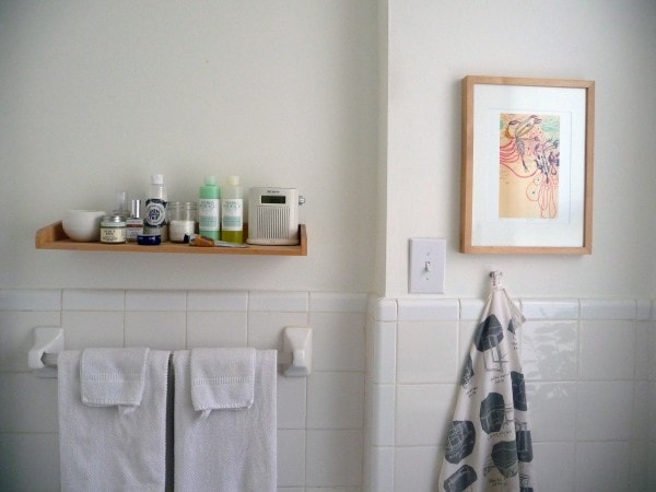
Can you believe we’ve had the little pied-à-terre in Manhattan for ten months already? It really doesn’t feel like that long. Given that the entire thing is only 400 square feet, it’s kind of lame that (a) I haven’t finished working on it yet, and (b) I still really haven’t posted that many pictures. Thanks to some prodding from Adam and some inspiration from Dan, though, I did take some photographs of the not-so-cute bathroom this morning.
Here’s what we were looking at when we first rented the apartment:
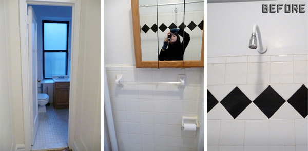
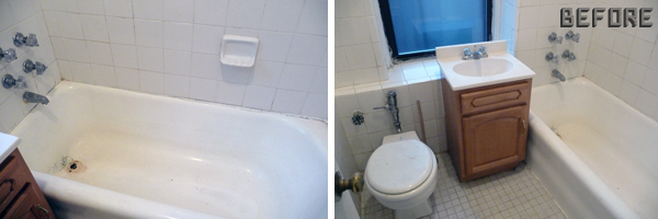
Typical pre-war New York City rental apartment bathroom—in other words, poor layout, cheap fixtures, crumbling grout, bad plumbing, and a rusty tub. Not cute, and actually pretty gross. We were able to negotiate with the management company a bit to have the tub re-coated with epoxy and the tiles regrouted (both of these things were technically done, but they were done very poorly and unprofessionally—we’re talking new grout over old grout, epoxy over moldy caulk, and that sort of thing), but it was still pretty gross afterward.
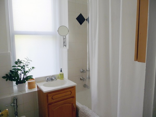
I cleaned everything with bleach, scalding hot water, and a scrub brush, for starters. And I caulked. And caulked. And caulked. You can’t tell from the photos, but there were weird gaps and cracks everywhere. The other thing that’s not apparent from the photos is that although everything is white, there are about 50 different whites going on in there—even the white tiles are all different colors. After a few failed attempts at painting the walls gray (the result was sad and dark), I went ahead and rolled on my good old default white-uniter, Benjamin Moore Simply White. I used the Aura Bath & Spa formula, which is completely matte but still impervious to water/steam-streaking.
The idiotically-placed (it was behind the door!), oak-framed, triple-fold mirror/cabinet was removed and stored in our basement at the house so we can put it back when we move. In its place I mounted a little wood shelf from IKEA (a discontinued item from the FÖRHÖJA line) to hold my daily essentials. Because the sink is in front of the window (do NOT even get me started on the fact that there is an open-backed vanity cabinet IN FRONT OF A LOW WINDOW and not even attached to anything—whoever put this bathroom together was clearly a moron), I put up an extension mirror ($4.99!). This solution has worked out nicely, since neither Evan or I care about having a large mirror in the bathroom.
(Hmmm. I’m not sure why the shelf looks crooked in the photo. I checked, and it’s definitely not crooked in real life. I blame my lens.)
The print on the wall is by Yellena James, and the cute hand towel is the brilliant “I Wish We Had IKEA” tea towel from Skinny Laminx (it provides a needed dose of irony anywhere in my house or apartment, don’t you think?).
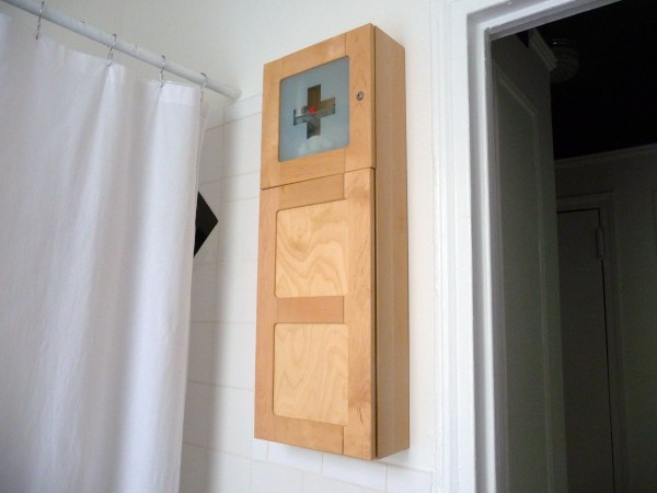
Happily, the space between the door and the tub is just the right size for the BJÖRKEN cabinet from IKEA (I think it’s been discontinued, which is a shame—it’s really nicely designed and well-made), and all of our toothbrushes and sunscreens and razor blades and other unattractively-packaged products get stashed in there.
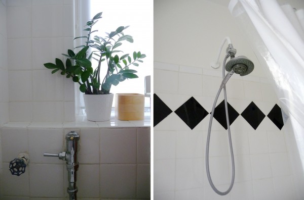
Yeah, even the plant pot and the plant in it are from IKEA. Yes, and the shade on the window (my trusty favorite, ENJE). I like how nicely the plant distracts from the ugliness in the room. Every time I bring the plant into the kitchen to water it, the bathroom immediately looks worse.
We also changed out the showerhead. The new model isn’t going to win any design awards, but it’s super-functional, it only cost about $40, and the installation took roughly 5 minutes. Way better than the nasty thing that was there (we threw it in the garbage—I’m willing to leave the replacement behind when we move). I highly recommend little changes like this if you’re in a rental.
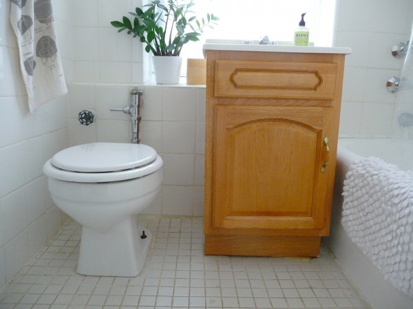
I know, this is decidedly not cute. The floor is grotesque, there’s no denying it. I swear to you, though, it’s CLEAN! I’ve bleached and Magic Eraser-ed it, and it still looks like this. There are three different grout colors layered on top of each other, and that’s not helping matters—not to mention that the floor is so out of whack that the vanity (does that hideous thing even deserve to be called a vanity?) has to be propped up with a shim. It’s just gross. Putting rugs down somehow seems to accentuate the grossness, and I don’t want to put anything on the floor that’s going to get in the way of being able to keep things clean. I just don’t know. I’ve seriously thought about painting the floor tiles or even putting down self-stick, solid-color vinyl tiles, believe me. Sigh.
You know what encourages me, though? GET LOAD OF THIS:
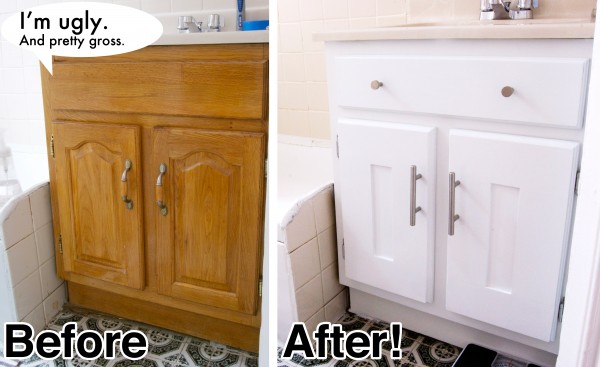
Incredible, right? This is, of course, the genius work of Dan at Manhattan Nest, who shares my “who cares?” attitude when it comes to security deposits (I’ve never lost one, actually—if anything, all of my landlords have been thankful for the changes I’ve made, even though I’ve never asked permission first). He covered the routing on the doors with 1/4″ planks of wood and painted the whole thing inside and out, and the result is just phenomenal. I’ve promised myself that if we can sign a lease for another year (we’ll know within the next two months, I guess!), I will take the time to rehab my vanity, too. I’m thinking deep, inky blue for the paint, though, because this bathroom definitely can’t handle another mismatched white.


75 Comments
Fantastic transformation, Anna! I adore your city bathroom.
You’re my interior design inspiration. 🙂
I was going to suggest a green or chartreuse, similar to the Meyer’s soap dispenser label, for the vanity, but then remembered it’s a rental.
It might detract from the different shades of white paint and grout, though, if you’re willing to repaint it white once you move out.
i’ve had the neon green claw foot tub that was featured on design*sponge on my brain all day.
http://www.designspongeonline.com/2010/10/before-after-emilys-bathroom.html
Oh, man – painting that vanity would make such a HUGE difference! And Dan did a fabulous job on his, kudos!
what a difference….and I know it feels so much better. great job…
You really have made it SO much better. But seriously. What were they thinking with that vanity? It’s nuts.
This also reminds me I need to put up my FRÄCK (I love that name), since I’ve been standing on my tiptoes to see into my bathroom mirror. For 4 years. So really, 10 months is nothing 🙂
FRÄCK FRÄCK FRÄCK FRÄCK FRÄCK FRÄCK
A few years ago I painted my grout with a special grout paint. I got it at the hardware store and it worked really well and held up. It came in an applicator bottle that was similar to the old ones we used to have for shoe polish.
It might help you or it might add another white.
I definitely couldn’t make the grout white (it would look awful), but I have considered making it darker. The only problem is that the grout is REALLY badly spread—it’s super chunky and uneven in areas, and I have a feeling anything I could do to it would just make it look worse.
Thanks for posting these and sating my curiosity! I think you have done a wonderful job with what you were given. It constantly amazes me that for the price of rentals in New York city what people often get for bathrooms is so poorly done. You have made a space that looks clean, bright and so much more inviting than what it was before! It looks so much bigger too! This looks so much nicer than many other bathrooms I’ve seen in city apartments. I really love the idea of the extension mirror because I would go nuts without a mirror above the vanity (I have a hard time calling that thing a vanity too). That Bjorken cabinet is beautiful! I can’t wait to see how the vanity will look if you get to rehab it. I say job well done!
Thank you so much for sharing this.
It’s one of those subjects never spoken about, or shown NYC rental bathrooms that landlords claim as “renovated” so they can claim an increase in the rent when it’s vacant.
I’m in my rental so long I decided to purchase my own vanity and faucets at Home Depot and new sheet rock and fix my bathroom.
The landlord handy man installed new shower faucets, and instead of putting on the escutcheon plates to cover the holes into the wall, he stuffed it with steel wool and put plaster over it! OMG, it felt like a crime was being committed in my bathroom.
I corrected the shoddy work myself. As if the landlord wants it to be insane how the work is done.
P.S. That vanity in front of your window, might win a prize for crazy landlord handyman.
: )
yuck. Rental bathrooms are disgusting. I’ve had much, much worse than that before, though. Good job with what you’ve been given!
The nitpickiest thing, but is the ‘vanity’ off-center on its base? That would drive me mental.
Thankfully, that’s just an illusion—the vanity is not off-center on its base!
The bathroom! I was curious how things were going in there! It looks really nice already (love the extension mirror and cabinet), I TOTALLY feel you on the copious bleach and the endless caulking exercise. I had the privilege of chipping bulbous yellow grout that had overflowed between tiles with a razor blade… fun times. I think I really need to replace our shower head, that’s probably the next little gift to the apartment.
I *almost* painted the cabinet dark, but decided I should try to keep it more generic since, despite my cavalier actions, I still get anxious about getting in trouble. Superpsyched to see yours. We have the same shim situation, I think I’m going to add a little strip of quarter round shoe molding to cover that fugly up.
ps- My stupid talking furniture! D16’s a classy joint… what’s that bad ‘shopping doing on here? Oy vey. (in all seriousness, I can send you a non-speech bubbled version if you’d like)
No way! I love your talking furniture!!
Yeah, Evan spent a few hours scraping off excess grout in the shower, too. I think some of it might have actually been joint compound, which is really disturbing.
The people at the tile store got us to buy grout PAINT when we had wine stains on the grout in our wet bar. It’s kind of like painting your nails in a larger area, but it really works.
Love the captions!!!
Love the bathroom re-do and the plant! What is it??
It’s…um…
I have no idea. Sorry! IKEA doesn’t label their plants.
The plant looks like Zanzibar Gem (Zamioculcas zamiifolia) – the only plant I haven’t been able to kill. 😀
Thanks, Niina! I just googled “Zanzibar Gem”, and that’s definitely what I have. And yes, it’s very hard to kill! I don’t have good luck with houseplants ordinarily. 😉
I love Yellena James! Also, you should see my rental bathroom. It’s three different shades of beige-y brown. Hideous.
Looks great!!! Great job!
Paint the grout!! I just did my entryway tile and it was sooo satisfying. Near-instant change and now my floor looks as clean as it is. Ahh…
The tile REALLY uneven and lumpy, and the grout is all over the place (it’s seriously almost an inch thick where the wall meets the floor)—I really think that painting the grout would call more attention to how gross it all is. It’s not even stained—it’s just that it’s uneven and applied in multiple layers in different colors.
I painted the tile in my half bath with some amazing Sherwin Williams water based floor paint a few years back and it worked perfectly. Not even a scratch a few years later. Now it’s way easier to clean and it looks great.
Even this puts our bathroom to shame. I should seriously just have painted over the tiling on the floor and walls And the kitchen tiles too which are ugly even though not as gross.
That cabinet is the only thing that looks a bit ewwww… so definitely do something to it, with your eye and skill it will look awesome.
(We are moving in a couple of weeks yeay! Problem solved for me.)
It certainly looks alot better now that youve fixed it up a bit! & i really like the extendable mirror & the plant going on there.
Hope you manage to find a solution to your grout issues!
New York rental apartments are so special. Makes me almost miss mine. Well, I miss that I use to have an apartment in New York.
You have done wonders to yours.
This post made me laugh a lot because it sounds just like the bathroom in our apartment. I love all the tile work we have, but the fact that the grout is a mix of light grey, white, and dark grey in various places makes it look like we never clean. We also have the multiple whites problem going on. Two different white tiles, white fixtures, and “white” (looks like the faintest light blue) walls…it drives me absolutely crazy. I just keep looking towards the future when we can have our own bathroom to tear apart and make right.
eech. I had that Exact Same Vanity in some forgettable rental years back. Ended up velcroing a cute black linen box pleat skirt over the whole mess. Looked tons better, and was a quick lazy and cheap fix. Cause that’s how I am.
I love how Ikea in Your house looks so much more expensive than it does in mine! Cute place 🙂
All I can say is this post is seriously inspiring to me. Being a renter can make a person feel like a redheaded stepchild at times but seeing what you can do to maximize a rental always helps. Thanks.
Why are the caps always missing from toilet bolts? Where do they go? Drives me bat-shit crazy!
Well, this toilet is easily 40 years old (at least), so I’m not surprised they’re missing! I imagine they got sucked up into a vacuum cleaner, eaten by a dog, or stolen by a child somewhere along the way…
One of my cats always steals the toilet bolt caps because he likes the sound they make on the floor. He also plays with bottle caps.
He also attacks plants. Jealous that you can have some greenery in your bathroom!
My previous bathroom had the 5X5 tile in white with little black flecks in it. And on one of the walls the tiles had both black and red flecks in it. There were areas where the black and white tiles had been replaced with the black, white and red tiles too. Gag.
I was so happy when we tore those out. I’m sure the fact that these were plain white helped you decide to take this place. It really looks super cute for a rental.
The bathroom looks great! It is nice to see that you were able to make something nice looking and functional out of not-so-great beginnings.
From personal experience I can say that changing the shower head in your rental bathroom is one of the best things you can do. New shower heads aren’t expensive and can really transform your bathroom. And this is the first time I’ve heard of the blog Manhattan Nest, but I’m already in love with it.
Is that a cute little radio on the shelf?
Yes, and I hope it never breaks, because it gets better reception than any other radio I’ve ever had! It’s from the now-discontinued Sony Liv line they used to sell at Target years ago.
I, too, have that same sink/cabinet in my rental here in California – nationwide ugliness! Also, when I found my light fixtures were the cheapest ones at Home Depot, even the salesperson there was appalled by my landlord’s penny pinching.
Your bathroom floor is pristine compared to the frightful stained beige vinyl in mine. As I am moving in the near future I limited my re-do to major cleaning, an Ikea cabinet, a new toilet seat and a clip on lamp since a mega-decibel fan goes on when you turn on the light – no window in the bathroom either – the landlord plastered it up!
You are so awesome! I manage to find something so helpful in nearly every one of your posts! We just painted our bathroom and I so wish I had known about the Aura Bath and Spa formula. But no matter! I know it now and I’m so glad I do. I will likely be linking back to you (yet again!) from my blog once I finally post our bathroom renovation pics. 🙂
seriously, the fact that you can make even that bathroom look amazing–incredible. and you’re right, the plant makes it look so cheery!
hey anna- I sorta had the same floor issues in my last LA rental– the white linoleum was super dingy and stained. but I came up with an amazing and CHEAP solution: I covered it with recycled rubber!
http://mylittleapartment.blogspot.com/2007/09/use-rubber.html
it works SO well in small bathrooms and the rubber is heavy enough that you don’t even have to adhere it to the floor below, so you can take it out when you move (although my landlords loved it, so it stayed). I invested about $125 in the project (including the rubber and shipping) and was so so so so happy with the outcome. I loved the feeling of the barely-bouncy rubber and it was super easy to clean. I used black Elephant Bark (http://www.rubbercal.com/elephant_bark.html) with tiny white flecks from Rubber Cal, who were great to work with and helped me figure out how much I needed to order, etc.
I’d be happy to tell you more about the project, if you want more info! It was seriously one of the best things I’ve ever done in a rental and it looked super clean and profesh.
loved the update!
-dean
!!!!!!! Dean, that is amazing. We were actually wishing that something just like that existed—I had no idea it actually does!
I’m definitely going to look into it if we renew the lease. I’ll be in touch if I have any questions. Thank you!!!
That’s amazing! I had no idea that existed. WOAH. This is, like, really valuable knowledge.
Kind of makes you rethink that tribute to your landlord’s Italian heritage, huh?
I noticed the crooked looking shelf, but I knew it had to be an illusion! Silly camera lenses.
Several months ago, I took a picture of a new floor we installed to post on my blog. When I uploaded the photos I started freaking out a bit because it looked like the floor dipped dramatically in the center. We’re talking funhouse proportions here! I got a level and a chalkline and had all sorts of things going on to make sure it wasn’t actually dipped. Thankfully it wasn’t. Whew. I’m still happy about that outcome.
yay! I realized that my flickr account w/the ‘how-to photo series’ has expired, but I might try to post the step-by-step on MLA soon…hope you renew your lease, the place is lookin’ good!
Ah! I love that bathroom shelf. Being a renter I never even considered being able to fix up the bathroom, this is inspiring, maybe I will find a way to bring some light in to my black hole of a rental bathroom 🙂 You did a beautiful job!
Anna, you make even the dodgiest bathroom look good. I’m sure it’s worse in real life, but with all your Anna-isations, you’ve done a cracking job of making the best of what you’ve been given.
I know you are saying how horrifying it is, but I think you did a great job of making it look like a pleasant bathroom to be in. You should see mine. It’s an apt with old details but pink (barf) tiles and terrible plumbing and worse landlord.
P.S: I’m in the market for a new camera and you seem to be enjoying that Panasonic you bought a while ago. Is it good with close-ups/macro photography? I’m hoping to take pictures of my work for my online portfolio, so need a good camera for macro photography and cannot afford a DSLR. I read it’s reviews on amazon but thought I’d ask you. Thanks 🙂
I love my camera! It definitely takes good close-ups. The only think it’s not great for is low-light shooting, but that could just be me not knowing the best setting to use.
http://www.ehow.com/how_5233086_paint-over-veneer-furniture.html
I’d paint that gross wood ‘sink holder’ white. It would fade into the background better. I’m amazed at the shoddy-what-were-you-thinking? work you find in apartments around the city. And not just ‘cheap’ rentals. I work in construction and you wouldn’t believe the number of crooked lights switches, outlets, etc. are in really top-end apartments. Where’s the pride, man??
All that said, sheesh, 10 months already??
It’s not a veneer or laminate, actually, it’s solid wood (not that that makes it any nicer, but it’s at least easier to paint). I don’t want to paint it white because, as I mentioned, there are already so many different whites in the bathroom that I have a feeling it will just make the sink top and other off-white elements look even more dingy and dirty.
In this kind of situation, I think it’s best to go with the “black hole” option, and use a very dark color. It will recede more than white.
Thanks Anna. The camera is definitely looking good as my option!
oh btw, I wrote you a while back (bombarded was more like it, lol) with questions about vegetarianism. I’m totally cool with you not replying yet. i read your blog so i know you have been swamped at work! 😉 Are you going to just answer it on your blog like with the job posts? That would be cool too.
hi anna, I’m digging your new layout!
This bathroom is just like mine, ha ha. I rent and am a bit lazy about things…I could be here for 10 years, I may as well do something about it. Hmmmm….
..including the vanity in front of the window and the cabinet behind the door. dummies!
The bathroom looks great, Anna! Where DIY home renovations are concerned, you and Dan (of MH) never cease to amaze me.
Oops…I meant *of MN (not MH). D’oh!
Hej Anna!
I just love what you did with the bath room! Great inspiration!
I’m a Swede living in Warsaw where we bought a pre-war apartment (from 1936). There are many old elements in it, like fish bone wooden floors, old wooden windows, interior wooden doors and exterior wooden door, which I just love. My Polish friends thought I was crazy when I showed them the apartment when I had just bought it. Let’s say it needed some of work… Now it is 3 years since we bought it and we have renovated the floor. Painted all walls, doors and windows white. Organized the barthroom in a different way (the WC and bathroom where sepatated with old beige plastic doors. We had a carpentar make a wooden door to the bath room which very much reminds of the other doors in the apartment. We also redid all electricity, which was very old. Last week I finally got permisssion to change the old knobs on the radiators to new ones, they were leaking. To make a very long story shorter. 🙂 We are almost done, except one room: the kitchen.
When I saw your post and saw the vanity, I immediately reminded me about my kitchen. The cabinets in my kitchen have the exact same color. I believe my kitchen was a DIY project by a previous owner, who very much liked oak and gold elements… Anyway it is extremely badly organized. When I do dishes, I get a back pain every time since the sink is placed deep in a corner… The radiator is placed up on the wall with wooden doors in front.. I think this kitchen could win an award for being the ugglist and most badly organized kitchen in Poland.
We are saving money to make a renovation of it and I’m just dreaming of the day when I will see the old kitchen being torn down. 🙂
Lotta, I think you need to put photos of your apartment somewhere online—it sounds amazing!
Sorry for the extremely long post… 🙂
I love the updated bathroom! The white makes it look so clean, fresh, and modern. Caulk is definitely a life saver! 😀
50% of the construction of my house is caulk! 😀
oh my goodness! i love it! I’m being honest too because this is a great example of a REAL bathroom. Most of us all have those “real” bathrooms and the ones we dream of having are just that…
I love how you took pictures of your before & after, I’m glad there is someone out there happy about their end result even working with what you got!
When I moved into my apartment, the bathroom sink had a yellow stain on it that would not go away no matter what I tried. I bought so many different bathroom cleaners and nothing worked. A couple years later, on a whim, I tried Bar Keepers Friend (which I had purchased for my kitchen sink, which is stainless steel). It took away the stain, which was a miracle to me.
That stuff is powdered, but I made a paste and it worked on my bathroom tile grout, which was also stained (the place is old, the girl that lived there before me was a total slob).
Bar Keepers Friend just came out with a new liquid version. It worked on my grout (not as well as the powder, but easier to use), in combo with a Magic Eraser. The only other option I can think of is hydrogen peroxide and a scrub brush.
That’s my suggestion… my bathroom is still old (and I’m not very home improvement minded), but it looks a hundred times better now that the yellowed grout and caulk has been cleaned.
Oh, believe me—I know and love Bar Keeper’s Friend, but it won’t make a difference here. The grout actually isn’t stained or dirty, believe it or not, it’s that there are multiple colors of grout (white, off-white, gray) all layered on top of either other.
Yikes! Good luck. I know what it’s like when something bothers you visually and you have to see it every day.
p.s. If you try either option (Bark Keep paste/liquid or hydrogen peroxide), let it sit for a few before you scrub.
Good luck!
I love that attitude towards security deposits. I can’t wait ’til I’m not renting but you definitely inspired me to add more plants to my apartment! Love Meyers products as well.
Here’s a possible solution for the floor you can’t change, interlocking (and removable) rubber floor tiles. The black with white specks version would add some drama to the bathroom and probably hide the wonkiness as well as the stains of the floor. The link is http://www.rubberflooringinc.com/interlocking-tile/8mm-strong-rubber-tile.html?utm_source=Nextag
Thanks for the suggestion, but I haven’t lived I this apartment for quite a while now. This post is more than two years old. 😉
I feel your pain so much I am cringing reading your story! I am inheriting an amazing deal on a 2br apartment from a bunch of very nice but….unspeakably filthy…(sorry guys) 20-something boys. Got here by Googling “gross apartment cleaning bathroom” 🙂 Thank you so much for the tips –