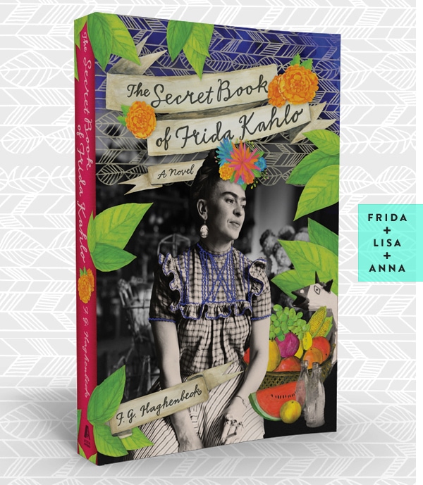
In October 2011 (yes, almost a year ago!), I started working on the cover for the September 2012 publication of Mexican writer F. G. Haghenbeck’s The Secret Book of Frida Kahlo. That’s a fairly typical time span between when the process of designing a cover starts and when a book has been printed, bound and is available to buy.
Initially I considered using one of Nickolas Muray’s amazing color photographs of Frida Kahlo on the cover, but rights clearance proved too difficult so that idea was scrapped. There was some talk about using one of Kahlo’s self-portraits as well, but rights issues were again a concern. The more I thought about it, the more I felt like the right path for this cover was a combination of photography and illustration. After all, the book is a fictionalized account of a life—it’s a fantasy based in reality.
I never considered asking anyone other than Lisa Congdon to work on the illustrative aspects of the cover. Lisa is a dear friend, but before I knew her as a person, I knew her as an artist. I’m a huge fan of Lisa’s work, and I knew that her sense of color, scale and balance combined with our mutual love of Frida Kahlo would be perfect fit. I’d never been so excited to ask someone to collaborate with me on a project before, so of course I was thrilled when Lisa said yes!
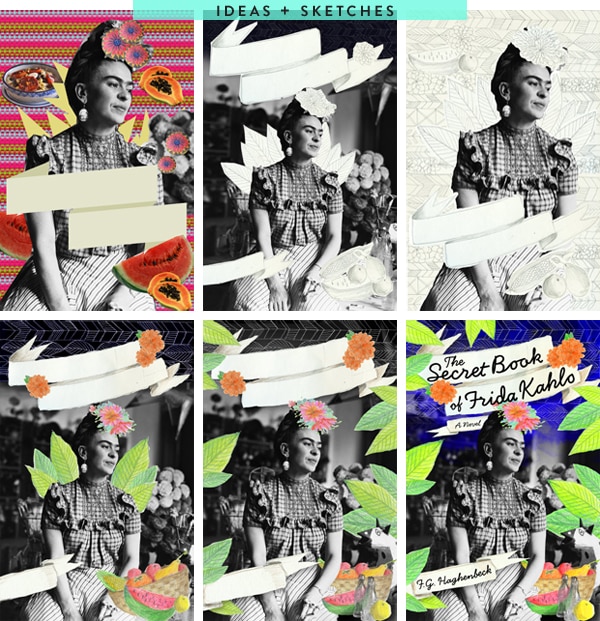
Once I found a great photo of Frida that was perfect for the cover and made sure it was available for licensing and alteration, I put together an extremely rough mockup of the kind of layout I was envisioning for the cover (that’s the first thumbnail above, in case you can’t tell!) and sent it to Lisa. I shared references with her for color and illustrative style—I wanted the vibrancy of Casa Azul and the spirit of Día de los Muertos masks and sugar skulls!
Before color was even involved, though, I asked Lisa to work up two pencil sketches of the cover—one with a fully-illustrated background and one with more of the photo visible. Based on those sketches, the publisher preferred seeing more of the original surroundings. Lisa then began to add color to more refined versions of the individual elements, which she then sent to me to experiment with placement. Once a final layout was approved by all necessary parties, I mocked up the title type digitally and sent it all back to Lisa again for her to do the final hand-lettering and painting work.
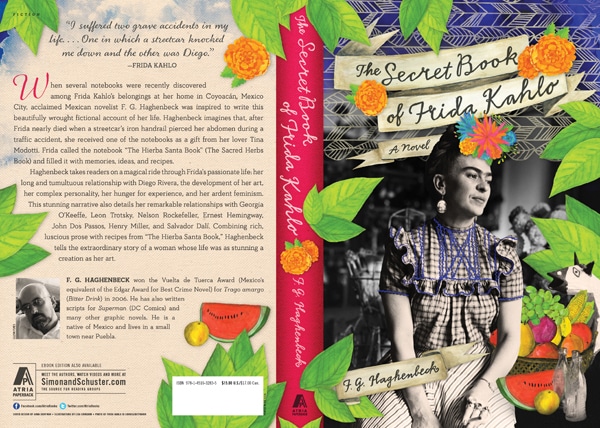
Initially we weren’t sure how best to go about sending the assembled layouts back and forth, since so much cutting-apart and positioning of tiny elements was involved. We ultimately decided that it was best for Lisa to create the illustrations on a white background, and to send them to me as individual parts to be put together in Photoshop. That allowed me to layer the leaves and move them around or add more as needed without Lisa having to re-do the entire thing from scratch every time. It also meant that I could later design a spine and back cover that would wrap around seamlessly from front to back. I love when books feel like finished packages!
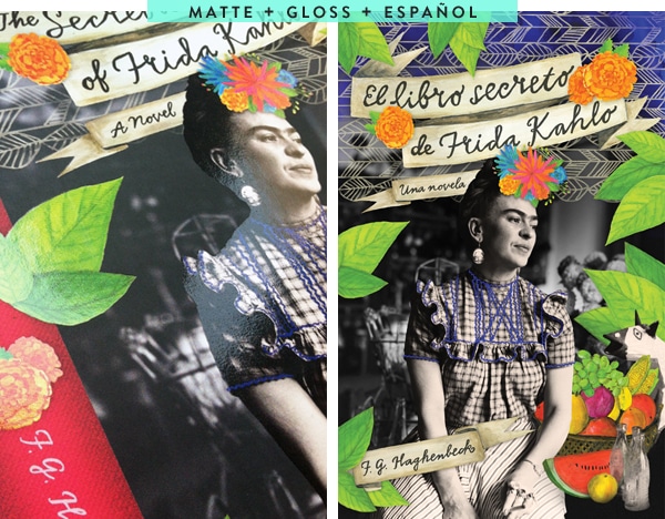
The bound books haven’t been delivered yet, but I did just get to see a cover proof. I specified that it should be printed with a matte finish over the entire background, with a glossy coating on the special elements in the foreground. I tried to take a photo (above left) so you can see how nice it looks—the matte and gloss finish really gives the cover a lot of dimension. I’m so happy with how it turned out. Oh, and there’s a Spanish language edition, too! Lisa’s hand-lettering looks beautiful in any language.
Speaking of Lisa’s hand-lettering, did you know she has her very own font available for purchase? Yup. It’s called Petit Lisa, and it’s tall and skinny and full of the warmth that all of Lisa’s work exudes. I can’t wait to try it out on a project!

61 Comments
That is truly very good looking, and it’s really great to get an insight into the process!
A truly fantastic book cover from front, spine and back! Great job Anna and Lisa!
Just love it!!! ♥I want the book now 🙂
This should become a regular feature!! The end product is amazing but the process is absolutely fascinating
I’ll think about doing that, Reem. Much more interesting when there’s a collaborative aspect!
I think it is beautiful! Two very talented ladies! Great job.
It looks beautiful, and I loved reading about the process! Matte background/glossy foreground thing looks so nice, I ‘m sure it’s as nice to touch as it is to look at.
That is a truly beautiful cover. Even though I’m an author, it’s still astonishing to me how long the book-producing process takes.
I agree with Reem. More book cover features! The finished product is spectacular…Now I feel like I must pre-order this book. This reminds me of a massive drawing I did of Frida wearing Queen Elizabeth’s clothes.
http://www.jenchudesign.com/blog/2010/09/the-queen/
Your drawing is fantastic, Jen!!
I really want to read the book. It hadn’t been translated into English yet when I started working on it!
Gorgeous!
That is a beautiful book jacket. If I saw it on the shelf, I’d pick it up immediately. I hate that e-books are taking that away.
Marci
But the book is available in English now, right? No matter–I can always buy it in Spanish and read it that way. It would be slow going but worth it, I’m sure.
To say I’m excited is an understatement. I think I’ve read everything published on Frida Kahlo and my husband and I went to a Diego Rivera exihibit for our first date…and we drove over an hour to get there, having known each other for a total of 7 minutes.
I love reading about the projects of talented people, and I get energized by the success and talent of others. Thanks for sharing your work with us, Lisa and Anna.
Jules, both the English and Spanish editions are out next month. 🙂
Fantastic! English it is. 🙂
i’m a total lurker, but i had a very serendipitous moment when your blog popped up on my reader today — my wife translated this book into english! the cover looks amazing! i just showed her — we’re both psyched! 🙂
Wow, what a coincidence!! How cool! I can’t wait to read the translation. 🙂
bravo, my friends. a beautiful collaboration! i look forward to reading it, too!
wow! this cover is beautiful and i loved reading about how it came to be. definitely a cover that would grab my attention and force me to take it up and have a closer look. bravo!
Beautiful collaboration! Looking forward to seeing this on the shelves 🙂
This is AWESOME! I’m a big fan of your work and Lisa’s and it’s so cool to see what you’ve come up with together! I’m a graphic designer myself and have often wondered what life is like as an illustrator, without the luxury of undo and copy and paste. Thanks for the behind the scenes peek!
Beautiful! What a great and effective concept, using illustration + exisiting photo to reflect the book being part reality, part fantasy.
I really like it when designers/illustrators collaborate. Looking at the beautiful things an individual can create, their signature, their taste, is really really great, but every once in a while getting a little surprise when two different people come together and make something new can be so fun.
I love it! You two (three) are like lightning. Hope there are more partnerships like this in the future!
Wow! That cover looks beautiful! It’s definitely a work of art itself. You guys did an amazing job, kudos to you both. I love when covers of books (esp. those I am considering purchasing) have well designed concepts which really are integrated with the contents of the book itself. Fantastic!
This looks sweet! I’d love to read it just by looking at the cover!
i’m a huge fan of both of you and feel honored to take a peek into your process! so thanks! the cover turned out beautifully, an excellent combination of both of your styles. i design for a smaller publisher and, being new to the cover design business, love to see how it’s done elsewhere. it would make a great regular feature! process is so fascinating!
Gorgeous! I absolutely love it. What a great collaboration.
thank you for sharing this process with us. as i understand you, she drew, for example, the leaves and the marigolds separately? and then you applied them to the master drawing?
awesome.
I’m not sure what you mean by “master drawing,” but yes, Lisa illustrated each element separately on paper, scanned them, and then I assembled them into the finished piece in Photoshop.
I dont know if you read young house love at all or know who they are even. BUT if you do, have you seem their new book cover? What are your thoughts on it?
I don’t read their blog, but Sherry and John are very nice people! I just looked up the book so I could answer you, and I think it looks very appropriate for that market.
I love this cover and want to read the book- amazing work, thanks for sharing!
Wow. Just wow. For a girl that can barely figure out how to save her photos in a file and then FIND them again, this whole process just blows my mind. Amazing the work behind it all. Love that font by your friend too. Very cool.
This is a beautiful cover! And this is also one must-have book:-)
One thing though: I’m a quilter and I think (but I’m not sure) that I’ve seen the (blue) background pattern with the horizontal bands of stripes and leaves (top part of the book cover) on fabric. I’ve been thinking about this for hours now and I just need to know if this is a pattern made for the cover or it is from a fabric and if, which one?
You know – sometimes a thing like this just keeps your brain busy for days, so I really want to know:-)
Orla Kiely comes to mind… and some of the younger American designers… it really bugs me *lol*
Hi Rosa, the pattern illustration was created by Lisa Congdon just for this book. I also used it in the gray/white background behind the book image for this post because I love it so much. 🙂
Thank you Anna. It is a great pattern. I have just drooled all over my lap top watching Lisa Congdon’s patterns on her website – I looove them!!! They would make fabulous fabrics!
And the book is preordered on Amazon – I would not have known about it if not for your post, so thanks:-))
Frida Kahlo has fascinated me for years:-)
This looks amazing, congratulations! Thanks for sharing the process, I love seeing how that works
“Once a final layout was approved by all necessary parties…”
Just a silly question, but does an author have any say in what the cover of their book looks like? Or is it bought, sold, and totally out of their hands already at this point? Just curious.
Beautiful work tho!!! Well done!!! A big fan of Lisa’s work — what a knock-out collaboration!!! 🙂
Some authors get more involved than others, but they nearly always play a part in the approval process. Generally speaking (and there are exceptions), the author will see anywhere from 1–3 options after the editor and publisher have seen a variety of comps and initial revisions have been made, but before the sales team brings the cover to buyers. Hearing that an author loves a cover is always good news. 🙂
This is absolutely beautiful! I think it goes great with Frida Kahlo´s work and personality. I love that you added the leaves and other feautures than only a simple photo. I guess making a book cover is similar to making a CD cover – I always wanted to try that! 🙂 Also the book itself looks like something I would like to read.
Hi Anna!
I really love the cover. It might be a strange question, but I’ve wondered for ages: does your personal style greatly influence your cover designs, or at all? I read the comment above regarding author interaction and input and wondered if certain designers gravitated towards certain genres or authors or vice versa. I love seeing your work, I agree that it’d be fantastic to see it as a feature 🙂
Hi Ruth! I think it’s inevitable that my personal style influences everything do, really—I don’t think that’s avoidable. The thing with commercial art/design, though, is that the ultimate goal has to be to create a product that will appeal to the people it’s meant to appeal to—and general sales, provoke interest or convey information. That need to appeal to an audience for commercial reasons is really what separates what I do from fine art. If you look at my portfolio, though, I do think there’s an identifiable style that runs through a lot of the covers I’ve designed…bearing in mind, of course, that I don’t put the majority of my work in my portfolio. 😉 After 15 years working for the same publisher, I do tend to wind up working on certain kinds of books that my style and interests are best suited for, but I don’t get to pick and choose which genres or authors I work on. Titles are assigned to me, not the other way around.
(All of this applies to my book cover work only. Websites/blogs and the other printed work I do on a freelance basis are a whole other kinda thing…)
Thanks so much for the insight, Anna! I’m actually looking at moving into graphic design (from floral design- the other end of the paper process?) and your posts on your experiences have been really helpful. Door Sixteen is a constant source of inspiration and wonderfully articulate design 🙂
Thanks, Ruth! And good luck to you.
When I buy this book I’ll be telling everyone in the bookstore who designed the cover! I’m so proud of the work that you do. I also admire your and Lisa’s ability to successfully collaborate.
🙂
What a neat post. I really like seeing the process from start to finish. Lisa is a hero of mine, and so is Frida, so this made it doubly good. Looking forward to buying the book, it sounds really interesting. Great job, both of you, on a design well done!
I ADORE this. 🙂 So inspiring, so fresh. :)))))
BTW, The Stockholm Rang rug is top favorite for me too, I have included it in as many illustrations as I can.. to indulge in *some* way. Constance is a bit iffy with rugs too. (I got one for my birthday and it has remained untouched!!! Knock on wood! I do have the possibility to close my bedroom door when she’s alone here though.. not an option for the living room..)
this is such a cool post! love that you’re sharing this with us….ive always been interested in knowing how people design book covers and this is amazing! Love the fonts and bright colors. It’s so fresh! They say don’t judge the book by its cover….but sometimes i think they are wrong! I’d buy this book for sure!
This is fantastic! Love Frida, love the illustrator and I just discovered your blog! Great day!
I LOVE it! Congrats – can’t wait to pick up a copy!
Everything in this post is awesome.
This is sweet. 🙂 ‘Nuff said.
So interesting! I was the production manager of a small publisher for a while, you’re almost making me miss working with the designers there. (Almost.) Love the process, getting it right can be stressful. 🙂
I’m a bit of a Frida Freak and my best friend is a huge Frida Freak. I’m going to order a copy for each of us. Your cover is gorgeous.
I love this post, please include more of all your book covers! I love the combination of hand drawn, photograph, and gloss. It’s perfect!
Thanks, Lianne! 🙂 You can see lots more of my book covers here: http://annadorfman.com/
Gorgeous. You have my dream job, so I love viewing the process shots so I can live vicariously. Great spot varnish, too.
Beautiful cover! Great solution layering the art over the photo
Hi,
Love your work… I am also doing a piece on Frida and was hoping to use a photo of her that I could edit. I was wondering where/how you managed to procure the image?
Regards,
Lina
Hi Lina, the photograph on the cover was licensed through Corbis/Bettman.