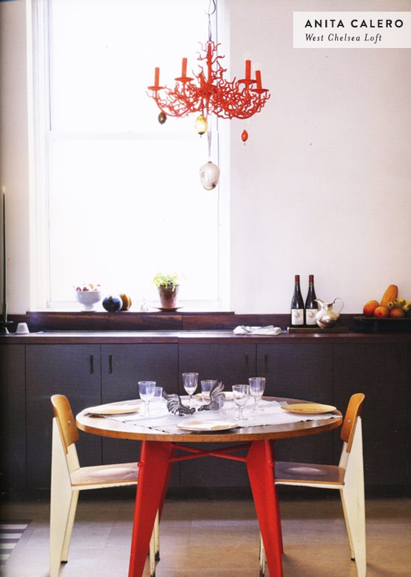
Yeah, I could live there is a semi-new, semi-regular D16 feature wherein I post pictures of homes I want to break into, kick out the inhabitants and move in. Today I’m spying on New York-based photographer Anita Calero’s West Chelsea loft.
I first learned of Calero’s incredible taste in furniture and eye for design when her house in East Hampton was featured in Domino magazine ages ago (check out this kitchen), and since then I’ve been hoarding every photo I can find of her homes. The amount of French Industrial furniture in her loft fills me with pure envy. I’m not sure how one gets their hands on quite so much vintage Jean Prouvé in New York City, but I’m guessing it involves quantities of money that I don’t have.
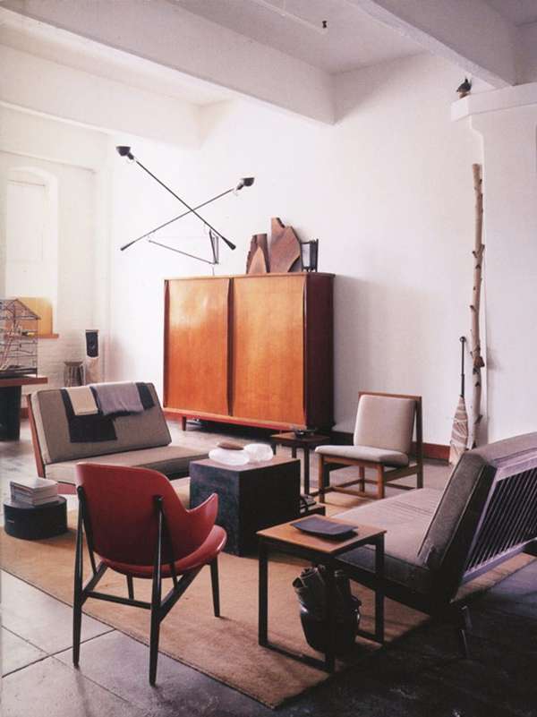
That Prouvé wardrobe…man. Why can’t I find one of those things on the street someday? (In case you’re curious, I just searched a few auction sites. They sell for like $30–40k. Gulp.) And who designed that lamp? The shape seems a little off to be Serge Mouille. Whatever, though. Everything in this photo is perfect and it makes me want to throw away everything I own and start over.
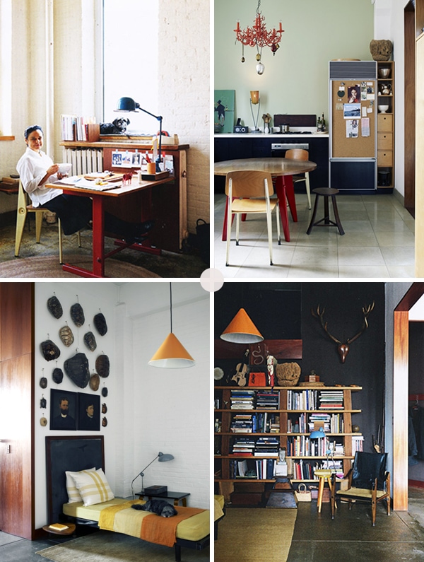
What, you don’t have a Prouvé desk chair, a couple of JIELDE lamps, a Kaare Klint safari chair and a bunch of turtle shells hanging on your wall? Yeah, me neither, but I wish I did. Well, maybe not the turtle shells. And look at that bookcase! It’s all college dorm-style with the shelves just resting on what look like wooden blocks, but it looks right. I’m crediting the black wall. Black walls fix everything.
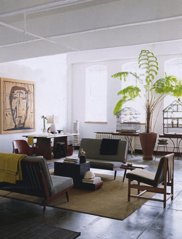
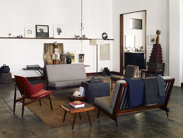
I’ll conclude this with a quote from Anita Calero:
People invite me to dinner because they know I will tell them how to reinvent their living space. It is natural for me to move things around so that they fit. I consider everything I own a piece of art including my toothbrush. So when I look at what you have, I see art and I just know where it goes. It is possibly because I am a seriously published photographer and have been a stylist; that I know when something is not right and does not fit. Objects need to dance in a rhythm to their own synchronicity in order for us to feel free. Nature is like that, it knows what goes with what. When things are right—there is happiness, there is peace, there is bliss. That’s what we want to come home to- and what we have to offer.
Nice. “I know when something is not right and does not fit” is really my whole approach to figuring out what to do with my own home. And I should probably get a nicer toothbrush.
Want to see more of Calero’s loft? There are more photos at Loft Life.
✚ Photos by Anita Calero/GMAimages.com and Jonny Valiant



18 Comments
Anna, MONEY FIXES EVERYTHING!
And black walls, sure.
I’m waiting for someone to tell me that that bookcase is actually some fancy thing that costs $20k.
So clearly you just need to invite her to dinner!!! And win the lottery! No problem.
Obviously we all need to use more watermelons around the living room as well.
I love the touches of red, little jolts of energy amongst a calm palette. Makes me wish I had more self control over what I put in my home, but then I just like all my stuff, I can’t help it.
Totally honestly, and not sucking up to you, I like your style better. So if you kick Anita out of her house and move into hers, can I have yours?
ha @ your better toothbrush comment.
I belive the lamp is a pair of Flos’ 265 by Paolo Rizzato. So simple and beautiful. Love the colors and sense of quality in the rooms!
Yup, that looks like it! I assumed it was something I can’t afford. 😉
Those wood block bookshelves have been in my inspiration folder for a few years now. I think that the super high ceilings help too. One of my other all time favorite inspiration images is from her Domino published house– the dining room with the cool piece of art that sort of just looks like oil pencil on butcher paper. And she uses chunks of wood there too, sitting on top of the stereo. I like to see the consistency and the differences between people’s city/country houses. Sort of like your houses… although you haven’t really shown your new apartment much… hint, hint.
oh man. I am seriously gagging over the “perhaps it’s because I’m a seriously published photographer” bit! Ick. Blech. Ick. I don’t know. I’m just a plain, old Midwesterner. I liked her house way less after she revealed her oversized ego. Not to mention turtle shells and caged birds. Eew.
Yeah, that line got a pretty deep eye-roll from me too. 😉
hi anna!
thank you so much for sharing this quote from anita calero! so eloquently said. it completely sums up the way i feel about design and how i like to keep my home. even my toothbrush is considered, indeed.
thank you!
side note: although i love the quote, i also share your feelings about the line “perhaps it’s because I’m a seriously published photographer.” she could have left that out. 🙂
Something tells me she think it sounds different than it does! Aside from that part, I like what she says.
I love that red light fixture! So cute, creative and a nice splash of color.
I don’t know about the bookcase, but the black wall is actually chocolate brown. See it in a different light here: http://art-dept.com/photography/anita-calero/interiors-exteriors#/page/5
Ugh, eclectic doesn’t begin to describe it. There is a favourite coffee shop of mine that has a similar style, wish my apartment was big enough to do something similar.