It’s been a while since I’ve shared any of my web design work. I don’t do very much of it since my day job designing book covers keeps me busier than than I can handle, but I really do enjoy fitting in a few non-print projects when I have the time. Here’s a little roundup of some of the work I’ve been doing on the side these past few months…
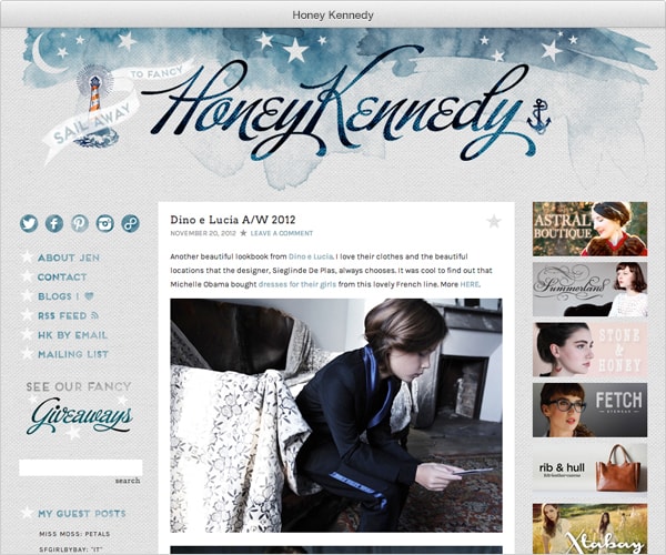
✚ Honey Kennedy
This is my second redesign of Honey Kennedy—the first was in April 2011. Jen asked me several months ago if I could help her with some minor updates, but my schedule was insane so everything was put on the back burner. By the time we got our acts together and talked about Jen’s wishlist, it turned into a complete overhaul! I kept the same basic logo design and the dreamy, saltwater atmosphere, but introduced a richer color palette and bolder textures. Nearly every element of the blog got a makeover.
Jen is probably my most demanding client, but I say that with love. She has such a clear vision of what she wants, and has a really good eye for the tiniest details—that’s the reason her blog is so great. She’s also become a very good friend in the time since we worked on the first redesign, and working together is a pleasure.
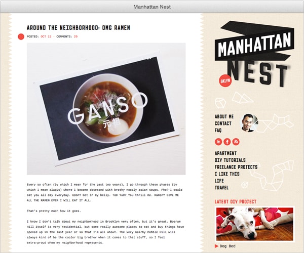
✚ Manhattan Nest
Another repeat client! I worked on a previous incarnation for Daniel two years ago, but it was never much more than a header design and some simple modifications to a prefab WordPress theme. Back then I don’t think Daniel imagined that his blog would eventually become super popular, so even just convincing him to move to a self-hosted platform was an effort. It was SO MUCH FUN to finally have a chance to design Manhattan Nest from top to bottom! It’s also so nice to think about how different Daniel’s life is now than it was two years ago—in 2010 he was a pet-free single guy on the Upper East side, and now he lives in Brooklyn with his boyfriend and their two dogs and he’s winning contests and stuff. (Hey, have I mentioned before what a truly good person Daniel is, and how happy I am that we’re friends and that he likes eating and drinking coffee as much as I do? Yes?)
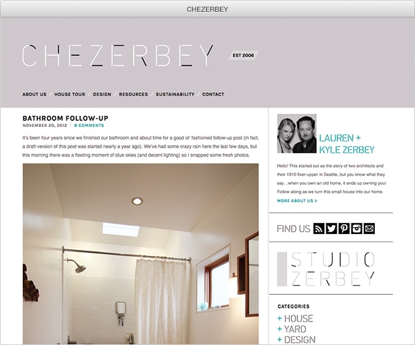
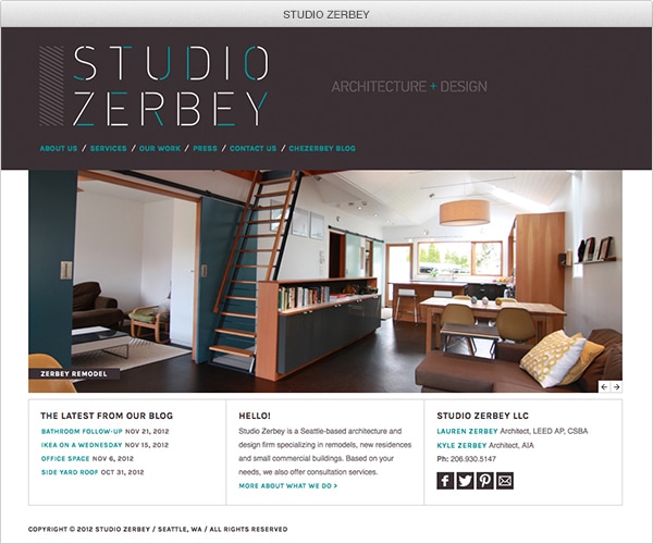
✚ CHEZERBEY + STUDIO ZERBEY
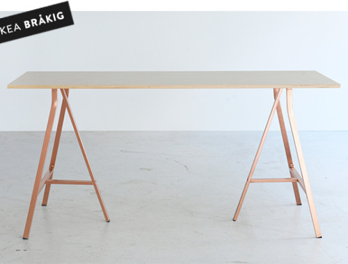
I’ve been reading Chezerbey for ages with more than a smidgen of jealousy in my eyes. Lauren and Kyle really set the bar high when it comes to home renovation, and it’s not just because they’re both architects—they also have amazing taste and an ability to stay within a budget and they’re not afraid to do pretty much all of the work themselves. I mean…this is my fauxdenza, and THIS is the Zerbey’s fauxdenza. WAY TO TAKE THE WIND OUT OF MY SAILS, GUYS. Just kidding!! Anyway, I was a little intimidated when Lauren first approached me about doing a complete makeover of their blog, but in the end it was a really smooth process. Both Kyle and Lauren are really good at expressing what they want and need both aesthetically and functionally, which is so helpful. Lauren even gave birth to their daughter in the middle of the redesign, but didn’t miss a beat. She’s superhuman.
In addition to having a kid, Lauren and Kyle also just became their own bosses and opened Studio Zerbey, an architecture and design firm. They asked me to design a website for Studio Zerbey that would complement Chezerbey while still looking distinct from the blog, and I think I achieved that. It was exciting to be involved with creating the indentity for a new business right at its inception!
Thank you so much to Jen, Daniel, Lauren and Kyle for trusting me with your projects…and for being patient and understanding when it comes to time constraints and sleep deprivation! I am privileged to have worked with you. Let’s all of us get together someday and have a “Dogs ‘n’ Blogs” party, OK? xoxo
22 Comments
omg. the zerby’s. they can do no wrong.
nice work btw.
happy thanksgiving!
THANK YOU SO MUCH. I’m sorry I’m a jerk. You are so amazing. I feel so lucky to know you and really touched that you are able to exactly extract something so beautiful from my crazy banter with the first go. I made a lot of odd requests, but I am blown away that both times the design concept was just so spot on even though I’m never sure if what I’m saying even makes sense. Your level of understanding what a ranting crazy person means is unparalleled. Thanks so much for making everything so amazing, for being such a good friend and for not killing me. XOXOXO
These are amazing! How do I get on this client list????!!!! Hmmmm????!!!! 🙂
Hmmmmm is right! Does this mean you’re starting to blog again?
Anna, thanks so much for putting up with all of our changes and comments to the websites and for taking us on as clients in the first place. We’re very happy with your designs and your helpful attitude. Maybe next time we’re in New York or you’re in Seattle we can finally meet in person;)
Well, I was a little intimidated to work with you so I guess we’re even! 😉
Thank you, thank you, thank you again!
P.S. – Dogs ‘n’ Blogs, I love it.
All three (four I guess with the business one) are lovely. Each is personal to the blogger but there are hints of Anna too.
I loved your comment about Jen being a demanding client and I read it as a positive. It’s been a while since I worked with a designer on a project but, when I did, the best work was always done when I was clear what I wanted and able to articulate these wishes and fears in a way that worked. When it works this relationship is thrilling; the creativity is inspiring and I find myself taking a direction that is both exactly what I had in mind and completely unexpected.
Thanks for this window into your non-print work. I want to find something that needs to be designed.
They all look incredible, but Jen’s looks incredible. The color palette is gorgeous.
Can I go to your bloggers party, I could meet all my favorite at once!! Great job Anna, every one of these design exult the personnality of the blog and still have a tad of yours, the balance is perfect!
These are super inspiring. Constantly amazed at your ability to renovate within a digital medium as well as your own home(s)!
Thanks! Hopefully I’m a better designer than I am decorator. 😉
Hi Anna, do you know any coding, specifically CSS3 and HTML5?
Yes.
I love your work… ’nuff said. It rocks. I wish I could hire you to revamp my look too.
You. are. amazing. ♥
Love the “Honey Kennedy” site. Did you do the watercolor artwork? Was this done with WordPress.org or some other way? Designing eyes want to know.
Ellen, yes, I created all of the graphical elements using both digital and analog methods. WordPress is the publishing platform all of these sites run on, but that has nothing to do with the artwork (not sure if that’s what you’re asking?).
I figured you did the artwork separately from the publishing platform. I’m learning WordPress to try to expand my own freelance design bus. which is why I was asking. Both elements on the site are really lovely.
YOU ARE MY HERO.
I love your work so so much. You are always such an inspiration!
I adore the Honey Kennedy header – absolutely love the watercolor effect.
Oh, ANNA! In the craziness of our little trip up to Buffalo, I’m just catching up on the world and I’ve missed THREE posts and I feel like an ungrateful jerk for not commenting earlier.
SO. I LOVE my site. I know I’ve said all this stuff to you before, but you did such an amazing job. Not just with the final design, but also with all of the putting up with me and my poor communications skills, magically divining what I *really* wanted from my “feedback”…you’re a great designer and an amazing friend. I’m so lucky to have you in my life.
Jen and Lauren/Kyle’s sites both look amazing, by the way.
xoxoxoxoxoxoxoxoxoxoxo