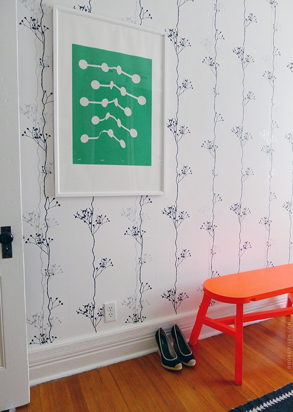
This is going to sound silly, but I’ve never hung anything on a wallpapered wall before. Considering the amount of wallpaper in my house, that eliminates a lot of possibilities when it comes to hanging art! I’m not usually so precious about stuff, but the thought of making a permanent hole in something that’s bonded to my walls fills me with panic. I got over myself this weekend, though, and I’m so glad. The dressing room looks so much more finished now!
The print that got me to finally pick up a hammer is Animal Sounds 002 by Matthew Korbel-Bowers. I recently did a styling project for Society6 (I think it’s going up on their site today–I’ll update this post when that happens), and this was one of the pieces I chose. I ordered it pre-framed (Vector White, 26×38″) since I didn’t have much time, and it looks great. I really love the design combined with the wallpaper pattern, and the way that bright green looks with my crazy orange bench.
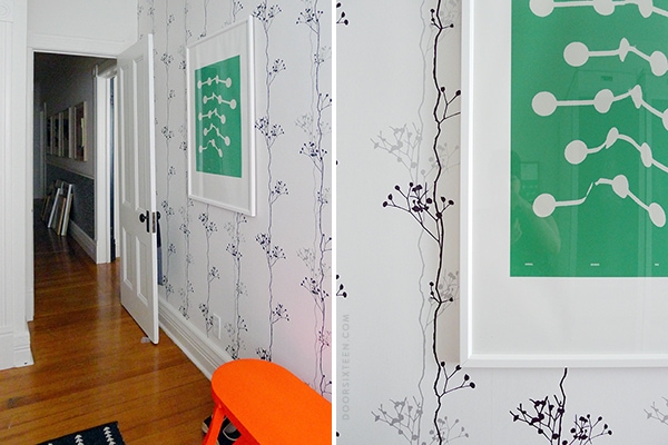
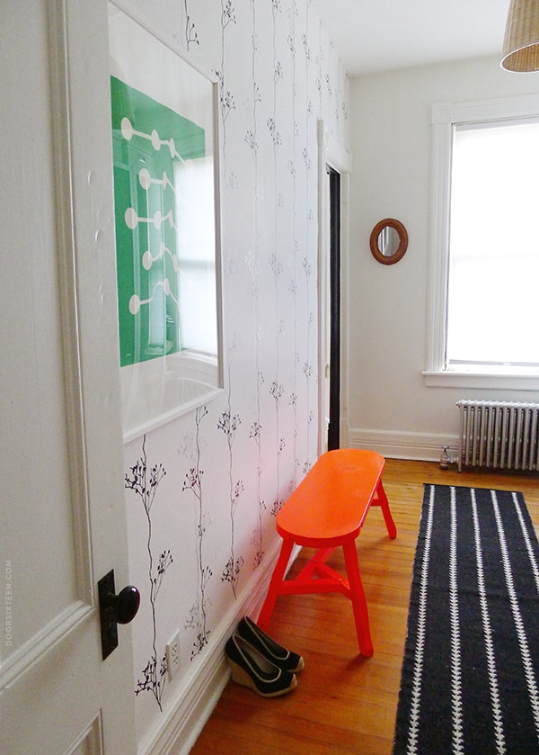
Long view! The dressing room is really narrow and difficult to photograph, but you get the idea. Oh, and the wallpaper (installed five years ago) is Berry Black from Ferm Living, the fluorescent orange Offcut bench is from Tom Dixon (discontinued, sadly, but you can still get the Offcut stool), and the rug is by Nate Berkus for Target (also discontinued, argh!).
I’m still feeling really hesitant to start hanging stuff all over my wallpapered walls, but this was a great baby step. Assuming I don’t hate it a year from now (I won’t), I’ll consider the hole worth it. Otherwise, I’ll take down the frame and point out the miniscule, barely-noticeable hole to every single guest who gets a house tour, because that’s just what I do.


26 Comments
I’ve always thought at one’s eye is attracted to the unusual, un-pattern part of a room, wall, etc., so putting a nail in a plain wall is more noticeable that putting a hole in wallpaper, especially if one puts it in the middle of a pattern. In other words, aim for the posy.
Love the look.
Yes, yes, but it’s so easy to fill a little hole in a plain wall! A wallpaper hole is permanent.
I know I’m being ridiculous. I’m getting over it. 😉
All I have to say – 3M Command Strips. A little pricier than nails and a hammer BUT they work like a charm. Perfect for renters, wallpaper or crazies like us (me + husband) who just don’t love the thought of a ton of holes in the walls. Seriously, check them out if you haven’t already. Love your blog!
…possibly spoke too soon. Apparently the 3M strips are NOT ok on wallpaper. You still may want to check them out 🙂
I was juuuust about to reply to you that they’re not OK on wallpaper. 😉 They’re great for other stuff, though!
(Thanks for the nice words!!)
Oooh, I love that piece against that wallpaper.
I would have aimed for the middle of one of the black dots. A void in black, maybe not so bad?
I thought about that, but decided it was more important to hang it in the right spot. 😉
ha, that would put me in a panic as well…this is encouraging!
Hi Anna!
Long time reader here but first comment (oh the shame!) Anyway a trick to hanging art on wallpapered walls is to slice a V shape in the wallpaper with an exacto and then carefully lift it up like a little flap. You then make the nail hole into the wall underneath it. If you decide to move the art or take it down you just fill the nail hole and glue the flap back down. Hope that helps in future wallpaper art hanging endeavors!
Your house and blog are my favorite!
It took us an entire year to get up the courage to put holes in our walls, and they’re not even wallpapered. And since the first one, we’ve just gone completely mad so I’ve got almost all my framed art up. Still have a whole bunch still leaning against the wall in the living room and I kind of don’t hate them there, to be honest.
Jessibee took my comment almost word-for-word but it’s a good enough tip that it bears repeating.. The house we lived in when I was a kid was covered in wall paper, it was the early 90’s in the Midwest. . The V cut was my mom’s trick for nail holes. She also upholstered the powder room ceiling (again: it’s was the 90’s) so her decorating advise should perhaps be taken with a grain of salt.
I have a question for you and JessiBee, then: Doesn’t the pasted-down V-shaped notch show even more than a tiny nail hole would? I guess I can see how it would be fine with wallpaper that’s busier/darker, but on white? I can barely get past the seams, and they’re supposed to be there! Hahaha.
Good point Anna. It works great with darker and heavier patterned wallpaper but you might see the notch on the white. If you use a really sharp razor and get the cleanest slice you can it should be very minimal, like have to catch the light just right to notice minimal, but, yeah, if the regular old wallpaper seams bug you this might be too risky. I wish I had a white wallpapered wall to try it out on for you!
Ha ha ha! I still haven’t hung anything on my toile wallpaper in my parlor and it’s been up there since 2006!
looks great! but i really wanna know where i can get those cute shoes?! 🙂
Abi, they’re from Banana Republic, but I’m afraid they’re at least four years old now.
Love that orange bench.. too bad it was discontinued..
Anna, the print looks fabulous on your wall.
It took me forever to decide to put a hole in my wallpapered wall to hang a painting. Then I hated it! Thankfully my wallpaper is quite busy so I pulled out the nail, filed the hole and re glued the wallpaper down. I definitely will not be attempting to hang anything else on my wallpapered wall.
wow. that print is AWESOME. i love that green. it looks great against your wallpaper and it really complements your neon bench. luv it.
hey, i’m excited to see your styling project with society6. i just know it’s gonna be coooool.
I just love that dressing room – it makes me happy every time I see it.
Me too, Laura! Thank you. 🙂
Long time lurker reader
One of the (many!) things I appreciate about your blog is that you are frank about seemingly “silly” anxieties and so on. They can be big deals and I’m glad that the world didn’t end : )
And gah, this will be creepy/ stalker-ish, but I think that the Society6 styling stuff you did went live?
I logged in today and on their mainpage, there are are two photos (one for totebags and the other for mugs) and I’m guessing the photos they used are yours because a) I recognize your totebag and mug designs and b) I think I recognize your white floor boards and black forest wallpaper (HA!)
Great work as always.
Thanks Vita, yeah, there are a few thumbnails up right now, but the feature won’t be up until the weekend. I’ll post when it’s live. 🙂
Another possibility is installing a picture rail. Probably only worth it if you’re planning to hang a gallery-style wall, or if you like to change up your art a lot. But they save the walls.
Anna, I love the title of this post more than words can express!