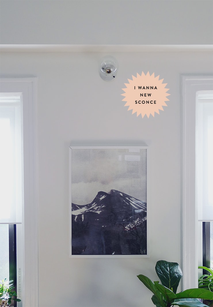
The new apartment came with three sconces installed in various places, and as far as rental fixtures go, they’re pretty nice. I’m used to apartments coming with those gross faux-brass things with the grape clusters etched into the fluted shades, like the ones I did a makeover on in the old Washington Heights apartment. These are just regular old ceiling sockets that cost less than a buck fifty, and paired with a nice big G40 bulb (three of which also came with the apartment, amazingly), they really do look quite good. I feel like this apartment needs a little bit more, though. The ceilings are so high that I think there needs to be more weight and substance to anything that’s high up on the walls.
I’ve narrowed my options down to seven finalists. While I think I’d like all three fixtures to be the same, I’m not opposed to a complimentary combo—especially if we’re talking about the one in the stairwell.
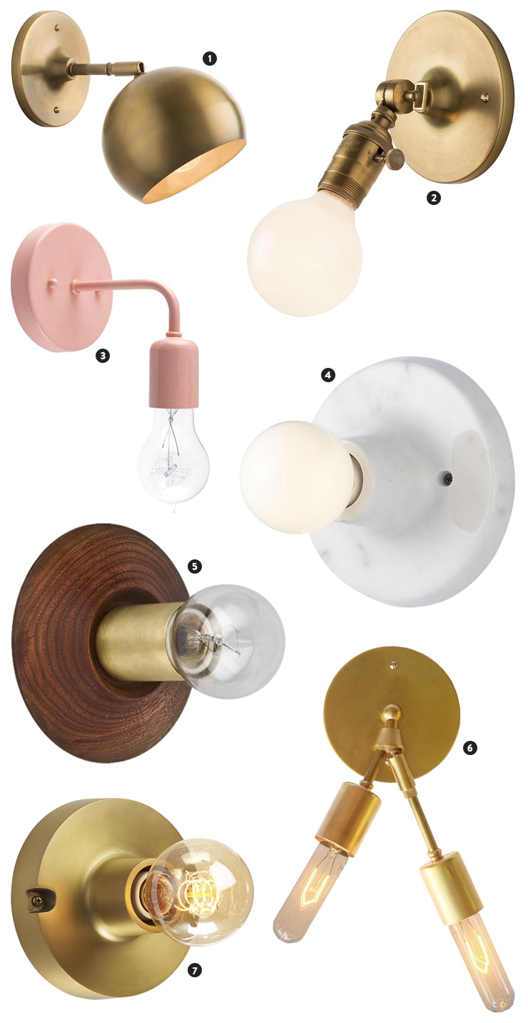
1. Schoolhouse Electric / Isaac Sconce
2. Schoolhouse Electric / Princeton Freshman Sconce
If narrowed it down to these two, I don’t know that I could choose between them. I love the shape of the Isaac, but I wonder if the slightly more industrial look of the Princeton isn’t more suited to the space. I do like that they’re both adjustable, since at least once of the sconces would be directly illuminating artwork.
3. Barn Light Electric / Downtown Minimalist Sconce
I mean…it’s pink, so I love it. My only concern is that the neck on this one might look a little anemic when it’s on the wall? I feel like this might be better as a bedside or reading light rather than a high wall sconce.
4. CB2 / Marble Flush Mount Lamp
This is basically the same as what’s there now, but MARBLE. Don’t the words “marble wall sconce” make you all warm inside? As much as a I love love love this thing, I’m not sure it gets me anywhere as far as adding a more visually substantial fixture is concerned.
5. Allied Maker / Flush Wood Minimalist
Siiiiiiiiigh. Four choices of wood (including blackened oak!) and three choices of metal. This lamp is gorgeous, no two ways about it. The only thing that makes me hesitate is the fact that I think I need something that’s going to direct the light downward. I don’t know. Maybe not?
6. Cedar & Moss / Branch Sconce
Sooooo pretty, but three is probably overkill. Maybe the Branch over the artwork, and the Tilt Mini in the other two spots?
7. CB2 / Brass Flush Mount Lamp
This is a nice, hunky piece of brass right here, and the price is great. It would definitely work in all three locations, and because it’s not white, it has a lot of presence. I don’t know, though…I keep looking at this one next to the one above it from Allied Maker and thinking it’s just not quite as nice. The price, though. The price is good.
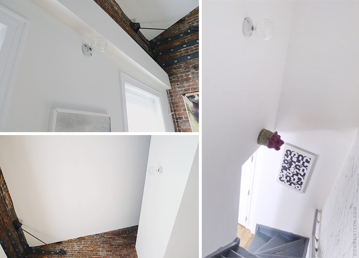
All I know is I don’t want to be looking at these sconces two years from now and thinking, “Hmmm, someday I should swap out those sconces.” It’s not a big deal! I tried to take photos of where the other two are in the apartment, but it’s a little hard to tell what’s going on because of the weird angles. The one on the bottom left is really high up—directly opposite the one in the picture on the top left, but about 5 feet higher. The fixture the right is in the stairwell, so I can’t install anything there that would protrude too much.
Decisions…




42 Comments
I like no. 1. It seems like the covered bulb would add more visual heft and also focus the light where you want it.
I love number 6 – it would enliven the two blank walls which have no art.
How about 6 and 1 in combo?
I like no.2 mainly because it’s adjustable but also because it seems to be a bit more simple, industrial while being a little old school too. I agree that it suits your space very well.
i like 1 & 3
All good options. The Schoolhouse Electric and Allied Maker sconces are of a much higher quality than the others. And don’t worry about directing the light down, use a gold- or silver-tipped lightbulb and the light will reflect of the white walls in an even, diffuse way.
I own a bunch of stuff from Schoolhouse and it’s definitely all really well made! And I know Ryden an incredible craftsman—I have no doubt the Allied Maker lamp is gorgeous in person.
I must say, the lamps I own from CB2 are very nice!
Tough choice!!! They’re all great for different reasons. I think I like #1 and #6.
Hmm, this one is tricky. Where I leave it’s really rear to have sconces inside, so I’m really not used to them and find it difficult to choose. I like most of what you’ve gathered, but i think that the 2nd one would work best in your space. The sconce on the wall of the bedroom’s “balcony” seems a little weirdly placed. I mean at least to me it would never occur to put a sconce there. So I was thinking maybe you could adjust the sconce there to aim upwards (maybe?).
PS: I can’t help it but the pink one really reminds me of flaccid penis. At first I thought it was the angle of the photo and the colour, so I clicked to the site. Nope! It’s definitely not the colour. And those 2 interior photos they have really don’t help…
PS 0.2: I hope PS 0.1 wasn’t completely inappropriate.
It looks weird in this photo because it’s a weird photo, but it actually makes sense in person. The only drag is that both of the living room sconces are on the same circuit, so it’s either both or none. I definitely need a dimmer!
p.s. Entirely appropriate!
I think they are all beautiful – but I guess I lean towards #1 because the others don’t seem all that different from the ones you currently have. I know the materials are different, but they are still a really simple socket and exposed bulb. #1 feels like it’s making a better argument for replacement than the others.
Do you really need to put a sconce there? I think the stairwell and bottom left are begging for something more linear. I could see a series of linear florescent tubes which become a art installation in the stairwell. Or maybe linear sconce (ala https://www.pinterest.com/pin/75364993738895492/) on the other one.
A little too slick for my taste, Louis, but a cool idea!
#2 … simple, does all the trick(s)
Totally unrelated to sconces, can you tell me where the mountain poster is from? Love it!
Thanks!
Sure! It’s from Fine Little Day:
http://www.finelittleday.com/posters/posters/up.html
I’d have to go for the Princeton freshman one, but only because of its name:).
All gorgeous, but #1 has always been a fave of mine…. here are a couple of other alternatives. Happy hunting!
http://www.urbanoutfitters.com/urban/catalog/productdetail.jsp?id=35834522&category=A_FURN_LIGHTING
http://www.urbanoutfitters.com/urban/catalog/productdetail.jsp?id=26623124&category=A_FURN_LIGHTING
http://www.urbanoutfitters.com/urban/catalog/productdetail.jsp?id=36245322&category=A_FURN_LIGHTING
Have you seen the urban outfitters sconce that is very similar to the schoolhouse electric Isaac? Not hard wired, but an electrician could change out its wiring for you…
Yes, Nik linked to it right above you, actually! Because I’ve owned a lot of Schoolhouse fixtures and know how good the quality is, I have a feeling is be disappointed in the one from UO. Also, I need brass. 😉
i like all of your choices, but have you also considered the lamps by one forty three?http://shop.onefortythree.com/collections/lamps. i basically like everything they do and their brass shaded wall scone woud look so nice above the mountain poster!
I have! I own a couple of Logan’s light already, and they’re fantastic. I actually considered the one you mentioned, but it didn’t make the cut for the same reason the pink one from Barn Light probably won’t. Because of the height of the fixture, I’m afraid the neck of the light will look to skimpy. I’d love it at bed/reading height, though!
OH MY GOD ALLIED MAKER. Why had I never heard of them before?!?!? WOW. Now I want that sconce in blackened oak with a blackened brass shank and the half-gold bulb from Anthropologie. In a bathroom. Twice. Flanking a mirror. Yum.
Go marble! Go marble!
I like the marble. Cool. Classy. Classic.
Good enough for Romans, good enough for today…
Love the Isaac–how about in the Persimmon color?
I like the Branch for the hallway. Do you have room to turn it the other way, so the branch is up?
How about your Patrick Townsend String Light, could that be wired to hang in the hall? P.S. you’ve turned me into a pink lover–taking an armchair in today to get upholstered in a muted pink. Kinda scared cuz I always go the gray/neutral route!
The stairwell is really narrow—not a place where you’d want something dangly hanging.
Hope you like the pink! I think it’s great with neutrals.
We just moved and I was also in need of a sconce – to go over a vanity mirror. I found a Crate and Barrel Baker sconce in copper during their Madison avenue store closure madness. Although I was not quite sure about the neck, I couldn’t get past the price and gave it a try. It’s very similar to Barn Light Electric’s Downtown Minimalist sconce and it worked really well. It has a minimal, yet a nice statement. You may wish to consider number 3 over the Up poster – this style is better in person and up on the wall. Your apartment is just so beautiful with everything you are doing. Where are the shades from? I was planning to try Loewe’s Allen + Roth, as per Daniel’s blog. Do you have any recommendation?
Thanks for the perspective on the fixture! I may need to make something out of cardboard and stick it on the wall just to get a sense of scale. The ceiling height in this apartment is bugging me out!
Oh, the shades are ENJE from IKEA, and no, I don’t recommend them. They used to be great when they were long and had a pull chain, but now they’re too short for older windows (I have to leave them at this height or there’s a gap at the bottom), and they have a really crappy spring mechanism. The ones from Lowe’s that Daniel wrote about are great!!
Thanks for the tip about Enje! Looks like a trip to Lowe’s is a must.
#1. Did you notice it’s your only choice that isn’t a 100% exposed bulb sconce though? That’s one reason I like it more. But maybe the straightforward simplicity of exposed bulbs is what you’re all about. I think they look cool, it’s just that They hurt my eyes and give me headaches.
My vote for Nr. 2
#s 1 and/or 6 – love the pink one, but agree it’s neck is too skinny for where you want to put it. Now I have to go obsess everything on the Cedar & Moss website…
hi Anna,
I’ve been so inspired by your posts for a long time now- love the blog redesign and all of your posts lately – Must have been so tough to let go of Door sixteen in Newburgh, but it is so amazing the document of that home and your city homes you’ve created here. ..Something about the brick and high ceilings makes this a tough choice- I would say #1 for above the mountain poster, and #2 in the stair way, OR #5 above the mountain poster and #2 – Its hard to get away from the ceramic baseplate look though, some combo of these guys could be cool too: http://www.communedesign.com/products/commune-light-socket -black above the poster and green in the stairs?
Thanks, Lara! 🙂 That’s really nice to hear.
I think those ceramic sockets are the same thing as what I already have, but in different colors. They’re cute, for sure, but I think I need something larger since the wall/ceiling expanses are so…huge.
I really love the look of #5.
Have you considered making your own sconces? I couldn’t decide on a style for a ceiling fixture in my house so I finally just designed my own and ordered the parts from grandbrass.com. Super solid brass pieces and since it was my design, it was exactly what I wanted.
After debating this for months (and considering many that you have listed), I finally just bought 2 of the Isaac sconces for our bedroom – I went with the black color with brass accents. They look fantastic, I’m so happy with my choice. The quality, and the light that they give off, is perfect. So I am partial to #1, but it is more directional which many not be great in all locations. I do think it would look really nice in the stair though since it sticks out a little more into the space.
This is maybe a stupid question, but at the risk of sounding stupid:
I know changing out light fixtures is not that difficult a task – black to black, etc. But where did you learn all this basic home diy stuff?
I’m currently making this face ಠ_ಠ at my entry way sconce and need a pat on the back.
Not a stupid question, Mandyee! My stepfather is an electrician (and a very patient teacher), so I’ve had a leg up in that department. 🙂 When it comes to all of the renovation work we’ve done over the years around the house, it really comes down to asking questions and Googling EVERYTHING. I’ve also been watching This Old House for at least 25 years, and a lot of what those guys do rubbed off on me in the form of confidence and DIY spirit, if not specific skills (because you really don’t retain this stuff until you’re actually doing it).
I don’t like to get into electric tutorials here on the blog, but wiring a sconce shouldn’t be a huge deal—it’s definitely a DIY project unless you’ve got some kind of old wiring situation (like old, brittle cloth-covered wires) that requires more extensive work that you might not be up for. TOH has a good, basic diagram and guidelines that should help you out.
GOOD LUCK!! Just make sure you shut off the breaker before you do anything. 😀
I’m thinking of doing this for our apartment, but maybe not double sided??
http://www.thedesignnetwork.com/episodes/fearless-diy-wall-sconce/
A. I love your blog and your style! B. All of these choices are great and I hate to add to your options, but you might want to check out all of the great lighting options over at http://shop.onefortythree.com/
I can’t wait to see what you choose.
I have several of Logan’s fixtures already—I’m a fan going way back. 😉