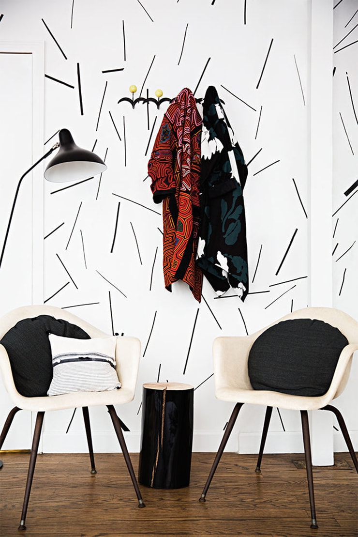
I picked up Domino magazine recently for the second time since its 2013 relaunch, and after getting over some initial sticker shock (that $12 cover price is rough), I felt my money had been well spent just to discover the gorgeous Flatiron studio of Lulu Frost, designed by Katie Martinez.
How cool are those skinny black stripes on the wall? According to the article, they’re just strips of gaffer tape. (By the way, gaffer tape comes in a whole bunch of colors and widths, so the possibilities here are endless! Also, I love that there’s a website that just sells tape.)
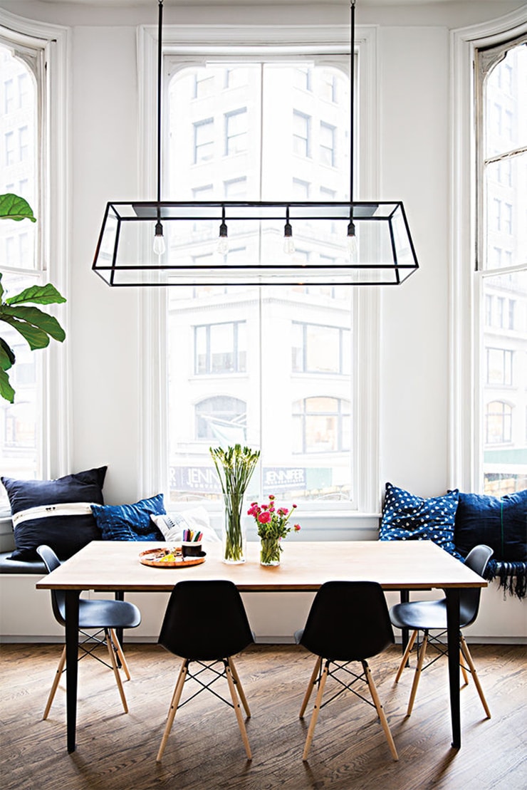
OK, you could put pretty much anything in front of THOSE WINDOWS (if you’re curious about what the outside of this gorgeous building looks like, here’s the street view), but this setup is particularly nice. I’m curious about where that table comes from—the legs are great.
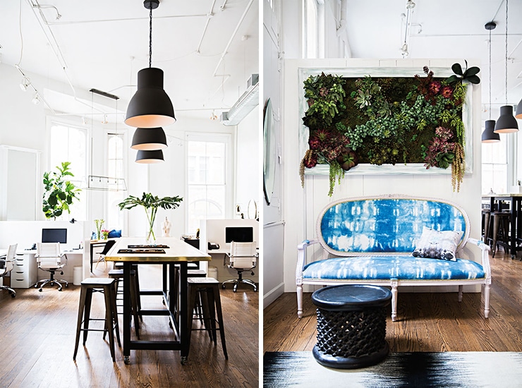
I’m a big fan of IKEA’s HEKTAR series, and the giant matte black ones look awesome in a space with high ceilings like this. I see a little sliver of one of my favorite rugs from CB2, too…
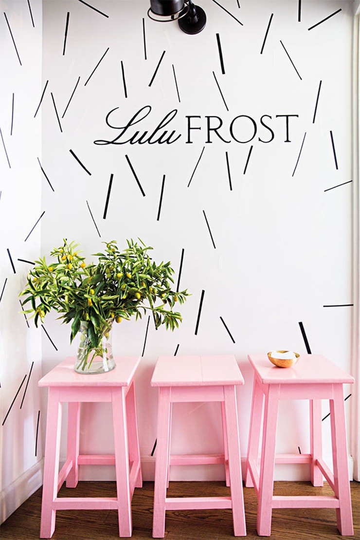
And finally, some pink stools. Happy, happy! This picture made me vow to make 2016 the year I bring a pink stool into my life. Dream big, baby!
Interior design by Katie Martinez / Photographs by Brittany Ambridge (See more at Domino)
8 Comments
I had Pink Tolix bar stools in my Paris Kitchen, it a fit of international moving stress I LEFT THEM in my apartment.. They made me so happy everyday, and even though they wouldn’t have worked in my new house in South Africa, I still miss them..
I love that living wall behind that sofa- that is my new dream!
Oh no! May pink stools once again be part of your life soon, Ita.
Ooh, I’m eyeing up the HEKTAR lights for my bedroom. Love the HEKTAR wall light too. As I’ll be having black walls (well just one, but it’ll have the wall lights on it) I’m opting for the bronze-y finish which I’m a bit nervous about. I can only gaze at them online at the moment (yes, complaining AGAIN about living in a non-ikea country) but will check them out in Australia in a couple of months.
I got some pink metal stools recently. They’re salmon-y/watermelon-y beauties and were ridiculously cheap because no one else could appreciate the gloriousness. Their loss!
The street view! Love it! I’ve always wished that this was regularly part of room reveals/house features in blogland, but I understand why it’s not (for the obvious stalker implications). It’s just so fun to know what view those gorgeous windows are framing or what life the homeowner is really living. We come inside to find reprieve from the world – what world are you living in? How did that influence your design choices?
All of that to say: it was a treat. Thanks!
Great inspiration, Anna. Do you still have your neon orange bench?
Love those wall hooks in Lulu Frost”s studio- first picture.
Yes, I do!
Anna, thanks for sharing these pics. I love the interior and I love the street view. they really combine perfectly, this seems to me like a dream house. I like the high ceiling, in my opinion they bring a small taste of the scandinavian design.
I love pale pink stools and pink walls too, I often propose my clients to paint at least one room in pale pink which is actually a colour that goes with everything.