
The winner of the informal face-off poll in my last house post is THE KITCHEN, narrowly defeating the bathroom with a current tally of 30-25. Congratulations, kitchen! Smell ya later, bathroom (figuratively, that is, not literally). How about we take a look around at the the entire kitchen from all angles, and then look over some plans?
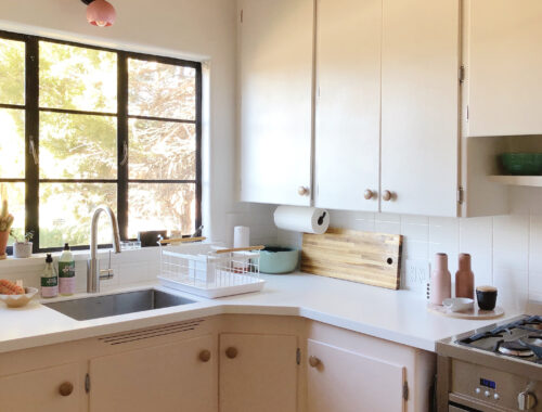
As you can probably tell from the photo above, the kitchen is on the small side, but not ridiculously so. The room is about 7′ wide and 14′ long, so the L-shaped configuration makes a lot of sense. The cabinets—original to the house and built on-site—are simple and spacious. I love that they extend all the way to the ceiling. I’ve never been a huge fan of corner cabinets because I feel like they waste a lot of space in the back, but it does make a difference here. Even just that little bit of extra counter space helps.

Okay, so here’s where things might get a little controversial. This sink is original to the house. It’s also in really bad shape. The enamel is very pitted and badly etched, and no amount of scrubbing I’ve done with Barkeeper’s Friend and Scotch-Brite pads (my usual let’s-make-a-miracle-happen combo) gets the sink to a place where it feels like it’s sanitary to use, much less nice to look at. Also, I greatly dislike double sinks. I guess if one side were big enough to wash a cookie sheet and the other side was small it would be fine, but that would be a huge sink in a relatively small space. So I’d much rather have a single sink that’s a little smaller overall, but with a basin size that’s more practical.
So the sink is a goner. It’ll go to Habitat ReStore, where hopefully someone will figure out a good use for it, like maybe in a laundry room or an art studio.
Also, can we talk about what’s going on with that grout around the sink? Because it’s gross. The original kitchen countertop would have likely been either Formica or Linoleum over wood, edged with metal. When someone decided to “upgrade” to cheap floor tiles, they just put the tile right over the old countertop—which made the surface significantly higher than the sink edge. Clearly the solution was to create a sloped edge with a whole bunch of grout?? Don’t do this. It’s gross. It’s impossible to clean, and every time it gets wet (which is often, since it’s around a sink), a little bit of the grout wears off and goes down the drain. Did I mention it’s gross?

Time for more controversy! Like the sink, these cabinet handles are also original to the house, and they are also gross. At first they look like they just need to be cleaned up, but on closer inspection, the finish is also really pitted and scratched—and a lot of them are actually cracking. I don’t know what kind of metal they’re made out of, but it’s weirdly brittle? Also, I honestly don’t even like them. I don’t think they look right with this style of house. So…bye, handles.

No, that’s not a miniature stove! It’s a standard model, but it’s in a 40″ space. In 1950, most stoves were 36-40″ wide, and surrounding cabinetry was built accordingly. Nowadays most stoves are narrower (standard in the US is 30″ wide), so they don’t always play nicely in older houses. Similarly, refrigerators in 1950 were much shorter than they are today, so the options that exist now to fit in these predefined spaces are really limited.
To me, the most obvious move here seems to be to replace the stove with a wider model (it’s tricky to find 40″ stoves that aren’t super expensive, but there are a few good options at 36″ wide), and put the refrigerator somewhere else (see below). THEN…extend the upper cabinet to the right of the stove down so it matches the cabinets on the left, and add another lower cabinet (and more countertop!) where the fridge used to be. Does that make sense?

Like this!! This gives you a whole additional 36″ of countertop, plus a ton more storage space, PLUS more options for refrigerators (taller, narrower, etc.) when it comes time to eventually deal with new appliances. Get it?

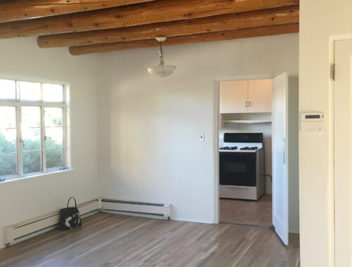
This is where the refrigerator will be moved to. This is completely dead, wasted space currently. I assume it once was used for a Hoosier cabinet or something like that, because there’s really not enough space for a dining table. Also, the actual dining room is only about 4′ away.
Now, about the floor. Why do people put this faux-rustic tile everywhere? This is the exact same tile that’s at Fritz’s vet’s office. Why is it also on the floor in this house? AND THE COUNTERTOP? I do not know. Yes, it’s cheap, but there’s all kinds of tile out there that’s cheap. Like Saltillo tile, for example, which is totally appropriate for a Pueblo Revivial house. Why go with the faux-rustic stuff when you can do the real thing for roughly the same price? I do not know.
Anyway, we knew we didn’t want to deal with demo’ing and replacing the entire floor right away, so this floor is going to get a stop-gap prettying-up for the time being. You’ll see.
So that’s the overview of the kitchen, and the rough plan for the eventual layout. I’ll be back next time with specifics about colors, materials, appliances, and all of that good stuff. Yay! Then it’s work time! Yay! Yay!



38 Comments
Screams potential! Let us just also pause for the gorgeous ceiling beams. Just wonderful. Good luck with the reno. You will smash it.
Thanks, Sinead!!
I am so incredibly happy that you are back at the blogging, sugar! You are delightful
No, YOU are delightful!!!
No controversy here. That sink and those handles did their job and were ready to move on! They will find a new life in a garage/art studio or similar space thanks to you donating them. Your kitchen needs better function and beauty!!! That grout around the sink…oh my. Tile on counters is so odd to me. I had a similar tile in my entry, and my suburbia house was built in 2004. There’s no way there weren’t better options available. Smart move for the fridge by the way. So excited for the next kitchen post to see more!
I’m excited to see what you do! I loved your posts about your house in NY, so this will be interesting!
Yay, Dana! I’m excited to share it.
Loving this, welcome back from a long time reader!
Hi, Sherri! Thanks for sticking around.
Glad you’re back!!
So, no dishwasher? What are your thoughts on that? You don’t mind not having one or didn’t want to alter the cabinets? I am curious because this is my dilemma.
No dishwasher! With the exception of one apartment I briefly lived in, I’ve never had a dishwasher. I actually LOVE washing dishes by hand (so satisfying), and adding one would eat up so much cabinet space (and add so much expense).
I had cabinets like that in my last place. Even that decorate bit under the sink! Really looking forward to see you work your magic on those. And I have those tiles in my bathroom (a rental, not by choice!) so yeah, they’re EVERYWHERE.
I love your house and look forward to seeing the changes you’ve made. I live in Albuquerque and it is so fun for me to see a home in New Mexico on a blog!
Can’t wait to see what you do!
Maybe keep the sink as a planter in the garden?
So glad you are posting this!!! Really looking forward to seeing the progress.
Former New Mexican and current Brooklynite here, obsessed with your beautiful home. Those vigas are beyond dreamy. Saltillo tile — YES. This is going to be so good. I’m so glad you’re sharing; thank you!
so glad you’re back anna! you and daniel are the sole people responsible for opening my eyes and cherishing my own old home. i also have that same floor tile in my kitchen that they also tiled the counters with in oklahoma! hahaha. i covered the counters with concrete for a temporary solution a few years ago but haven’t gotten around to the floor yet. i try to just ignore it (it’s hard!). so excited to see what you’ve done! we have family in santa fe and FELL IN LOVE on our first visit. it’s hands down one of the top places we would move to in a heartbeat. the sky there is like nothing else!
EXCITING. Ill be waiting breathlessly for the next installment of ANNAS KITCHEN RENO
So happy to read this post! I love a good window over a sink. Lovely light, indeed. Excited to read more!
I have these same tiles in my rental kitchen in Brooklyn, whyyyy. Can’t wait to see what you do to yours!
Haha, I have the SAME DAMN TILES in my 1920s rental. I just know there is a wood floor under there. Grr.
So so happy you are back at your blog! Cant wait to see and read about how it turns out.
Such a great foundation (well, faux-rustic floors, aside) for a refresh! I can’t wait to see what you come up with! And btw, thanks for teaching me a new word – vigas! I’m a Michigander so we don’t see them around these parts. 😉
I hear you on 1950s porcelain sinks, btw. We had one in our 1950s colonial and altho I was grateful it was a single bowl, it was impossible to keep clean. I’ve always had stainless steel sinks so I’m fine with scratches and expect normal wear and tear, but every thing seemed to leave a black mark in that porcelain sink. argh! When we renovated our kitchen, it was the first thing to go!
Literally can’t wait to see you work your magic !!!!
yay! kitchen! I knew my patience would be rewarded. when I asked on FB you laughed, lol. so happy to see you blogging again. and the beams, love!
Like I mentioned, I hate the gutting of the vintage kitchen, but I totally agree with you regarding the sink and hardware. And that crumbling thing happened to my faucet (which caused it to spit water into the air, which was funny for about a minute). It’s just cheap metal. Also not having a dishwasher (I have had them & never used them) means hand-washing dishes which substitutes for washing your hands. 🙂
So fun to see. That is crazy about the floor tiles as the countertop!!!!
So glad to be reading your renovations (:
What an amazing canvas to start with and I’m so looking forward to what you do with it!
I believe your handles are likely zinc. We have a kitschy vintage bedroom set with extremely unique handles that mimic a design on the front, and they were brittle like that. And super glue didn’t work, which was amazing. So we pry it open with our fingertips until I can find the extremely particular replacements I have in mind.
Zinc! That makes sense. I think you’re right, Brit. Thank you.
I’m looking forward to seeing the new sink and stove and fridge and …
I’m SO pleased you’re back blogging. Back to beautiful basics.
Can’t wait!!! I’m currently obsessed with Saltillo tile. There’s a honeycomb pattern I’m thinking about for my kitchen…1950s. The cabinets are white and I have the same pulls that you have only mine are copper and in pretty good shape. So happy you’re blogging again!
I have the SAME TILES in our bathroom. Can’t wait to be rid of them soon. So excited to see what happens in your cute kitchen!
1) your kitchen update at the Newburgh (Newberg?) (Newburg?) house was an all time favorite of mine so I’m really excited about this.
2) faux rustic is the devil’s spawn.
3) yes please to single basin sinks!
Those tiles look familiar, and I live in Germany. I, too, know them as chugly (cheap ‘n ugly) space fillers, mainly in areas people don’t go too often (basement storage) or don’t have to live themselves. Glad they’re getting the boot!
About the rearrangement of the cabinets, how about putting the stove at the end under the far-right cabinets, which already seem to fit in width? Then you can extend the cabinets currently over the stove to make a nicely uniform front, and you’d gain 40″ of counter space and more under-cabinet room, too. Unless you really really want a wider stove because it might get you six burners, which some people do love.
Another thing: I really like the typeface you chose for your blog, and apart from seeing it it’s also ever so pleasing to even just write comments in.
Glad you’re back to regular blogging, I’ve been reading you for a long time now and kept checking in now and then to see if maybe you’ve posted something. Also, time flies – I can’t believe it was already five years back that you moved to New Mexico. Like, what?!
Love that you’re back to regular blogging!
I redid my small 1960 kitchen a few years back. I got a sink that’s about 2/3 on one side, and 1/3 on the other (it’s a Kraus, similar to https://www.kraususa.com/kitchen/kitchen-sinks/kraus-kbu21-30-undermount-16-gauge-stainless-steel-6040-double-bowl-kitchen-sink.html). My SOLE reason for doing it was that if the big part of the sink was full of dishes, I could still access part of the sink for making coffee in the morning. Literally, that was my reasoning, because it had been an issue in our house that annoyed me daily! And I’m happy to say, it totally worked. The small part is really too small for anyone to put any dishes in it, it’s pretty much a prep sink, or where I’d imagine people would put a disposal (which we don’t have).