Hello! It’s time to talk kitchen planning! First, though…YOU. Yes, you. You are awesome. I am awestruck. From the bottom of my heart, thank you so much to those who have offered support to Door Sixteen through my Patreon, and especially to everyone who has offered words of kindness and encouragement since I returned to blogging. I know times are tough right now all around, so for you to help out—whether it’s through financial support, awesome comments, and more than anything visiting this site and reading my posts—means an awful lot. I’ve said it before and I’ll keep saying it for as long as there’s a single person reading this blog: Door Sixteen readers are the best. THE BEST. I am so lucky, and it fills my heart with genuine happiness to know that you care. Thank you.
On with the show!

A couple of days ago, I introduced you to my kitchen—or at least my kitchen as it looked in early 2018. It’s now 2020 (which I don’t think is even a real year, honestly), and that’s worth keeping in mind as I share much of this renovation story. The very first steps happened way back then, and…it’s kinda still going now? Or at least it’s not completely finished yet. So you’re getting two years’ worth of the whole process compressed into a few posts. My boyfriend (I’d like to stop referring to him as “my boyfriend,” but he’s not an internet person—maybe let’s just call him “AK”?) and I have been working with limited funds and limited available time for labor, so getting the kitchen to its current state has taken longer than most renovations of this size. (I’m always amazed when I see a blog post about a kitchen renovation and it takes, like, 2-4 weeks from start to finish. Or less!! I can’t even imagine.)
Even though we knew it was going to take a while to do everything we wanted, it was important to both me and AK that we have a clear plan mapped out from the beginning. To that end, I put together the mockup you see above in January 2018. It was how I envisioned the kitchen looking. Actually, I envisioned the lower cabinets being black or dark blue initially (because I’m a one-trick pony), but AK suggested right away that we go with a dusty, pale pink instead, and he was absolutely right.
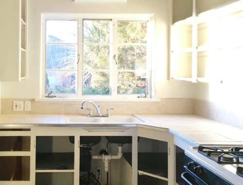
Knowing that tearing the awful floor tiles out would be too much of an ordeal for now—but also knowing I didn’t want to live with them—I decided that painting the floor would be a good short-term solution. I’ll get into that more in a whole separate post, because it was A PROCESS. And exhausting, knee-torturing process.
Armed with my mockup, I set about picking out the exact colors and fixtures and materials. It was a lot easier to do that with an end result already fleshed-out, rather than just going into it blindly.

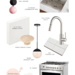
And this is where wound up after some negotiating and compromising and convincing and adjusting! I’ll run through everything so it’s clear what’s what going forward. Clockwise from top left!
✚ Sazerac Sitches Loa Sconce with Blush Pink Shade/Matte Black
The existing light fixture above the sink was for a fluorescent tube light, which I am absolutely positive nobody wants to stand under while they wash dishes in their home. Swapping it out for this cutie? Immediate improvement to the entire room.
✚ Kraus Standart Undermount Sink
As I mentioned in my kitchen preview, the original sink had to go. I knew wanted its replacement to be stainless steel, an undermount style, have straight sides/no curves, and be big enough to easily wash a cookie sheet—but small enough to not gobble up too much precious counter space. 23" is the right size to accomplish that!
✚ Kraus Oletto pull-down faucet
I need to have a sprayer, but I didn’t want to have a bunch of things sticking out of the countertop. A pull-down with a toggle button (to switch between stream and spray) is the answer. I did consider a black faucet, but because the mineral content in the water is really high here, I knew that would be a huge pain to keep looking nice. We chose the sensible finish, spot-free stainless.
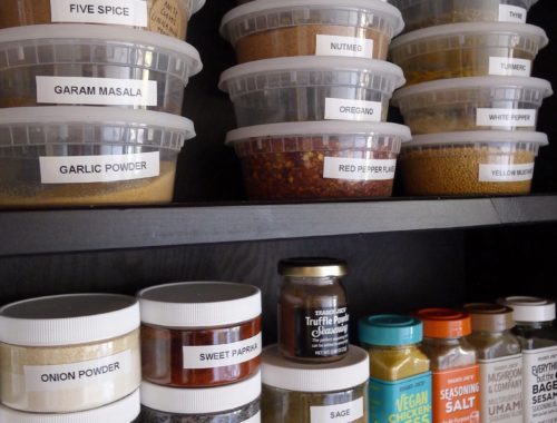
✚ Daltile 3×6" subway tile
4×4" tile would definitely have been more appropriate for a 1950 kitchen (and it’s what I originally planned for in my mockup), but I wanted to push the kitchen a little more toward the ’60s and go for a grid-stacked brick instead. Yes, it would have been nice to use something fancy like these 2×8" cement tiles, but fancy often means expensive when it comes to tile, so standard 3×6" subway tiles (which cost a whopping $15/case; or $30 total for the entire blacksplash) won. They look much more mid-century than Victorian when they’re stacked in a grid (as opposed to running bond, as seen in my old Newburgh kitchen), and using a light-colored grout helps with that, too.
✚ Cosmo 36" freestanding gas range
No, I’d never heard of the brand Cosmo either, but for $1700 (compared to similar-looking 36" freestanding ranges that cost well over $3000), we were willing to read the reviews and take a chance. It can be a little tricky to light sometimes, but all in all it’s a great stove and I love to cook with it. NO REGRETS.
✚ Farrow & Ball Pink Ground (modern eggshell)
✚ Valspar Du Jour (Signature semi-gloss)
✚ Rust-Oleum brush-on Black (gloss)
Paint colors! At $44/quart the Farrow & Ball paint was a big splurge, but a quart was enough to do two coats on all of the lower cabinets, so not so bad. (I can’t say enough good things about the quality of this paint, by the way. The finish is gorgeous, it’s super-durable, and the color is just…perfect.) Valspar Du Jour was my color of choice for all of the woodwork in the house, so it made sense to continue that to the kitchen cabinets. The brush-on Rust-Oleum is for the steel casement window.
✚ Mercury Row Globe Pendant
Again, I wanted to push this room a little more in the mid-century direction, and I always love globe lights. This is the 9" size—any larger and it would overwhelm the room (and possible get whacked when opening an upper cabinet).
✚ Birch Cabinet Knobs
Generously-sized, natural-finish wooden knobs were the first thing I imagined adding to this kitchen. I would have loved to go really big (like 3"!) but AK was worried that would be ridiculous (IMO that’s the whole point, but what can you do), so we compromised with these. They’re nearly 2", which still looks nice and chunky and feels much more cozy and “friendly” than metal pulls would have. Also, at less than $2 each, they’re pretty affordable even if you need 16 of them. I finished them with clear polyurethane so they’d be easy to keep clean, and over time they’ve yellowed a bit to nicely compliment the vigas.
✚ LG HI-MACS countertop/Nordic White
This was my first experience picking out countertop material, and…wow. So many options. Once we figured out that what this kitchen really wants is something simple and basic, the field of options got much narrower. The original countertop was either sheet Linoleum or Formica with a metal edge, not tile. I’m not a huge fan of ’50s-era kitchens, but I didn’t want to make this room feel too contemporary by using something like quartz, and marble would’ve just been too much (too fancy and too expensive). My gut said either wood or plain white, and plain white won. LG HI-MACS is acrylic solid surfacing; pretty much the same thing as Corian. I love how soft and suede-like the surface feels—very much like honed marble. Nordic White is a little warm, but not too much. I think we had about 12 samples of different HI-MACS whites when we started, and we just kept coming back to this one.
So those are the materials and the basic plan! Well, it’s the plan for one end of the room. The other end of the room (where the fridge is getting moved to) is a whole other thing, and I kind of need to save that for a future post because otherwise it’s going to get too complicated.
Up next? Painting the cabinets, inside and out! See you soon!!
34 Comments
Thank you for restarting your regular blog posts–they’ve been a nice bright spot in a pretty dreary time.
I am excited to see what you’ve done with your house!
I’m really happy to be here and posting, Sarah! 🙂
Your blog posts are so much tidier and easier to read than most others. Yay graphic designers!
Haha!! It took me wayyyyyy too long to make that design board. I’m glad it’s easy to read my posts! I bumped the font size up a little recently, and I think it helps.
love it!
😀
Base cabs match your logo—not lost on me.
My whole life matches my logo!!
Thanks! I’d forgotten just how much I love your home improvement descriptions—you always capture both the design and practical details that matter most to me.
Thanks, Malia. I know I probably use too many words!
Well I’m hoked! Cant wait for the next installment.
Hopefully Friday!!
I’m so glad you’re blogging again! You have the type of aesthetic that can be blindly trusted, no matter what you choose. As a former architect, I can say that I would have no doubt about hiring you anytime to design my interiors. Maybe when I’m able to buy a little casita in SF?!?!
Never trust me blindly for ANYTHING, Sandra!! 😉
Welcome back Anna! Do you mind if I just copy this kitchen? I was going to copy your Newburgh kitchen but I think this one suits my house style more. Prob will make the lower cabs dark though because we have small kids and they’re dingy little monsters. And yes, I agree with the F&B, pricey but so worth it. Ive tried to colour match with BM a couple times and the quality of coverage/pigment just wasn’t the same.
Copy away, Katrina!! Isn’t the F&B paint fantastic?? I can’t believe how well it holds up to scrubbing, accidental kicking, etc.
These seem like great choices! So excited to see more! Now I’m off to check out the company’s website of that cool pink sconce.
I ordered the cutest flush mount light from Sazerac Stitches. It looks great but I accidently dropped it and damaged one arm of the light. I contacted SS to see if it was possible for me to buy a
replacement arm and they took forever to reply. When she replied it was such a rude message saying “The shades are made of steel. I don’t understand how one could have been broken.” and then she never replied to any of my emails after that. If anything is wrong good luck getting any help from them.
Yeah! I can’t wait for the cabinet painting
post!!!!!!
So happy you are back….between you and Daniel I am able to get through the day…long time follower of both of your blogs and what can I say…a bright spot in my day!!!
Love it! Can’t wait to see the finished product. I’ve been wanting to repaint our cabinets and paint the interiors (for the first time), as well. This may be the jolt I need to spring into action!
I never would have thought of pale pink for the lower cabinets, but it is fabulous, so subtlebut gives that extra SOMEthing.
Interesting too about stacking the tiles and then they read mid-century.
I didn’t discover your blog until the very end of Newburgh, so it’s fun looking back to see that kitchen too, thank you for taking the time to link.
Oh I just love having your posts to look forward to now! You are doing a great mental health service, long distance!
So happy you’re back! You (and Daniel, bless him) are providing my favorite kind of distraction during this crazy time — I live for realistic depictions DIY home renovations. We’re four years into ours and there’s still an entire gutted bathroom that needs to be dealt with along with dozens of small we’ll-get-to-it-when-we-get-to-it projects. Time and money, the great limiters!
Also— we bought that same sink when we rebuilt our kitchen, and I honestly can’t say enough good things about it. Everyone tried to tell me to go bigger, but for my small kitchen, it’s the perfect size and I love how deep it is. I hope you’re as happy with it as I am!
Thank you so much, Sara! Yeah, I was a little worried it would be too small until I unpacked it. It’s like a bathtub!! It’s the biggest sink I’ve ever had in a kitchen.
Hi Anna! Welcome back!
Visualizing the room seems to make the process a lot easier. What do you use to make the mockups?
I just did it in Photoshop!
I cannot express the happiness that is Anna Dorfman returning to the renovation blog world. YAY!!!!!!
KERMIT ARM FLAIL!!!!!
Hi there! I know years ago you posted about painting window frames and I’d love to do the same. Are you following the same process or do you have new tips to share? Our windows are all vinyl, and I’m in Canada as well so I’m not sure what products are available, but that’s my summer goal!
Thanks for starting the blog back up. I’ve always loved following along 🙂
Holy CRAP, Anna…you’re dating ANTHONY KENNEDY?
Farrow and Ball sent out an email y’day about painting kitchen cabinets with their Modern Eggshell. Weird. Eager to see how you like the Hi-Macs. We had Corian in our last kitchen and now we have stainless, but I kind of miss the Corian…and I know the Hi-Macs is more, uh, cost-effective.
HAHAHAHAHA. Yeah, the age difference is a lot, and our politics are completely opposite, but it helps that he lives on the other side of the country!
And yeah, I saw that F&B email! Weird timing.
Any man who SUGGESTS pink cabinets…..now there is a keeper!
I love, love, love that you’re blogging again, and I love, love, love your choices. Specifically, I love how your instinct is to preserve what is original to a house, but you’re also practical about what you want and need in the modern day. I’ve been following your blog for quite some time. Your life, and mine, have changed a lot since then. Divorce, multiple moves, and, for me, finally my dream house to renovate! (If you’re interested, follow my Philadelphia renovation in Instagram @thegermantowndutchcolonial.) So the timing is perfect for me to follow your renovation while finally being able to work on my own. I’m so glad you’re back!
Hi! Do you mind sharing who makes your under-cabinet paper towel holder? I’ve been looking for something super simple but it’s impossible to find.