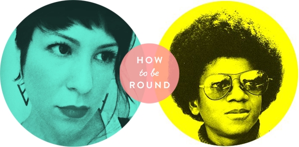
Between the categories page I designed for sfgirlbybay and the multitude of round icons I’ve made in the last couple of days on Twitter, I’ve gotten a lot of questions lately about how to make a circle with an image in it. Because it’s such a huge part of my daily working life, I tend to assume that everyone (a) owns Photoshop, and (b) knows how to use Photoshop, so it doesn’t occur to me that things that seem so simple (making circles, putting type on photos, etc.) to me might not be as obvious to everybody else. This is super-easy, though. I promise.
Okay, first things first: I don’t know how to use any image editing programs other than Photoshop. I’ve been using Photoshop for 17 years (that doesn’t seem possible, but I double-checked with a calculator to be sure…EEK!), and I’ve never had any reason to use anything else. I’m sure it’s possible to accomplish these results with other programs, but I can’t tell you how. I’m sure there are tutorials out there, though!
Second things second: These instructions assume you are creating a graphic element for use on the web. This is not how I would create a similar element for print. Designing and creating documents for print is a whole ‘nother ball of wax!
Now that that’s all out of the way, let’s get started…
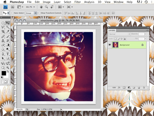
STEP ONE: Open your photo. For this demo, I’m using an Instagram photo of Rick Moranis as Vinz Clortho, the Keymaster of Gozer in Ghostbusters.
If your photo is really huge, now would be a good time to knock down the pixel width to a manageable size (Image > Image Size). Remember, when you view something at 100% in Photoshop, that’s the same size the image will appear when it’s on the web at screen resolution.
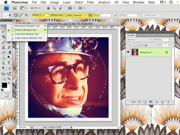
STEP TWO: Choose the Elliptical Marquee Tool from the toolbar.
See the area I highlighted in yellow above? Make sure that Feather is set to 0px, Anti-Alias is checked, and Style is set to normal.
Click and drag the marquee tool to select the area you want to make into a circle. Hold down the shift key to keep your circle perfectly round. If you need to move your selection around as you drag, hold down the space bar at the same time. (You’ll get the hang of it, trust me!)
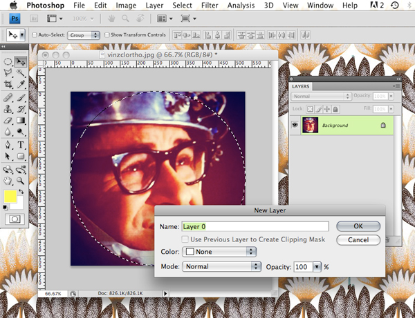
STEP THREE: With the selection still active, crop your image (Image > Crop) to remove any extraneous areas.
Double-click on the Background in your layers palette to turn your image into a free-floating layer. A dialogue box will pop up—just hit OK—you don’t need to change any of the settings.
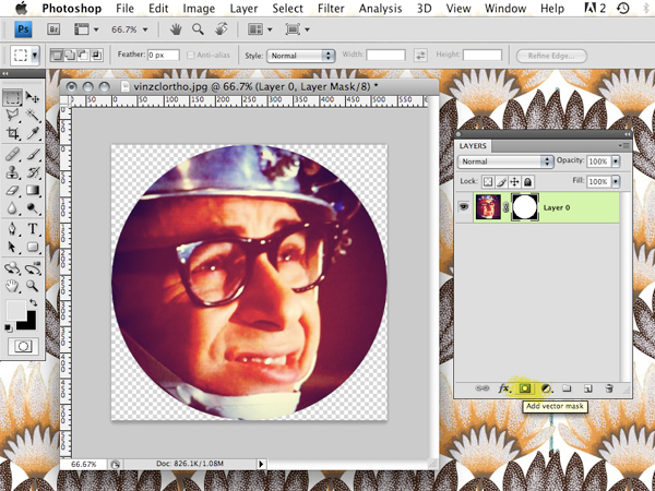
STEP FOUR: With the selection still active, click the “Add vector mask” button at the bottom of your layers palette (highlighted above in yellow). WOAH! Magical! Circle!
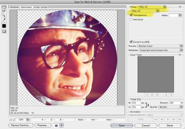
STEP FIVE: You’re pretty much done now, but for extra bonus points, you can now save your circle with its transparent background intact. That way, if you use your circle somewhere with a colored background (like on Twitter!), there won’t be a white square around it.
Go to File > Save for Web & Devices and choose PNG-24 (highlighted above) from the pull-down menu. Make sure the Transparency box is checked. Click Save, name your file, and you’re done!



66 Comments
um, THANK YOU!
i’m trying to teach myself photoshop, and am too lazy to do online tutorials. 🙂
I think I did it a bit differently, but honestly couldn’t tell you if I did or not. It was fun to try something new and this tutorial is great. I will bookmark it for sure. Have a wonderful weekend. Will you be out using the new camera?
There are a few ways to accomplish the same result, but I think this is the cleanest and easiest—doesn’t really matter how you get to the goal, though! 🙂
(And yes! Camera!)
I hope this isn’t too forward, but I kinda wanna make out with you for choosing Rick Moranis for your tutorial, ha.
😀 I loooooove Rick Moranis. He’s kind of the best thing about Ghostbusters, which is a pretty big accomplishment considering he’s competing with Bill Murray AND Annie Potts!
Thank you so much for the awesome tutorial! You’re the best!! xoxo
Thanks heaps Anna! I’ll have try this out. Photoshop scares me a big so I tend to forget how to do everything in-between uses. It’s a bit tragic. Would you believe I still use Pagemaker to do design work at my workplace. Oh well 🙂
I’ve been loving your twitter icons. The duotone colours are pretty awesome too, I have to admit. Going to have to make myself round!
I did graphic design at college, so learned to use photoshop, but now use The GIMP (Linux image editing program) It works pretty similarly, so people could work it out from this I think.
I think I might have to turn myself round when I get home. Thank you!!!
I want learn more about photoshop now. (note to self: look up photoshop courses)
Whoa whoa whoa– Wait. Are PNGs compatible with Internet Explorer now?? My blog used to have a design that was pretty much all PNGs but it looked TERRRIBLE in IE. If they work now, this is beyond exciting. No more transparent GIFs!
Hah! Anyone using a version of IE old enough to not support PNGs probably has no idea what the internet is supposed to look like at this point, so I wouldn’t worry about it.
http://www.libpng.org/pub/png/pngstatus.html#browsers
Thank you sooooo much for posting this! I follow you on twitter and wanted to ask how to do it when I saw all the awesome ones you were making! Thanks again 🙂
Thank you so much for this! I just learnt more here in 5 minutes than I have from a book I bought months ago!
Monthly PS tutorial? Pretty please?
Also, let’s see your new camera, please! It’s too gorgeous to not be all over your blog right now 😉
Kellee, I’d love to do that if I have the time, but I can’t promise that kind of regularity. I’ll try, though! I really enjoy teaching people this kind of stuff. 🙂
(Believe me, I can’t wait to get out and use my new camera!! I’m so busy with work this weekend…ack!)
hi Anna! thanks for the tutorial. i’m going to give it a go at work this week!
i have a totally ridiculous question, though. Step One: open your photo. do i open it in Preview, or iPhoto, or is there a way to actually open it in PS? sorry, i realize my question couldn’t be more basic — i’m a total newbie to PS.
thanks! and happy holiday weekend!
Momo, you need to open it in Photoshop, yes! That’s the only way to use Photoshop. 🙂
Launch Photoshop, then go to File > Open, locate the image, then click Open. (Or you can just drag the image onto the Photoshop application icon in your dock!)
14 or 15 years of Photoshop under my belt! Do you remember the incredibly tragic flaw of just ONE undue in photoshop? I just cannot fathom life the History pallette, how the hell did we do it back in the day? I guess I must have worked super slowly and saved often!
😉
I do not know HOW we managed without that history palette!! Oh god, do you remember how easy it was to screw up a whole file just because you accidentally took your finger off of the brush tool or double-clicked something by mistake?!
p.s. Maybe we should show this to Janet so she can learn how to make a mask.
So awesome. I tried it out and I love how it looks, thanks!
Thank you soooo much for this!
I love this! Thank you! How do you do the 2 tone coloring on them?
Caroline, the quick & dirty method is to just convert the image to B&W, put a layer on top filled with your color of choice, then change the blending mode on the color layer to multiply.
cool. executed:)
thank you for making my world round. this is so awesome of you to share with everyone! xo
thank you so much for this. as usual, you are a rock star. 🙂
i suspect there will even more round images on blogs now – including mine!
(but i swear i googled how to do this last month or so! though your instructions look a bit simpler 🙂
Wow, THANK YOU!! It’s so kind you want to share us your knowledge, and you do it with style! You’re sweet!
sooo helpful thanks!
also loving the script font you are using.
Thanks for posting this, Anna! I use GIMP but was able to use your tutorial to get an idea of what I needed to do to dottify myself. I loved these when I saw them on Twitter and I think it’s really cool of you to share this info and offer to make them for us. I definitely felt less like a dorky copycat. 🙂 Thanks again. You rule.
okay, just to confirm – your way MUCH easier than the way i was doing it (directions found via google) AND thand you for including the holding down the space bar tip!
I think you have created a colorful, round (and beautiful) monster. My twitter feed is already showing Kathleen, Leah and Tamera (and I’m sure many more) all sporting this new look. Goodness, me (nice work, Anna!).
How awesome that you used Rick Moranis for this tutorial!
This is awesome — thank you!
Also, saw the pic of you & Holly on Decor8 — love it!
–Kim
the weirdest thing with my current PS is that i don’t have an elliptical tool. i could never figure out why. i burned this creative suite from a techie friend and noticed it was not in the toolbar. so, i’ve just worked around it in my kind of PS mostly self-taught manner.
don’t mean to bog you down with questions, but do you have any idea why this would happen or how i might make it reappear? don’t need to be round necessarily, i do miss using it for other things.
i’ve made so many circles in photoshop, but not like this. i followed your instructions step by step and i learned 2 new things tonight:
Image > Crop
AND
add a vector mask to a selection
neet-o — thanks, Anna!
Wow, thank you so much for taking the time to do this tutorial.
I’m a total Photoshop hack, you just taught me a few things!
Looking forward to being round-a-bout…
what ever happened to Rick Moranis??? I’m totally gonna google that shiz. Thanks for the instructions, Anna!
Wow, Thats so nice n simple!! Thank you for it. 🙂
Please make more design tutorials like this! Thank you and hello from the Philippines!
Mabuhay!
Way to make it so simple and fun without sounding condescending!
LOVE! now how do you do this on instagram?!
Instagram doesn’t do this kind of thing—it’s square format with filters/borders and tilt-shift effect only.
Hi there, I saw this tutorial ages ago but finally used it today. VERY HELPFUL for those of us who only use photoshop once in a while. Thank you so much for the level of detail here. I know it must be time-consuming to do these, but it’s very much appreciated. Love your current blog design.
Thanks, Amy! Glad you found the tutorial useful. 🙂 🙂
Hi there,
Just wanted to say thanks for this. I just used your tutorial to make myself a new blog header. I looked at some other tutorials and yours was by far the best and easiest to understand. Thanks again!
You are awesome!!! Thank you so much for making this so easy to learn. I saw many examples before finding your website that made this process overly complicated and not easy to follow.
Thanks again for the excellent help!
Hi Anna! I just to say, thank you very much for creating this wonderful and so easy to digest tutorial. I’ve been rummaging the net and the others just look too complicated that my brain would just switch off in the middle of reading it! I’ve only just started learning Photoshop for about a week and doing it step by step and learning things on my own, so your step by step guide is definitely useful and worked for someone as Photoshop challenged as me! Thank you once again. Browsing your site already.
AJ’s Mom (from the Bean Team :-).)
This was an amazing tutorial. However…I know for sure I did it right…but when I post as a picture in blogger it still adds the square backround. AHHHHHHH!!!! HELP PLEASE
Sorry Paige, I don’t know anything about the file formats Blogger supports. You’d have to check their help docs to see if they support transparent PNGs.
Thank You!
Anna, you are the absolute best for this awesome and easy to follow tutorial. you have no idea how much you are appreciated.
I know I’m a little late to this party but THANK YOU! After reading several online tutorials and failing to get my perfect circle, I found you. Great instructions and got it on the first try. You’re awesome!
Thank you! This was so clear and easy to follow.
Just did it! Thank you!
If you don’t have photoshop, there is an app that does this.
http://kropcircleapp.com/
Very helpful post!
I’ve saved it in your correct way as a web file ticked transparency and png 24. But it has uploaded with a box around it.
http://faiths-journalismblog.blogspot.co.uk
Please can you help?
The box is a style you have applied to all of the images on your blog. It needs to be edited through CSS—it’s not part of the image itself.
thank you for the detailed tutorial!
however, i’m sure i followed the instructions carefully and the image is transparent when i open it in my desktop image viewer, but when i upload it as my twitter icon it still has the white background? did twitter disable the transparency thing or is there a particular size i should be following?
thanks in advance if you decide to read and hopefully respond to this.
Yes, Twitter has since disabled transparency support.
Thank you so much for this tutorial. Really easy for me to follow, can’t believe how easy it is! I’ve been thinking about this for awhile and finally decided to google it. Who knew it would be so simple!
Super helpful! Thank you!!!
You are awesome. I went to Photoshop Essentials to try and find a similar tutorial and my head was about to explode. I love that website but they tried to make it overly complicated. Your tutorial – simple, direct and to the point. I tried it once and it worked ! Ive been wanting to learn this for a long time. Thank you so much 🙂 !
thank you, thank you, thank you!!
thanks for tutorial! i just made my first one and it was so much easier than i thought! you rock!
Thanks for this, Anna! I remember using it a while back and went back to it today. You said you wouldn’t do it this way for print? I don’t want to burden you with a complicated question, but could you point me in the right direction to figure out what to do for print? Thanks in advance.