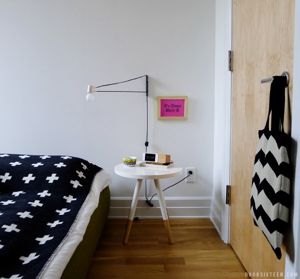
I finally took some photos of the new apartment that aren’t iPhone snapshots! We rented this place three months ago, and since then I’ve really been struggling to make it feel right and OK. Even though the building the apartment is more than 120 years old, the interior was completely gutted a year ago. It’s just such a sharp contrast to our fixer-upper Victorian house (not to mention just about every apartment I’ve rented previously), and it feels very hotel-like to me. I’ve tried to compensate by treating it like a dorm room!
I do like how the bedroom is looking, and really, even just having a separate bedroom is a wonderful improvement over our old studio. Evan and I often operate on very different schedules, so there’s no telling how many humans (or dogs) will be in the apartment or the house on a given day or night. Having a distinct area for sleeping makes everything feel a bit more normal for everyone.
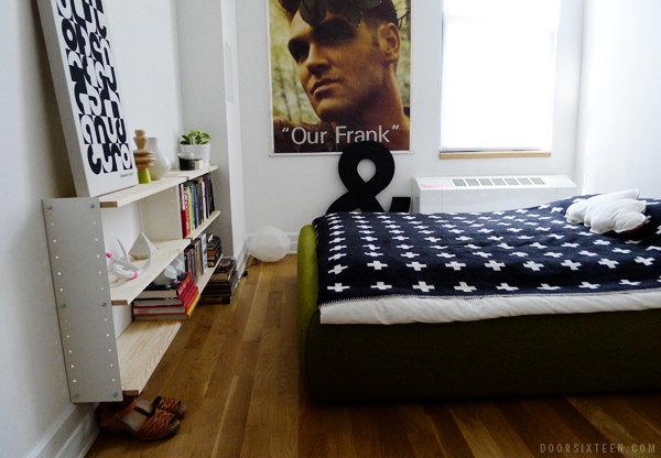
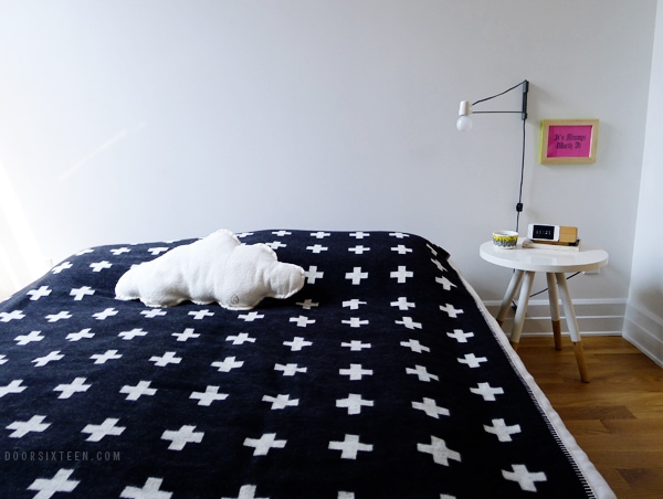
Sorry all of these photos look kind of the same! The bedroom is really only about 10’x10′, which is pretty tiny. It’s hard to stand far enough away to really get good shots, but I tried my best.
The “reversed-socks” table is pretty cute, right? It’s from West Elm, but I think it’s discontinued because it was a floor sample clearance item. That awesome lamp is by Brendan Ravenhill, and the cloud pillow came from La Casita. The cross blanket, of course, is by Pia Wallén. Daniel and Valeria at Hindsvik made the big ampersand. Oh! And the bed itself is a discontinued model from IKEA.
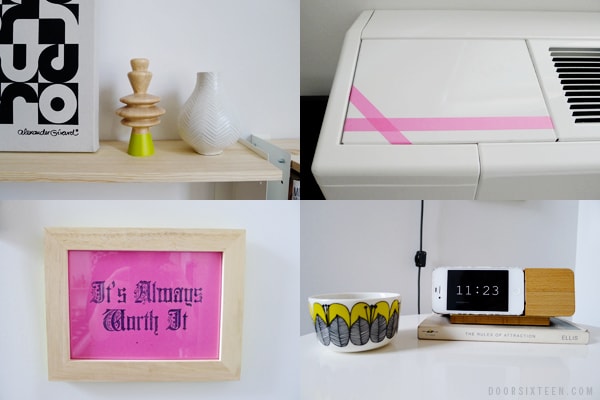
I’m in love with that acid green-footed candlestick. I rarely go into Bo Concept, but I spied this guy through the window recently and ran in for a better look. It’s part of a whole collection. Don’t they look great all in a row? And yeah, I did try to spruce up the ugly built-in heating/air-conditioning unit with some neon washi tape. I don’t know if it’s helping, but it was a fun way to spend 30 seconds! That great print was made by my friend Lisa Congdon. I was with Lisa and Victoria when I bought that little bowl at Marimekko (the new flagship store in NYC is wonderful!). I keep my jewelry in it at night.
I keep meaning to blog about that “alarm clock.” It’s actually just a block of wood with no electronic parts! It was designed by Jonas Damon for Areaware (it comes in a bunch of colors now, too—when I bought mine this was the only option), and it’s really just an iPhone stand. You can run a cord through the back so you can charge your phone while using it like a flip clock! They have an app that you can download and everything. Very cool, especially for people like me who use already use their iPhones as alarm clocks.
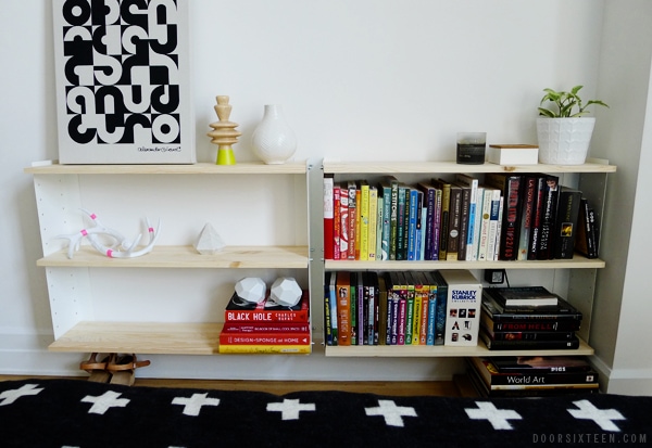
I’m really, really happy with this shelving. We only keep a handful of books at the apartment at any given time (the big “library” lives at the house), but I was getting tired of having little stacks of books and DVDs gathering dust on the floor. The shelves are comprised of two sets of steel EXBY OXIE brackets from IKEA ($20 for two) and six EKBY TRYGGVE pine shelves ($3 each). Grand total? $58 for a pretty substantial amount of shelving that looks good and doesn’t take up most space. The brackets are so great. I’m sure IKEA will discontinue them soon since they’re one of those “sleeper” items that doesn’t get much notice, so I might have to stock up on a few more sets just in case.
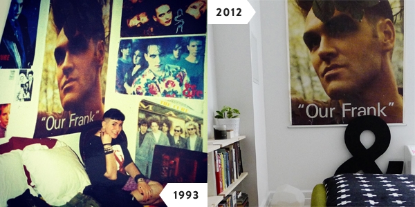
And yes, the Morrissey poster! I bought it exactly 20 years ago at Rhino Records in New Paltz. It’s been hanging on my wall in the vicinity of my bed ever since. Much like the Smiths poster on the dining room mantel at the house, it’s a constant. I loved these things when I was 16 years old, and I love them now at 36. I think teenagers have an inherently good sense of what makes you feel good in your own space, and I’ve tried not to lose that as I’ve gotten older. Too often grown-ups get sucked into the idea that their homes need to look “adult” or sophisticated or whatever. Not me! I say bring on the giant Morrissey heads, the over-sized ampersands, and the stuffed cloud pillows.



65 Comments
Looks great ^^ The Crux blanket is awesome 😀
Just Lovely!
I will just keep on living vicariously through you and your Brooklyn home while I am stuck here in Sydney, still trying to make the move to NYC.
looks awesome! and not like any hotel i’ve seen. well done, as always! 🙂
Ha! Love Rhino Records. Also, Sara in Sydney, there are MUCH worse places to be “stuck.” I’m in NYC and wish we could trade for a while!
Was revisiting this post today as I’m going to pop some of those shelves up! Twice the price here in Australia at Ikea…what is with that? Still cheap though.
We are having the most glorious weather here right now (not really autumnal or fallish) . So, I’m happy to be stuck in Sydney at the moment. Would love to trade some time though!
Love love those shelves, and all the pops of colour. I’m a long time reader of this inspiring blog, finally getting around to doing some of my own DIY.
Thanks Anna for the inspiration.
Awesome, girl. those shelves are so slammin’…
Excellent. As always. xox
Awesome! One question – where did you get that tote bag in the first photo? I think I might need it haha.
Thanks, Amy! The tote bag was a gift from Victoria (she has the same one!), and it comes from Hansel From Basel. 🙂
The bedroom looks great! I would not have guessed that the shelving is from Ikea, never saw it at the store. I spy Swedish Hasbeens wedges under the shelves, own the same model and they are the only heels I can walk in.
I love my Hasbeens!! Once they got broken in, they became the most comfortable summer shoes ever. 🙂
I love it! I thought the ampersand was in reference to “Our frank and open deep conversations.” 🙂
Perhaps I should continue the line on the floor…
Yep, definitely doesn’t look like a hotel room to me either. You have plain old good taste. xx
Question regarding the iPhone stand: does this require removal of the phone from a protective case each night? I love it, but I feel like I’d probably end up dropping my phone at some point in the a.m., pre-coffee. 😉
PS…not surprisingly, it all looks amazing!
I’m sure it depends on the case. I leave mine on with no problem.
Your bedroom looks amazing and like Nina I would have never thought that shelving was Ikea. I’ve never seen any dorms this nice, but it looks comfy, inviting and definitely not a stuffy or “adult”. I love the idea behind that “clock”, not sure it would look quiet as nice with my touch though.
that iPhone dock is perfection! (as is the rest of the room, as per usu) thanks for the link!
Gorgeous! The colour combinations make my eyes happy 🙂
Beautiful! I love all the clean, bold colors and lines. Especially the green on the bottom of the bed, I would have never thought to pair those colors together, but it looks really good
And this is irrelevant, but I love Morrissey in the middle of all that Robert Smith.
Those shelves are perfect, using the bare pine looks great. I wish I had more wall mounted shelves in my new build (quite literally new, built in 2005) but the plaster board walls don’t seem to hold much 🙁 oh and sneaky plastic pipes hidden in every wall !
Great seeing how you make up the apartment. I previously lived in a Victorian terrace, so the “new” is a bit weird 🙂
The Bo Concept candlesticks are so great, seen them in the catalogue but there’s no store near me. You have such good taste.
Do you have some kind of poster frame hanger system thing (I’m normally very articulate, I swear) on “Our Frank”? I’ve been hunting for something for ages and I keep ending up with those cheapie plastic slides. This looks much more like what I’ve been envisioning.
I do, yes! I should have mentioned it. It’s Jorgen Moller’s aluminum Posterhanger system. Really nice! They come in a bunch of sizes, but you can’t find a perfect match it’s really easy to trim the rods to fit with a hacksaw.
I’d love to have that poster framed at some point, but it’s going to cost a fortune (and be really difficult to transport!), so for now this is good enough for me. 🙂
It would take me years to accomplish what you have done in one weekend! The bedroom looks wonderful! and cozy, without being crowded. Those shelving units are really nice.
Wow, Ikea is SO cheap in the US! In Australia that shelving combo is $140! Looks really great though, I absolutely love your style.
Dear Anna:
You’ve nailed it as usually. The place feels absolutely cosy, modern, crisp, airy, light….
All the best.
Marta (from Spain)
Thank you so much, Marta. 🙂
That clock dock is rad. Covet!
I love what was done for such a small space
Rhino Records! I bought my first record there in college. (I grew up in New Paltz.) Thanks for the happy memory, and for introducing me to Pia Wallén.
Hi, neighbor! I grew up in Rhinebeck. 🙂
I love the shelving! I’ve never seen those at Ikea before but I’ll certainly get two. Or four. Or ten because I’m certain they will be discontinued.
I know the apartment has been a weird adjustment, but this really looks gorgeous, Anna. You took a very plain, uninteresting space and made it super fun and unmistakably you. Not that I’m surprised, but I am impressed!
(I see you, antler things with pink washi tape. You look good.)
Everything in the room is so inspiring- I’ve had my eye on that iPhone dock for a while… Love the Brendan Ravenhill Cord Light too. And that IKEA shelving? Amazing.
Lovely!
I Like!!!
Maliin
I’m so envious that you still have posters from your teens. I wish I was so far seeing back then because if I was I’d have a fabulous collection today!! I really adore your collection and your eye. Thanks for sharing.
Hi, Anna! When I saw your giant Moz poster I just knew we could be friends! (I actually just got to see him live last Friday – he sang a lot of Smiths songs too!) I love your room – it’s a perfect blend of cool 16 year old meets design savvy 36 year old.
xo
cortnie
I’m glad the cloud found a place in your beautiful home! 🙂 thank you, xoxo
looks great!
We love Ekby Oxie. Does the crucifix blanket in the apartment mean that you are here more often than at your house (I love your house)? Thank you for posting again, have a wonderful weekend!!!
Definitely NOT a “crucifix” blanket, haha! And no, it doesn’t mean anything other than I like how it looks in this bedroom. I love my house, too. 🙂
Sorry, that would be something a Crucifix blanket. Not sure it would have a similar appeal though. (Reminds me of Richard Huttens benches in the shape of a Crucufix, I have a very passionate dislike of Richard Hutten as a designer by the way, almost like he is one of the people I love to hate; that said I do love the rubber leaf magnets he has made http://blackdotcooperative.wordpress.com/2010/03/23/green-is-good-magnetic-leaves-by-richard-hutten/, maybe something you could use to spruce up your new-fangeled radiator along with the pink tape?). Oh well…. have a wonderful weekend!!!
Simone, the reason I laughed is because “crucifix” (at least as the word is used in US and as it is literally translated from Latin) refers to the image of a person nailed to a cross. Wallén’s blanket depicts the crux quadrata, NOT a crucifix. The comments on this old post about this image as a recurring theme in culture, art and design are pretty interesting. This shape is the most universal after the circle, and it predates Christianity going all the way back to the stone age.
Regardless, as an atheist, none of these things hold any religious meaning in my home. A cross is just a shape, no more and no less. I wouldn’t assume that Wallén’s intent was to conjure any religious association, but as far as I’m concerned, it’s just a blanket with plus signs on it—just like this is a blog with some plus signs on it.
Hi; to me the crosses in the blanket remind me of the Red Cross and the Swiss flag to be honest. Have a wonderful day.
Oh, definitely! But not Christ hanging on a Christian cross.
Kudos to you for keeping that Morrissey poster so well preserved. I have a big one of him that was given to me as a gift but it’s suffered from years of wear-and-tear. Still, that’s kind of part of the beauty. I need to give it a good home on my office wall. Sigh.
It’s actually REALLY beat-up. The back of it is a cross-cross of packing tape!
It looks amazing! I love the monochromatic colour scheme!
Monochromatic? Surely you must mean multichromatic!
Hi, Anna !
This is my first comment ever, but I am a reader since a couple of years.
I’ve read your tweets about your hunt for flat sandals (although the hasbeens in the photo above look perfect) and I have to say that H & M sells nice sandals here in Germany at the moment. I’ve you want, you can have a look at the German Online Shop (just switch the country to “Deutschland” (Germany), the category is “Damen” (=ladies) and then “Schuhe” (shoes). If you like a pair, I can send it to you ;o)
That’s so nice of you to offer, Iris, but I am really only interested at this point in buying shoes that are made to last for many years. No more H&M sandals for me, no matter how nice they look. But thank you anyway!
Yeah, that’s the route we all should go more often when it comes to qualitiy and durability ;o)
I just wanted to say, I’ve been looking for a bedside table, and I went to West Elm today for another thing, but also hoping they’d have this table, they did, I got it, it’s totally great. Thank you for pointing me towards a very affordable, very cute bedside table!
Hello Anna,
My name is Ingrid, I am a set & costume designer living in Sydney, Australia. I have started following you on Instagram, under ingridweir, and that led me to your blog. I am fascinated by it- I am doing up the old schoolmasters house- 1893- in a remote country town, a magical place full of history;gold and art. If you want to stop by http://oldschoolmastershouse.com.au/
all the very best,
Ingrid
The apartment is looking great; I can’t wait to see more.
Every time I remember that Morrissey’s autobiography is a real thing that is actually coming I smile. I don’t really know anyone in real-life who would understand this so I had to mention it here.
Whether on not anyone publishes it is another question! I’d rather see him get a record deal at this point…
oh my! how did i miss this magnificent piece of his mozzer-ness. love it and love that you’ve loved him as long as i have. 🙂
tapping into the 16 year old self…i love it!
Hi Anna,
I love that you’ve resisted the notion of a grown up home with grow up stuff – it’s all the better for it! I just wish my teenage posters were in as good nick as yours. I love this room – it’s effortlessly cool 😉
I’ve just discovered your blog and can’t stop reading! The Cure, Marimekko and the big ampersand 🙂 Beautiful!
Such a lovely apartment! I like how you change your style! Beautiful!
where is the little white bedside stool from?
It’s mentioned in the post—it was from West Elm.
ADORE the Our Frank poster – it looks great! Can I ask you a silly question about the bed? (Apologies if you have noted before) – is the black and white blanket just laying over your duvet? Or is it some kind of cover? Thanks!
Hi Jennifer, yes, that’s just a standard duvet with a white cover and a patterned blanket on top. 🙂