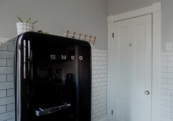
So…how about THAT! If you follow me on Instagram, then you may already know that there is now a cute little black SMEG refrigerator living in our house. It was part of the original kitchen plan I made last year, and we felt pretty strongly about making it happen, so here it is. A mere 11 months later! Hah. And yeah, I know, it’s sort of the whole $289 trash can thing again, but that’s why we do our own renovation work and why we only spent $140 on a new floor and slightly more than that for four walls of tile…you get the idea. It evens out, and everything is still under budget.
AND IT LOOKS SO MUCH BETTER. The old refrigerator (still in great shape — it went to live in Kingston with Daniel and Max) was way too big for our kitchen, and it was never full to more than 1/3 capacity.
Somehow I managed to not take a decent full-length photo of the fridge over the weekend, but to answer the two big questions:
✚ Nope, I’m not worried about the bad reviews online. Everyone I know who has a SMEG loves it. I’ll take my chances. If it turns out to be a disaster, I’ll let you know.
✚ It’s not too small for us. Not even the freezer. We’re only two people and the most we ever freeze is a tray of ice cubes and a box or two of veggie burgers. The capacity of the fridge is greater than it looks like from the outside — there’s really plenty of room for everything we typically have on-hand.
Anyway, this is by no means the big reveal, but while I wait on my own indecisiveness before finishing the kitchen for real (LIGHTING!!! and that door, and…), I thought it would be fun to post some then-and-now photos taken from the same positions. Unfortunately the “then” photos are really awful, mostly because they were taken almost as an afterthought during our walk-through on closing day. I have so much regret about not taking better photos before we started in on our seemingly never ending renovation plan, but what can you do? Oh well.
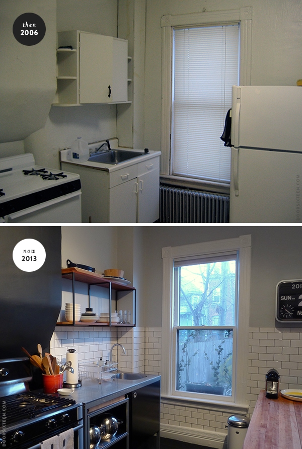
If anything about the 2006 photos makes some part of the old kitchen look salvageable, it’s just a fault of the lack of detail in the photos. It was disgusting. No debate.
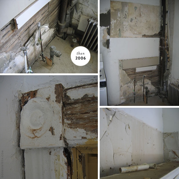
These photos were all taken on Day One of our kitchen renovation, which was almost eight years ago. All we’d done at that point was take out the old cabinets and the remove the boards that had been nailed into the corner to hide pipes. This was also the first time either Evan or I had been involved in anything resembling a home renovation project, and we were horrified. We were so, so lucky to have had a couple of family members and friends who knew what they were doing and were generous enough to lend a hand. Two hands, even, and for many days. It took quite a while for us to feel like we could do anything by ourselves.
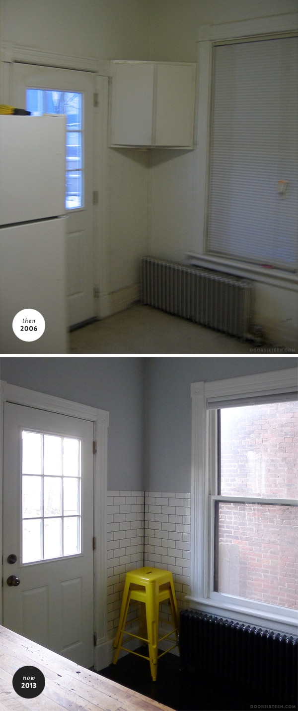
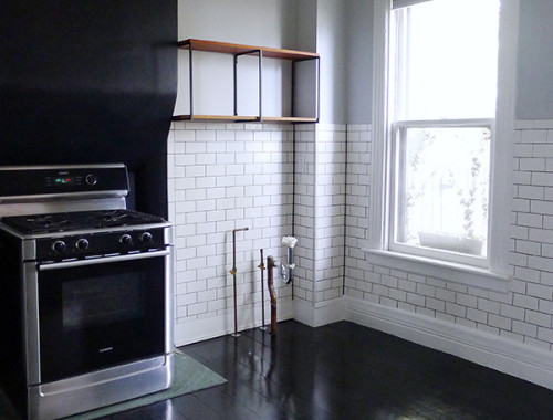
OK, I still hate the door (we’re planning to replace it next summer), but aside from that? I think this is a perfect corner. I’m so glad we decided to hire a plumber to move the supply line for the radiator over to the right a couple of feet. I know it seems like a minor thing, but having the radiator centered under the window makes an enormous difference in the overall balance of the room. It feels right now.
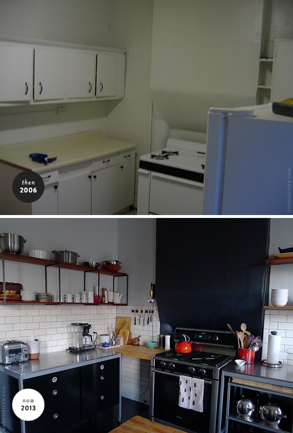
I keep scrolling up and down to compare these two photos. We didn’t take down or move any walls in the kitchen (or elsewhere in our house), but it really does look like a different kitchen entirely. This is a small room with three doorways, two huge windows and a huge, protruding (and receding!) hearth, and that meant that we couldn’t go with a traditional layout or standard cabinetry. It was frustrating initially because I was trying to make the challenging aspects of the room less obvious, but once I gave in started turning those things into features — like painting the entire hearth black — it all came together. This is why I love old houses! If you listen to them, they tell you what to do.
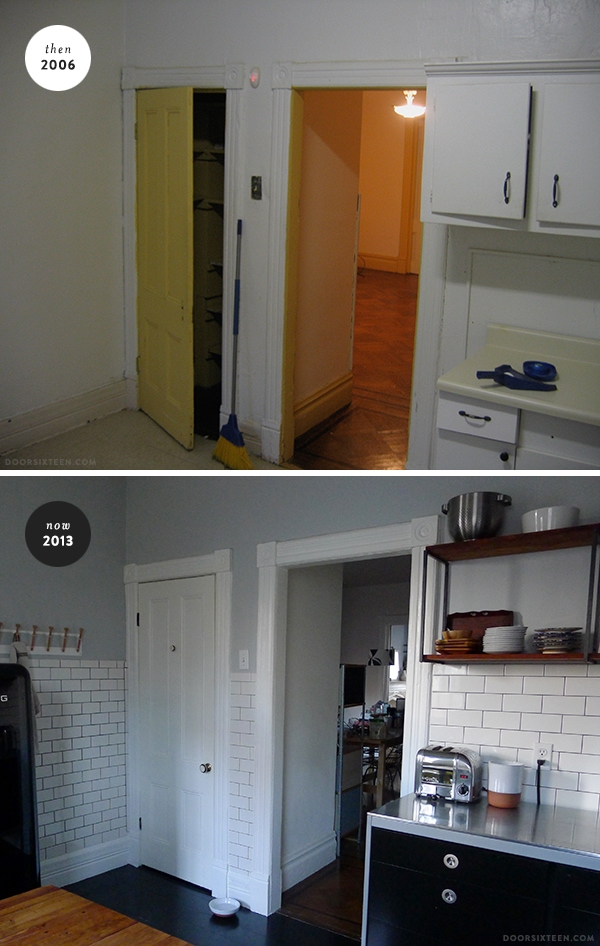
OK, that’s weird cropping, but I wanted to match the original photo! Just ignore the mess in the dining room, too…the table is covered with unneeded kitchen stuff we need to donate. If I back up a bit, though, you can see this corner of the room a little more…
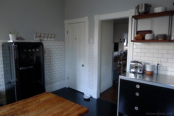
So much better! The closed door on the left leads to a pantry. The contents have changed (we use it to store food now), but here’s an old post about the pantry renovation. It’s very cute, I must say.
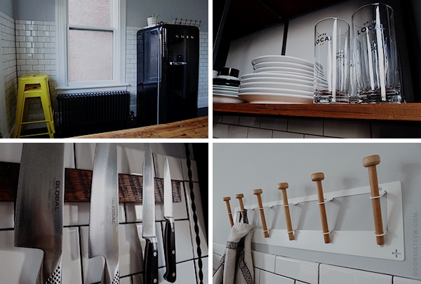
A few details from around the room, clockwise: Yellow Marais-style stools from Industry West, Drink Local glasses from West Elm Market, wall hooks from Pedersen + Lennard, reclaimed wood knife rack from Furnished Modern.
So that’s the kitchen, for now. It’s still not finished, but the remaining projects are going to take a while. When it’s DONE-done, I’ll take lots of nice photos and break everything down cost-wise as best as I can.



99 Comments
You really did an amazing job, this looks só good! We have a black Smeg-freezer. We do use it a lot and I love it. Everytime I look at it, I am glad we decided to invest in a pretty one.
I try not to gush, but the before-and-after is astonishing. From nondescript grossness to such a clean, precise, airy space — it’s absolutely beautiful! It looks so much bigger and brighter and more productive and inviting. (Yeah, I could live there.)
This is great! You know what I like the most – that the tile around the room finishes at the top of the Smeg fridge and fits so perfectly under the shelves. I’m sure you planned the shelves and tile to fit together but did you know the tiles would fit the height of the Smeg or was it just a happy accident? Either way, it looks really well resolved. Congrats on a job well done.
I wish I could say that I contracted a custom fridge from SMEG, but no, it’s just a happy accident. 🙂 I did plan for the tile and shelving to align with the sash break in the windows, though!
A triumph! Really I love that you made it look like this all on your own and didn’t spend thousands on builders and new units. Congratulations, it really is fab, and my favourite bit is the tiling.
Your kitchen is great, the black Smeg looks so beautiful!!!
What a transformation! The kitchen looks amazing and I love those cool wall hooks. 🙂
Oh a Smeg….how shiny…how black..how utterly perfect. I have had it on my wish list for what seems like forever. Love it and love it in your kitchen! perfection! congrats 🙂
At a quick glance, the reflection of the tiles off the SMEG made it look like it was embedded into the wall. I was going to quickly yell at you through the internet and go, “YOU GUYS DID WHAT?!” *phew*
I’m really glad that you guys took before photographs as ugly as the surroundings were at the time. To think that you guys saw such potential of how this could all be in the future leaves me speechless. Your house is growing up so fast! I want to cry.
Hah! When we were looking for a house to buy, we actually saw a lot of kitchens with cutouts in the walls for the refrigerators. I guess at some point that was considered preferable to having the fridge in the butler’s pantry? I’m not sure, but it does look really weird!
Maybe not yet done-done, but this is clearly a masterpiece and testament of your talent + vision. Congrats!
man, i love a good before/after set of photos. per usual, outstanding. thanks for introducing me to new product lines, i.e. pedersen/lennard hooks. your taste is superb.
this is insane in the membrane!
it looks like a different beast all together.
happy thanksgiving to you and your new old kitchen!
Fantastic design and work! You and your hubby take such care and consideration to each piece of your design. My wife and I are in the midst of buying a farmhouse from 1800 that we will be updating the kitchen a bit as the layout is odd.
Wow, 1800! Yeah, that’s a whole ‘nother situation, since I’m guessing the house wasn’t built with a separate kitchen in the first place but rather a room for dining that happened to have a giant fireplace in it. Good luck with the house! I bet the floorboards are amazing…
so incredibly beautiful! love the fridge, the reflection of tile, the floor…. everything!
That is a crazy amazing transformation! You must be so proud. I love the fridge, it really makes the whole kitchen!
Oh my goodness, you’ve created a dream kitchen. Definitely understand the need to splurge on important things.
Read those Robbie comments, absolutely hilarious! Did you ever get to read the post he wrote about “bloggers like you”?
HAHA, I forgot about Robbie. No, shockingly, that post he was working on never seemed to materialize. The world will never know about my “dumpster dive aesthetic.” HAHAHAHA. Good grief. I’m still waiting to find that magical dumpster filled with Vipp trash cans.
Everything about this is awesome! What a fantastic job you’ve done!!!
It all looks nice, but I’m especially pleased with your attention to detail on the original woodwork. Makes such a difference! Your house is thanking you for that effort for sure.
Thanks, Emily! Yeah, the woodwork was in pretty terrible shape. I’m glad I have that photo to show people when they ask why we didn’t strip and restore the wood — in part it’s because I usually prefer painted woodwork, but honestly it just wouldn’t have been possible. All I could do was carve out the rot, do a lot of patchwork with epoxy, and caulk/paint the hell out of everything. It still doesn’t look perfect up close, of course, but it’s good enough — when you see the whole room as a whole, you don’t really notice how lumpy all of the woodwork is. 😉
Seriously perfect. Everything is looking so good. I want to come over and have a coffee. It looks so cosy and I love how you have really embraced all of the original features and made them work.
Also, that is the sexiest fridge EVER.
It looks AMAZING!!
Am drooling from Philly! Gorgeous! Congrats! Hope you guys will take the room for a test run and cook a Thanksgiving meal this week. If so, post pix!
We’re heading to my sister’s house in CT for Thanksgiving this year, but I’m sure I’ll be cooking up a storm this winter! 🙂
Beautiful! Did you build the open shelving or did you buy it? (Sorry if I missed it.) I need something just like that for my kitchen.
Thanks!
Fiona, the shelving was custom made for the space by Blake Avenue. You can read more about it in this post:
http://www.doorsixteen.com/2013/03/12/the-kitchen-shelving-is-up-yayyyy/
Just from the photos alone the difference is gobsmackingly amazing. You guys did an amazing job and I also think your choice of style really makes the space work. Brilliant job!
In awe of the transformation (and the labor it took).
Just curious: what kind of door change would you like to make? Is it a simple change from a metal door to a wooden one or do you want to have less glass area?
I actually want to have a very simple wood-frame door with a large glass area, like this (but painted white):
http://www.jeld-wen.com/catalog/exterior-doors/custom/wood/glass-panel#group=All&model=model215
Oh, that’s perfect. Thanks!
I was wondering that too.
Wowza! Color me IMPRESSED TO THE MAX! Stunning work!
Um, so, when I saw the site pulled up in my browser and I saw the adorable black Smeg I totally squealed out loud. Now my roommate thinks I’m a dork for being so excited about someone else’s fridge, but I can’t help it! It looks so great and I know you’ve been wanting one forever. Congrats! ^_^
Oh my gosh it’s like night and day!! Your new kitchen looks amazing!!!
Absolutely gorgeous. The tile on the wall is so, so good. And I think the Smeg fridge is just the cutest.
It looks so so good. Lovely job!
Kitchen is just splendid — unique, full of character and a joy to the eye. Of all your improvements, I think the tiled walls have the biggest impact.
Out of curiosity, is it a SMEG FAB10RNE ?
I don’t know the model number, sorry — it’s the only one available in the US. This is it.
I just Googled that model number, and no, that’s definitely not it. That one looks like it’s counter height…
or a SMEG FAB28RX1 ?
I really don’t know, I’m sorry! If you call West Elm they can probably tell you the model number. It’s not on their site as far as I can tell.
[For sure it’s the 28 model. The 10 is a short, under-counter type. The numbers refer to capacity…]
Looks made for your space Anna, congrats and the kitchen has come together so simply and well.
It’s an amazing transformation. I can tell that the Smeg is as happy to be there as you guys must be to have it. It’s perfect.
jbhat
Congratulations – that is one beautiful and efficient space. I completely agree about listening to old spaces. If you pay attention, you can find the best of a place and bring it out. Really, really nice work. You guys are good stewards of your home.
Hello,
I’m writing from Europe and find it funny that you could even think that that fridge isn’t big enough ! ; ) My family of 3 has been using the smaller version of the SMEG fridge and it was perfect for us ! Also, we’ve never had any problems with our SMEG !
I know, Americans are obsessed with giant refrigerators! I think it goes back to food shortages and the Depression and immigrant families…I understand it, the instinct to have lots of supplies on hand and to never be in danger of a shortage. It’s embedded pretty deeply in the culture here. We (meaning Evan and I) tend to buy food in small quantities, though, since we never know how long we’ll be at our house or the apartment. I also hate having things go bad, especially vegetables. Less space, fresher food! So happy to hear your SMEG has treated you well. 🙂
Would love to see an overhead shot, just to see how it all fits together.
I’m not sure I know how to do that (I guess I’d need a special lens and a fancy camera and some kind of ceiling mount?), but I can make a floor plan.
PS: your kitchen is just sigh-worthy. You must be so proud and feel so accomplished to have created it yourselves. AnnMarie’s comment about squealing out loud and having her roommate think she’s a dork probably is fitting for many of us, even if we didn’t actually squeal.
Amazing renovation! your blog is so inspiring… my husband and I recently moved to a new place, but our landlord doesn’t allow us to make any changes, not even to put a frame on the wall, which I’m totally ignoring it…but I keep dreaming about the perfect house, and your blog just helps a lot! 🙂 Congrats!
Wow, what an incredible transformation! We are 4 years into our own, seemingly endless, renovation so it is very gratifying to vicariously enjoy the fruits of your labor.
And it was also super encouraging to learn that you hadn’t done anything construction- or renovation-related before buying your home. Our own kitchen is begging for a tiled backsplash / wall but I’m scared to heed the call. What you did with yours (those corners!!!) is amazing.
This is the work of magic! I can’t believe you went into something like not being seasoned renovators and had this as the end result. You have some serious talent! I may have to do some searching on your blog for tips on tile work, as the ones they slapped up in our new place are hideous and we’re thinking of just re-doing them ourselves (since that’s all we could afford anyways). Great job – quite the inspiration!
Oh Anna you make ikea look awesome!
I love the SMEG too. I’ve a red one… no regrets.
Anyway, where did you get ’em wall shelves?
Happy Thanksgiving!
Damien.
Thanks Damien, the shelves are from Blake Avenue — there are a couple of links if you scroll up to my reply to Fiona above. 🙂
Beautiful!
Wow, the transformation is amazing! I love the clock, do you mind sharing where you got it? I’ve searching for it but can’t find where to buy it. Thanks!
Hi JHiro, you can read a little more about the clock and some sources for it in this post:
http://www.doorsixteen.com/2013/04/01/field-report-karlsson-big-flip-clock/
Really nice work! My own Smeg is the same model but in baby blue, I love it!
So many congratulations, Anna. This looks just amazing. And boo to the not-nice people who question how you choose to allocate your house dollars. Re: fridge size: When we moved to our house two years ago, I really wanted a freezer-on-the-bottom model (yes, I did covet a SMEG, but it doesn’t fit well with the layout of the kitchen we have now, and it will be quite a few years before we can do any major renovating, like flipping room functions), and we had trouble finding one that was small enough! In the end, we went for a GE model, and at 19 cf I still sometimes think it’s too big. Re: the door: We replaced our very similar front door with one that’s top to bottom glass (albeit mullioned) last year and I can’t tell you how much light pours into the house now. We’re planning on doing that with our back door (which is in the kitchen) at some point, too. (Added bonus: all glass means Rocky can watch dog TV all day. I’m sure Fritz and Bruno would love a new door, too.)
Oh yes, F&B will have a blast watching the Groundhog & Squirrel channel, I’m sure!
I love what you’ve done, Anna! I’m halfway through a kitchen renovation (plus two bathrooms) in my 1890 home, and I think your line about listening to your old house is totally perfect. There’s no point in trying to fight the house too much. Great job!
super, amazing, dream 🙂 Congratulation!
So in awe of your reno skillz, and so thrilled to see a Pedersen + Lennard coat rack in your kitchen. Cape Town designers conquering far and wide!
Also, completely agree with you about centering that radiator under the window. Subtle, but immensely better.
I’ve loved following your progress on the kitchen, it looks awesome. That Smeg is perfect!
You’ve done an amazing job, I love so much about your kitchen! It’s great to see the before and after photos next to each other so you can see how far the rooms come and also how much work you’ve done. Love your smeg fridge too by the way, it’s on my wish list!
it looks AMAZING! you’ve done such a great job.
I think I found your blog because of your kitchen – I love seeing how it has evolved and thank you for this then and now post.
Looks great! It’s so refreshing to see a kitchen without upper cabinets crowding the room. I will never understand why people are so obsessed with obscene amounts of kitchen storage.
Hi Anna,
I really love your kitchen and all those clever ideas in it. It both amuses and annoys me, that people obviously think your fridge is small.
As you point out yourself, there are two people living in your home and as a regular reader I know that you also live in Brooklyn part time. I totally see that the Smeg is large enough for a couple. Anyone who thinks you need a larger fridge for 2 people probably overbuys on food and keeps throwing a third of their groceries away every week.
Thanks for sharing your home ideas!
I love your black&white and yellow and wood kitchen!
amazing job!
AMAZING!! It boggles my mind how your aesthetic is modern and still fits the age and character of your old house so seamlessly. Truly inspirational in both design and execution…jealousy-inducing, to say the LEAST!
I second that. It’s beautiful.
Thank you, Nancy and Jessica!
Perfection in a kitchen.
Where did you get your freestanding kitchen cabinets and sink unit
They’re from the UDDEN line at IKEA, which unfortunately has been discontinued in the US for years — I bought them in 2006.
Congratulations – everything is looking fabulous, it has been fun and inspiring following your progress!
And welcome to the club of SMEGs – I have an orange one, and to be honest, I find it is huge – definitely much bigger inside than it looks from the outside!
I need to go back and read all your earlier posts, I need all the help I can get on the kitchen front – I may be doing things back to front! I bought the smeg first, then ripped out my old cabinets, I have bought and assembled a couple of udden units, but they are standing in the middle of the room while I try and work out what to do with all the rusty pipes I uncovered, how to deal with the tile on tile (!), how to deal with the fact I don’t have the right power supply for an electric stove or a gas supply in the right place for a gas stove… hopefully it won’t take me 8 years to sort things out! That would be a long time cooking on a camping stove and washing up in the bathroom!
I may be a little late, but I have to say that your kitchen is honestly the most stunning and well executed I’ve EVER SEEN. It’s such a perfect blend of minimalism and scandinavian chic. I just. UUuugh, I want it!
Caroline, that’s very nice of you to say! Thank you. 🙂
Great job!
It is amazing that you recognized so much potential when buying your house. It really looked bad.
As for a size of the fridge, most of the families (4+ persons) have the fridge of this size or smaller. I live in Europe, Germany and we like to buy fresh food at least once per week. After the second world war people were hungry and missing food generally but still kept the “smaller” size of their fridge.
Painting the hearth black and making it a feature turned out so well (not sure I would have had the guts)!
I am glad you listened to the house!
Slightly off topic, but I have to tell ya, I love seeing the South African content on your blog. First the Skinny Laminx and now the Pedersen & Lennard! Keep it up!
xo
Door Sixteen Groupie from Cape Town
Sara, I’ve been specifically trying to seek out more South African design lately — there’s SO MUCH amazing work coming from your neck of the woods, it’s very exciting. If there are SA designers you think I should know about, please tell me! I’d love to do a post specifically about SA design. 🙂
Not sure if you still check these older comments but here’s another great SA designer…
http://zanaproducts.co.za/shop/
I bought this (http://zanaproducts.co.za/shop/sprinkles-black-print-leather-shoulder-bag/) the other day and thought you might love it.
xx
Oh and I have to add, they have lovely little zipper pouches.
Will def keep you posted. There’s a design conference coming up called Design Indaba. It’s like TED but its just design. You should look into coming. They usually have really awesome designers from all over the world. Massimo V is a big fan, he comes every year and calls it the best design conference in the world.
Hey Anna! How have you liked the knife rack from Furnished Modern? Is it really super-strong? I worry that with the wood, it might not be strong enough to hold my big knives if I bump into them by accident, and the reviews on the site dont really address that.
Kitchen looks so beautiful! Can’t wait to get started on mine.
Allison
Are you wondering about the strength of the magnets? If so, yeah, it’s pretty darned strong. I don’t know how heavy your knives are, but I can’t imagine any knife I’ve seen getting knocked off of it! It has those super-powered magnets embedded in the wood. It’s tough to pry off of my stainless steel countertop, I can tell you that much! 😉 The wood is really nice and chunky, too.
Thank you so much, Anna! That’s all I wanted to know! I just have a nice, heavy Wusthoff knife that is my go-to knife and some smaller ones, so it wouldnt be overloaded. I just thought that maybe the thickness of the wood would hinder the strength of the magnets underneath. Thanks again!!
Allison
I absolutely love the addition of the subway tile on the wall it looks amazing, well done!
I’ve been on the fence about buying a SMEG for years. Would you be willing to give us an update regarding your experience thus far regarding performance and durability and defrosting and whatnot? I know the smeg would make me so so so happy to look at every day, but to be honest, the negative reviews really scare me. Thank you! PS: i love your blog so much 🙂
Aya, yes, I definitely will!! I want to make sure I have enough time with it first, though. I’ve only had it for about 8 months, which I’m not sure is long enough to really get a true sense of its performance.
I will DEFINITELY give an honest review when the time comes, though, I promise!!
Hi Anna!
Love your work. I noticed the absence of a microwave. Do you have one hidden somewhere? Ours just pooped out and I’m trying to decide what to do. My teenagers that use it frequently though, so NOT having one really isn’t an option. What to do? What to do? I’ll try Pinterest for creative options next because it’s either THAT or get work on re-grouting shower tile (ew).
We don’t have a microwave, Cari, but if we did I’d probably put it in the pantry. We used to have one, but we rarely used it—a waste of space for us.
Hi Anna, I’m with Aya: I’d love to hear how the Smeg is holding up more than a year later. I am not worried about the small size, but the many negative reviews online have given me pause. If you have time, I’d love to hear if you still think it’s worth the money. I know that I love the look of it, but it’s a lot of money for something that has mixed consumer reviews. Thanks! Laura
Wow, your kitchen looks really great! I love the black finish on the appliances, it’s a nice alternative to the white or stainless steel appliances I’m used to. I think the Smeg fridge looks great. They have a sleek and classic design that really stands out.