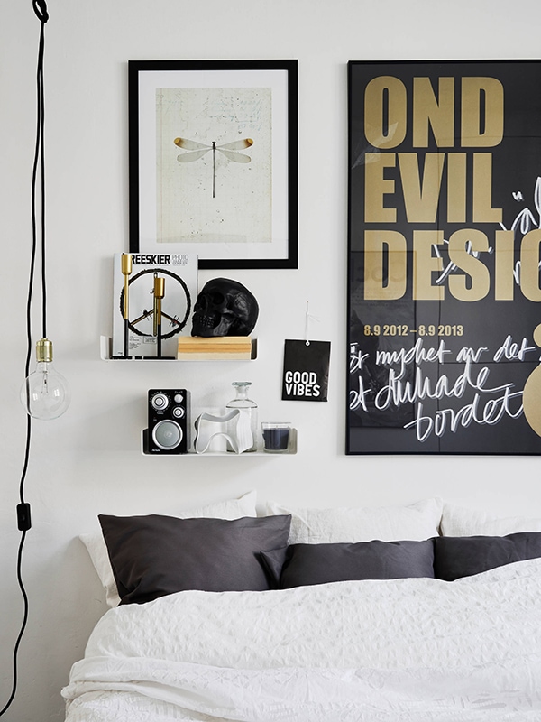
Yeah, I could live there is an occasional D16 feature wherein I post pictures of homes I want to break into, kick out the inhabitants and move in. Today we’re spying on real estate firm Stadshem’s listing photos (oh, those Swedes and their awesomely stylish real estate listings…) of an already-sold apartment in Gothenburg. I spotted the apartment on Stadshem’s excellent Instagram last month and have probably looked at the photos at least once a day since thing. Pining. Longing.
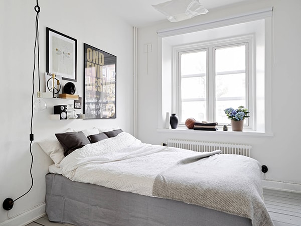
The bedroom is the least remarkable room in the apartment, I guess, but it’s perfect. That gray linen bed skirt! And the hanging bulb next to the bed, too. I like seeing how people deal with not always being able to hardwire sconces or ceiling lights. Bonus points for the above-bed skull, and extra bonus points for it being a black skull.
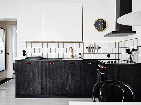
OK. OK. OK. Scroll up, scroll down…KITCHEN. I could’ve just made this post about the kitchen, because I would be totally happy curling up next to those cabinets and just making a home right there. The best thing about these cabinets is that they appear to be homemade—or at least home-refaced. I’m pretty sure they’re just clad in pre-fab softwood panels, like the ones Daniel used in his office and kitchen. I think even the countertop is made out of the same material.
By the way, did you know you can stain wood with India ink? I guess that seems pretty obvious, but I never thought of it before until I saw someone stain their butcherblock countertops black. Amazing! The pulls look like they’re made out of simple strips of leather fastened with brass-head bolts. So smart.
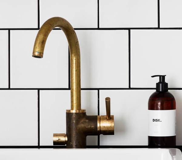
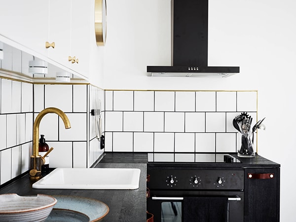
Forget the apartment, forget the kitchen, I just want to live in the sink so I can look at that FAUCET all day long. I have Googled and Googled, and I can’t find a raw brass faucet just like that. Plenty of things like this, but not that. I want that. If anyone has any leads, please share!
EDIT: Thanks to everyone who identified the faucet as being the EVO 184 by Tapwell! You guys are awesome.
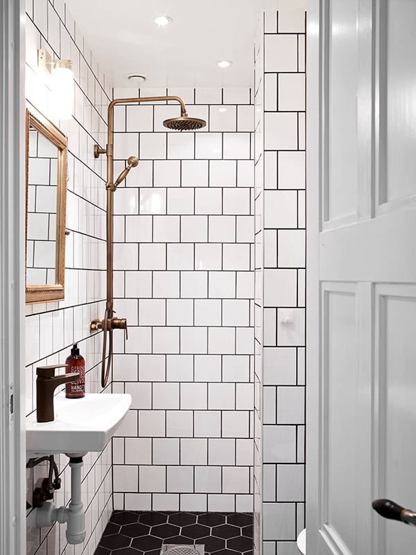
HEART-EYES. I’ve never really thought much of square white tiles before, but seeing them in a running-bond pattern with dark grout in this bathroom and kitchen puts them in a new light. Maybe it’s that large-scale hexagon floor, too. I dig the combo. I could most definitely live there.
All photographs via Stadshem, Gothenburg, Sweden. View more of this home (including the living and dining areas!) here.

48 Comments
OMG ! I just clicked through to the rest of the images… Pleeeeease, does anybody now where that amazing sofa comes from ? Super stylish AND cat-claw resistant… who could ask for more ? 🙂
Hi,
might this be the faucet you’re looking for?
http://www.hemvaruhuset.se/tapwell-evo-184-grottesco-koksblandare-p-5366.html
(I’m sorry it’s in Swedish but at least you get the name/model.) =)
Thanks, Sparris!!!
Hi,
This tap is also available from http://www.thefrenchhouse.net at a much better price.
Or maybe I should have called it a faucet for US people. Here’s a link to the product:
http://www.thefrenchhouse.net/homeware/hardware/copper-sinks/brass-kitchen-tap.htm
It is divine. Thanks for sharing, Anna; following their Instagram account now also! Swoon city.
After some careful Swedish googling (‘Obehandlad mässing’) I found it’s a tap from Tapwell:
http://www.hemgallerian.se/blandare/3383-tapwell-koksblandare-evo-184-grottesco.html
In their own catalog it’s http://www.tapwell.se/EVO-184/article
and then choose the ‘obearbetad massing’ option on the right.
Go buy! One for me too! ;P
Thank you, Annemarie. For some idiotic reason it never occurred to me to Google it in Swedish!!
The hardware and fixtures are worthy of their own post.
Hi Anna,
I’ve been looking for a similar faucet for ages (over a year) and the more I look, the more I’m convinced the home owners are customising their own faucets to give them the polished brass look.
Look at this one, they had it stripped and replated:
http://www.dwell.com/house-tours/slideshow/minimalist-brooklyn-apartment#10
I’m guessing this is the way forward 🙂
Have a great Sunday!
Doorot
Swooning so hard. The instagram of the real state firm is excellent too. Thanks!
Wow, that place is to die for! I definitely want to pull a goldilocks on this one too. My favorite part is the kitchen cabinets. And the black grout with the white subway tiles is just like POW!
The faucet is Tapwell EVO 184.
Thanks, Anette! I’m amazed and impressed by how many D16 readers were able to identify this faucet to quickly. 🙂
I’ve often wondered if Swedish real estate companies hire stylists to help sell their listings. They certainly shell out for great photos, so it’s probable, I suppose.
Hi there – thank you for the link to the VIB post on our counters 🙂 Its been about a year since we left our home to travel and I am anxious / excited to go back and see how they’ve held up for our tenants. I love this apartment that you featured here. I am currently in Tbilisi, Georgia sitting in a lovely flat that shares the same architecture — tall, tall, tall ceilings, large windows, and amazingly thick walls that make for lovely window seats / shelves.
Hi Jenia! I’m curious about how your counters are looking, too. Thanks for sharing them with us! Enjoy your travels—and enjoy the journey home, too. 🙂
Try Astra Walker for the tap – http://www.astrawalker.com.au/collections/icon – the Icon Plus series comes in a range of finishes, raw brass being one of them. Also another company called Brodware – http://www.brodware.com.au. They have come lovely copper ones as well. I am in love with the tiny brass strip on the top of the tiles. Sublime!
I’m impressed by you all finding that tap so quickly! I really thought it would be a custom strip job. Those Swedes got style.
Incidentally, here’s another house where they stripped the tapware (then replated it): http://thedesignfiles.net/2013/10/melbourne-home-dan-honey-and-paul-fuog/
Wow, I love those plywood cabinets!! 😀
Clicked through to the listing and realized this apartment was really close to my home, in fact I used to live in that area before and my daughter goes to dance class there. And yes, many of these companies does offer styling. And while the apartment looks nice, it is a shame so many of the original features are gone, like the kakelugn that must have been there (where the glass is collected on the floor now. And the kitchen, but that probably happened a long time ago so this nice kitchen probably replaced some ugly 80’s cupboards. But, Anna, I can honestly say your house is so much nicer, especially your kitchen and fireplaces, and bathrooms. Not to mention the location. Sweden really is small! Our cities are not really cities. But I will have to think about wheter I can fit a tap like that in the renovation ov our 70’s kitchen, it will be really modern, because our 70’s rowhouse is really modern, with big windows. I wonder how it would look with a brass tap.
Love everything of this home but kitchen an its details are the best part in my opinion, the contrast between black and white is great
I like that apartment too! However, Stadshem is based in Gothenburg, not Stockholm. So even though the street is called Stockholmsgatan (Stockholm street) both the company and the apartment is in Gothenburg.
Thanks so much for the clarification, Daniel! I shall amend the post. 🙂
What do you think the trim is around the tile in the kitchen? Brass strips?
Hi Rachel, you can actually buy tile edge protector strips in a variety of materials, including brass. It’s pretty cheap, too! Try Googling “brass tile edging”—there are lots of options. It has a perforated lip on it that’s held in place by thinset, and the tile goes over that.
I don’t know what kind of finish was used on that stove to make it so perfect next to those cabinets, but that is truly stunning. The bedroom is amazing as well.
Lizzie, have you seen the DATID line from IKEA? It has that same kind of black-satin finish.
http://www.ikea.com/us/en/catalog/products/90222214/
Oh, thank you for the link! I hadn’t seen that before, it’s lovely.
Agreed! They used to have a gorgeous freestanding range in that finish as well, but it was discontinued. You can see it at Remodelista:
http://www.remodelista.com/products/datid-pro-d51-an-gas-range
I think the stove is the TJÄNLIG from IKEA.
http://www.ikea.com/no/no/catalog/products/10245158/
Nice! We don’t have that line in the US, unfortunately.
Oh, oh, oh. That’s gorgeous…
Anyone know who makes the small wall shelves in the bedroom?
Paul, thanks to reader Karen on Twitter, the shelves have been identified as IKEA ENUDDEN, mounted upside-down:
http://www.ikea.com/us/en/catalog/products/80225736/
Thanks, Anna. And thank you Karen.
These are such sick picks. Love them all.
Nice interior designing and interior furnishing!
This whole place rocks. I’ve been dreaming about brass fixtures for ages. That faucet is perfect.
Random, but have you seen this?
http://www.earthtuface.com/collections/face/products/skin-stick-7oz-20g
I immediately thought of you.
What beautiful packaging!!
Treating wood with leather oil (and wax) creates a beautiful, dynamic effect as well. I loved it when we put it on our floors, but I love how it has worn even more.
Very pretty, but I can’t concentrate on any of the apartment’s features because they put those shelves RIGHT above sleepers’ heads in the bedroom! I can’t stand it! Maybe they’re a lot more together than I am because I would hit my head every morning on those shelves.
Christine, I think it’s one of those things that seems like it would be a problem but actually isn’t in practice. We have a shelf right above the bed in our bedroom, and neither of us have ever hit our heads on it—and we’re definitely not trying to avoid it, either!
http://www.doorsixteen.com/2010/10/24/the-bedroom-wall-is-finished/
Jumping back on this thread, have you seen these faucets? So pretty!
http://www.dornbracht.com/en-us/products/kitchen/cyprum/
Anyone know the manufacturer for the exposed shower? Trying to find a good quality one that’s affordable but not too modern. This one would work!
Where did you get your shower head system? Looks great by the way!
This is a real estate listing.