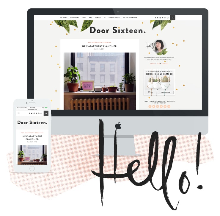
A redesign was long, long overdue here, and with the sale of the brick-and-mortar Door Sixteen pending (we are in contract!), it seemed like the perfect time to do some serious housekeeping.
So what’s new? Well, aside from the obvious, I finally implemented a few features I’d been putting off dealing with for much longer than I should have.
✚ Bigger images! After many years at 600px, I’ve made the jump to 740px. That may not seem like much, but it makes a huge difference—especially with landscape photos.
✚ Responsive design! OK, I’ll be honest, I don’t really see how this makes any difference (who makes their browser windows that tiny?), but everyone else other than me says it matters, so there you go.
✚ Mobile version! Alright, it matters. I give in! I give up! I can’t imagine wanting to read a blog on my phone, but I also can’t imagine wanting to go to the beach, so what do I know. The mobile version is cute! If you’re a phone-reader person…there you go. Happy now?
✚ Related posts! I should have done this a long time ago. I like it when blogs I read show related posts, so hopefully someone reading my blog will enjoy it, too—even if it means crappy, poorly-lit photos from 2007 showing up from time to time. (Did I really not understand white balance at all?)
✚ Subscribe to new posts by email! It’s always been possible to do this via my RSS feed, or any of the various feed readers out there (Bloglovin’, Feedly, etc.), but now there’s a subscription box in the sidebar. I chose to link it up with Bloglovin’ since that’s what I use to read blogs, but you do you.
✚ Better categories! I think they’re better, at least. They’re up there, in the navigation bar at the top. I went from like 9384092384 categories to around a dozen, which was really hard. I also grouped my posts from all of the apartments I’ve lived in into discernible chunks, so now if you only want to look at posts about Brooklyn Apartment #5, you can do that. (Do you think the categories need to go in the sidebar, too? Does anyone still use category-based navigation to read blogs? Who knows!)
✚ Post excerpts! I’m sure some of you won’t like this, but aside from the most recent blog post, everything is displayed as a very brief excerpt with a thumbnail image. I swear this isn’t about trying to get more clicks (I don’t have any ads on my blog that benefit from extra clicks, FWIW), it’s really about trying to make it a little easier to slog through the archives. My posts tend to be on the long side and have a lot of large images, and scrolling through a page of full-length posts can be tedious—not to mention the page load time. I thought about putting a “read more” link in the middle of every post, but that seemed annoying/teaser-ish and maybe confusing? With the little excerpt, you know from the outset that you’re going to have to click a link. Anyway, this means there are now TWELVE posts on each archive page instead of five, which is cool if you want to, say, scroll through inspiring interiors quickly and look for something that catches your eye. I would LOVE to hear your feedback about this format. It’s a test, and we’ll see how it goes. I really just want the blog to look nice and clean and be easy to navigate.
I think that’s it! I hope you like the new look and the new features. Let me know what you think! If there’s something else I can do to make the experience of reading Door Sixteen more enjoyable, please share. Likewise, if ANYTHING seems glitchy or weird or broken or wrong or anything other than right, TELL ME. I’m sure I overlooked something, or possibly many somethings.
Credits:
Theme: Florence from Solo Pine (FYI, Solo Pine’s themes are super-flexible and modification-friendly!)
Header & title font: Brandon Grotesque, designed by Hannes von Döhren (This is the same typeface I’ve been using on my blog post graphics since 2010—it’s so nice to have everything matching, finally!)
Body font: Lato, designed by Łukasz Dziedzic
Leaves: Taken from 18th-century botanical illustrations by Pierre-Joseph Redouté
Hosting: I’ve been a happy Dreamhost customer since 1998
88 Comments
Hi! It looks great! I love the polka dots, and that they echo the dots in the leaves. I collect botanical prints so I clicked to see the Redoute link. It did not work for me, the last e got dropped.
Thanks Jola, it’s fixed now!
Love the new design! Such a happy place 🙂
Thanks, Nurul! I’m glad you like it. 🙂
I love the new design and, as always, look forward to following. Just don’t be too busy to call me. By the way, there is a typo: better catagories (unless you were planning to make this about cats?). Love you!
Fixed it! Thank you. 🙂 xoxox
Wow! What a great surprise to wake up to! I absolutely love it.
I don’t understand white balance, myself 🙁
One little thing: a typo w/ the Better Categories.
Love!
Thanks, Chris—my mother beat you to it. 😉
The new design is lovely, as all your designs I’ve seen. Appreciate the mobile version, works great!
Awesome—I’ve been getting good feedback on the mobile version, I’m glad it’s useful!
Hi there!
I like the new design, it feels light and fresh. I think it would help to have a link to the homepage on the navigation bar or a scroll to top button, where there is the link to the homepage. Other than that, it works great. Well done Anna!
Hi Maria, the header logo links to the home page, and there’s a scroll to top button in the footer. Does that accomplish what you’re looking for?
I did realise that the header logo links to the home page, but I hadn’t seen the “back to top” button in the footer, I kind of stopped scrolling down at the Instagram shots. Sometimes the “back to top” button appears right next to the content, like you have done in Daniel’s blog (i think…), so that was what I had in mind. Anyway, I think it works the way you have put it and really it wasn’t such a big deal. I commented on that only because you asked for recommendations/opinions. It’s definitely not something that really bothers me or that would make me comment otherwise.
Ah, ok, I get what you mean. I’ll see what I can come up with that won’t occupy too much space in the menu. Thank you for the feedback! 🙂
I LOVE it, really do, even the background image, which I am not usually a fan off.
So, responsive design/mobile version. Sadly yes, it’s a must. I use my laptop, tablet and mobile all equally and am driven mad by sites that aren’t mobile enabled where I have to keep zooming in and out, and ultimately will click away.
Gaaah, related posts, can’t believe you have just enabled. I just disabled that feature, as I went and looked at my fave blogs, including this one and the majority weren’t using them , so I got rid off. Now I will have to have a rethink.
I used to hum and haw about categories but I do think they are important, I did a poll recently and people seem to still find them useful, though personally I use the search function more.
Post excerpts. I for one won’t be moaning. Load time is EVERYTHING. If I have to wait too long for a page to load I will click away. Any site that is image intensive should be using them and this is what I tell clients and friends who are rebuilding blogs or setting up for the first time. Unfortunately I do use the ‘read more’ feature because that is how my current theme works.
That instagram strip at the bottom…I would LOVE that. I saw that somewhere else recently and have been trying to find a way to incorporate into my blog page ever since.
Anyway, done now. LOVE the makeover, its fab. Clean, chic and elegant. Well done!
Lorrie
-x-
Lorrie, this is the Instagram plug-in:
https://wordpress.org/plugins/instagram-slider-widget/
Thanks Anna, I will try that out and see if I can just have it on my blog page.
xx
Thus far little success. As I have my homepage as a static page. Will have to have a good think on this one.
Anyway, thanks for the help. Have a great week. Blog still looks awesome! 😀
Lorrie, you can use the shortcode option (instead of the widget) and just insert that on the pages where you want the slider to appear.
Sorry Anna, posted my original reply on someone elses thread by mistake, can you delete for me please. I didn’t realise you had turned off the comments on your reply. No worries, am done now 🙂
Anyway, there is nowhere on the blog page you can insert shortcode as there is no text field. However, I put the plugin widget into the footer area and adjusted the php and css to make it work. Quite please with the result.
Thanks again xx
No worries! I didn’t turn off the comments, I just have them set to not nest any deeper than that—otherwise the columns get way too skinny. Glad you found a solution for your website. 🙂
Hi, I’m a relatively new reader of about 6 months. You survived one of my “add all the home diy blogs to rss and get rid of the boring ones” events. So I really like your stuff!
The redesign looks great, although I will rarely view it. I’m strictly an RSS reader, and it worried me to see that one post with the excerpt format. Since you’ve asked for opinions, I’ll be honest and say that I’m most likely going to unsubscribe. It makes sense what you are doing for your archive readers and I wish there was a workaround for RSS readers; I know from experience that I will stop reading blogs that change over to this.
Hi Mirror, the RSS feed should still be displaying the full posts, just like it always has. I didn’t change anything on that end, I just changed the way the posts display on the site. Nothing has changed from before as far as the RSS feed is concerned.
What RSS reader do you use? I’d be happy to look into it and see if maybe there’s a cache that needs to be cleared or something.
it showed me the whole post – I use bloglovin as my RSS feeder
Thanks, Laura—I emailed Mirror so I can (hopefully) figure out what reader is creating an issue. Feedly is fine, Bloglovin’ is fine, and the raw feed is fine, so I’m not sure what the issue could be.
Hi there Anna…
I wanted it on the blog page only, and there is nowhere you can insert the shortcode as there is no text field. However, what I did was insert it into the footer widget, and then jigged the php and css to get it to work and fill the area.
Cheers xx
FYI, for anyone else concerned about this:
I communicated with Mirror off-site, and apparently this was just a one-time occurrence that involved a single post (which predated the redesign) being truncated.
Rest assured the RSS feed will still show FULL posts, just like it always has!
Hi Anna, it looks great! Great job!!
And I especially love the excerpts thingy, I don’t like having to scroll past full posts. 🙂
p.s. Anna, which plugin do you use for Related Posts’, or did you code one for yourself?
It’s built-in to all of Solo Pine’s themes, but if you have Jetpack enabled on Wordpress, you can enable related posts in your Jetpack settings:
http://jetpack.me/support/related-posts/
Cheers Anna
I was using the Jetpack one but had to disable as it was also showing on my portfolio pages. But I just found a good one by Yuzo. 🙂
I posted earlier from my phone & now am on my laptop…I love these polka dots. Gorgeous design. I am also very happy to read ‘I DON’T HAVE SOCIAL ANXIETY DISORDER ON THE INTERNET.’
I think I need a t-shirt with that on it!
Haha! I was wondering if anyone would notice that. 😉
Looks great! I seem to recall you having a raindrop theme years ago, and now raindrops are always associated with you in my head, dunno why. Love the leaves!
Raindrops are a recurring theme in my work…always will be. 🙂 It’s a good association to have.
Man, I’m obsessed! I tweak mine every two weeks and achieve a somewhat desired look, then end up changing it again. I love how great the background photo looks. I try to stay away from them cause sometimes they’re distracting but you made it flow perfectly! Great job Anna!
Thanks, Gina! I’m definitely a “set it and forget it” kinda gal when it comes to my blog design—I should be switching it up more, even if it’s subtle changes.
possible typo in your ‘about’: ‘that went into making a once-derelict property into a beautiful to live’– should that be beautiful _place_?
Ah, thanks!! Good eye, Kelly.
oh man, i must have visited your site about a dozen times this morning, waiting for the unveiling. anna! your site is beautiful. it’s awesome! i love the fixed leaves and the gold speckles at the top of the page. the fixed navbar is ever so convenient and the wall to wall IG thumbnails at the bottom is a nice touch. your site is bright and airy — and the bigger pictures are a huge +++! i check out sites on my phone all the time (thanks to instagram) and your site rocks it on the iphone. cayuuute!
Katrina, thank you so much! You’re such a master of web stuff AND making stuff look cute, so I’m super happy that you like the new look. Thanks for being so supportive for so long. Your work inspires me! 🙂
Anna. Your new online outfit is beautiful! When I saw your Instagram, I took my sunglasses off in awe. OFF. And I too cannot read blogs on my phone – I have to sit down at my desk and give it proper attention, so I had to wait to get home to check it out in real life.
It’s a beautifully fresh new twist on Door Sixteen. My eyes really like it. x
Like this? 😀
Literally, just like that 😀
I thought so!!! 😉
The new design is great!! It’s full of life and personality. And plants (I’m a self-proclaimed plant enthusiast) which is always a plus in my book. I’ve only just begun to explore everything new, but it looks wonderful and its so easy to navigate!!
Thank you, Madi! I’m all about plant life these days. 🙂 🙂
Hi Anna, Love the new update! So fresh and lovely (seeing the love of plants going on there 😉 )
Thanks so much, Maria!!
Love the make over – looks great on my tablet!
I use this theme – LOVE solo pines! Also, love, love your redesign and am one who is really thankful for related posts + excerpts. You’re one of the people I turn to for info/ideas so making it easier for people like me to go down a rabbit hole on your site is so lovely 🙂
Love the update! I exclusively read blogs on my phone, usually while lying in bed, so I appreciate the mobile version!
Oh it looks amazing! I’m actually using the same theme as you and I just LOVE how you’ve made it your own – awesome font choices too! Nice work lady 🙂
Stunning website update. I wanted to say that I literally wept when I read your post about the sale of your beautiful house. I have been following your blog for years, all through the renovation of my own period house, on the other side of the world. Your journey renovating with your own hands and your style were so similar to mine. Our house is a blend of mid-century modern, subway tiles and a whole lot of Ikea. I couldn’t comment at the time as I was so overcome with emotion! My husband really didn’t know what to make of me crying into my iPad as I read your post. Congratulations on the creation of such an amazing space, the sale and building such a fantastic blog to share it all.
Ooooh, Sandra!! Hugs! This is so nice to hear—even if it did make you cry and your husband thought you were weird, hahaha. I hope I’ll be able to continue to inspire you even without the house to help me. 🙂
Looks lovely Anna!
Very fresh!
I recently added the related posts to my site, and although I am still building content, it is interesting how it connects things together.
Glad you like it, Devyn, thank you!
It looks so good! Nice work.
It could totally be my crappy old iphone 4s, but in the mobile menu, “Categories” and “+” do nothing when I click on them. The other menu items work though. On my desktop, I’m getting a broken image icon under the about-faq-contact (with excellent thunderbolts, I might add). When I click on it, it goes to etsy.
Hi Amy, the “+” is just a divider so it shouldn’t do anything, but “my homes” and “categories” are drop-down menus. Would you mind sharing what iOS you’re running on your phone so I can look into whatever the issue is?
As for the broken image…I’m not sure! It’s hosted remotely, so maybe that server was temporarily down.
Sorry — I didn’t check back on this til now. I’m running 8.1.3 (old-ish). I’m now seeing that when I tap the arrows, the menus DO work. It’s just when I click the word before the arrows that nothing happens except the word changing color. My fingers weren’t hitting that little arrow before, I guess.
Wowza! It looks amazing! Also, how good are Solo Pine themes? I’m using florence too, yet I love how you can personalise it so easily.
Yeah, I’m super happy with Solo Pines! Their documentation is outstanding. More than happy to give them my money for their hard work.
I love the new design! I use feedly to catch up on blogs, but I actually don’t subscribe to my favorite blogs via feedly because I’d rather see them in their “natural habitat”, HA. I much prefer reading posts amidst a great design, even if that involves a “click through” feature. Also – “I don’t have social anxiety disorder on the internet” = the best ever. 🙂
Katie, I’ve always been an advocate of reading blogs in their “natural habitat,” too! I appreciate how much work goes into presenting content in a certain way. That was one of the things I loved about Google Reader (RIP—all hail the “next” browser button), and it’s the main reason I use Bloglovin’ now. I just use the frame view, and then I can see the actual blog layout and easily navigate to the next post in my queue.
I still think Google Reader was the (no-frills) gold standard, though.
It is beautiful. I love the organized categories – it is fascinating to look at all your book covers.
Thank you, Julia! Glad to hear the new categories are working out. 🙂
I think the new design looks gorgeous! I love the big photos and the post excepts are great! They make it so much easier to browse through the posts, especially in the archives. I still like to use category-based navigation, so I’m glad you’ve kept that. And the links to the different apartments are very helpful.
There is one small thing that I noticed. When I click on ‘categories’ or ‘my homes’ in the navigation bar at the top (holding my ipad in a horizontal position) and a drop-down menu appears, if I decide not to click on one of the options after all and remain on the same page instead, the menu remains visible for some time, also while I scroll down the page, and it blocks part of the screen. I thought I might be able to make it disappear by clicking somewhere else on the screen, but that didn’t work. It does go away after a while though, and it doesn’t bother me or anything, but I just thought you might like to know.
Wiki, thanks for the feedback!! I’ll have to test this out on Evan’s iPad tonight to see if I can come up with a fix, but on my iPhone, the menu goes away if I just tap the menu icon again. Does that work on your iPad?
I tried that too, but that doesn’t work. I have an older model, an iPad 2, maybe that has something to do with it?
I’ll most definitely look into this tonight. Thank you so much for the feedback!! I’ll do my best to come up with a solution. 🙂
Love it, love it, love it!! Looks so good. The post excerpts are great so is your I love Instagram:) Well done lady!
xx
Anna, I was a huge fan of your old design but I really dig this one too 🙂 Still clean with a fresh twist. I love the Brandon Grotesque font and will relaunch my blog soon with BG as my main font as well. Such a happy clean font! Have a lovely day xo
Love it Anna – so clean. xoxo
Hey Anna,
Love the new look! And yes, I do use categories to look around a blog so I think it’s great you’ve condensed them. (And they’re all categories I’m interested in so…whoo hoo!). Also think that giving post excerpts is totally the way to go. You can see a whole lot more from the recent past in one swipe. Looking forward to spending some time here!
Cheers,
Zandra (Little Yellow Couch)
Post excerpts = yay! I have been known to search through your vanity posts from time to time and next time I get the urge the excerpts will be most appreciated. 🙂 Looks great all around.
Glad to hear it, Abigail!! I think the excerpts are really going to work out for people (like you! and me!) who enjoy category-based navigation.
WHOA!!! k2! I love it – so fresh looking!! Me next, me next!! I need a makeover!! I’m excited to cruise around and check it out. Looks so good! xo
Girl, YES!!! You are next. I am so amped—let’s do it. xxx
The gilded dots and the scattered leaves make me feel like I am happy skipping through your always inspired blog. I’m going to go play with the mobile version now!
Love love love the new design! And so happy to see the Bloglovin’ email widget on your site (I work on the biz dev team at Bloglovin’)! 🙂 xx
LOVE the new design, Anna….still adore the site!
Hi Anna, personally I am sad that you have switched to excerpts that then require clicking through. As a New Yorker who only reads blogs during my hour long subway trip to work each day, I download and archive blogs off line via my blog reader (Feedler Pro). Now I can no longer do that with your blog, which essentially means I will never read it again. I’ve lost access to a lot of really good blogs when they’ve made this change. Is there perhaps a way to program it so that people can pick whether they want excerpts or full posts? If not, I hope you will reconsider this decision.
Hi Beth, I actually haven’t changed ANYTHING with regard the RSS feed, so everything should still look the same for you. The ONLY thing I changed is how the archives display on the site itself. The RSS feed still displays the entire post content, just like it always has.
I’m happy to troubleshoot if you’re saying full posts aren’t showing up in the RSS feed, of course!
looks so great Anna!
Your new site design is a gorgeous place to visit! Also, love the themes from Solo Pine – great resource.
Hey there! There have been so many comments, but I’ll just chime in anyway. I like the new look, super fresh and nice. I admit to reading your blog on my phone, but via bloglovin, so not all of the new style transports there. If I see something that interests me I also read that on the bigger screen. In comparison to the bloglovin feed, the type is a little less readable (I think they use Helvetica), but as you work in graphic design, I assume you have made a careful and informed choice. To be super fussy and particular (please don’t be mad), I don’t really like, that one can see the pattern of the printed dots in the leaves on the top of the page. I’d blur that slightly, but maybe you really wanted them to look like that and who am I to disagree? The post previews for the older posts are a big improvement in my view, especially since you upped your blogging frequency. Regarding the content: I’m very sorry you are selling the house, but you have never only written about the house, haven’t you? Posts about make-up and clothes don’t interest me personally all that much, but I really don’t mind them, and sometmies even think to myself “I like those earrings.” To the posts about cute products and graphic design are always interesting. What I tremendously love, and sadly you only do them so very seldomly, are those posts that give one the sense of the very urban quality of New York life. As I look down on the page and see your Instagram feed with the photo of “Lingonberry cocktails at the IKEA 2016 catalog launch” I wish you would write about THAT, because it looks so super effing gorgeous. Those water towers! Are they still in use? Anyhow, thank you so much for writing this! Best wishes from Germany!
Hi Florian, yes, the enlarged halftone dots are indeed deliberate. Visible halftones have been a motif of my work since art school, and they’re not going anywhere. 😉 As far as New York life goes, I’ve found that Instagram seems to be better suited (for me) for that. I don’t carry a camera around with me, just an iPhone, and if I take a shot of something I like, it usually goes on IG right away. I try to be pretty selective about duplicating content on my blog that I’ve already posted to social media.
That said, I’m working on a post about the IKEA event which will hopefully be up either later today or early tomorrow.
Thanks for the feedback! 🙂
Sorry this is so after-the-fact, but I just wanted to say that I love the new site! I’m a fellow graphic designer (just without a day job anymore) and so of course I always appreciate any discussion on templates, design, functionality, etc. I’ve been mulling over updating mine with a totally new platform for a while now…the only thing is I currently use blogger- arguably the worst platform in a lot of ways- but I love how customizable it is (I do all of the design and HTML myself). Anyway, one quick question- do you have to size down all of your photos with this Wordpress template? And I assume you were using Wordpress beforehand so that all of your old posts transferred over seamlessly? That’s my biggest hesitation- losing ALL of my current content, sigh. Anyway, once again, love the new look!