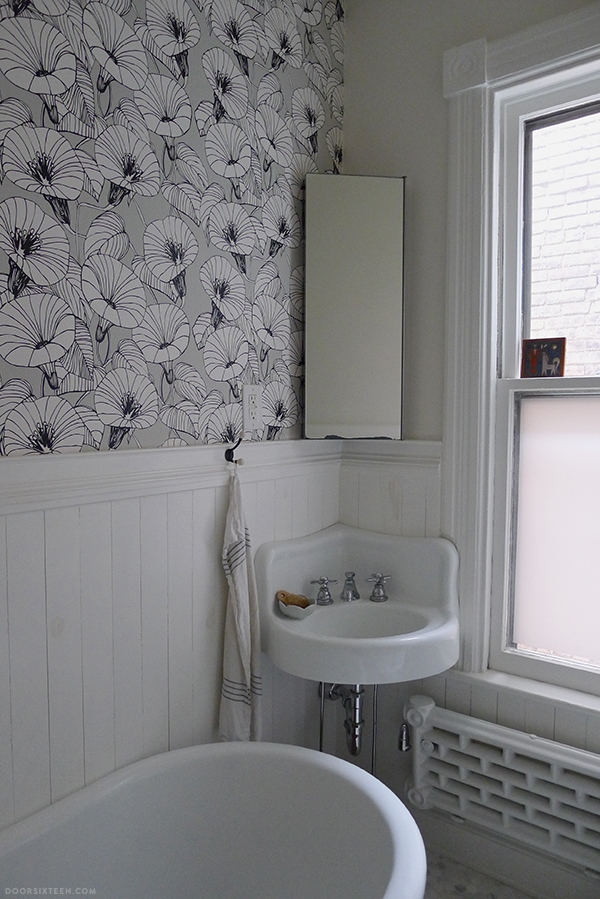
Something happened with the light this weekend. Despite the three feet of snow still piled up along the side streets in the City of Newburgh, it suddenly feels like spring is coming. The weather was beautiful yesterday, and the daylight pouring into the second floor of our house made want to do nothing but wander from room to room.
I don’t really take many pictures of the house anymore unless I’m working on a specific project, but after eight years, those projects are fewer and farther between—especially since the remaining ones are expensive and daunting, but not necessarily interesting to look at (like replacing our exterior window casings or buying a new boiler…snore + $$$ = no fun). I still love my house, though, and it still makes me happy to share it. So maybe it’s OK to just take some pictures without them being about a renovation project!
Here’s a walk through the oft-neglected second floor of the house, taken while admiring the almost-spring light.
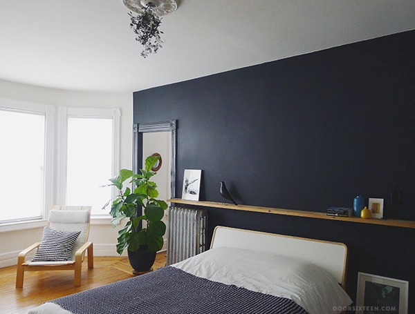
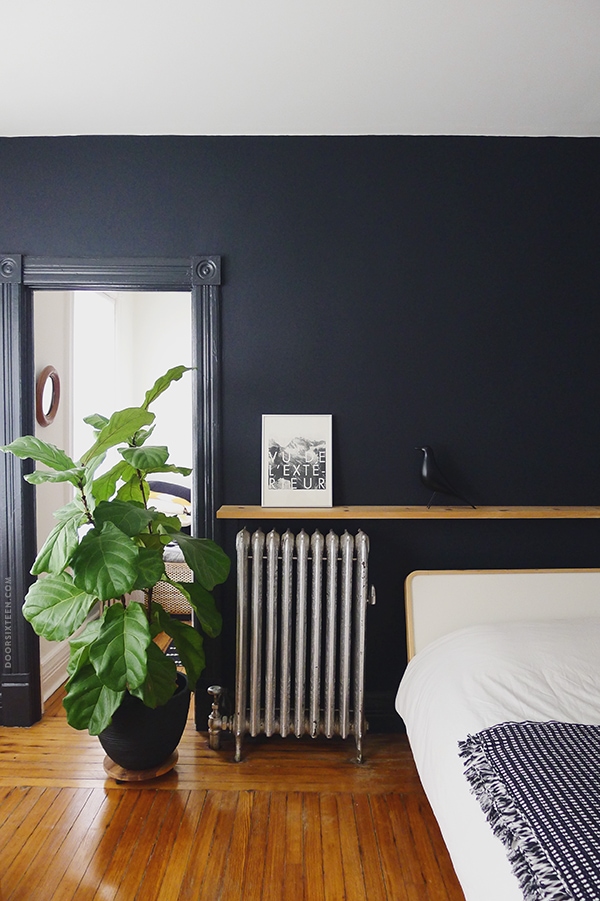
My fiddle-leaf fig tree is still alive! Miracles. The print is from Fieldguided—I bought it ages ago but just got around to framing it last month.
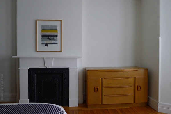
Ah, it’s the rarely-seen east wall of the bedroom! I’m still unsure about the Heywood-Wakefield dresser. HAH. I’ve been thinking about either painting it (don’t bother with the hate mail, H-W protectionists, I already know) or getting rid of it since pretty much the day I bought it, but it’s kind of grown on me? I don’t know. It’s not hurting anyone, so it can stay for now. I promise not to paint it. Really. It is an amazingly well-built piece of furniture, I’ll say that much.
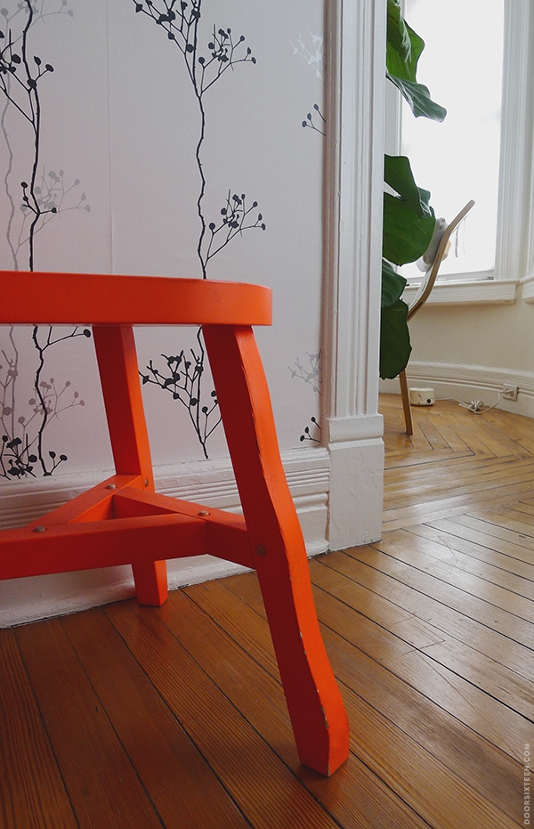
I love you, Tom Dixon Offcut Bench. This is one of the best things I’ve ever bought. It really needs to be seen in person to be appreciated—the fluorescent orange is nearly blinding. I got a good deal on it because it was a floor model and it’s a little banged-up.
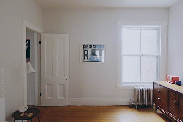
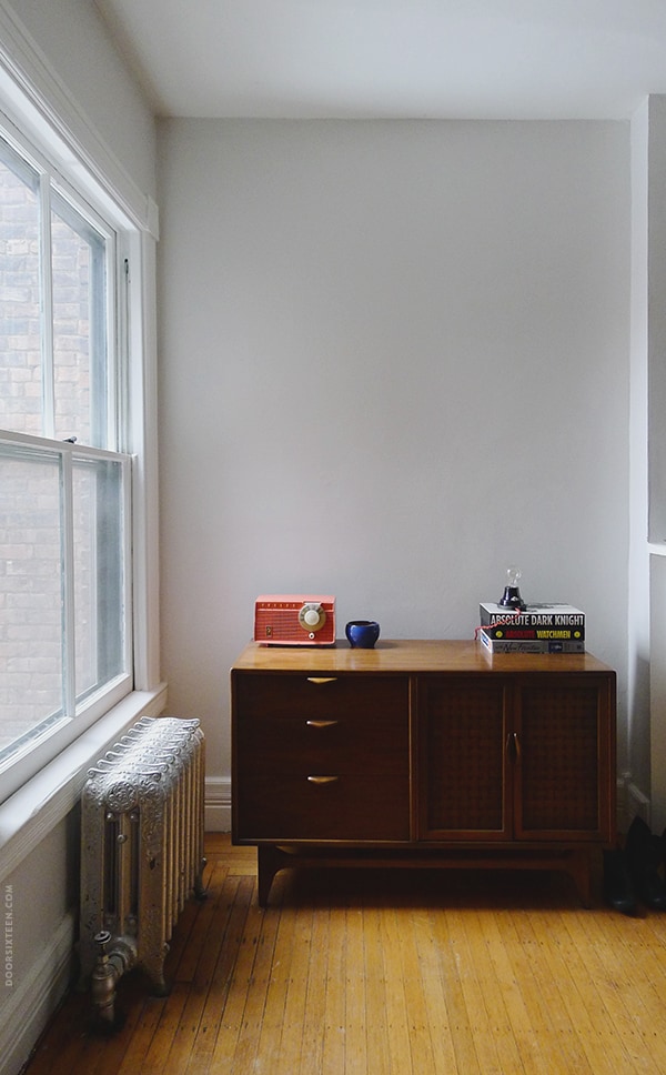
The guest bedroom gets such nice light. It’s in the middle of the house, directly above the dining room. It’s a little shadowy, but the sun that comes in the huge window is beautifully filtered. It’s such a nice place to be. I wish we had more guests. (Sadface.)
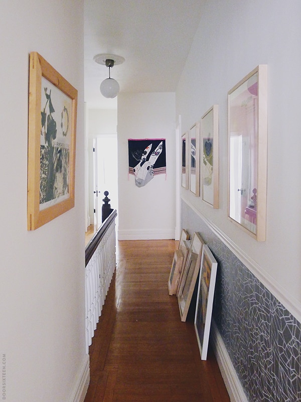
Frames. Everywhere. Always. I’ve been making a big effort lately to get artwork I’ve collected over the years out of storage and into frames, and, hopefully, onto the wall. It never ends! One of these days I need to sit down and make a master list of frame sizes, what I want matted, and what I can frame myself versus having to send to a shop. It’s overwhelming.
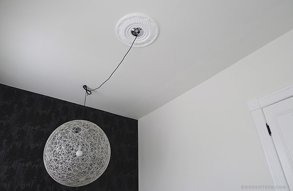
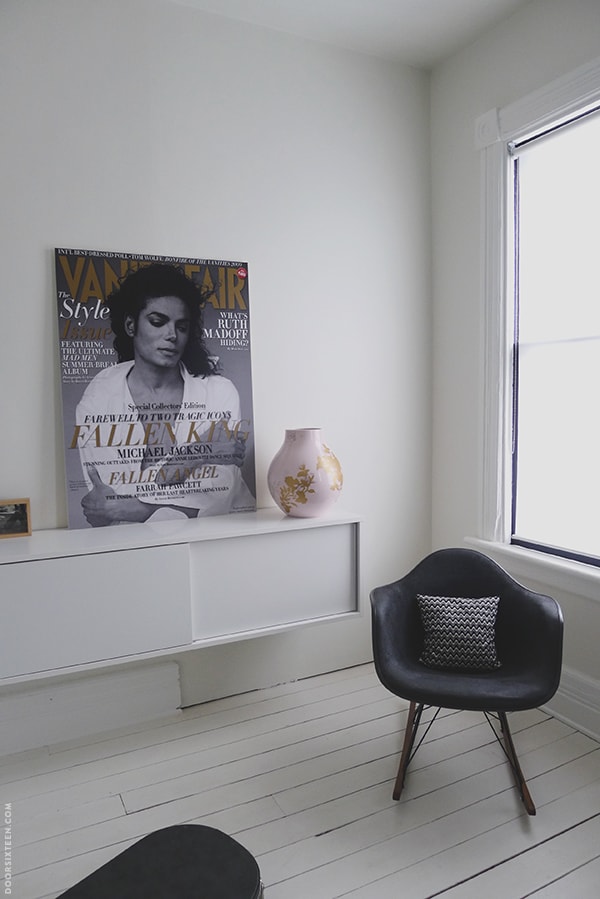
And finally, the studio. I never get tired of this white floor—it’s the best room. It looks bright and clean even at midnight, and even when there are guitars and amps and cables all over the place. Yes, that section of molding is still missing. And yes, that’s OK—it’s good enough.


80 Comments
where is the grey/black wallpaper in the first image from? thanks-
Hi Kate, that’s a design from the Danish shop Ferm Living called Bindweed. It’s discontinued, but if you Google you can still find a few retailers selling existing stock.
Oh Anna…
I saw your blogs years ago when.my addition was just a dream. I love love the Binweed stairs your friend did. Now that my addition is FINALLY in full swing….I cannot find the Binwood anywhere!!! So sad. Just want to do my stairs. Any chance you and your friend who did her stairs have extra you want to sell?? I know I am grasping. Guess I will probably have to settle for something else. I am very bummed. Should have bought a roll back then and aved it.
Looks amazing! Question: did you paint your trim? We moved into our 110-year-old house 6 months ago and it has original trim, which is nice, but really banged up and I’m a sucker for crisp, white trim. I know I made half the internet faint by saying I wanted to paint original trim, but man, it’s time, right? How did you deal with the balance of keeping things “original” and doing what you wanted to do?
Marlena, this is kind of a huge subject (and sort of the impetus for starting the blog!), so I’ll try to keep this brief…
The house was a serious fixer-upper. It had been neglected for a long, long time, and there were many layers of paint on top of peeling paint on top of more paint on top of moldings that had suffered a fair amount of water damage/rot in about 50% of the house. Even most of the original doors had huge dents, missing panels, splits and even holes cut in them. In other words, the decision was already made for me—I removed the loose paint, stabilized the rot, filled holes, sanded, and repainted. That was that. It’s hard to tell in these photos, but if you look closely at the moldings, you’ll see they’re pretty lumpy and imperfect. I’m totally OK with that. Stripping the woodwork was really only a viable option for the miraculously-undamaged banister, and I give my mother full credit for that work!!
Personally, this is how I think about this stuff:
1. Is the house architecturally significant? Are you in an historic town? Is your house’s original condition a rarity in your area?
2. Do you think of this house as being your “forever house,” or is it mainly an investment?
3. Yeah, I have no idea. Most of the time I think people should just do what they want with their own houses, but at the same time I’m totally averse to removing anything original from my home (or knocking down walls, etc.). I try to take it one thing at a time, and evaluate as best as I can. I trust my gut.
If you don’t already know the blog 47 Park Avenue, definitely check it out. They’ve managed to strike a great balance between painted and unpainted trim in their Victorian, and it looks AMAZING.
http://www.47parkavenue.co.uk/blog/
Thanks, Anna! I really appreciate your detailed response. And I will totally add 47 Park to my Feedly. To answer your questions, and more to get me thinking about them:
1. Eh? It’s called a craftsman, but the outside had regular siding put on it a while ago. Some things are original, but others are not, in that they added a bathroom off the kitchen and changed a powder room to a closet, but most of the wood/trim is original, but it’s “alligator-ing,” a term the real estate agent shared in that the finish is lumpy because of time, etc., so at some point we’ll need to strip it to refinish, or do what some think is the unthinkable, and paint.
2. Definitely a house for the next 15-20 years. We do updates/repairs that we value along with the necessary, but we are not flippers at all.
3. I think my gut says paint. Or not. If the house *wasn’t* 110 years old, I would totally paint the trim. Our last house, where we lived for eight years, was built in the 1940s and painting the old oak trim was the best thing we ever did.
OK, I’m done for now typing out loud. Thanks for sharing your thoughts!
Also, have you considered refinishing/cleaning up (not painting) your existing trim first to see how it looks? You’d be surprised the difference it can make.
Your house looks beautiful! I think it’s wonderful to have photos like this: taking in the moment and appreciating where you are with the life and home you’ve created. It seems to be a thing with some bloggers to take on a new project or buy a new house JUST for the sake of generating content. I get it’s their livelihood but it also just seems somewhat wasteful when what already exists is already good (good enough).
Now for a relatively fluffy question: have you ever moved your bed against the windows in your room, the windows serving as a sort of backdrop for your bed? Just curious as we have a similar set-up to your current arrangement, and I like it, but our room is narrower and so we’re limited with what can go on the longer wall…
Thanks, Reba. I can honestly say I’ve never done a project for the sake of blogging about it, hahaa. I can barely complete the projects I need to do for the sake of sanity!
Yes, we have had the bed like that. It just doesn’t work. It took painting that wall black in order to make it feel grounded where it is right now, and for me to stop being annoyed that it wasn’t lined up with the fireplace. (The room is pretty narrow, btw. There’s only about 3′ between the foot of the bed and the fireplace front.)
Here’s a post from 2007, with pictures of the bedroom with the other configuration:
http://www.doorsixteen.com/2007/07/15/bedroom/
Aha –I see what you mean! Wow, the painted black wall really does make a difference in grounding the bed on the longer wall.
Also you mentioned the light right off the bat in that link from 2007. I appreciate your consistency!
Oh, Anna! The house just looks so beautiful these days. Everything is just so dreamy. I know I get to come over now and then and spend time there, but it’s still fun to see pictures of the house on the blog—as someone who followed your renovations before we even met, it’s like visiting an old friend when I see it online! And as someone still at the beginning of all of this, seeing where you are 8 years out is truly inspiring. This place is so loved!
(and I know I’m only 45 minutes away, but I’ll totally come stay in your guest room! Especially if Fritz promises to cuddle my ankles.)
If by “cuddle” you mean “bite with gummy force,” then yeah, he promises!!
I feel kind of weepy when I see old comments from you on my blog from before we knew each other. I’M SO GLAD I KNOW YOU. Come over, we’ll have drinks, braid each other’s hair, and watch Stripes and you can pass out in in the guest bedroom. xo
Oh, I’m so glad I know you!! It’s a date!
I absolutely LOVE the wallpaper in your bathroom!
Your house is stunning, and looks SO much like you, which is great. I remember hearing a designer say once that your home should greet you when you walk in it, so I imagine yours does.
Also, pointless comments, but I love that vilmie rund blanket on your bed! I have the same one on mine. And that Michael Jackson photo is beautiful.
Thank you, Lizzie! Yes, my home definitely greets me when I open the front door. 🙂
I wish I’d bought two of those blankets. Fritz did a number on this one when he was teething, and it’s looking pretty rough around the edges.
This is one of my favorite blogs (and has been for years)! Even though nothing was new, I really enjoyed seeing pics of your house today. I had not really remembered all the wallpapers; each shot is familiar by itself, but to see them all together was inspiring. Amazing!
Thank you, Cassie! I’m glad you liked it even thought it’s all old news. 😉
Oh I love the little corner sink in the bathroom! We took ours out when we did our bathroom renovation, but we’re hoping to find a new place to use it. It’s original to the house (1902) and just too cute to give away! 🙂
Thanks for the 2nd floor update. I’d never seen a post about your bedroom before and I am in love with that black wall. I really want to do that in my living room so that I can hide my television in plain sight. Unfortunately, that room is a living/dining combo that is 12′ x 25′ and the black wall would be the 25′ wall with three doors. I also love the H-W dresser. In the picture it seems a bit squat because it blends with the hardwood floors. Have you thought about living it up on legs? Maybe something in a distressed tubular steel that would fit well with the massing of the dresser itself? Love the blog; it’s so inspiring!
Good, solid dressers deserve respect, but I also thought that giving the H-W dresser legs instead of a plinth base could help it play better with the other players in the room. Also, maybe a facelift involving new handles for the doors? It’s definitely the right size for the space.
Sorry guys, I think sticking legs under this piece of furniture would look really horrible. It would completely destroy the proportions and throw it totally off-balance visually. I’m absolutely against this idea. And the handles on H-W furniture are the most beautiful part!! (Not to mention that they’re integrated into the door fronts and cannot be removed.)
I appreciate the suggestions, but I think this is really more about respecting the design of the piece and either appreciating it in my own home or letting it go to someone who will appreciate more than I can.
Your fiddle leaf fig looks SO HEALTHY! That takes some talent, well done!
I think it’s really all attributable to the southern exposure and filtered light, combined with neglect. I really only water him once a month or so! The only other thing I’m careful about is moving him away from the radiators when the heat is running. Keeping the pot on casters makes that muuuuch easier.
I can honestly say that I don’t think I would ever do in my own house what you’ve done in yours — but I really love seeing your house. I don’t know if I’d be brave enough to paint a wall in my house black, but I love seeing the black walls in your home! So thanks for sharing with us interwebs people.
And the light in your second floor really is lovely and dreamy. I covet it like crazy! My house somehow manages to be mostly dark and shadowy, even at noon. ~sigh~
Love the fig, the corner mirror in the bathroom, and the bench. Oh the bench.
i love your home.
i actually shared a photo of your upstairs bath last night with my sister (she’s planning a bathroom reno). it’s still my all time fave. what a great job you & evan have done.
thanks for sharing.
jo
Thank you, Jo. Good luck to your sister with her reno!
It always makes me happy when you post pictures of your Newburgh home. I think because I’m an “upstate” gal and so the house/design feels attainable. This weekend was so very wonderful. Sunshine! 50 degrees! It’s a total tease, but I took advantage of it and spent a lot of time outside.
Beautiful! Thank you for sharing. And yes, spring is coming soon. How wonderful.
i love seeing your house. it never gets old and always inspires me. one thing i especially love is that pink vase next to mister michael jackson. perfect pairing. xo
Thank you, K1! You are welcome here anytime. <3
Have you considered moving the H-W dresser to one of the walls that you’ve painted dark? I think a dark background takes the glare out of the light wood and puts the emphasis more on the shape of the furniture. I’ve had this pin in my inspiration folder for a few years because I liked the light wood against the dark wall. It’s not exactly your style (understatement), but it gets the contrast point across. http://www.pinterest.com/pin/237072367858912557/
Hi Sasha, I don’t want to move the bed away from the dark wall just for the sake of the dresser (not actually sure where we’d put the bed, hah), but yes, I do like wood and black together very much. In this case I prefer it with white, though. It’s actually the shape/details of the H-W piece that are unappealing to me! I’m not really a fan of that style of furniture. The only thing I DO like about it is that it fits into that space so nicely, and it helps take the edge off of the wood floors (which are the same horrible orange/aged polyurethane color).
I’ve always been a fan of your home and in this light it’s even more stunning.
The HW dresser definately is a statement piece, I agree. It looks like it (cliche I know) needs a big but minimal round mirror above it, embarrassing a minimalist 30’s twist. Perhaps it would be really sweet in the guest room. It does grow on you for sure.
*embraceing. Not embarrassing. Bahaha or was it a Freudian slip. Embracing.
Hahaha, that made me laugh. Yeah, I think it’s either here or nowhere for that dresser—there really isn’t room for it anywhere else in the house, not even in the guest bedroom. It’s pretty huge. I agree that it would look great with a mirror above it, but that’s the thing with fireplaces and mantles—the space on either side needs to relate to what’s in the center, and that collage (my dad’s work, a wedding gift) is very special to me. I don’t want to distract from it at all. I have a feeling anything I could do to embellish the dresser would be at odds with the rest of the room, anyway. I think it probably needs to have a new home with someone who likes ’30s/’40s American furniture more than I do. 😉
Just a thought, while reading these comments and looking back at the photo I had the thought that the dresser could look more settled in that spot with the collage above it oddly enough. they have similar colours/ feel. There is a certain tension in that picture that makes it feel off kilter. The collage is difficult to make out, but it does look beautiful.
For some reason, this was really relaxing. Thanks for that.
In other news, after having an eBay alert set up, oh, forever, 2 IKEA UNNI rugs finally came up recently. In deciding whether or not to buy one (or both), I Googled around – and the first hit was a Flickr comment I made on one of your hallway photos 5 years ago. I realized I still like them and went for it, and I’m happy I did.
Emily, those rugs are the BEST!!! I wish I’d bought a dozen of them. Sigh. IKEA discontinues the best things.
these pics are great. Its nice to see ‘just because’ photos 🙂
they give we readers an inside look of a regular Sunday at Anna’s house which is lovely.
Thank you for the pictures! I would love to see more. There can never be too many 🙂
Hi Anna; I arrived at your blog a long time ago when I was google-ing Anes bed Ikea (still a very strange name) when they still sold that bed. I felt right at home here LOL. Anyhow, at the time I made a comment wondering why people in the US almost always put their bed in front of the window (still don’t understand that). (I like to look out and see the morning when I wake up.) It all looks really wonderful, you are really lucky having such a nice place.
Is that the Garland light above your bed? Nice to see so much Dutch designers in your house ;-D
Have a wonderful day.
I like that dresser! Maybe you’d like it more if it had a little more contrast– you could remove the handles and stain them a little darker? I love contrast.
Given the value of H-W furniture (this particular piece, which is actually a sideboard/buffet, is worth between $1200-2000), I think altering it would be a bad idea if I ever want to sell it—which, considering I don’t really like it, is a strong possibility. 😉
I love everything about this! Bookmarking for future reference 🙂
Ah, house love! These photos are so beautiful! There’s something I love in every room you’ve shown…the wallpaper in the bathroom is stunning as it stands out against what looks like an all-white room; I’m not usually a fan of painting one wall a different color than the rest of the room but you’ve really made it work; love the H-W dresser (you seem like you’d be a mid-century mod fan… are you not?); I’d love to see more of that orange bench…
So, my big question is: How do you keep your home so tidy? I’m in love with your style and aesthetic and your home looks so relaxing and personal. And TIDY!
Hi Zandra, “mid-century modern” is such a broad (and overused/abused) term—it’s a little like saying “rock music,” you know? There’s lots of furniture that falls within that category that I do like (obviously, hah, look around my house and apartment), but I think of myself as a modernist more than I do a mid-century enthusiast. I also tend to prefer Scandinavian mid-century design more than American, with some exceptions of course, like the Eameses.
At any rate, I don’t really think of Heywood-Wakefield furniture as being mid-century modern (at least not in the way that I think people usually mean when they use that term). The stuff that came out of H-W during the ’30s and ’40s (like this piece) are based on French art deco furniture designs. There are a million miles between this chest of drawers and, say, an Aalto tea cart, even though they were designed within a few years of each other. That’s the reason why H-W furniture looks very “retro” to our eyes in 2014, but classic Aalto pieces still look contemporary or even futuristic despite being almost 80 years old. The bed and chair in my bedroom are very obviously inspired by Aalto, and so the dresser sits there like a dowdy sore thumb by comparison.
Anyway! You can see more of the bench here in this post, or by following the link above to the product page on the Tom Dixon site:
http://www.doorsixteen.com/2013/05/07/favorite-spot-my-dressing-room/
As for tidiness, I recommend one thing: Don’t take pictures of your houses to share with the internet when it’s a mess. Works like a charm! 😉
Anna, You’re home is stunning and inspiring. I apologize for this mundane question, but what did you use on your studio floor? I have a dark, tiny studio with hardwood floors that I would love to paint white. I keepkeep getting talked out of it, mostly from a durability/ upkeep perspective.
Hi Debra, there’s a post about the floor with all the details right here:
http://www.doorsixteen.com/2009/01/26/white-painted-floor-back-room/
(And thank you!)
So lovely! I love the light too!
Can you tell us how you decide which prints to get framed vs. which you can do yourself? I need to frame some things and am totally clueless. Like, can you go to Michael’s and have them cut a mat to be the right size… or is that a terrible idea?
I don’t recommend getting ANYTHING framed or matted at Michael’s, personally. They’re super overpriced, and they run these phony “sales” all the time to make people think they’re getting a good deal. The one time I brought a job there (having a very basic mat cut to size), they literally got it completely wrong THREE TIMES before I took my business elsewhere. Maddening!
Basically, my rule of thumb is that I get original works of art and editioned prints professionally framed. (Well, in theory. In practice it gets rolled up and put in storage.) Anything else goes in an IKEA frame, unless it’s a weird size and then it just sits around forever waiting for me to take action. Hah.
I sat in the parking lot of Wegman’s at 5:45 this evening (35 degrees) and something about the lighting made me think “thank God this awful winter is almost over…..spring is coming”! Anyway, on a different note, I like how you painted the trim to match the walls on the bedroom accent wall. I too have a darker wall in a room but I left the trim white and it has always bothered me–actually I didn’t know what was bothering me until I saw your picture! Gonna paint that trim this weekend.
Lindsay, yeah, I left the baseboard moldings white on the black walls in my living room and dining room, but the bedroom has all of these crazy door and windows and everything is different heights—it really needed to have the moldings painted out in order to look more uniform. Good luck! 🙂
Oh wow, it is like a walk down wallpaper memory lane! It all looks so beautiful! 🙂 You really do have such a stunning home, Anna. Love all the white and light! So glad you shared these pics.
I’m the ultimate Ferm/Hygge wallpaper ambassador, haha! I didn’t realize quite how much there is of it in my house until I did this post. 😉
I immediately thought of my little place when I saw the picture with all of the framed art work leaning against the wall waiting to be hung. Story of my life…
I love your blog by the way! One of my very favorites! 🙂
Gorgeous home (and apartment as well). Love all the DIYs. You say you don’t have guests often? Hey, I’m available!
Hi Anna –
What kind of chair is the one in your bedroom?
Hi Alice, it’s from IKEA. I don’t remember the name—it was discontinued a long long time ago, though.
Oh that lovely early Spring light – your Fiddleaf Fig will love it! Not only is it still alive but it looks great! My neighbor’s have one in their front yard that is about 15′ tall with quite a twisted trunk & huge leaves.
Lovely light. Lovely rooms. Lovely wallpaper (!). I’m especially drawn to the bedroom. Ours has only dim light, and I’m still fighting its natural cocoon aspects.
An aside: You should NOT put a lament about an underused guestroom on the interwebs with such gorgeous photos. You don’t know which appreciative readers might take that as an invite and show up at Door Sixteen with a steamer trunk and Kindle. Just sayin’. 🙂
Hey Anna – Totally love the space, it’s so lovely! The fiddle leaf fig tree is so awesome haha 🙂 Keep up the great work
M+D Old New House
I am so in love with the wallpaper in your bathroom and your dressing room. Do you know if the dressing room wallpaper is still sold? I’m normally not big on wallpaper because it’s much harder (and more costly) to change than a coat of paint, but that is one pattern I can see loving for a very long time. The orange bench plays perfectly off of it (and reminds me of China Glaze Japanese Koi nail polish. Blindingly bright and magnificent).
Not on topic, but how are you liking your SMEG fridge? I know you coveted it for years, so I was just curious if it is living up to your expectations.
Great to see these photos. It’s all beautiful but I’m especially digging the bedcover and the bathroom. I appreciate what you went through with the bathroom, too, basically gutting to restore. That radiator is stunning. Usually I like the old things but not in this case.
Hey Cate, thanks! And yeah, the bathroom renovation was intense. With the exception of the beadboard (which was truly unsalvageable by anyone’s standards), we kept everything that was original—including the upper (plaster) portion of the walls. The sink, tub, and radiator were all there, we just had them reglazed. The original floor was long gone, sadly, but I think we chose something that looks appropriate. The last thing I want with all this renovation stuff is to wind up losing any of the house’s existing personality.
Anna, we actually did something very similar with our bathroom. Replaced the bead board with new, kept everything else. The bead board had been destroyed with tile glue — though there was never any tile on it, only wallpaper. (Still not done — have to patch holes, paint some trim, reglaze sink, get new old toilet.)
The radiator is original!!!??? When do you think it dates from? It looks so modern. Like a little sculpture there, very cool.
That sink is just so cute too. Very special.
Ah…this post is like never-ending-inspiration. The second floor looks terrific, Anna! I have a question: where did you get the light colored wood frames? I’ve commented on your blog before– and I’ve mentioned that we purchased an old (big) historic home almost one year ago. Since we moved from a tiny Brooklyn apartment, we owned almost nothing when we bought this house. Because of that, most of our decor budget went to furniture (chairs, a dining room table (that was an exciting purchase), night stands, couches, etc.)… Anyway, the house looks great but it needs to be warmed up. And the best way to do that is with rugs (we found some great ones), plants (I’m really into those fiddle head ferns you’ve posted) and art work. I have a small collection of prints I’ve found along the way, travel photos I’ve blown up, etc. But finding frames that I like has been an uphill battle. (And getting professional framing done costs a fortune!). Thanks for your input. And enjoy the almost-sping light!
Hi Batya! Thanks for the nice words. 🙂 Most of the frames come from IKEA—they’re the basic RIBBA style.
GORGEOUS print on the wall!
I love that little sink
@Chelsea, GORGEOUS prints, plus GORGEOUS black matte wall! My little sister would definitely draw on it like on a chalkboard 🙂 A great space to unleash imagination…
So… have you seen this?
http://www.borastapeter.se/en/collection-wallpapers-by-scandinavian-designers/wallpaper-2763/
Anna, I have a couple questions:
1) Is there a shower in your upstairs bath? Or just the tub?
2) How do you decide, as a designer, what artwork/prints needs a mat and what doesn’t?
Also, I’ll admit it: if that H-W dresser was mine, I would paint it so hard.
Hi Anna, there’s a tub with a handheld shower in the upstairs bathroom. You can see more photos of the bathroom here:
http://www.doorsixteen.com/2008/12/01/at-last-the-upstairs-bathroom/
I don’t have any method for deciding what I’d like to mat, but I usually prefer to leave the edges of artwork exposed unless there’s a reason why they should be covered.
What a plant! Wow! I manage to kill every plant that comes in my home.
Just wanted to let you know that I never want you to stop photographing your home! I love it and I never get sick of seeing your photos of it 🙂
Kind regards from across the globe.
Tess
I love the black wall in the bedroom – it looks almost navy in that sunny spring light. What’s the color name/manufacturer? I might steal it for my tiny kitchen, which the last occupants painted an eye-gouging creamsicle orange.
It’s Benjamin Moore’s Soot. 🙂
inspiring as always Anna!
love this so much we featured it in our blog post today on decorating with plants for our happy house rules project, especially in the hope it will encourage self confessed plant killers like you to have more green in their homes.
x nat