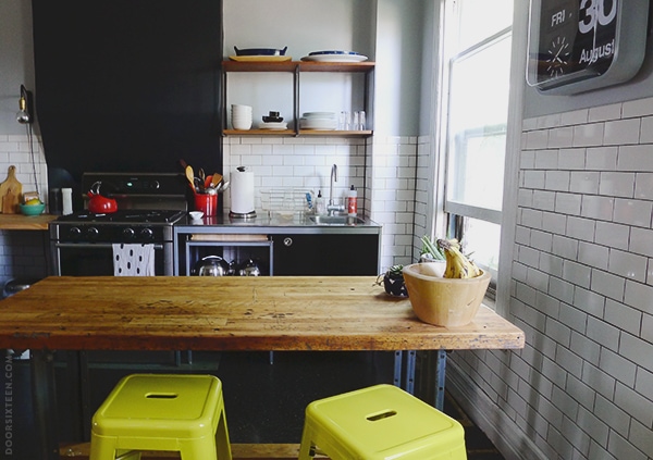
Nine long months after I started tiling the kitchen, I’m am extremely happy to say that I am DONE! Well, I still have to caulk around the window casings and along the tops of the baseboard moldings, but other than that? COMPLETE! FINITO!
(Done with the tile, that is. Not the rest of the kitchen.)
Man, what a relief. I think I’ve gone through 11 boxes of tile, and who knows how many batches of thinset and grout. So much black grout. Black grout is the messiest thing on the planet. My arms are tired and I’ve got a pinched nerve in my neck and I am over all of it. I love tiling, I really do, but there are limits. My limit seems to be about 10 hours at a stretch, and then I need to take a break for a day or two. Or six months.
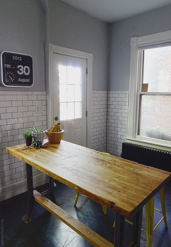
This is what I worked on for that last couple of weekends — the entire back wall and rear half of the right wall. It feels really good to see tile here instead of half-painted bare walls. I’m so glad I didn’t just do a tiled backsplash or anything. This is the kind of kitchen that needs tile everywhere.
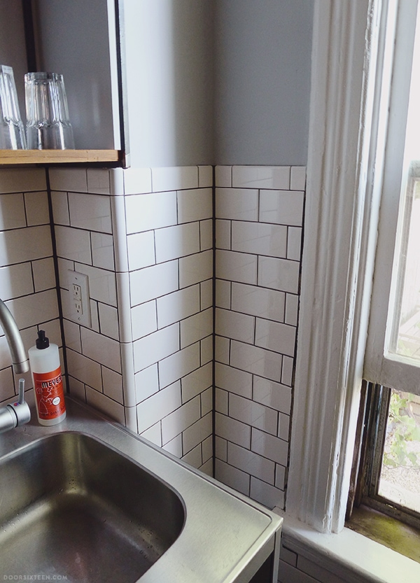
Oh, and a beauty shot of my favorite corner, of course, all angles and lines…I love it.
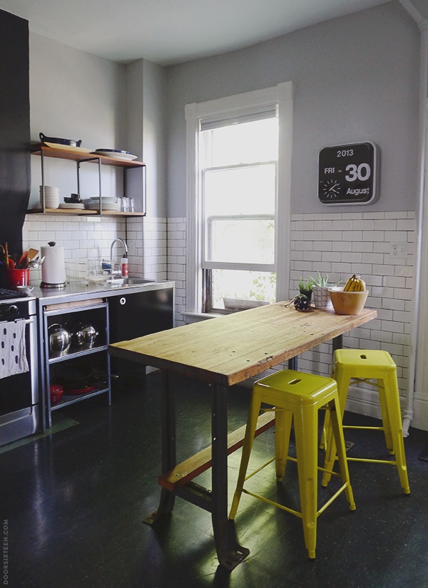
This is now my favorite spot to sit in the house. Evan and I have stopped using the dining room for meals unless we have friends over for dinner, and I camp out there for hours in the morning on the weekends. I don’t know why we never put an island or table in the kitchen until now, but it makes a huge difference.
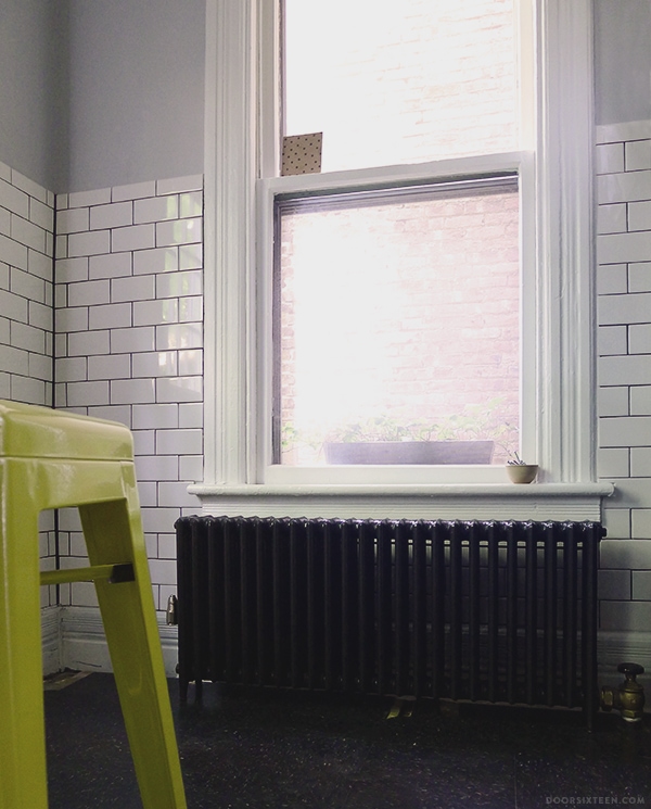
Here’s the newly-refinished radiator in place! It’s not actually connected to the pipe yet since we still have to rip up the floor, but it’s very exciting to see it looking so fresh and non-rusty. I still don’t understand why it was originally installed all the way over in the corner? It’s literally exactly the same width as the windowsill, so centering it underneath looks a million times better. Moving that pipe was worth every penny.
As good as it feels to have the tiling finished, there’s still so much left to get done before the cold weather comes…
Kitchen renovation to-do list:
✚ Disconnect sink, remove all cabinetry and refrigerator
✚ Spray paint island legs
✚ Build shelf for bottom of island
✚ Floor demolition (remove VCT flooring and plywood subfloor)
✚ Assess condition of original pine subfloor; repair if possible
✚ Paint existing pine subfloor OR install new pine flooring and paint
✚ Paint ceiling
✚ Run conduit for surface-wiring new lighting, which means…
✚ I had better figure out what light fixtures I want
✚ Gaze sadly at giant refrigerator and wish it would magically turn into a cute little SMEG
✚ Eventually: Replace exterior door
I’ll be getting back to work on this list TOMORROW! I plan to use every available minute of this Labor Day weekend to get that floor demo work done. If the existing pine can’t be salvaged, we’re going to need to put in an order for replacement tongue and groove. Fingers are tightly crossed that it doesn’t come to that, though!


72 Comments
looks sooooo good!! i love the island part, too. such a nice spot to sit while someone’s cooking (or not cooking). bravo, k2!! xo
Amazing! What I wouldn’t give for a beautifully tiled kitchen… Loving the table, too, it’s got that perfect level of history/patina to it.
Well done!
You’re going to paint the ceiling right after you pull up the floor or right before, right? Because then it won’t matter how messy you are. ; )
We’re painting the ceiling after the floor for a few reasons (timing, namely), but don’t worry — we’ve painted a lot of ceilings in our time, and we’re pretty tidy about it at this point. 😉
Looks great!
The tile looks great!! What color gray paint did you use above the tile? I am having a gray paint dilemma – just had my bedroom painted and it’s too light (argggghh). Your gray looks perfect.
Hi Geraldine, the paint is Filtered Shade by Valspar. It’s a very good gray, though I should warn you that it does lean a bit lavender in certain light. I like that, personally, but it’s something to be aware of.
You can see the paint when it first went up in this post:
http://www.doorsixteen.com/2013/01/28/the-kitchen-has-been-painted/
Anna,
This is exactly why I read your blog. I’m going to admit, I don’t have the same taste in design you do. The clean swedish-ness, the stark, geometric patterns, the monochrome. It’s not me at all. But you do it SO WELL, it’s impossible to deny how beautiful it is . I love the way your house and apartments have evolved into places steeped with Anna&Evan-ness (with a light dusting of dog hair).
The kitchen is magnificent.
Kudos.
Paige
Thanks, Paige!
Interesting that you see Swedish-ness in this kitchen. I’m so heavily influenced by classic French bistros and Victorian-era American kitchens that to me it does not feel Scandinavian at all!
As a new homeowner, I’m discovering that one of the best feelings is making something in your home beautiful that wasn’t before, and one of the worst is wondering about the completely nonsensical things that previous owners did. Your kitchen is coming along beautifully!
I’ve got to agree with Paige (above) that your taste is not always mine — but it IS extremely beautiful even if I wouldn’t want to live in it.
Yours is the first subway tile I’ve seen in Blogland that is just precisely right for the place where it is used. Huge applause for you on completing the project.
And yes, I’ve waited three years between heavy home reno operations (from dismantling, refinishing, and reinstalling the kitchen cabinets to installing whole-house bamboo flooring was about that). Take a bow, then a hot shower and some relax-with-a-cuppa time. Here’s hopes that the carpenter ants didn’t have time to do much damage.
L, have you seen my friend Daniel’s kitchen? I think he’s done amazing things with subway tile in his house. It’s just right in that space — really wonderful.
http://manhattan-nest.com/2013/08/26/the-kitchen-the-big-reveal/
I’ll report back on the carpenter ant situation in a couple of days. Fingers crossed. 😉
Just wow! This is absolutely beautiful!!
The tile looks great! I love your island table.
Thanks, Maria! It was a really lucky find.
It looks wonderful!! I wish I had the patience for those types of projects 🙂
Sorry about the pinched nerve. I hope it gets better soon!
Kitchen is beauteous, as I always knew it would be. Love.
oui oui j’adore!
I could sit on one of those stools for 14 hours straight. Beautiful!
You done good! What a ton of work that was! So awesome you were able to do that tile job yourself. Love how the shelving fits perfectly to the right of the wall pop-out at the stove, too.
On your recommendation a few weeks ago we bought two of those dirt cheap Carlisle stools in Shady Leaf from Target, and they are great, especially for the price. Have a good, productive long weekend, Anna!
I didn’t mention it in this post, but the yellow stools are actually from Industry West:
http://www.industrywest.com/shop/stools/marais-stool.html
The finish and overall construction is a bit nicer than the ones from Target (the colors are brighter, too), but yes, they’re more expensive. The Target ones are a great value for the price! Glad you’re happy with yours. 🙂
Your kitchen is really stylish! Tiles, radiators, floor… Everything is perfect! Good work 🙂
Effing gorgeous!
I am so impressed! Looks amazing!
love everything about it and really admire the hard work you put into it! Look forward to seeing what lighting you choose.
Well, HOT DAMN. Looks sooooo amazing, my friend. I love the way the island looks in front of the subway tile, and with the clock…subway tiles just make everything better.
Let me know when you want to fret some more about lighting. 🙂
It looks great! Congratulations on getting it done — what a huge job. i was just at the Mount (Edith Wharton’s) and her kitchen was tiled all around with subway tile — very reminiscent. It looks lovely and totally in keeping with your nice old house’s character. Good luck with your floors — I hope you find they’re fine. Don’t do too much labor on Labor Day! 🙂
What a great job you’ve done. All that work has definitely paid off and it looks fantastic. Bravo to you and thank you for sharing it with us.
Being in the middle of finishing drywall in my kitchen, can I somehow crawl into these pictures and live there? It looks so good!! I’ve always admired your kitchen taste for not being the “expected” (fitted cabinets stuff like that) but still obviously being functional and used while maintaining respect for your house. When you figure out how to transmute Samsung into Smeg, let me know too.
The tiles look great! I love the height that you stopped them at, the grout and those yellow stools. Lookin’ good!
xx Erin
Good thing you’ve got those stools angled properly to do your ‘fridge gazing. Seriously though – awesome job so far (and fingers crossed that the floor is a happy surprise!)
stunning!!
oh my goodness, that looks fantastic.
It looks really nice. I like that it is so “consistent” it all goes together really well without being to narrowminded about the whole thing (sometimes that happens when people don’t allow themselves some bandwidth when they put things together). I’ll help you hope for a Smeg, I think they are great as well.
I sort of missed the reason for taking out the floor, I would think that you had done that before you filled the room with kitchen stuff and tiled the walls etc. To me it sounds as if you could end up with a gap between the bottom of your baseboards and the new floor. (If so just fill it up and paint it).
Anyhow, good luck with it all, have a nice day.
i wish your kitchen was a coffee shop! it’s so pretty and cozy 🙂
Tiling the radiator wall now really does make a huge difference! It looks amazing and I think the Udden units are the perfect match for this space. And those wall shelves are gorgeous!
This is just so, so good.
I just wanted to say that I really love the corner also. Lovely work, very inspiring.
Hi Anna, do you feel your kitchen and Daniel’s are practically twins :)? Or do they have a different feel?
Now you just need a fiddle-leaf fig.
Daniel is one of my closest friends, and we have a very similar aesthetic sensibilities — we’re both drawn to classic, timeless materials, and we are constantly asking each other’s opinions when making renovation and design decisions. It’s not a stretch for us to wind up using similar palettes in different ways. Honestly, though, having spent plenty of time in both my kitchen and Daniel’s in real-life, I don’t really think they’re all that similar? Also, his photos are way better than mine. He’s thinner, too. And younger.
Oh, and here’s your fiddle leaf fig tree:
http://www.doorsixteen.com/2012/07/29/giant-green-nature-in-the-dressing-room/
He may be younger and thinner, but you’re both very lucky to have a friend like that, who completely gets and shares your design aesthetic. I think this is what I was trying to get at: while using very similar materials, you created spaces that look different. Like their owners 😉
Would love to see some fresh photos of how your apartment is coming along. Hope you got the stairs all figured out.
By the way, just wondering, why is there no way to reply to your reply?
I have the threading capped at one deep on the front end just for aesthetic reasons. I see and read every comment, though!
Your kitchen is gorgeous, Anna! Congratulations. What is the tile piece that you use on your corners? It isn’t a bullnose, is it? I know it’s bullnose that is used to transition to drywall but this piece looks different than a bullnose. Is it a special corner thingie piece? Thanks!
Hi Melissa, it’s ceramic quarter-round. This really isn’t how it’s supposed to be used, but I made it work. 😉
Anna – I just wanted to let you know that I discovered your blog through A Beautiful Mess, fell in love with your house, proceeded to look for a place upstate because of it, may be getting a place upstate (we live in NYC), spent the weekend reading your blog and am so excited to know that you are also a vegetarian (vegan?) AND are close to my same age . . . this is super exciting for me. HA HA! Anyway, thanks for your blog – it’s really great to read and I love what you’ve been doing to your house! –Megan
That’s so cool, Megan! Good luck with your home-buying adventures. 🙂
I really love the combination of materials in your kitchen. Love.
Anna – deep respect all the way from Manchester, England!! Your kitchen looks fantastic and I am in awe of your tiling work. I love the whole thing. Think your blog is brill!
Hi, love the kitchen, simple but nice!
Small question, where can I find the clock, I absolutely love it and been seeing it everywhere on Pinterest, but haven’t seen a manufacturers name or shop!
Thank you!
Hi An, the clock is by Karlsson. There’s a post about it here with information about sources and such:
http://www.doorsixteen.com/2013/04/01/field-report-karlsson-big-flip-clock/
Ok, your inside corners look amazing. How did you get such beautiful straight lines? Even with tape, mine always seem to come out a bit wonky.
Sarah, I use tape (there’s a photo here), but aside from that I do like to consider myself a bit of a caulking master. I like to say my house is 50% caulk, 20% Bondo and 30% holograms. I’ve gone through SO MANY tubes of caulk sealing up every gap, crack and split where materials meet in this house, and at this point it’s like drawing a line with a pencil. It’s all about the size of the opening in the tube, the pressure you apply with your finger when you smooth out the bead…it takes practice. Maybe if you’re still getting a bad edge with tape you need to try applying a little more than you think you need, and then wiping off the excess with your (gloved) finger?
Thanks Anna. I totally hear you – seems like no lines in old houses are straight. Perhaps I just haven’t been removing enough caulk when using the tape. I end up with a ridge when I remove the tape, and then smoothing the ridge makes the line wonky, and then I get cranky and go demo something else instead. Guess I should start working more on my fine motor skills!
I’ve loved following along with your kitchen renovation. The subway tiles look amazing, and I can’t believe how successfully you did it yourself. This is such an inspiration! Thank you for sharing it with all of us.
This deserves a before and after post. Show what the kitchen looked like when you bought it and compare it to now… or maybe when the floor are done?
I’ll re-post some before photos when the kitchen is done (early 2014, hopefully), but you can see what it looked like here — unfortunately the photos are pretty terrible:
http://www.doorsixteen.com/2012/12/04/kitchen-tiling-progress/
(There’s a link right before the slideshow…)
I love subway tiles in the kitchen. And the best part, they are usually inexpensive! We did a black and white kitchen with the the white octagon tiles from Home Depot as a backsplash for a similar effect. Well done!
Incredible job Anna! A huge congratulations are in order for the huge undertaking. I can see why you’ve been hanging out in there so much. I would too.
So when are you moving out so that I can move in? Seriously though, this is my dream kitchen. You did an amazing job!
I’m amazed by the transformation so far! Great call on tiling the entire wall to the floor, instead of just a backsplash. I kind of got the French bistro vibe from this look too, or an old-world Italian deli. It just feels like a place where good food is made. Can’t wait to see the rest!
It looks fantastic! All that hard work paid off!
It looks GORGEOUS, Anna!
I love your blog. I am relieve to read that it took you 9 mths to finish tiling.
We finally moved into a 100 yr old house that has been REALLY badly renovated for a long time.
We are thinking about what we should do with it.
My initial feeling was that we have to gut this place but when I read your blog I feel as though we could do a lot without the hugh expense and burden of gutting.
Hi Anna,
Lovely kitchen! I’m wondering what colour paint you’ve used on the walls – very pretty!
Oops! Sorry, found it. Please disregard.
Oh! I replied before I saw this — no worries. 🙂
Hi Antiope, it’s Valspar’s Filtered Shade.
I know you’re busy with your new floors, but I actually have two questions about the old floor…..
Which style of the Armstrong VCT did you guys end up getting? There are several speckled black options! Also, did you have to wax and buff your floor to maintain it? I am thinking of doing this in our mudroom/entryway that is too big for us to afford tile, and too gross to keep the way it was when we moved in much longer! Thanks for your reply if you get to it!
Hi Rachel, unfortunately I don’t remember — it was almost 8 years ago. I’m pretty sure it was Armstrong brand, but I didn’t even know there are different kinds. Sorry! And no, we never waxed or buffed the floor. We put the special coating on it once when we first installed it, but beyond that I never did anything other than vacuuming and using a Swiffer wet mop.
I was just wondering where you got the island bench? I am looking to do a renovation with butchers block and new cabinets without buying anything new.
Hi Sunny, there’s a post about it here:
http://www.doorsixteen.com/2013/02/08/please-meet-my-kitchen-work-table/